-
Six Sigma Manufacturing Quality Control Data App
-
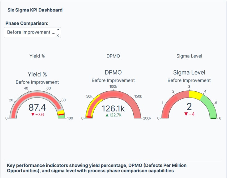
Six Sigma KPI Dashboard
-
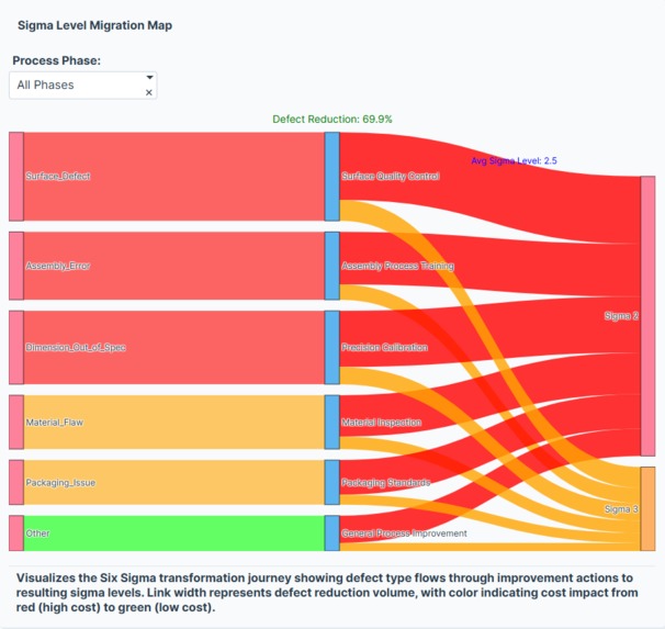
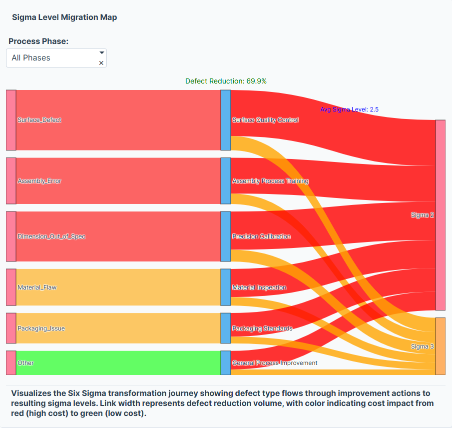
Sigma Level Migration Map
-
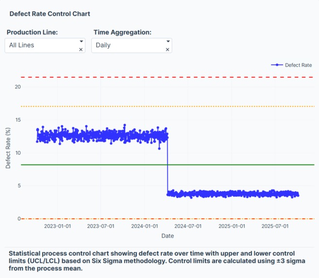
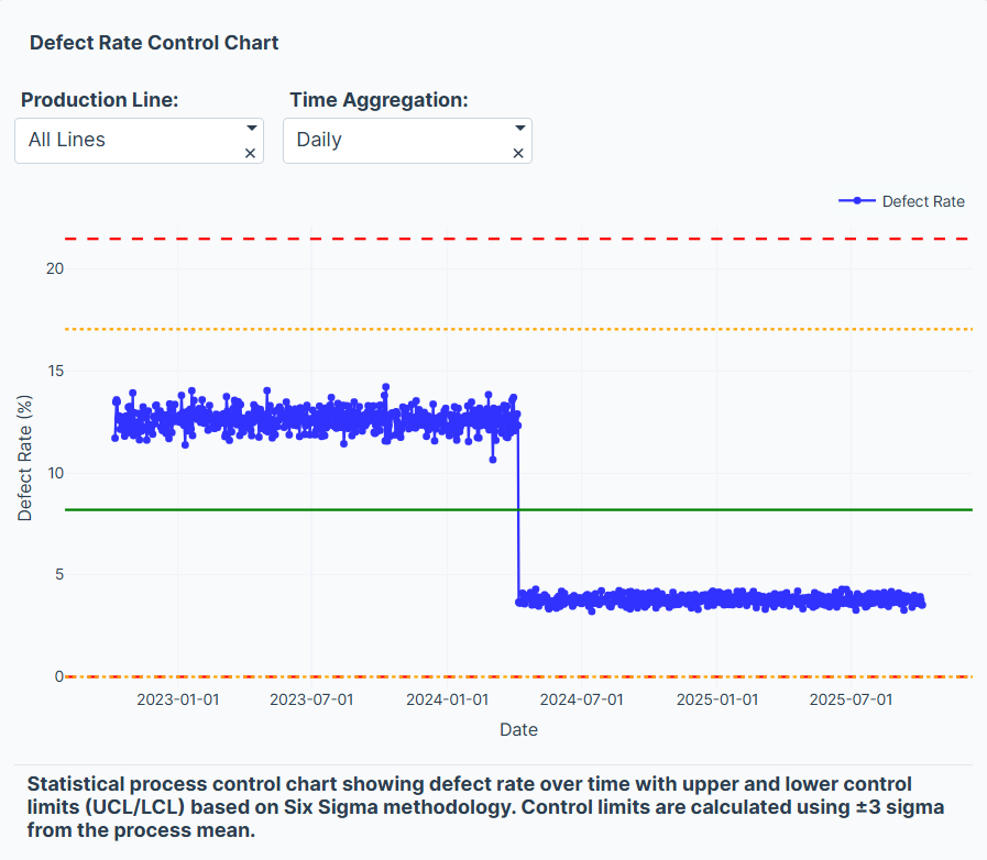
Defect Rate Control Chart
-

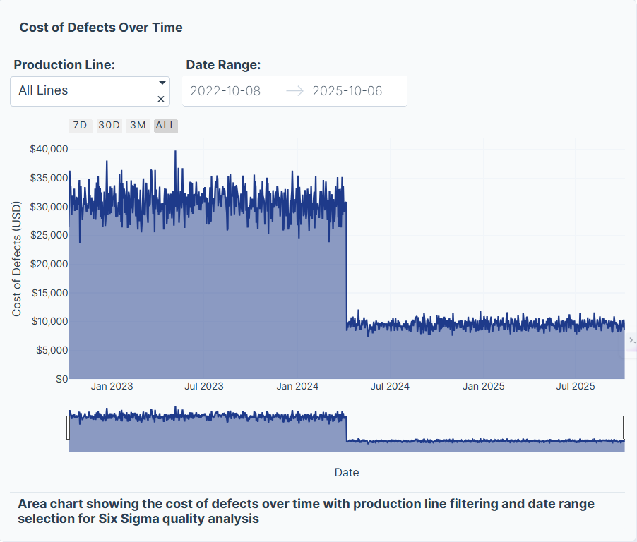
Cost of Defects Over Time
-
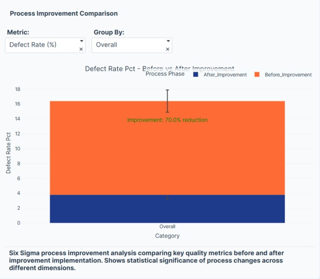
Process Improvement Comparison
-

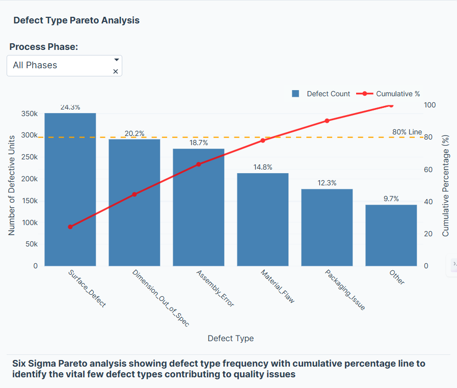
Defect Type Pareto Analysis
-
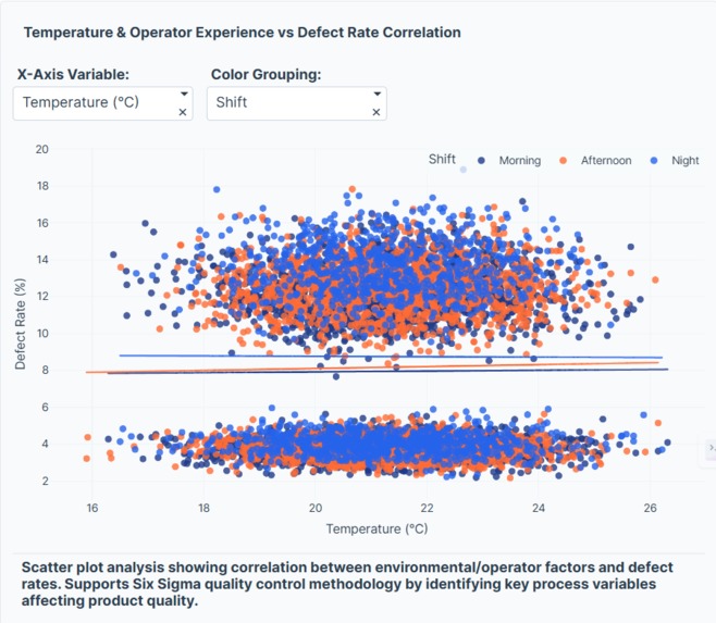
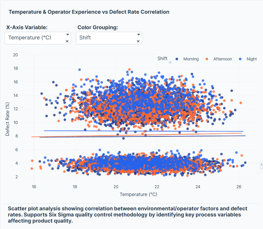
Temperature & Operator Experience vs Defect Rate Correlation
-

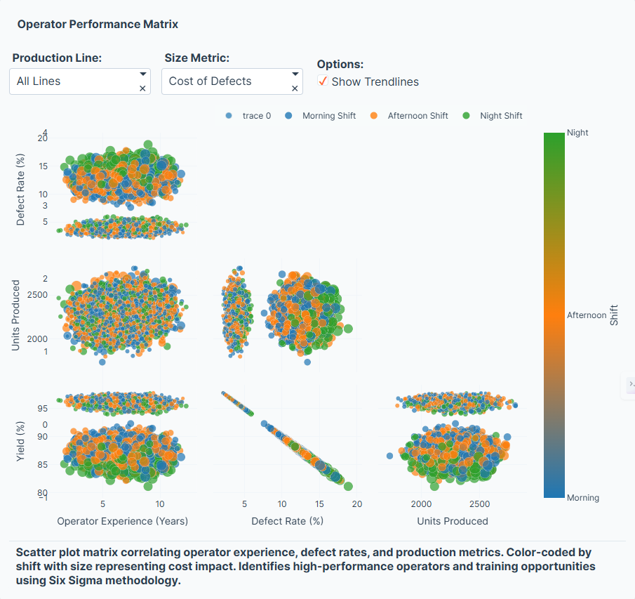
Operator Performance Matrix


💡 Inspiration
Manufacturing has always been about precision, consistency, and efficiency — the core principles behind Six Sigma. I was inspired by the idea of transforming process improvement methodology into an interactive, data-driven story using modern visualization tools.
Instead of static charts, I wanted to build something where users could see process variation, identify root causes, and quantify improvements in real time. Plotly Studio’s flexibility made it the perfect platform for combining data science, storytelling, and operations excellence.
🧱 How I Built It
The project began by simulating a realistic manufacturing dataset with the following structure:
7 production lines
3 years of daily data (1,095 days)
Metrics like Units_Produced, Defective_Units, Downtime_Minutes, Temperature_C, and Operator_Experience_Years
Two distinct process phases: Before and After improvement
Here’s a simplified code snippet used to generate the dataset:
defective_units = np.random.binomial(n=units_produced, p=defect_rate)
yield_pct = (units_produced - defective_units) / units_produced * 100
dpmo = defective_units / units_produced * 1_000_000
Once the dataset was ready, I uploaded it into Plotly Studio and designed interactive cards and charts such as:
- Control Charts to visualize process stability
- Pareto Charts to identify key defect causes
- Scatter Plots showing correlation between operator experience, temperature, and defect rates
- KPI Cards displaying metrics like Yield, DPMO, and Sigma Level
I applied the Six Sigma relationship between defect rate and sigma level using:
$$ \sigma = \Phi^{-1}(1 - p) + 1.5 $$
where ( p ) is the defect proportion and ( \Phi^{-1} ) is the inverse normal distribution.
🔍 What I Learned
Building this app taught me how powerful data visualization can be in revealing hidden operational insights.
I learned to:
- Structure datasets for process analysis (e.g., yield, DPMO, phase comparison)
- Use control limits and cumulative cost metrics to measure performance over time
- Combine Six Sigma methodology with interactive analytics for data storytelling
- Apply LaTeX math and Markdown to communicate technical insights clearly
⚙️ Challenges Faced
Every improvement project comes with its challenges — just like Six Sigma itself.
Defining control limits dynamically: Calculating and visualizing UCL/LCL in Plotly Studio required careful data aggregation. Designing for clarity: It was tempting to overload the dashboard with charts, but simplicity and flow mattered more. Telling a story with data: Turning raw metrics into a clear before vs. after narrative was as important as the numbers themselves.
🚀 The Outcome
The Six Sigma Manufacturing Quality Control Data App brings manufacturing analytics to life:
- Users can track process performance across multiple lines
- Discover which defect types dominate (Pareto principle)
- Quantify improvement impact through yield, DPMO, and sigma metrics
- Correlate environmental and human factors with process quality
It transforms Six Sigma from a static methodology into a dynamic, interactive experience — merging operational excellence with data visualization.
🧠 Final Reflection
Continuous improvement isn’t just about reducing defects — it’s about learning, visualizing, and evolving.
Through this project, I realized that data tells a story, and when paired with tools like Plotly Studio, that story becomes actionable insight.


Log in or sign up for Devpost to join the conversation.