🧠 SignalForge Intelligence
Inspiration
In most systems, data is everywhere. Clarity is not.
People look at dashboards, charts, and reports—but still ask:
- What actually changed?
- What matters right now?
- Where should I focus?
SignalForge Intelligence started with a simple idea:
What if a system could find the most important signals—and explain them clearly?
Not just show charts. But help people understand what is happening.
⚙️ What it does
SignalForge Intelligence turns raw data into actionable insight using anomaly detection, reasoning, and visualization.
It:
- detects unusual patterns and anomalies
- identifies the most important changes over time
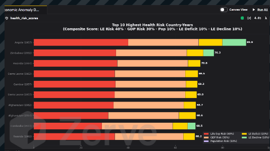
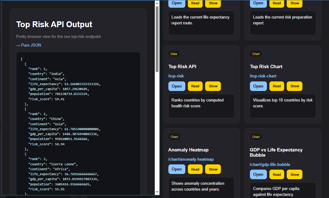
- ranks risk across signals
- visualizes trends and relationships
- explains findings in plain language
- connects each insight to underlying data
The result:
data → signal → explanation → decision
📊 How it works
SignalForge Intelligence analyzes structured data from APIs and transforms it into meaningful insights.
It:
- processes global historical data (Gapminder dataset)
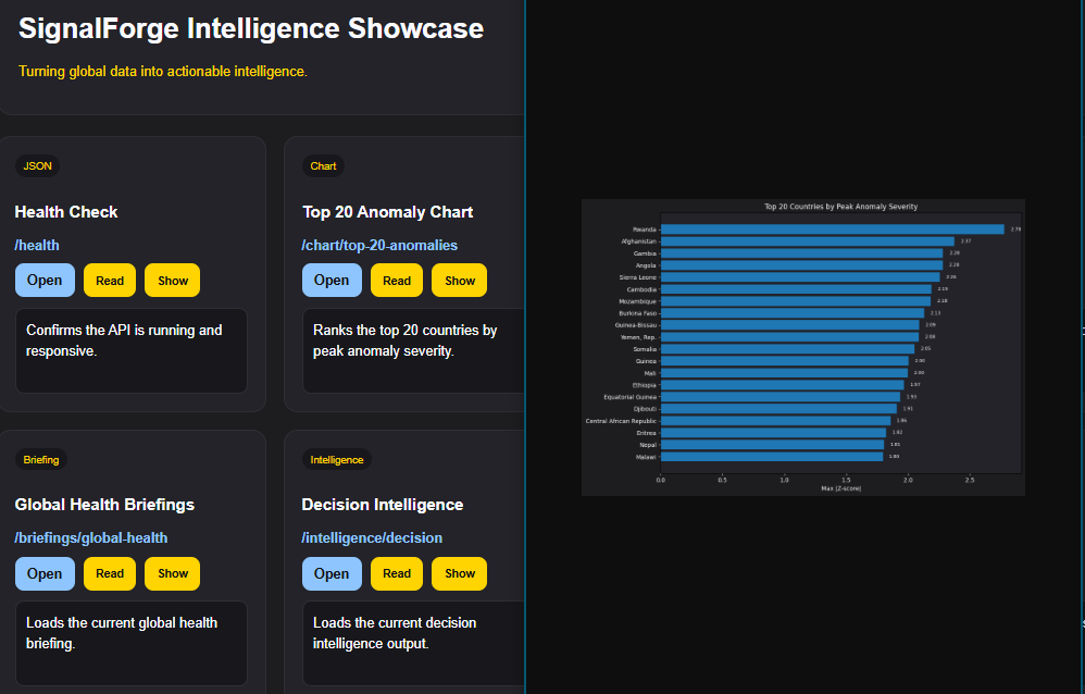
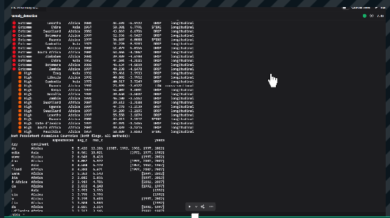
- identifies anomalies and outliers using statistical signals
- compares trends across countries and time
- ranks risk and significance of changes
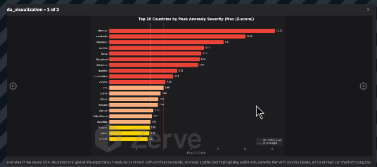
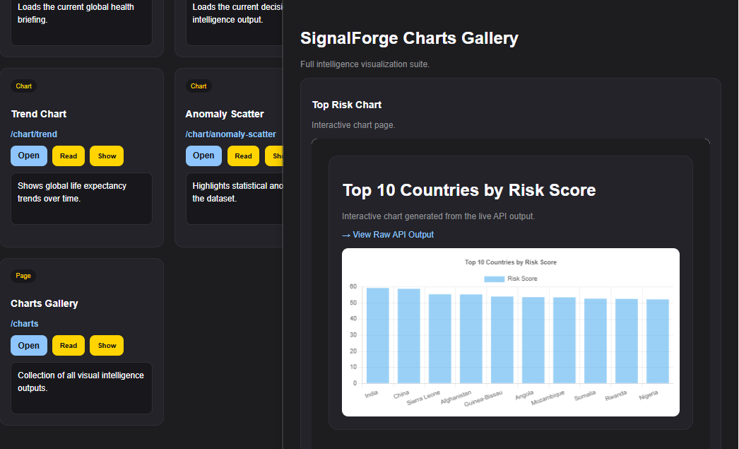
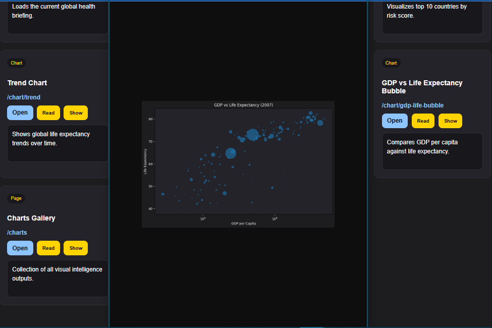
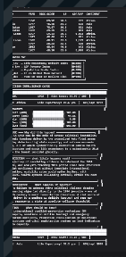
- generates visualizations (trend lines, scatter plots, heatmaps)
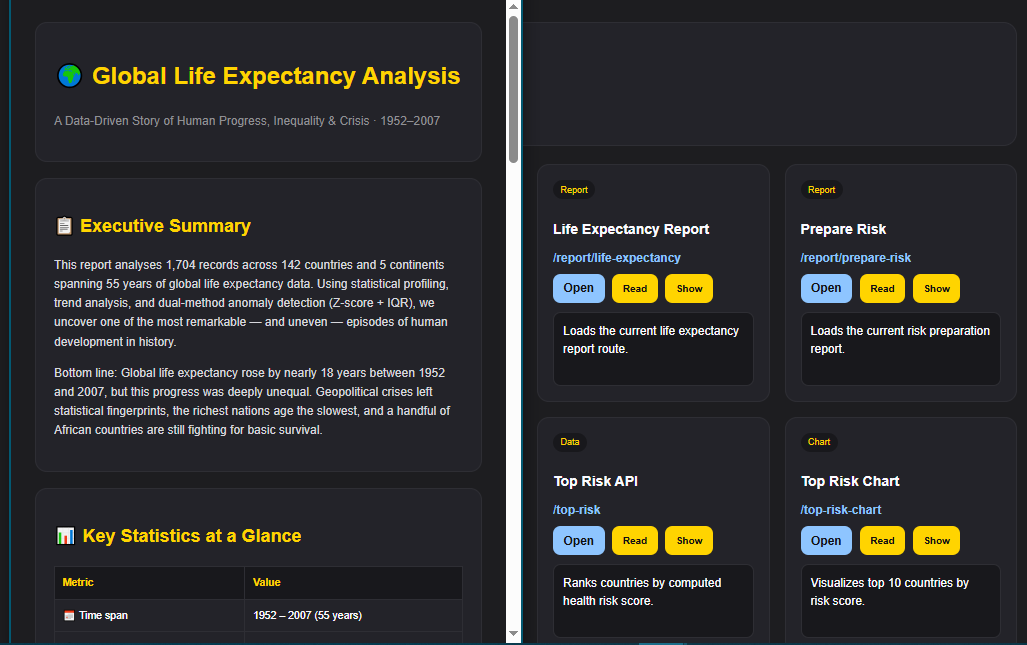
- produces plain-language explanations of what the data shows
The system creates a continuous flow of insight from structured data.
🖥️ Visualization Experience
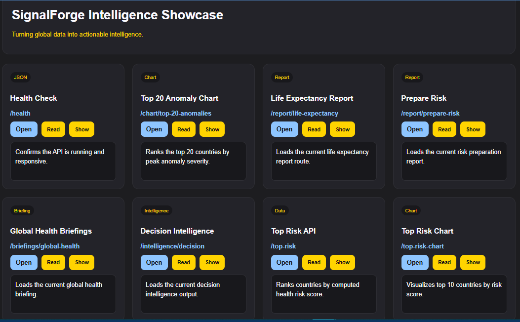
SignalForge Intelligence presents insights through an interactive visualization layer:
- trend charts showing changes over time
- anomaly scatter plots highlighting outliers
- heatmaps showing regional patterns
- structured insight panels explaining results
- optional narration to guide understanding
Users don’t just see data—they understand what it means.
🧠 Why it matters
Most tools stop at visualization.
SignalForge Intelligence focuses on meaning.
Instead of asking users to interpret everything themselves, it helps answer:
- What happened
- Why it matters
- What needs attention
This shift—from data to understanding—is where real decisions begin.
🧠 What makes it different
This is not just a dashboard.
It is an intelligence layer built on top of data.
- It surfaces signals, not just numbers
- It prioritizes what matters
- It explains insights in human terms
- It connects insight directly to data
It doesn’t just show information—it helps you understand and trust it.
🏆 Accomplishments
- Built an intelligence layer on top of API-driven data
- Created anomaly detection across countries and time
- Designed multi-view visualizations (trend, scatter, heatmap)
- Generated explainable insights from structured datasets
- Integrated visualization with narrative understanding
📚 What we learned
- Visualization alone is not enough—interpretation is key
- Highlighting what matters is more valuable than showing everything
- Combining data, visuals, and explanation improves understanding
- Users need guidance, not just access to information
🚀 What’s next
- Expand to real-time API data sources
- Improve anomaly detection models
- Add user-driven queries and filtering
- Enhance narrative generation and insight explanations
- Develop into a full data intelligence platform
Final thought
There is no shortage of data.
The real advantage is knowing what matters.
SignalForge Intelligence is built to make that clear—by turning data into understanding.


Log in or sign up for Devpost to join the conversation.