-
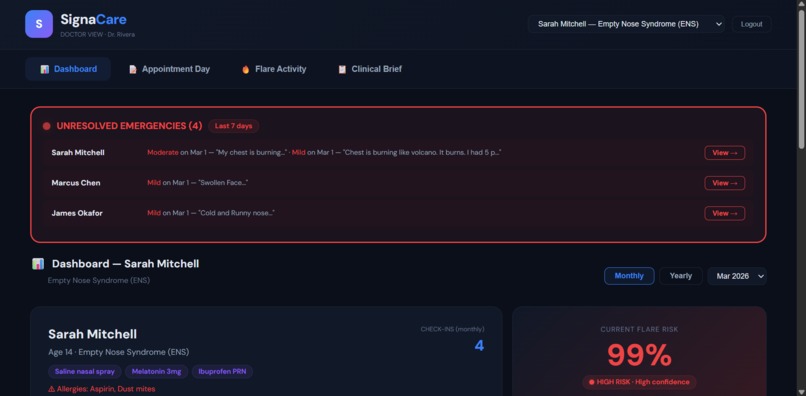
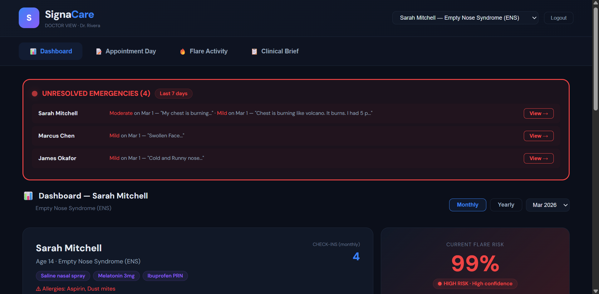
Doctors side patient dashboard
-
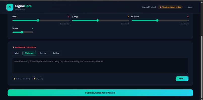
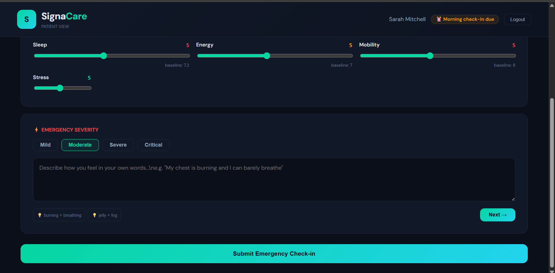
Patient Side Emergency Checkin
-
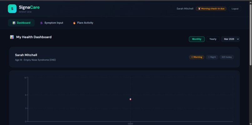
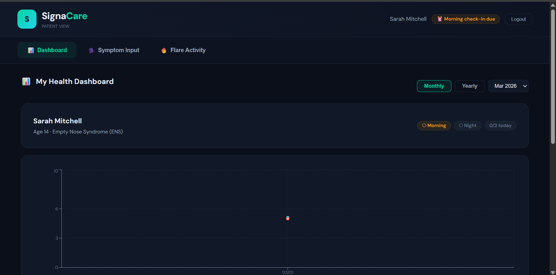
Patient Side Dashboard
-
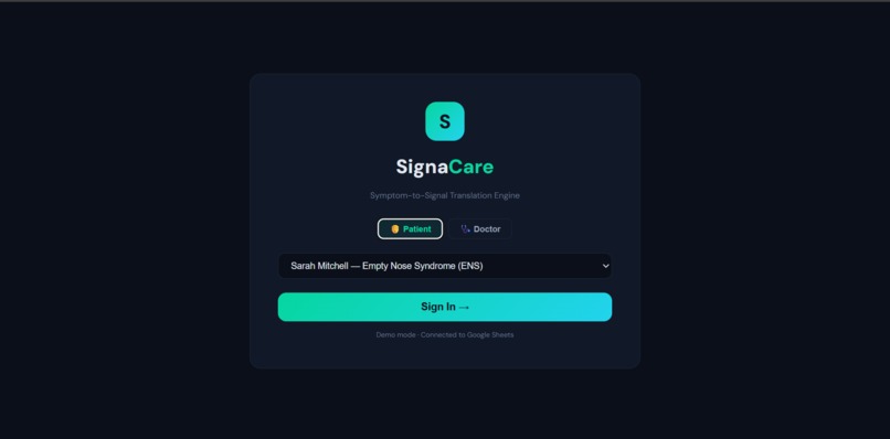
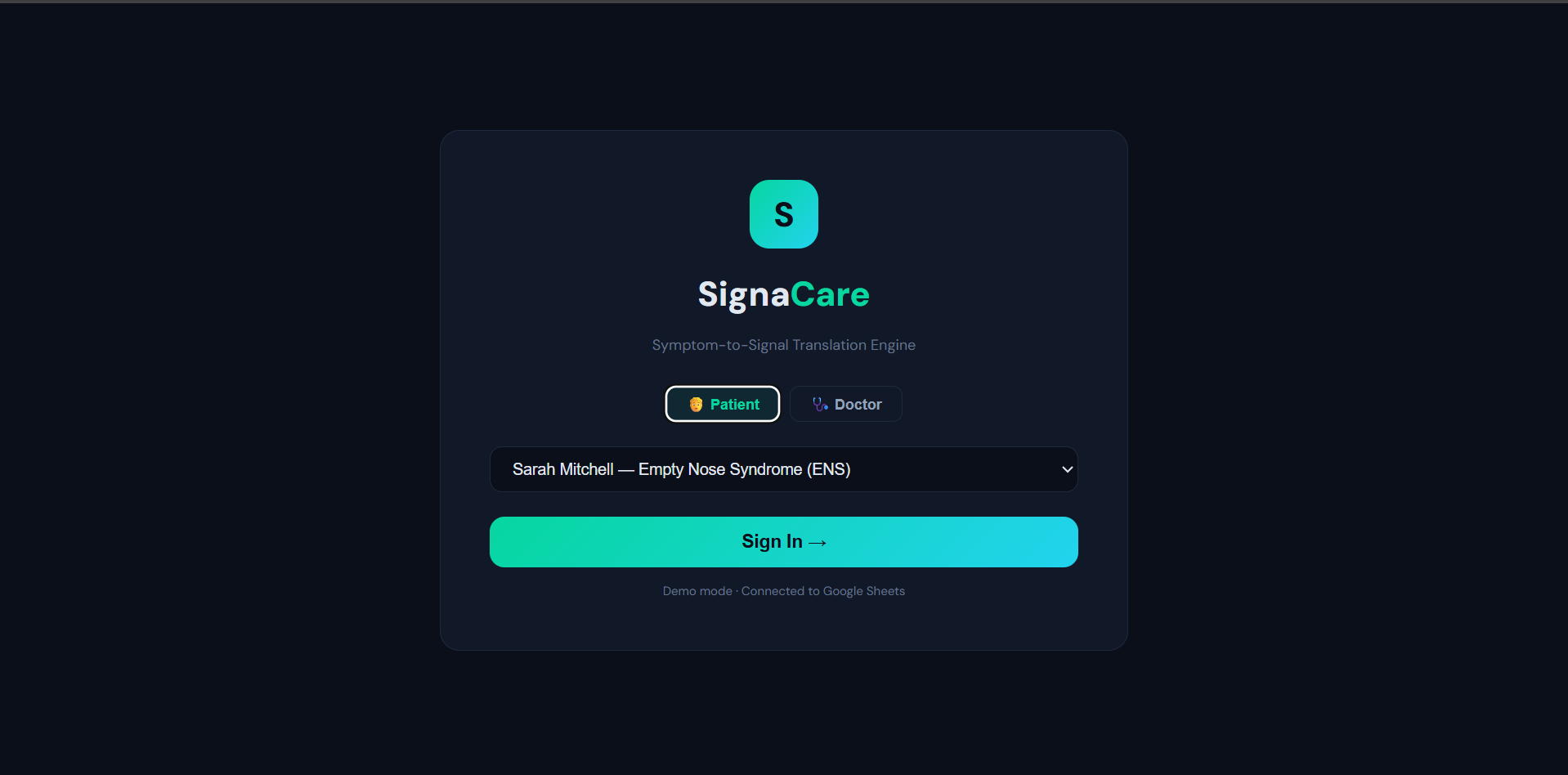
Login
Inspiration
Rare disease patients describe their daily reality in vivid language — "breathing through a desert," "legs like jelly," "drowning with nothing blocking me." These descriptions carry deep clinical meaning but get lost in 15-minute appointments. AESNV's challenge named this perfectly: there's no bridge between lived patient experience and structured clinical data. We built SignaCare to be that bridge.
What it does
SignaCare is a symptom-to-signal translation engine with dual patient/clinician interfaces.
- Patients log daily check-ins with metric sliders and free-text descriptions. For emergencies, Claude API conducts adaptive follow-ups to clarify severity, then Med-BERT extracts clinical entities (symptoms, HPO codes, body systems) into a structured summary.
- Doctors see baseline vs. current comparisons, Bayesian flare risk with interpretability panels (evidence, uncertainty, missingness), symptom heatmaps, a "Since Last Visit" delta card, and unresolved emergency alerts across all patients.
Not a diagnostic tool — it structures symptoms for interpretation and care planning.
How we built it
- React + Recharts — role-based dashboards with trend charts, heatmaps, flare timelines
- Google Sheets + Apps Script — persistent data layer with REST API
- Claude API — adaptive follow-up conversations during emergency check-ins
- Med-BERT NER — clinical entity extraction mapping patient language to medical terminology
- Bayesian Engine — real-time flare risk scoring with full interpretability
- Synthetic Dataset — 10 patients, 3 doctors, 3,392 check-ins, 51 flare episodes over 6 months
Challenges we ran into
Data shape mismatches between flat Google Sheets columns and nested React state required a full adapter layer. Date formatting caused bugs everywhere — ISO strings leaking into charts and wrong sort orders. Our initial trigger correlations were hardcoded; we replaced them with dynamically computed frequencies from real flare data because honesty matters in healthcare. Balancing what patients vs. doctors should see (e.g., hiding anxiety-inducing flare scores from patients) was a constant design tension.
Accomplishments that we're proud of
Every flare risk score shows what drove it, what's uncertain, and what's missing — true interpretability for clinical use. The adaptive follow-up pipeline turns raw patient language into structured clinical data through real conversation. The emergency alert system tracks resolution — alerts persist until patients confirm they're okay. The delta card gives doctors instant context: what changed, how many flares, how many emergencies — no more starting from scratch every visit.
What we learned
Healthcare signals need transparency over impressiveness — a 72% risk score means nothing without explaining it's driven by 40% pain deviation with 2 missing metrics. Patient metaphors are data, not noise. And the gap between prototype and usable tool shrinks when you design for real clinical workflows.
What's next for SignaCare
Mobile app with push reminders and wearable integration → Telehealth with live dashboard overlay for severe cases → Med-BERT fine-tuning on rare disease corpora with multi-language NER → FHIR-compliant EHR integration → Multi-disease expansion using modular symptom ontologies.

Log in or sign up for Devpost to join the conversation.