-
-
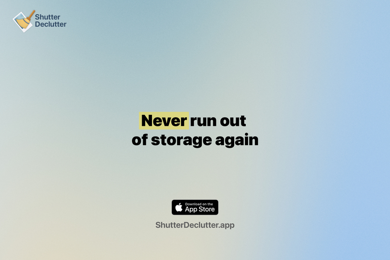
Never run out of storage again
-
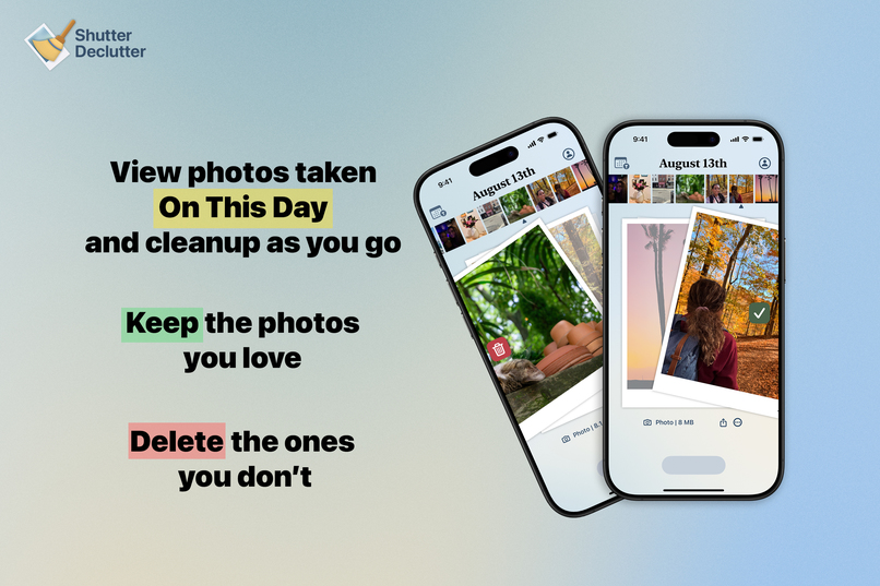
View photos taken on this day; Keep the ones you love, delete the ones you don't
-

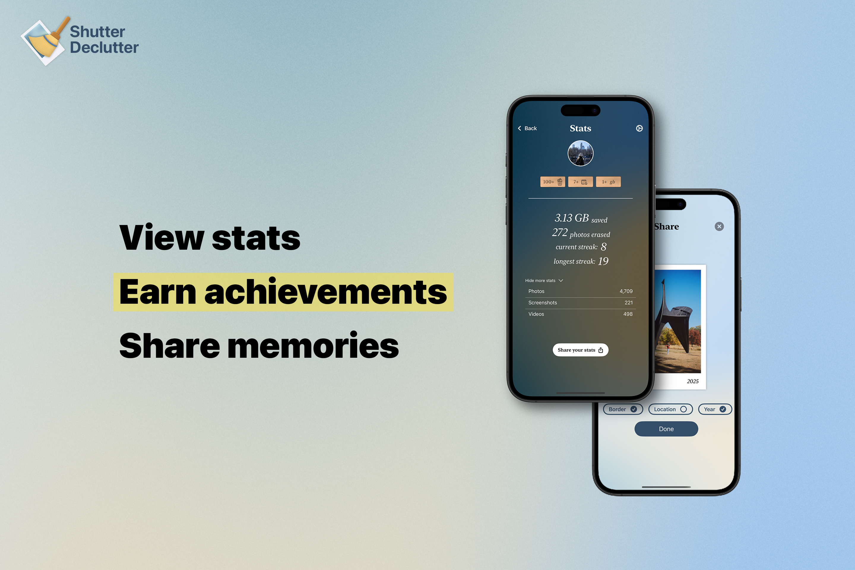
View stats, earn achievements, share memories

Inspiration
The inspiration struck when I hit that dreaded "iPhone Storage Full" notification on my phone. Like millions of others, I had tens of thousands of photos. Many were accidental shots, forgotten screenshots and duplicate photos I'd never look at again. I knew I didn't need more iCloud storage; I needed less digital clutter.
But when I tried to tackle it all at once, I got completely overwhelmed and gave up halfway through. That's when I realized the real problem wasn't just having too many photos but instead it was approaching cleanup like a marathon instead of building sustainable habits. What if I could make decluttering a daily habit instead of a massive, overwhelming project? By showing people their memories in easily reviewable sections, they could naturally decide what to keep while rediscovering forgotten gems. A few minutes daily beats hours of dreaded cleanup every time.
What it does
The idea is you review photos taken "on this day". So if it's August 19th, I show you photos taken on August 19th 2025, August 19th 2024, and so on. Swipe to delete the ones you don't want, saving storage space as you go. It's a bit like Tinder, but for your photos. By only viewing the photos taken on that day, it breaks up the arduous task of going through photos endlessly. Once you've swiped through photos on that day, you're done! Go outside, make some memories and come back tomorrow to swipe through the next day.
Other apps have no organization; and showing you all your photos from whenever and wherever. This in turn wears down the user so that they get tired of reviewing and never open it again. My app provides an ADHD-friendly, fun way to reminisce on past memories and save space while they're at it.
How I built it
- Swift
- Heavy reliance on PhotoKit
- SwiftUI
- RevenueCat of course for subscription management, which made it easy for me to handle in app purchases.
Design tools used:
- Sketch
- Photoshop
- After Effects for the animations
- Illustrator
Design details
Every design element was crafted with intention. I display the photos in Polaroid-style photo frames for a more nostalgic feel. The background isn't just a simple gradient, it's actually a blurred mosaic of my own photographs. I chose the blue color palette because the sky is the most common element found in photographs. Even the app icon's signature broom (since a broom represents "cleaning") I hand illustrated it in Adobe Illustrator, using a skirt I was wearing as reference to get the bristles just right.
Challenges I ran into
Performance - Apple's PhotoKit does not offer a native way to only fetch photos taken on a specific day; regardless of the year. You can fetch photos given a period of time, but my app fetches them based on their specific month + day which isn't supported. Fetching every single photo was performance intensive so, I had to come up with a clever solution to fetch only the items requested, maintaining optimal app performance.
Knowing when to ship - I had a solid MVP early on, but kept second guessing whether it provided enough value for users to actually want to buy a subscription. I didn't want to ship too early and risk a weak launch, but I also didn't want to wait too long and not be able to grow the app within the submission deadline.
Accomplishments that I'm proud of
The launch - The first few days I had 11 users, but after posting on social media, cold emailing journalists, putting up signs around town, and countless other things I did to prepare for the launch, that number shot up exponentially.
The buzz - The Verge featured the app, users were organically posting about it on social media, and numerous people reached out to have my app featured in newsletters.
The growth - At the time of writing (1 month post-launch), I now have thousands of active users and over 1,000 paying subscribers
What I'm most proud of - Building something people genuinely love enough to not just use, but actively recommend to others. So much organic, word of mouth growth tells me I solved a real problem that resonates with people's daily lives.
What I learned
- No one will download an app they haven't heard of, no matter how good it may be. Letting users know about your app is key.
- Pre-orders and beta testing help so much. Getting feedback early to hit that perfect launch can make sure users are paying subscribers day one.
- Make sure you use a unique identifier for your users in RevenueCat. Being able to grant entitlements makes providing customer support a million times easier.
- Use apps like Mobbin to research good onboarding flows, and settings pages. Things like that you can't afford to mess up.
- I didn't realize how important good design is. Every app has a million competitors and there has to be something that makes your app stand out. I learned that my unique app design is a huge reason why users are choosing my app over competitors.
What's next for Shutter Declutter
Address user feedback I've received plenty of user feedback for Shutter Declutter. I'm going to work on addressing the biggest pain points for users first and then working on bigger updates after that.
Sharing Sharing is a crucial marketing tool, and I think it's important to have sharing features built in. One of the most important next steps for me is to improve on that experience and provide more ways for users to share their memories. I check social media and to my surprise, I see people post their photos that they've rediscovered by using my app. Because of this, I want to build upon this experience so that more users take advantage of it!
Other future improvements:
- Mac App
- Localization
- Even more accessibility options
- Themes


Log in or sign up for Devpost to join the conversation.