Inspiration
I’ve always been fascinated by the “why” behind shopping—how age, location, and promotions shape our choices. Seeing raw sales data felt like looking at noise, so I set out to transform it into clear, actionable consumer insights.
What it does
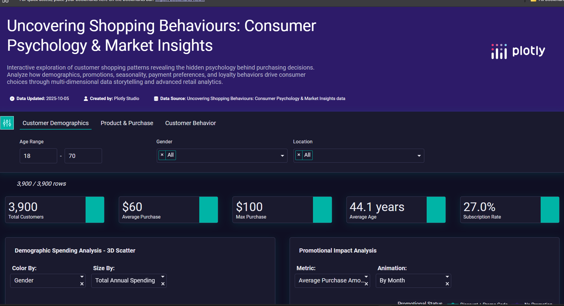
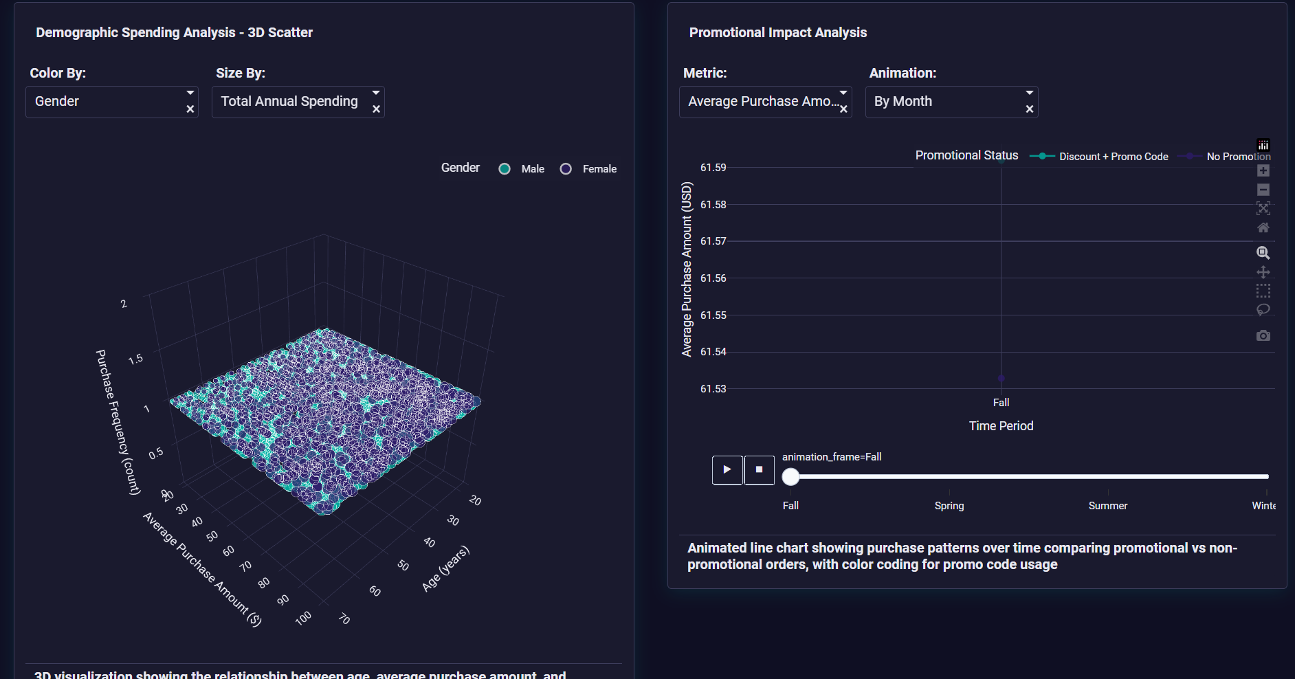
Shopping Psychology Decoder turns 3,900 customer records into an interactive story. Explore demographics, seasonal trends, promotional impact, payment preferences, and loyalty patterns—all connected for seamless analysis.
How I built it
- Data: Cleaned and merged customer demographics, orders, and reviews in Python
- Visuals: Created advanced charts (3D scatter, animated bars, sunburst, maps) with Plotly Studio
- Interactivity: Added cross-filtering, dropdowns, sliders, and hover tooltips for real-time exploration
Challenges I ran into
- Merging multiple data sources without losing detail
- Balancing performance and interactivity for smooth animations
- Designing a dark theme that remains readable and accessible
Accomplishments that I'm proud of
- Implemented 12+ filter controls for deep segmentation
- Built custom chart types (e.g., radar, calendar heatmap) that reveal hidden patterns
- Delivered a polished, mobile-responsive app that loads in < 3 seconds
What I learned
- Effective data storytelling requires more than charts—it needs a narrative flow
- Advanced Plotly features (cross-filtering, animation frames) unlock powerful insights
- User-centric design and accessibility are key to engaging data apps
What’s next for Shopping Psychology Decoder
- Add predictive models (e.g., spend forecasting using \$$ \text{ARIMA} \$$)
- Integrate real-time API data for live sales monitoring
- Expand to product recommendation engines powered by shopping archetypes


Log in or sign up for Devpost to join the conversation.