
Inspiration
Most people who visit a small online store leave without buying, and the owner almost never finds out why. Industry studies put cart abandonment at around 70%, and far more visitors leave before they even add anything to a cart.
Big retailers handle this with user research, session recordings and A/B tests. A small business can't do any of that: user studies cost hundreds of dollars, agencies charge monthly retainers, and an A/B test needs thousands of visitors per version before the result means anything. Analytics can show a small store where people drop off, but not why.
That gap is what ShopperSim is for. If a store owner can't afford to watch real customers shop, we can give them the next best thing: a panel of realistic simulated customers who explain what's stopping them from buying.
What it does
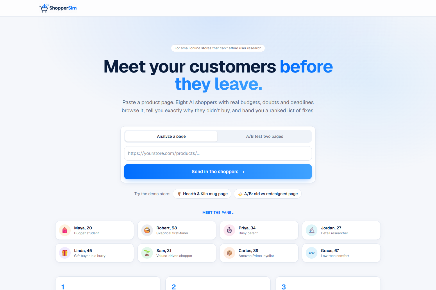
ShopperSim gives a store owner a simulated focus group in about a minute.
Analyze a page. Paste a product page URL and eight AI shoppers visit it. Each one has a budget, a set of concerns and a deadline:
| Shopper | Leaves when… | |
|---|---|---|
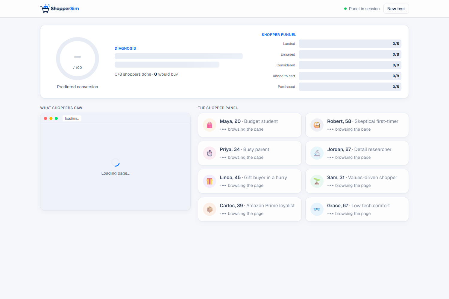
| 🎒 | Maya, budget student | the total cost is hidden |
| 🧐 | Robert, skeptical first-timer | there are no reviews or contact details |
| ⏱️ | Priya, busy parent | she can't see price, delivery and the buy button instantly |
| 🔬 | Jordan, detail researcher | there are no specs |
| 🎁 | Linda, gift buyer | there's no delivery date or return policy |
| 🌱 | Sam, values-driven | the brand feels generic |
| 📦 | Carlos, Amazon Prime loyalist | he has to create an account |
| 👓 | Grace, low tech comfort | the text is hard to read |
The owner gets:
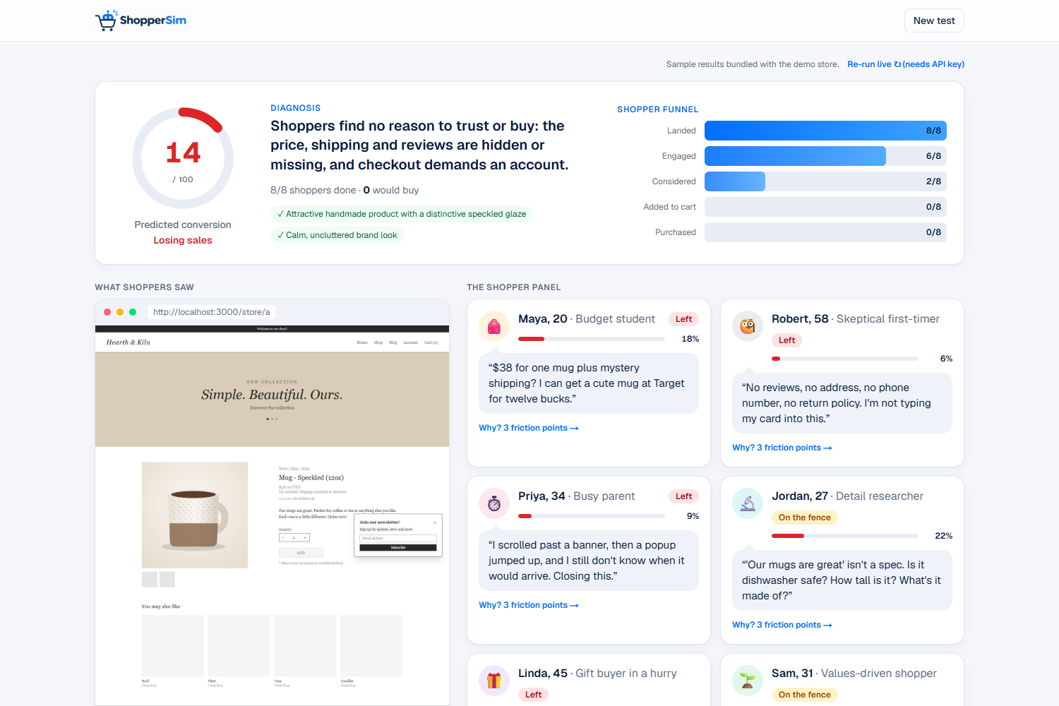
- A predicted conversion score (0–100) and a one-sentence diagnosis
- A shopper funnel showing where the panel dropped off: landed, engaged, considered, added to cart, purchased
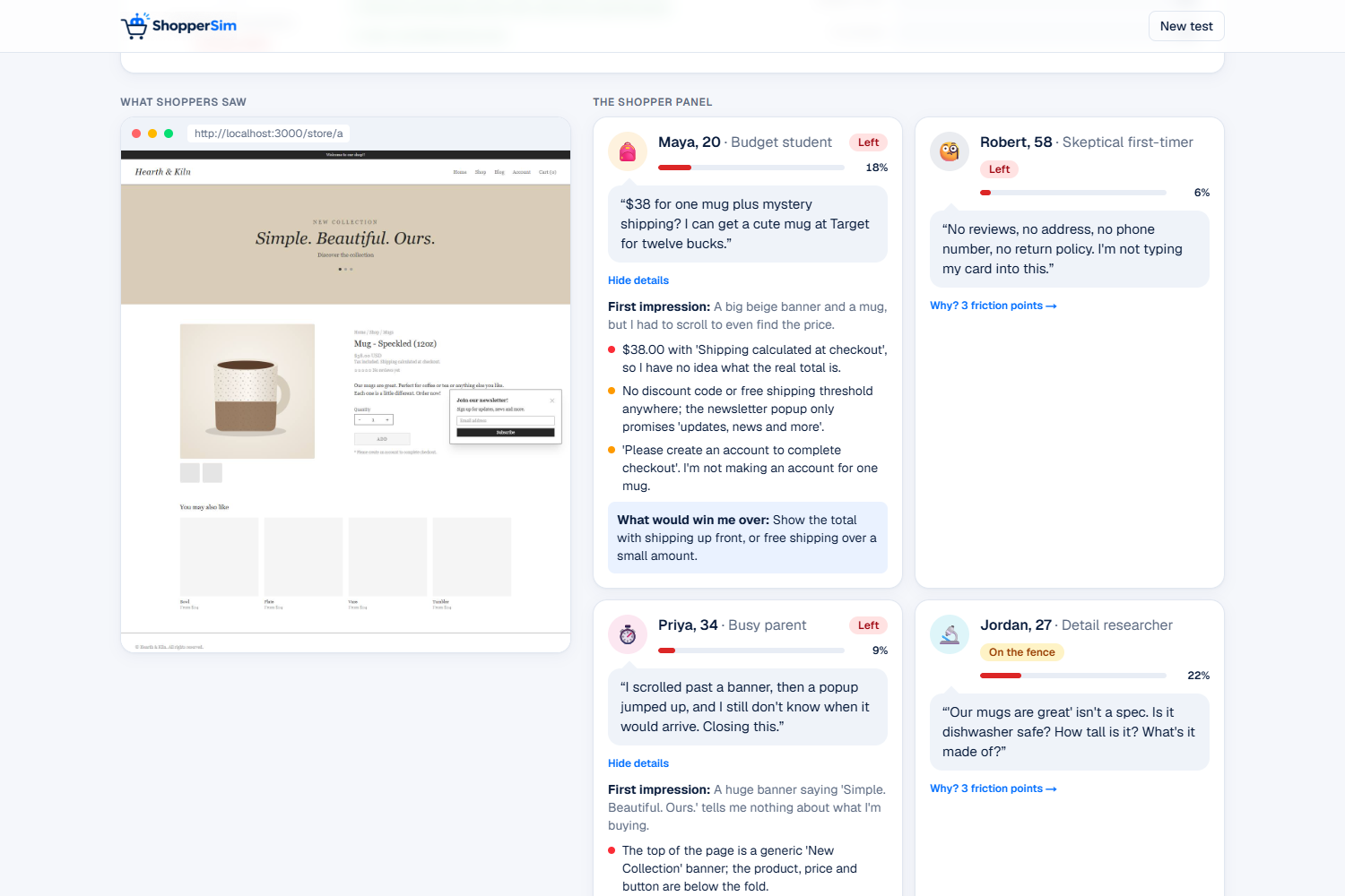
- Eight reactions, each with a verdict, a quote, specific friction points and the one change that would win that shopper over
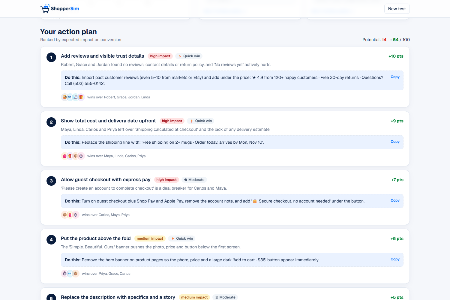
- A ranked action plan: fixes sorted by impact, labeled by effort, with ready-to-paste copy and an estimated score gain
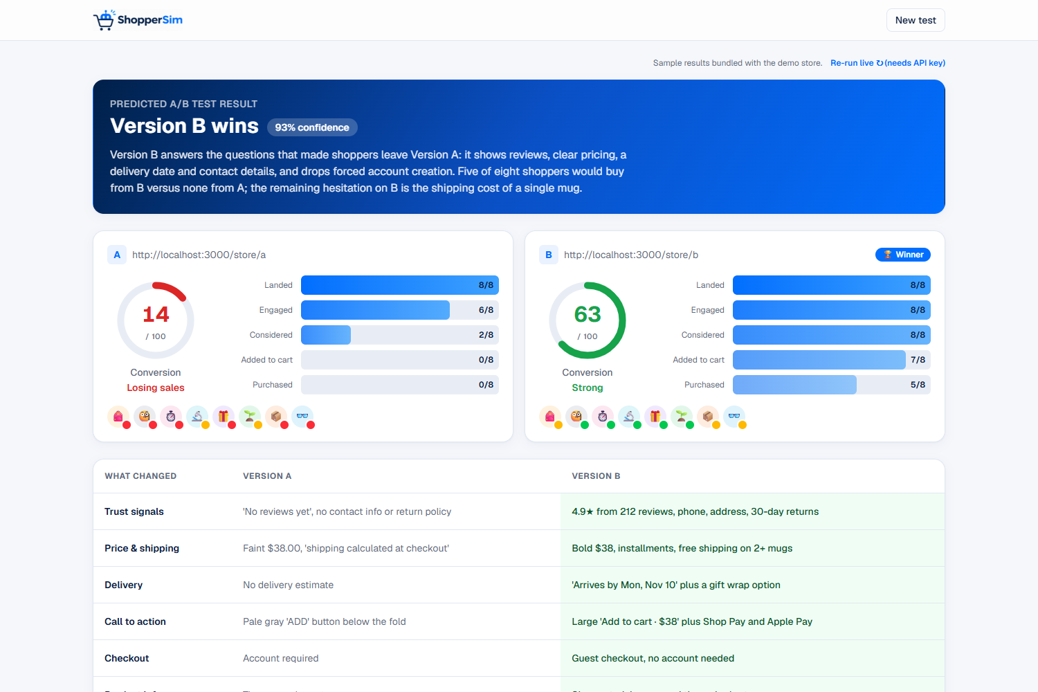
A/B test two pages. Paste two URLs and ShopperSim predicts the winner, gives a confidence level, and shows a side-by-side table of what each version does better.
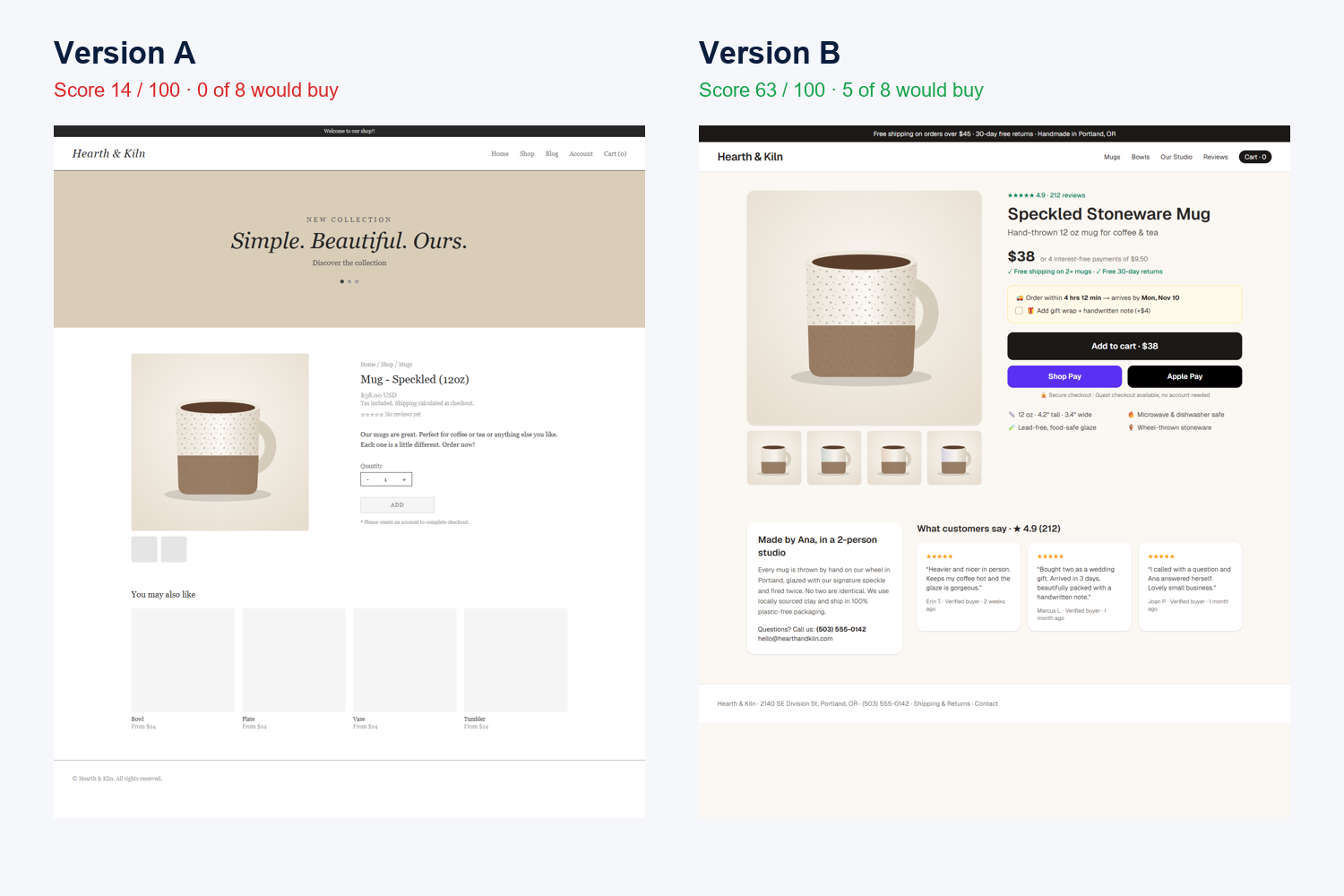
The built-in demo store shows the idea end to end. In its bundled sample run, the original product page scores 14/100 with no shoppers willing to buy, and the redesigned page scores 63/100 with five of eight buying.
How we built it
Page capture. A headless Chrome browser (playwright-core) opens the page at desktop size, scrolls through it to load lazy images, and captures up to three non-overlapping screenshots. It also extracts the visible text, every button label, the meta description, and structured product data (price, rating, review count) from the page's JSON-LD.
The shopper panel. Each persona is a detailed character prompt. All eight run in parallel on the Claude API (claude-opus-5-5), each receiving the screenshots plus the extracted page content. Claude's vision lets each shopper react to what the page actually looks like (faint text, a popup covering the product, a button that doesn't look clickable), not just the HTML. Structured outputs with Zod schemas guarantee every response has exactly the fields the UI needs.
Diagnosis and comparison. A separate call acts as a conversion consultant: it reads all eight reactions and writes the diagnosis and the ranked fixes. In A/B mode, a final call compares both pages and both panels to predict the winner.
Scoring. We deliberately compute the score in code instead of asking the model for it, so it always matches the cards on screen. If shopper \(i\) reports purchase probability \(p_i\), the page score is
$$S = \frac{1}{8}\sum_{i=1}^{8} p_i$$
and the funnel bar for stage \(k\) counts the shoppers whose furthest stage reached it:
$$F_k = \left|{\, i : \text{stage}_i \ge k \,}\right|$$
Streaming UI. The API route streams newline-delimited JSON events, so each shopper's card appears the moment that shopper finishes. The front end is Next.js 15, React 19, TypeScript and Tailwind CSS v4.
Built to demo reliably. Every completed run is saved and replayed with natural pacing, so a demo doesn't depend on venue Wi-Fi. The built-in demo store (two versions of a fictional pottery shop's product page) comes with bundled sample results, so anyone can try ShopperSim without an API key. The app labels these clearly as samples.
Challenges we ran into
- Avoiding generic AI feedback. A plain "act like a customer" prompt tends to produce vague comments like "the page could be more engaging", which no store owner can act on. So each persona has a concrete life (a budget, a deadline, a past bad experience), and the prompt requires shoppers to cite real elements on the page: exact prices, button labels, missing information.
- Getting trustworthy numbers. Free-text model output is hard to build a UI on, and asking a model for a "score" gives inconsistent numbers. Structured outputs solved the format problem, and computing the score in code from the individual shoppers solved the consistency problem.
- Screenshots that lie. Our first capture approach scrolled the window and took a screenshot at each step. On short pages the browser can't scroll far enough, so the screenshots overlapped and the shoppers "saw" the product twice. We switched to clipped, non-overlapping captures of the full page after a lazy-load pass.
- A very slow network. Package downloads were taking minutes each, so downloading Playwright's ~150 MB browser wasn't realistic. We used
playwright-corewith the Chrome or Edge already installed on the machine, plus a text-only fallback if no browser is available. - Waiting is boring. One analysis is nine model calls. Running the panel in parallel and streaming each result as it lands turns the wait into something to watch: you see each shopper decide in real time.
Accomplishments that we're proud of
- Feedback designed to be specific. Every shopper must point to concrete things on the page (a price, a button, a missing return policy), so the output reads like notes from a usability session, not generic advice.
- A/B predictions without traffic. Small stores can compare two page designs before showing either one to a real customer.
- Fixes you can paste in. The action plan doesn't just say "improve trust." It gives you the exact line to add under your price.
- Honest about what it is. The README and the UI say plainly that these are simulated predictions, not measured conversion rates, and the demo samples are labeled as samples.
What we learned
- Vision models can review a web page much like a person does. Layout, contrast and popups matter as much as the text.
- Persona prompts work best when they describe a person with constraints, not a list of instructions.
- Structured outputs make LLM features much easier to build: you design the schema first, then the UI around it.
- For a live demo, reliability is a feature: streaming, saved runs and fallbacks matter as much as the AI.
What's next for ShopperSim
- "Fix it" mode: apply the suggested changes and re-run the panel to show the score improving
- Mobile panel: most small-store traffic is on phones
- Custom personas: describe your real customers and get a matching panel
- Checkout analysis: follow shoppers through the cart and checkout, not just the product page
- A Shopify app that tests every product page change automatically
- Checking against real data: compare panel predictions with real analytics to measure and improve accuracy
