-
-

App Icon
-
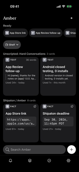
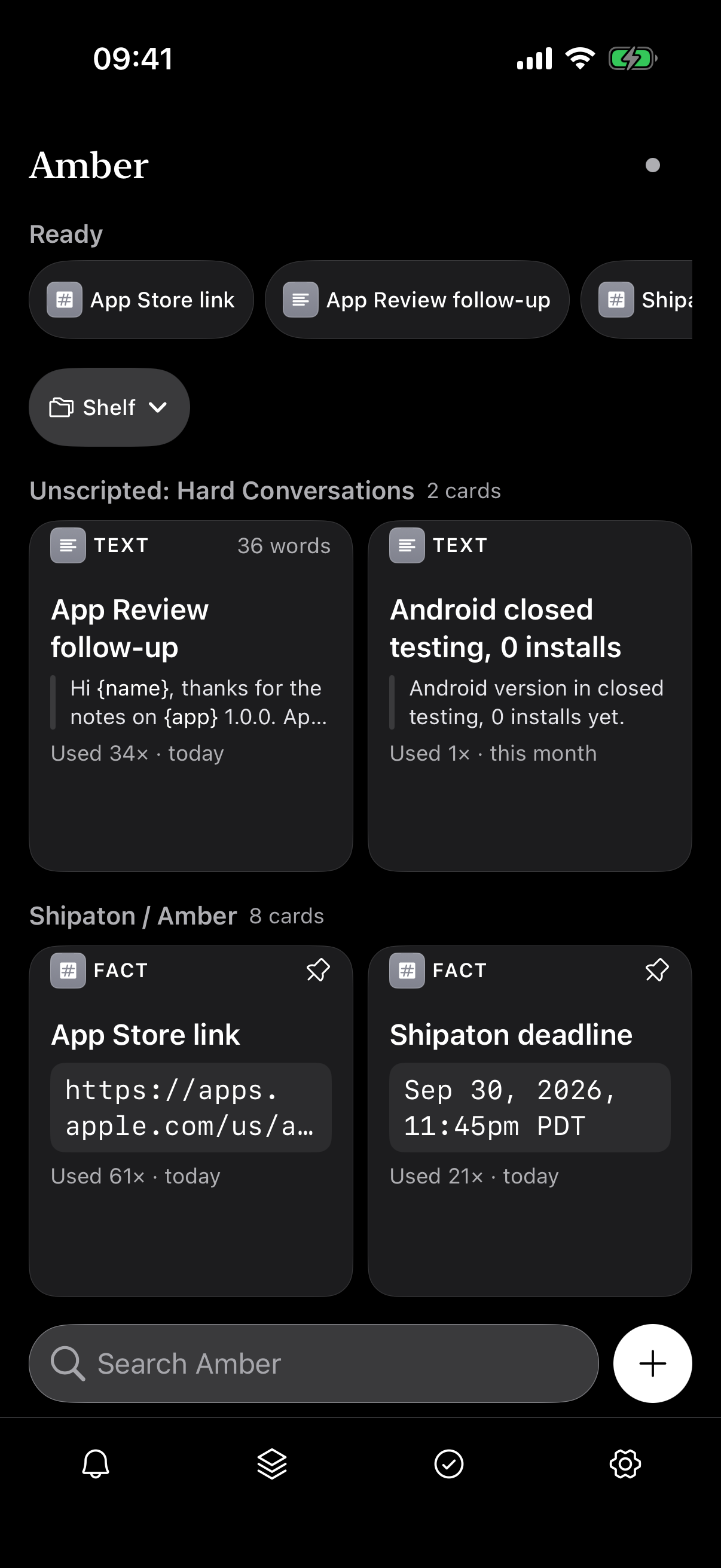
iOS app
-
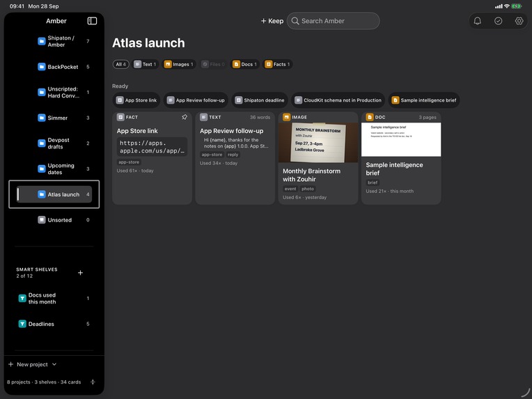
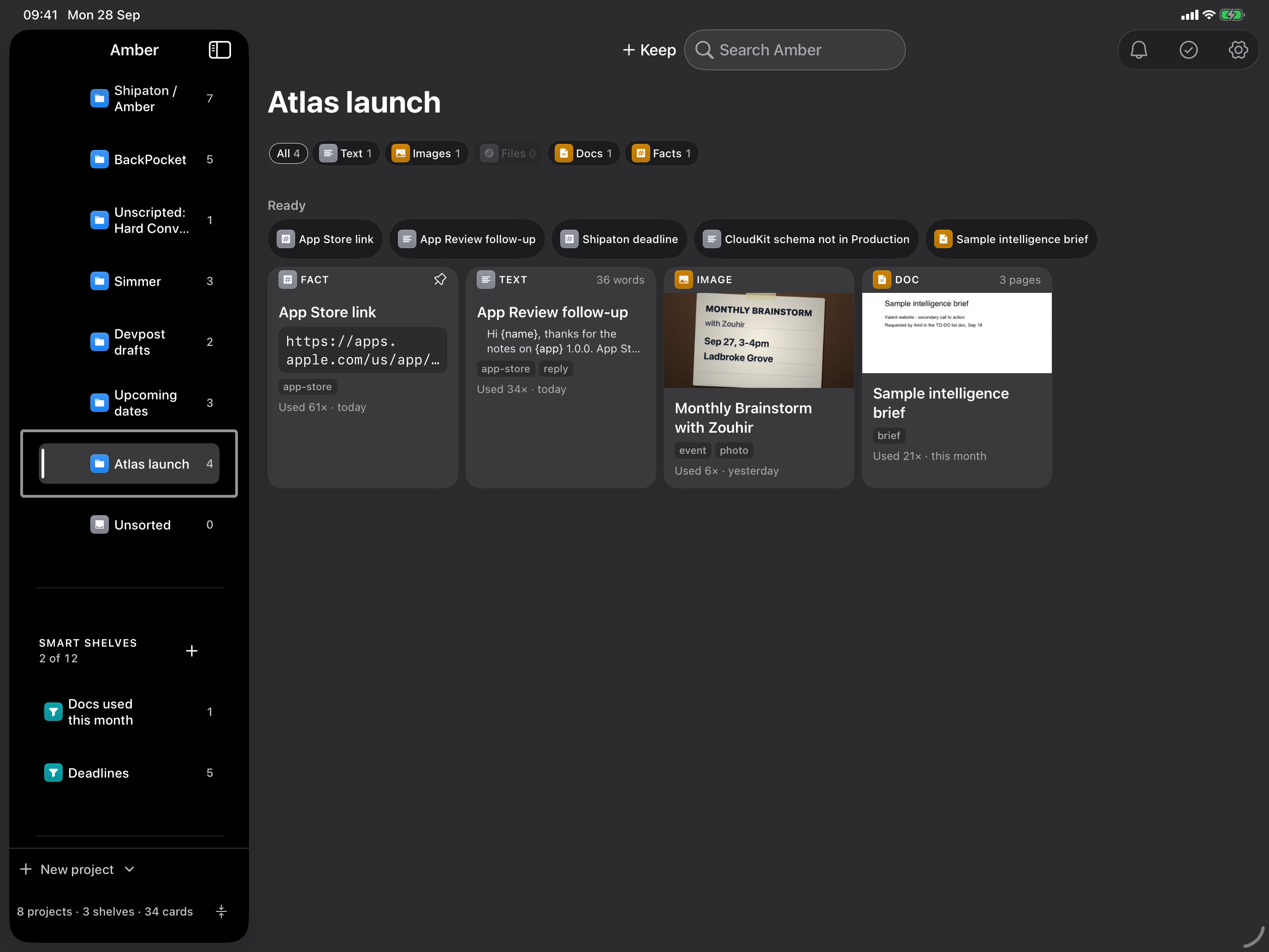
Amber macOS app: Project view
-
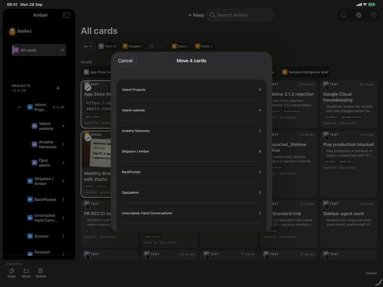
-
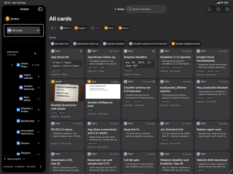
Amber macOS app: All cards
-
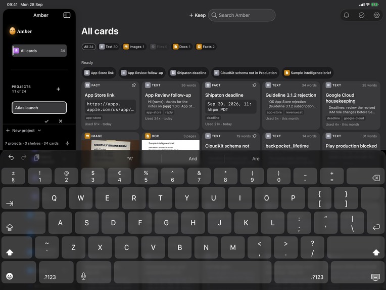
Amber macOS app
-
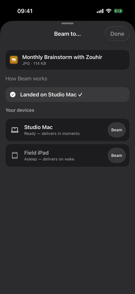
Beam feature iOS to other devices

Inspiration
I counted once. In a single day I typed my own email address 11 times, pasted the same client onboarding reply 6 times, and went hunting for the same PDF rate card 4 times.
None of it was hard. All of it was friction. Twenty seconds here, a broken train of thought there, dozens of times a day. And every tool I had was the wrong shape: Notes is built for writing. Files is built for storing. Nothing is built for reusing.
So I built Amber. One calm, fast home for everything you reach for again and again. One rule shaped every decision: Amber is not a notes app and it is not a file manager. It's the drawer next to your keyboard.
What it does
Keep something once a snippet, a template, ct** like your address or IBAN and reuse itin a tap, on iPhone, iPad and Mac.
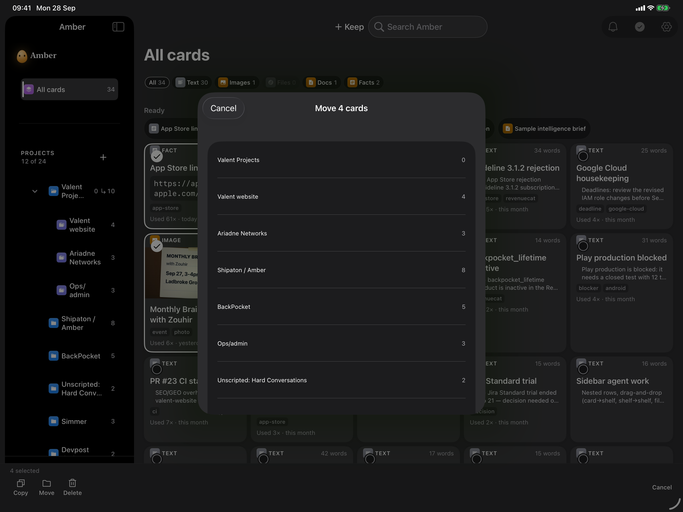
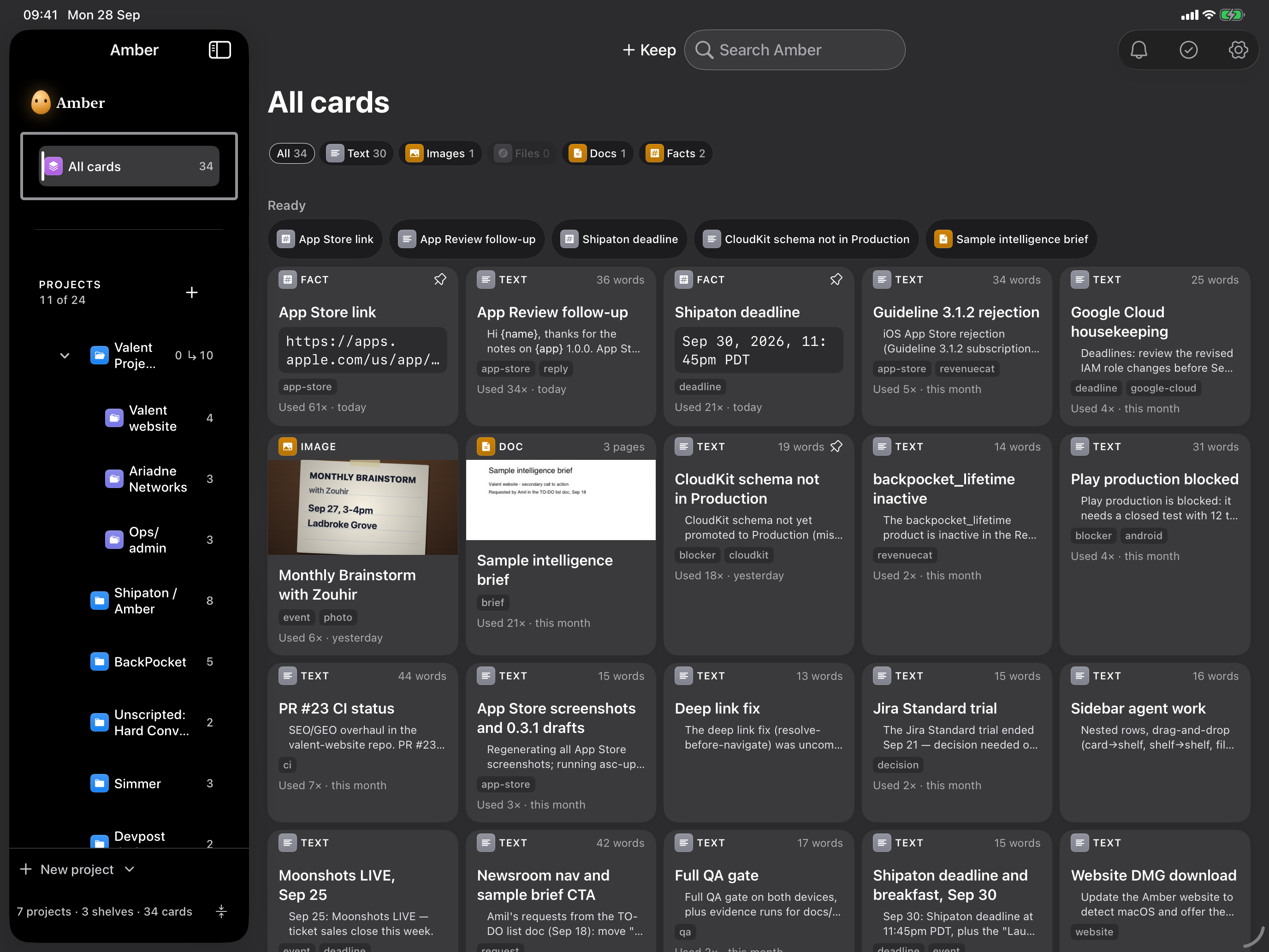
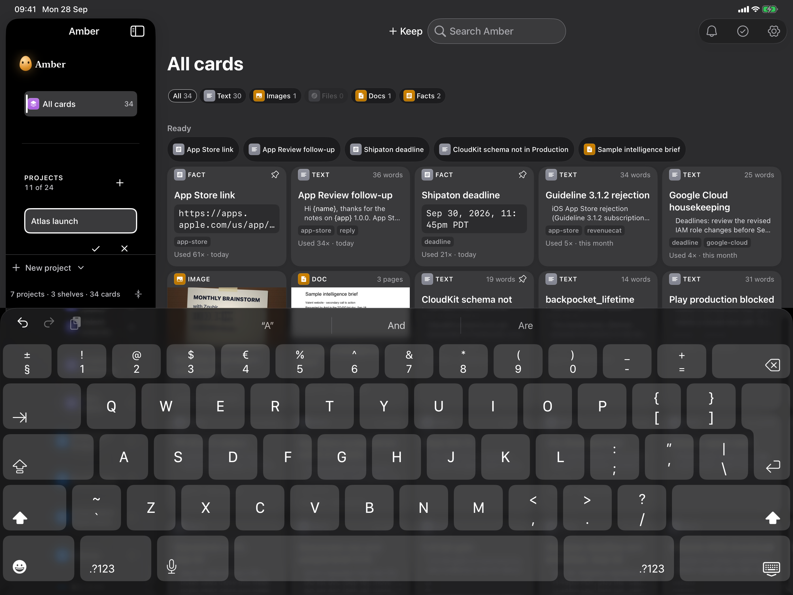
- 🗂 Projects and smart shelves: file PDFer by client or launch. Smart shelves like"Deadlines" keep themselves up to date.
- ✍️ Templates with blanks:
Hi {name}, your plan renews on {date}asks for the blanks, then hands you the finished text. It refuses to paste a half-filled template into someone's email. - 📋 Fill a form: your details in the order forms ask for them, one tap each.
- 🖥 Show Mode: present a document page by page across the table, then hand over the real file.
- ⏰ Reminders and an Agenda: "refresh this rate card next quarter", lined up overdue first.
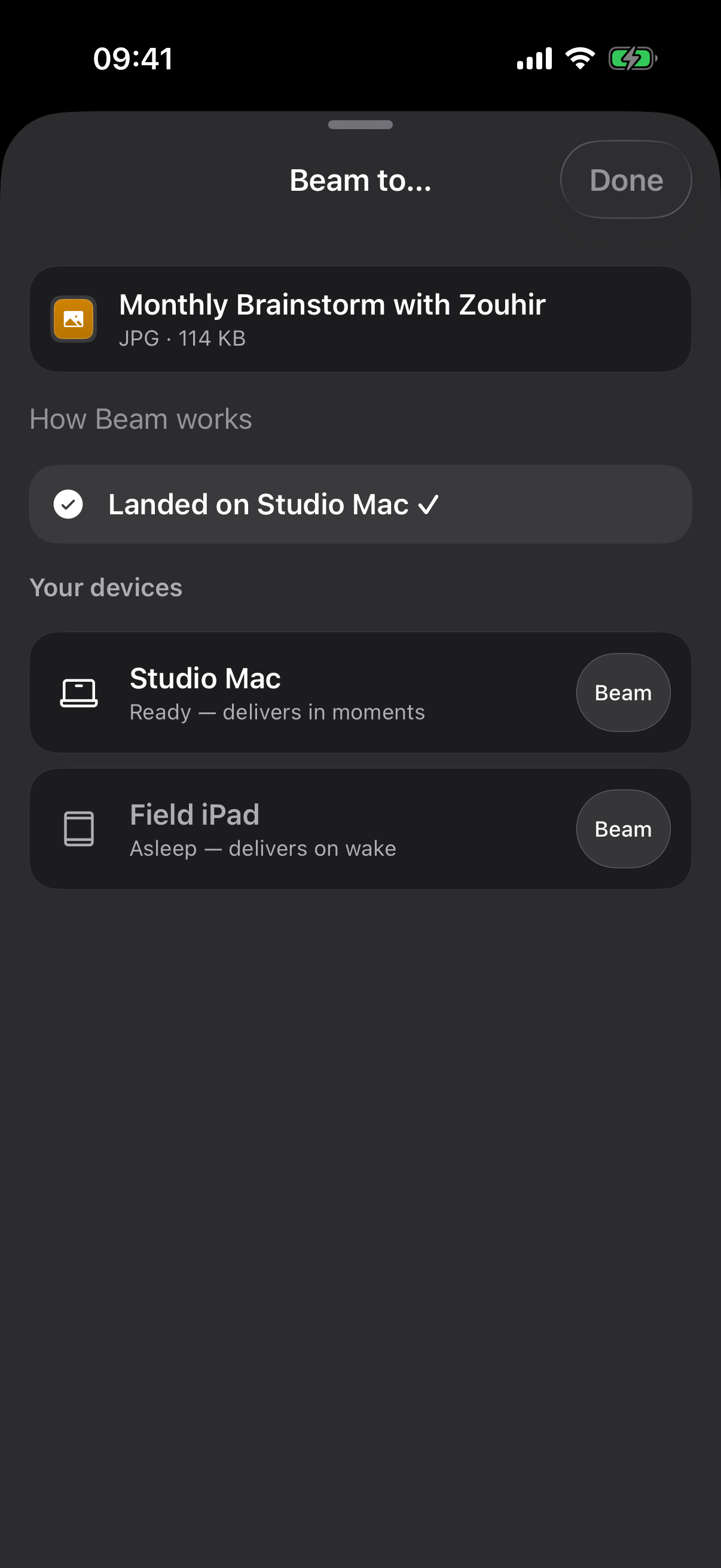
- 📡 Beam: send a card from your iPhone to your own Mac. No pairing, no cable.
- ⌘⇧A on the Mac: summon Amber from any app and paste without leaving what you're doing.
- 🥚 Embry, a little amber mascot who reag, because useful should also feel warm.
Everything stays yours: *no account, no serv Your cards live on your device and sync through your own iCloud. Search, text recognis all run on-device.
Amber is free to use, and Amber Pro is a one-off purchase through RevenueCat, not a subscription. If Pro ever lapses, your cards stay readable and copyable. Nothing is held hostage.
How I built it
Amber is one SwiftUI codebase with a native shell for each device: a thumb-friendly iPhone app, a sidebar-and-grid iPad app, and a true Mac app with a menu bar icon and a global shortcut.
The best decision I made was putting every rule of the app — search, ranking, templates, projects, reminders — into a small Swift package with no UI at all. That means 1,931 tests run in about 3 seconds, without a simulator, so I ran them after every change instead of once a week.
The Ready Row at the top guesses what you'll want next. It multiplies a few simple signals together, so one card can't hog the row just because it's old and popular:
$$\text{score} = \text{how often} \times \text{how recently} \times \text{where you are}$$
Recency fades with a one-week half-life, so the reply you used this morning beats the one you used a lot last month.
- Stack: SwiftUI · Swift 6 · Core Data + CloudKit · RevenueCat + StoreKit 2 · on-device Vision, Natural Language and Foundation Models
- Languages: English, French and German
- Proof: every feature ships with its own screenshots, videos and a written QA report — 77 of them — covering dark mode, the largest text size, reduced motion and iPad.
Challenges I ran into
A paywall that looked perfect and could not sell a thing. For weeks the purchase screen rendered beautifully and every test passed — yet no one could have bought Pro. Five small bugs were stacked on top of each other, including an API key Xcode silently dropped and Terms links pointing at a domain that deliberately never resolves. My new rule: test that a price appears, not that a screen appears.
Sync that worked on my desk and nowhere else. In development, cards synced. In TestFlight, nothing — and no error anywhere. Distributed builds talk to a different iCloud environment that never learns your data's shape on its own. I rebuilt the storage layer on Core Data mid-project so I could define that shape up front, and added a check that proves it's there.
Search that was 34× too slow. My first search took 3.4 seconds on a big library, against a goal of a tenth of a second. The fix was simple once I found it, and the speed limit is now a test that fails if it ever regresses.
A Mac I wasn't allowed to automate. Apple's UI-testing tool is blocked on my Mac, so rather than ship it untested I built my own test driver — it clicks, types and drags on the real Mac app like a person would, and photographs the result.
A colour palette that claimed to be accessible and wasn't. I measured every colour. Several failed WCAG AA contrast, so I fixed them without losing the brand gold, and now a test checks contrast on every theme.
What I learned
- A green test suite is not proof. My worst bugs hid under passing tests because the tests checked the wrong thing.
- The quietest failures cost the most. A dropped setting, an ignored config, an empty cloud database, & none of them showed an error. Each one is now written down so it can only surprise me once.
- Saying no is a feature. I kept a list of ideas I didn't build and why. It protected the app's focus more than any roadmap did.
- Shipping teaches faster than planning. Amber went from first commit to the App Store in about five weeks, and real reviews taught me more than any spec.
What's next
Grow Amber's users on the Apple App Store, turn Amber Pro into steady revenue, and add more languages so Apple power users all around the world can keep once and reuse everywhere.


Log in or sign up for Devpost to join the conversation.