-
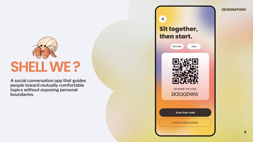
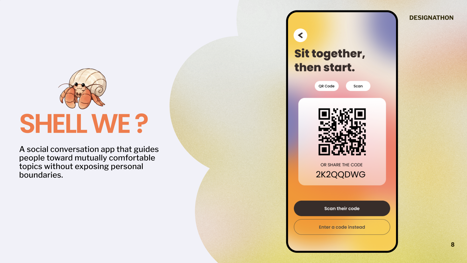
QR Screen
-

Mascot
-

Mascot-2
-
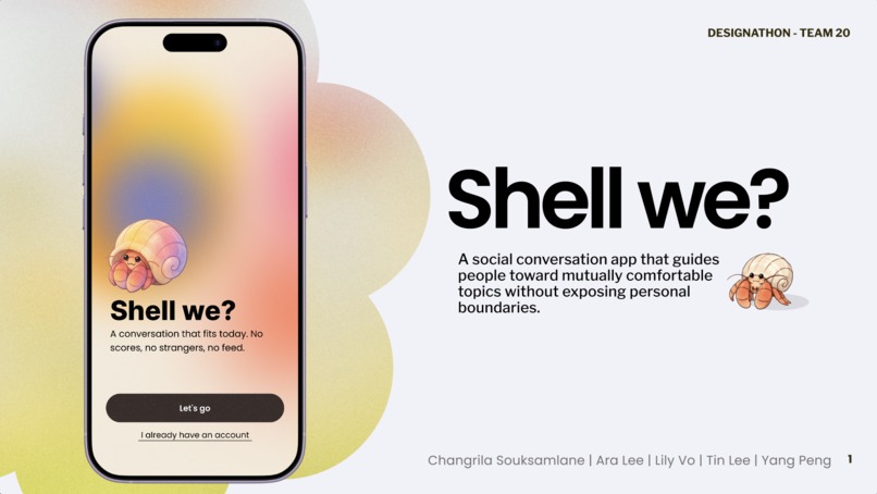
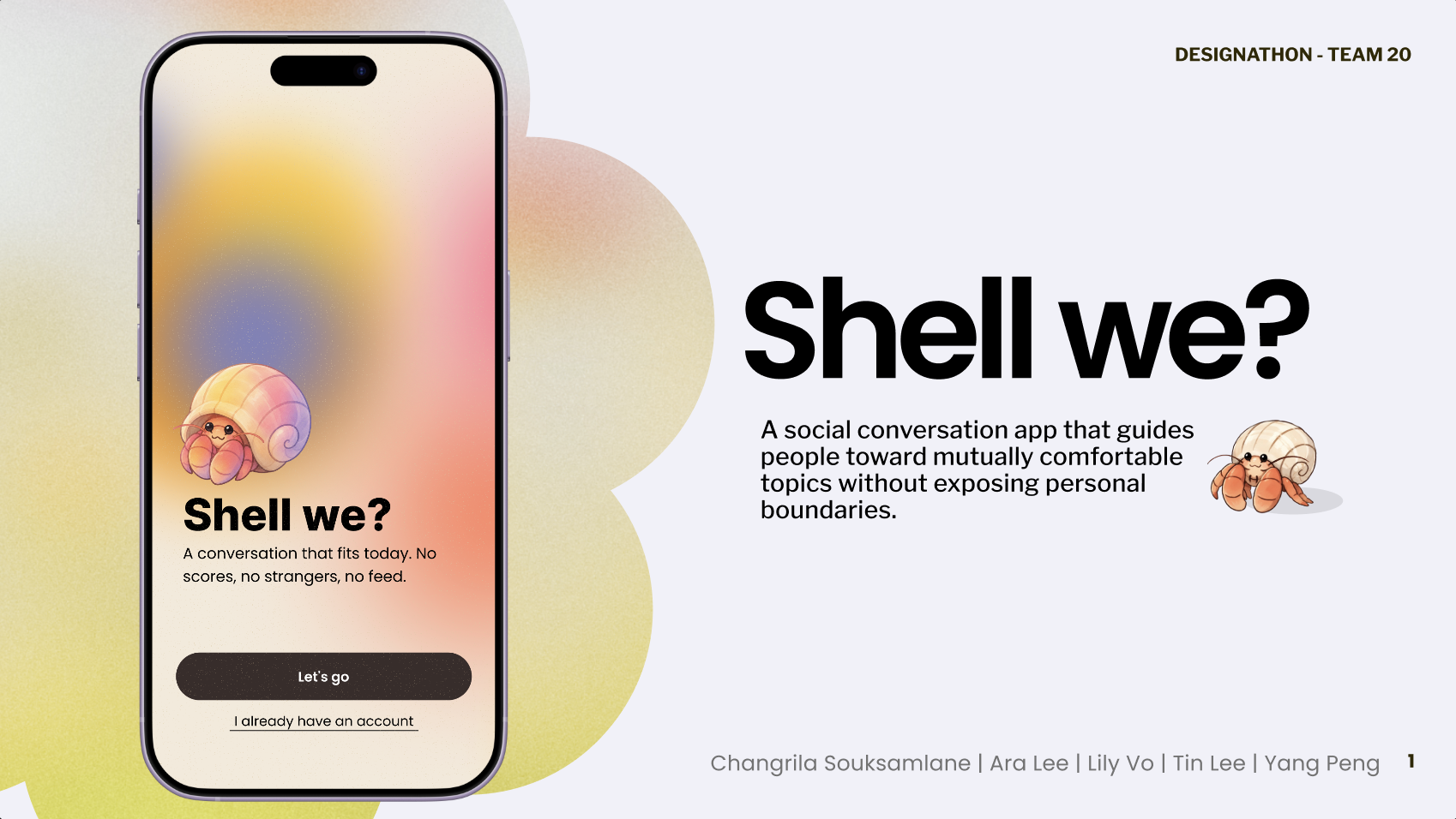
Shell We? Presentation


Inspiration
Someone asks about family, or money, or how you're really doing. It lands wrong. And the other person just takes it: laughs, changes the subject, and quietly stops replying to the group chat.
We surveyed 30 students. 64% had sat through a conversation that got too personal. 88% had held something back because they couldn't guess how it would land.
What struck us is that nobody in these stories is doing anything wrong. The person asking had no way of knowing. Because comfort isn't a fixed setting: it shifts with who you're with, where you are, and what kind of day you've had. There's just no way to check.
Our persona is Mia, a first-year international student in Sydney. She wants real friendships. However, when talking with people from different cultural backgrounds, personalities and conversation styles, she is often unsure which questions will feel natural and which might feel too personal.
What it does
Shell We helps two people find the conversation they're both actually up for, in person.
Meet. Two students meet in real life. One opens Shell We, and they show and scan each other's QR code. This is the only way to start a session. Otherwise it can't happen unless you're actually sitting together.
Match. The system compares both check-ins, finds their mutual topic overlap, and lists out the ones that are comfortable for both of them.
Create. From that shared ground, Shell We generates 2–5 prompts and questions at one of three levels: surface, personal, or deeper.
Chat. The app guides the conversation, but the two people are still talking to each other, not to the app. It hands over the questions and gets out of the way.
Link. When the conversation ends, the shared colour and pattern their two check-ins created together is saved into the user's Today collection — so what's left afterwards is a keepsake, not a transcript.
Two rules make it work:
- The lower ceiling always wins. If one person said Not today, the topic is off for both. No majority, no percentages, no compatibility score.
- Nothing is ever attributed. You see that a topic is closed. You never find out whose it was.
How we built it
Ideation. We started with a long list and argued it down to one. This idea kept coming back because every single one of us had a story that fit it.
Interviews. We talked to students to find out how often this actually happens, not just whether it sounded relatable. We were after two things: how common is it to sit through a conversation that's gone too personal, and which topics do people find easiest and hardest to talk about.
That second question gave us our most useful artefact. We mapped 30+ conversation topics on two axes: how often they come up, and how personal they feel. Music, food and hobbies clustered in one corner. Income, mental health and past trauma sat in the opposite one. Politics, family and living situation landed in the messy middle. That map ended up being the app's data model, not just a slide.
Research. Alongside the interviews we read into the psychology of self-disclosure, which is where we found the idea that reframed the whole project: people open up in response to being opened up to, and it has to escalate gradually. That's why Shell We has three depth levels instead of one on/off switch.
Style and components. We wanted it colourful and playful rather than clinical — this sits next to wellbeing without being a wellbeing app, and it needed to look like it. We landed on a warm cream base, a terracotta accent pulled straight from the mascot, and pastel yellows, mints and periwinkles for the topic states. Then we built the pieces before the pages: buttons, survey cards, the crab slider, topic chips, the depth selector — each a Figma component with variants, so every screen after that was assembly instead of drawing.
The hermit crab earns its place here. Its pose is the state: fully out of the shell means "into it", halfway out means "okay", tucked in means "not today". People read their own boundaries before they read a single word.
- Prototype. We wired it together in Figma into a clickable prototype covering the full loop — check-in, connect, conversation, and the saved Connection Shell.
Challenges we ran into
Our research contradicted our own product. The same survey that said people hate boundary-crossing also said personal conversations are what actually build connection. If we only ever routed people to safe topics, we'd have built something that traps everyone in small talk forever.
We sat with that for a while, and the answer turned out to be a reframing: the category is scarier than the question. "Mental health" sounds like being asked for a diagnosis. "What helps you reset after a rough week?" is something people answer at a bus stop. Users weren't refusing the conversation — they were refusing the unknown.
So we let people preview the real questions behind any topic they closed, privately, with the setting unchanged unless they choose otherwise.
Then we had to make sure that wasn't manipulative. A screen that shows you what you're missing is one design decision away from a persuasion funnel. Our guardrails: the app never prompts you to reconsider, the other person is never told you looked, and "Keep it closed" is the primary button while "Open this topic" is the quiet secondary one. Making the less open outcome the default action was the hardest call we made, and we think it's the right one.
Naming took three attempts. Room Read → Shellter → Shell We.
Our first design wasn't a system, it was 14 screens. An audit turned up 27 different text styles across the app, 14 font sizes, and left margins ranging from 20px to 72px. We rebuilt on shared variables before adding anything new.
Accomplishments that we're proud of
-The mascot helps conveys our idea well. The crab's 2 poses signify when opening up and setting their boundary. -Designing an app that works both way Not only preventing boundaries being crossed, our app also has tips on how to open up the right way. -Aiding people to navigate one of the most ambiguous unspoken rule There is no universal rule on which topic is too personal to bring up or not, so having a third-party entity to bring out that "rule" for each personalised connection helps.
What we learned
- People want to get closer, but they often have to guess how personal a conversation can become. Our opportunity is to reduce that guesswork, so people can avoid uncomfortable moments while still feeling confident enough to have more meaningful conversations. -8 of 11 participants strongly recognised that the unwritten rule exists, while 5 of 11 strongly agreed that the rule is necessary. -If someone crosses a privacy boundary, boundary-turbulence research links privacy violations with hurt, anger, fear, withdrawal/distancing and relational damage. But avoiding disclosure altogether is not an ideal solution either, because self-disclosure helps relationships develop. The practical problem is finding an acceptable level of depth without knowing the other person’s boundary.
What's next for Shell We
-Improvement for Learning section More resource gathering and AI training for practice behavioural multiple choice questions
- Refine insights for growth Add dashboards to show growth in comfort level with certain topics time to time -User testing & Feedback gathering Testing on at least 20 people within our target audience to gather further user insight for app practicality
Acknowledge of AI:
- Claude for ideation, writing, design inspiration
- ChatGPT for modifying pictures/images of our drawing
Built With
- chatgpt
- claude
- figma


Log in or sign up for Devpost to join the conversation.