
Settlr — Find Where You Can Actually Afford to Live
Inspiration
The housing crisis in California isn't just a statistic — it's personal. As students and young professionals looking at San Luis Obispo County, we kept running into the same frustrating loop: browse Zillow, find a place that looks great, then realize it would eat 55% of our income. Repeat. There was no tool that started from our financial reality and worked outward to show what's actually viable.
We were inspired by a simple question:
What if the map showed you where you can live, not just where you want to live?
Most housing platforms are built for landlords listing inventory. Settlr flips the model — it's built for the renter. You tell it your income, how much you're comfortable spending, who you're living with, and where you work. It does the math and lights up the map accordingly. The neighborhoods that fit glow blue. The ones that'll stretch you thin glow red. No guesswork.
We also wanted to go beyond just "can you pay rent." Real affordability means understanding the full picture: utilities, commute costs, walkability, parking, noise, what actual residents say about living there. That holistic view is what drove the feature set.
What It Does
Settlr is an interactive housing affordability explorer for SLO County. Here's the core flow:
Onboarding form — Enter your income, choose a rent-to-income percentage, specify your living situation (solo, partner, roommates, family), set your work location, and pick your commute tolerance.
Affordability heatmap — The Mapbox 3D satellite globe lights up with color-coded neighborhood overlays. The color mapping follows a standard rent burden model:
$$ \text{Rent Burden} = \frac{\text{Monthly Rent}}{\text{Monthly Gross Income}} \times 100 $$
< 28% → Comfortable (deep blue) 28%–35% → Manageable (violet) 35%–45% → Tight (amber) 45% → Out of range (crimson)
Neighborhood deep-dive — Click any neighborhood to open a dock bar with six panels:
- Listings — Real rental listings with satellite aerial imagery, filtering, sorting, shortlisting, and one-click tour request emails
- Costs — Full move-in cost breakdown (first month, deposit, utilities, supplies) with a savings impact bar
- Walk Score — Walkability, transit, and bike scores
- Insights — Noise levels, parking difficulty, local tips, recent news, and live Reddit community discussions
- Room Layout — SVG room planner that auto-arranges furniture based on dimensions
- Checklist — AI-generated personalized move-in checklist
AI Verdict — An LLM-powered financial health assessment that scores your situation $1$–$10$ and generates a monthly budget breakdown:
$$ \text{Max Rent} = \left\lfloor \frac{\text{Combined Annual Income} \times p}{12} \right\rfloor $$
where p is the user's chosen housing percentage (default 30%).
Directions — Multi-mode routing (driving, walking, transit) from any listing to local amenities (grocery, hospital, gym, beach, trails, downtown, Cal Poly, airport) with animated route drawing and turn-by-turn steps.
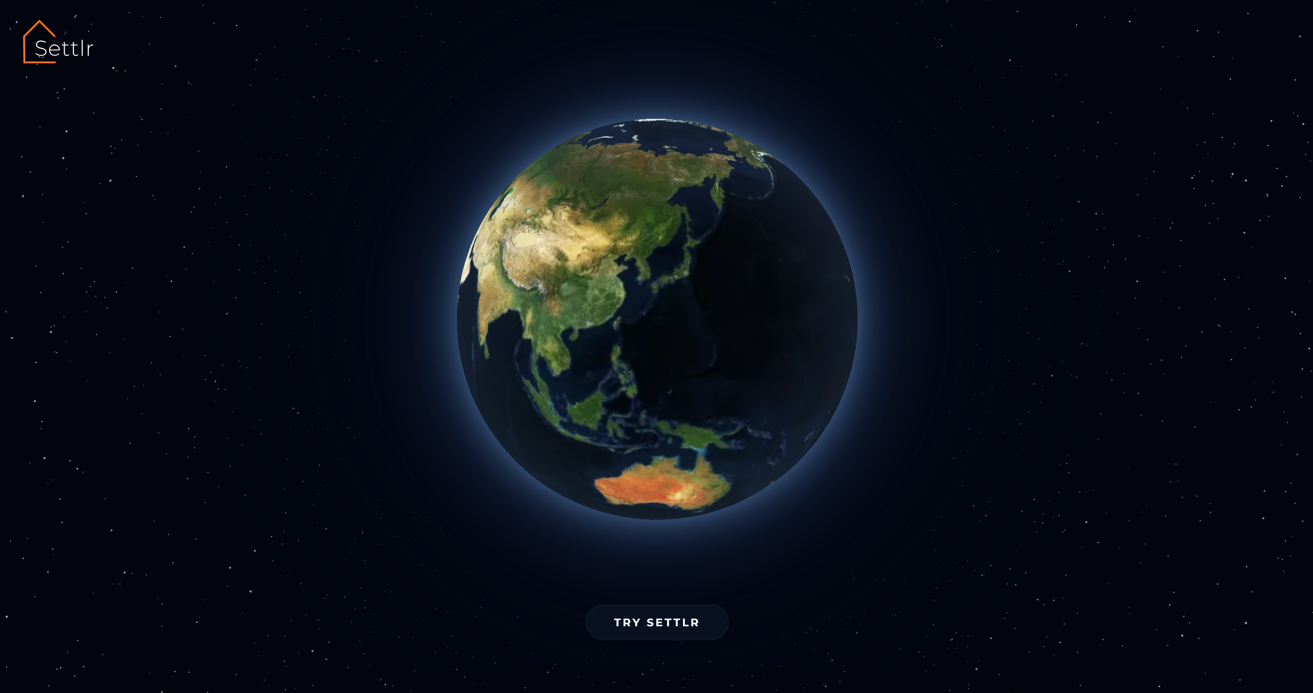
Cinematic landing — A Three.js starfield with shooting stars, a "Welcome to Settlr" text reveal, and a Mapbox globe that sweeps from Indonesia to the US before landing on the dashboard.
How We Built It
Stack
| Layer | Technology |
|---|---|
| Frontend | React 19, Vite 8, Mapbox GL JS, Three.js / React Three Fiber, Framer Motion, Recharts |
| Backend | Vercel Serverless Functions (Node.js) |
| AI | OpenAI GPT-4o-mini (verdict, checklist, furniture list) |
| Data | RentCast API (listings), WalkScore API, Teleport API (city comparison), Reddit Search API (community reviews) |
| Deploy | Vercel (auto-deploy from GitHub) |
Development with Kiro
The entire project was built using Kiro as the primary development environment. We used several Kiro features:
Vibe coding — Most features were built through iterative conversation. We'd describe a feature ("add a heatmap glow overlay to each neighborhood polygon that fades on zoom-in"), Kiro would generate the full implementation across frontend and API layers, and we'd refine through follow-up prompts. The most complex single-session generations were:
- The
MapViewcomponent (~550 lines): neighborhood overlays, heatmap glow circles, listing pins with zoom gating, multi-mode routing with animated polyline drawing - The
LandingPagewith its phased animation pipeline: Three.js starfield → canvas shooting stars with evenodd clip paths → timed text fade → Mapbox globe sweep → nav reveal - The full serverless API layer (7 endpoints) including Reddit scraping with in-memory caching
Agent hooks — We set up an auto-commit-and-push hook that triggers on every file save (.js, .jsx, .css, .html, .json, .svg, .md). Combined with Vercel's auto-deploy, this created a zero-friction save → commit → push → deploy pipeline. Every change was live within seconds.
Architecture Decisions
- Serverless API routes instead of a persistent Express server — each endpoint (
/api/claude/verdict,/api/rentcast/listings, etc.) is a standalone Vercel function. This simplified deployment and eliminated CORS/proxy complexity. - Fallback data everywhere — Every API call has hardcoded fallback data so the app works even without API keys. The RentCast listings endpoint has realistic SLO rental data for 8 zip codes. WalkScore falls back to curated per-neighborhood scores. This made development and demo-ing reliable.
- Mapbox Static Images as listing photos — Instead of relying solely on RentCast photos (which are often missing), we generate real satellite aerial imagery of each listing's exact coordinates from 4 angles using the Mapbox Static Images API. Every listing card shows its actual location.
What We Learned
Mapbox GL JS at the edge cases is tricky. HTML markers on a globe projection misproject at low zoom—pins that should be in SLO scatter across the planet. We learned to gate pin visibility to a specific zoom band (11.5–18) and lock minZoom to 8 after the initial globe animation to prevent users from zooming back into the danger zone.
Canvas animation and WebGL don't automatically play nice. The landing page layers a Three.js WebGL canvas (starfield), a Mapbox GL canvas (globe), and a 2D canvas (shooting stars) on top of each other. Getting the shooting stars to clip around both the globe disc and the animated text required an evenodd clip path that updates every frame — a technique we hadn't used before.
Reddit's public API is fragile. The search.json endpoint rate-limits aggressively per IP, returns inconsistent results, and blocks default user agents. We learned to use a descriptive UA string, cache responses for 1 hour, search targeted subreddits (r/SanLuisObispo, r/CalPoly) before falling back to site-wide search, and gracefully degrade to "no discussions found" instead of error states.
AI-generated JSON needs guardrails. GPT-4o-mini occasionally returns malformed JSON or drifts from the requested schema. Using response_format: { type: 'json_object' } and very explicit schema instructions in the system prompt reduced failures dramatically, but we still needed try/catch with hardcoded fallback responses for every AI endpoint.
The 30% rule is a starting point, not a rule. Through building the rent allocation slider, we learned that housing affordability is deeply personal. Some users are comfortable at 40% if they don't own a car. Others prefer to stay under 25% to maximize savings. Making the percentage user-configurable (with clear warnings above 40%) is more honest than enforcing a single threshold.
Challenges We Faced
1. Globe-to-map transition
The app starts as a cinematic globe and needs to smoothly transition into a functional map. Mapbox's globe projection looks stunning but breaks HTML marker positioning. We had to carefully orchestrate the flyTo animation, then lock the projection to a flat map at the right moment, and set zoom floors to prevent users from accidentally returning to globe mode.
2. Listing pin drift With Mapbox terrain DEM enabled, listing pins would visibly drift away from their true positions on zoom-out because DEM tile resolution changes with zoom level. We had to disable terrain entirely and rely on sky + fog + pitch for the 3D feel instead.
3. Keeping the UI responsive with heavy map interactions
The MapView component manages neighborhood overlays, listing markers, route layers, and satellite previews simultaneously. Each re-render could trigger dozens of Mapbox setPaintProperty and setLayoutProperty calls. We used useCallback extensively and checked for existing layers before adding new ones to avoid the "layer already exists" error that crashes the map.
4. API key management across environments
Five different APIs, each with different key formats, rate limits, and failure modes. The Vercel serverless functions read from process.env, the client reads from import.meta.env (Vite's convention), and local development uses .env files at different directory levels. Keeping this organized without accidentally exposing keys required discipline — and the Kiro steering rule that blocked all key modifications.
5. Reddit scraping reliability Reddit blocks requests without a proper User-Agent, rate-limits at unpredictable intervals, and sometimes returns empty results for queries that work fine in a browser. We built a multi-layer fallback: try targeted subreddits first, broaden to site-wide search if results are thin, cache everything for an hour, and return a clean empty state instead of errors. The UI shows "no discussions found" rather than a broken panel.
6. Shooting star canvas clipping The landing page shooting stars needed to appear behind both the globe and the text, but all three are separate DOM layers. We solved this with a 2D canvas overlay that uses an evenodd clip path — the outer rectangle includes everything, and inner sub-paths (a circle for the globe, a padded rect for the text) create holes. Both hole positions update every frame as the text scales and the globe fades in.
What's Next
- Expand beyond SLO County — The architecture is location-agnostic. Adding a new city means adding neighborhood data and adjusting the map center.
- Saved searches and alerts — Let users save their criteria and get notified when new listings match.
- Commute time heatmap — Color neighborhoods by actual drive/transit time to the user's workplace, not just distance.
- Roommate matching — Connect users who are looking in the same neighborhoods with compatible budgets.
- Mobile-first redesign — The current UI is optimized for desktop. A responsive layout with swipe gestures for the dock bar would make it usable on phones.
Built With
react · vite · mapbox-gl · three.js · react-three-fiber · framer-motion · recharts · openai · vercel · node.js · rentcast-api · walkscore-api · reddit-api · kiro
 Liang")
Log in or sign up for Devpost to join the conversation.