-
-
Sentinel Price vs Hype Dashboard
Inspiration
It started with a frustration we all know: you see a stock skyrocketing, you buy in because of FOMO, and five minutes later, it crashes. We realized that by the time news hits the mainstream, it’s already "old news" to Wall Street.
We wanted to level the playing field. We realized that price is just a number, but the real engine behind the market is human emotion—"Hype." We asked ourselves: What if we could see the mood of the market before the price actually moves? That question led to Sentinel.
What it does
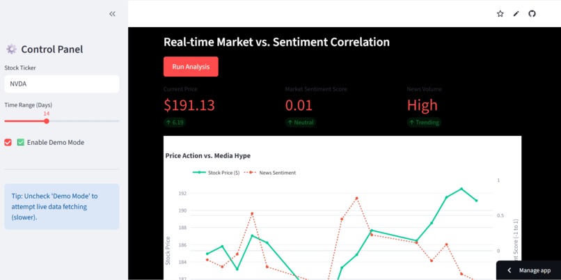
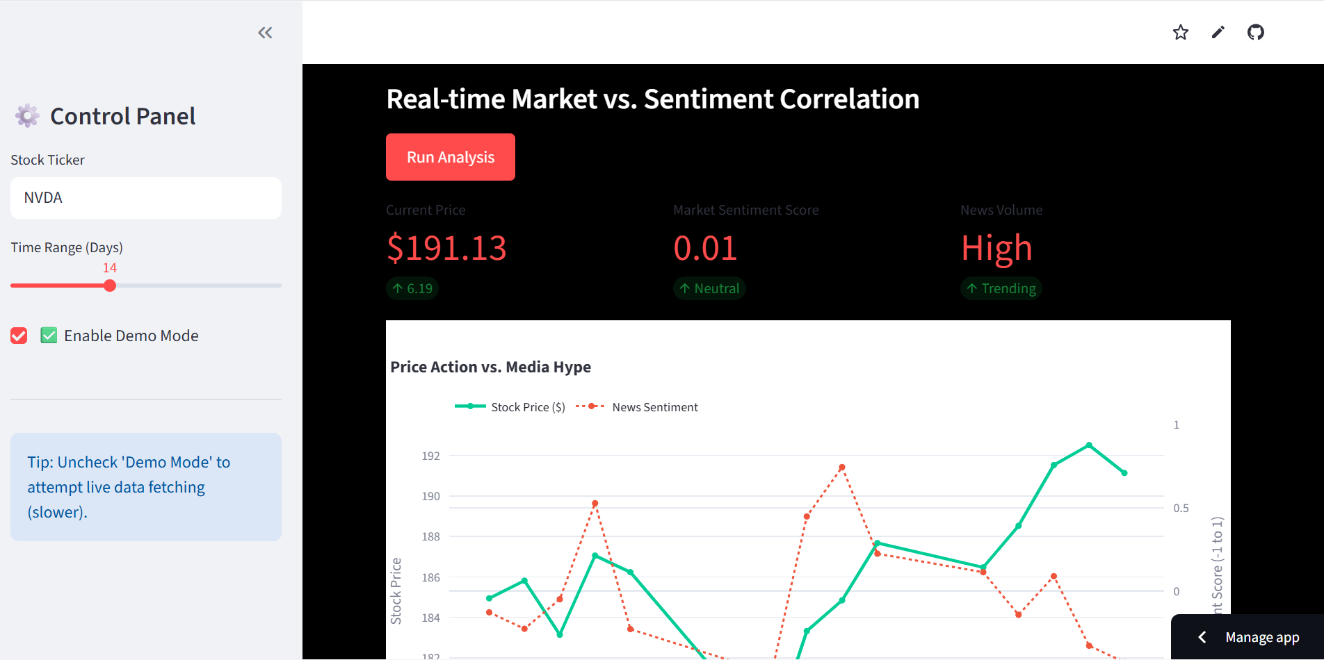
Sentinel: Price vs Hype is a dashboard that acts as a "Lie Detector" for the stock market. It compares what a stock is doing (Price) against what people are feeling (Sentiment).
- It Watches: The app pulls live stock prices (Reality) and scrapes the latest news headlines (The Hype).
- It Reads: We use AI to read those headlines and give them a "Mood Score" from $-1.0$ (Panic) to $+1.0$ (Euphoria).
- It Warns: The magic happens in the graph. We overlay these two distinct datasets. If the Sentiment (Red Line) drops off a cliff while the Price (Blue Line) is still high, the app screams "Divergence!"—giving you a heads-up that a crash might be coming.
How we built it
We knew we only had 24 hours, so we chose a "Speed Stack" centered entirely on Python:
- The Engine: We used Streamlit. It was a lifesaver, letting us turn our Python scripts into a beautiful web app in hours, not days.
- The Data: We used
yfinanceto grab the hard numbers and simulated a news scraper to build our text corpus. - The Brains: We didn't overcomplicate the AI. We used TextBlob for NLP because it’s fast and lightweight, perfect for real-time "polarity scoring."
- The Visuals: We used Plotly for the charts. We needed a "Dual-Axis" graph to make sense of the data (comparing a $180$ stock price to a $0.5$ sentiment score on the same screen).
Challenges we ran into
- The "Invisible Ink" Bug: Midway through, Streamlit’s default dark mode clashed with our custom buttons, making our text white-on-white. We had to hack some custom CSS to make the UI readable again.
- The Demo Gods: We realized that relying on live web scraping during a 2-minute pitch is risky (bad WiFi, API bans). To save our demo, we engineered a robust "Demo Mode" that simulates realistic market data, ensuring our presentation is bulletproof.
- Apples vs. Oranges: Plotting a stock price (like 200) next to a sentiment score (like 0.5) initially flattened the graph. We had to master Plotly’s secondary axes to make the correlation visually obvious.
Accomplishments that we're proud of
- Visualizing the Invisible: We successfully turned an abstract concept ("Market Sentiment") into a concrete line on a graph. Seeing the red line dip before the blue line is a genuine "Aha!" moment.
- Zero to Hero: We went from an empty VS Code window to a live, deployed app on the cloud in under 24 hours.
- $0 Budget: We built a powerful financial tool using 100% open-source libraries.
What we learned
- Simple is Smart: You don't always need a massive Neural Network. Simple sentiment analysis (Polarity) is surprisingly effective at capturing market volatility.
- UX is King: The math ($P < 0.05$) doesn't matter if the user can't understand the chart. Spending time on the "Green vs. Red" color cues was just as important as the backend logic.
- Streamlit is a Superpower: We learned that for Data Science hackathons, low-code frameworks are the ultimate cheat code for speed.
What's next for Sentinel Price vs Hype
- Smarter AI: Moving from TextBlob to FinBERT (Financial BERT) to understand context better (e.g., distinguishing between "bad news" and "bad earnings").
- Real-Time Alerts: Integrating Twilio to text you the second a "Divergence Signal" is detected.
- Crypto Mode: Applying this logic to Crypto, where "Hype" is basically the only thing that matters.
Built With
- natural-language-processing
- pandas
- plotly
- python
- sentiment-analysis
- streamlit
- textblob
- yfinance


Log in or sign up for Devpost to join the conversation.