-
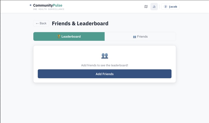
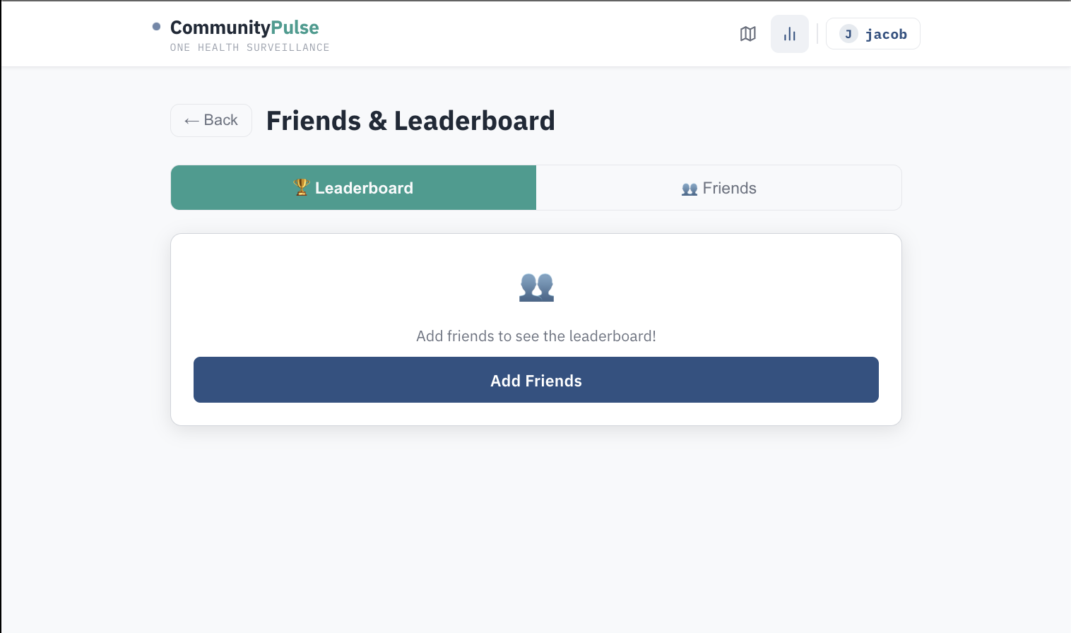
Leader board page in order to compare streak to friends
-
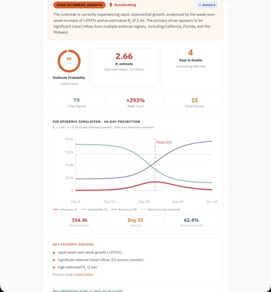
Gemma 4 Ai Prediction with SIR and Re
-

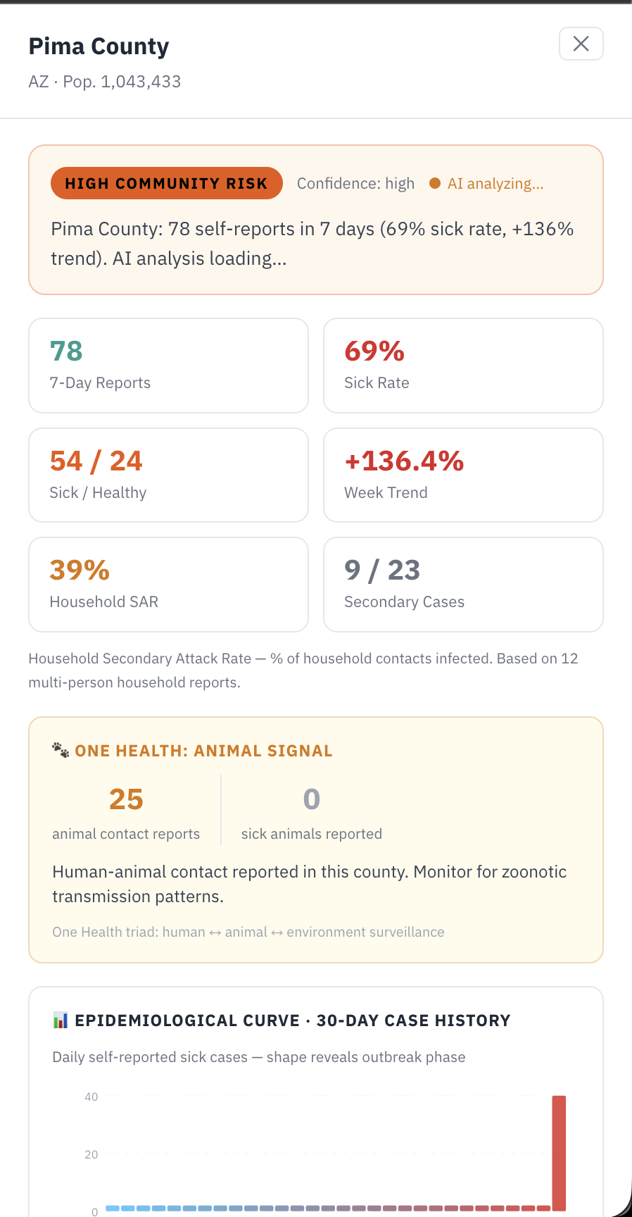
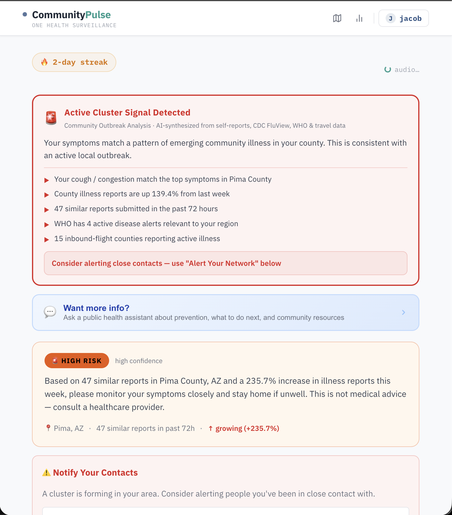
County detail view
-
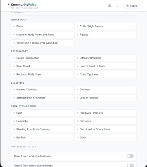
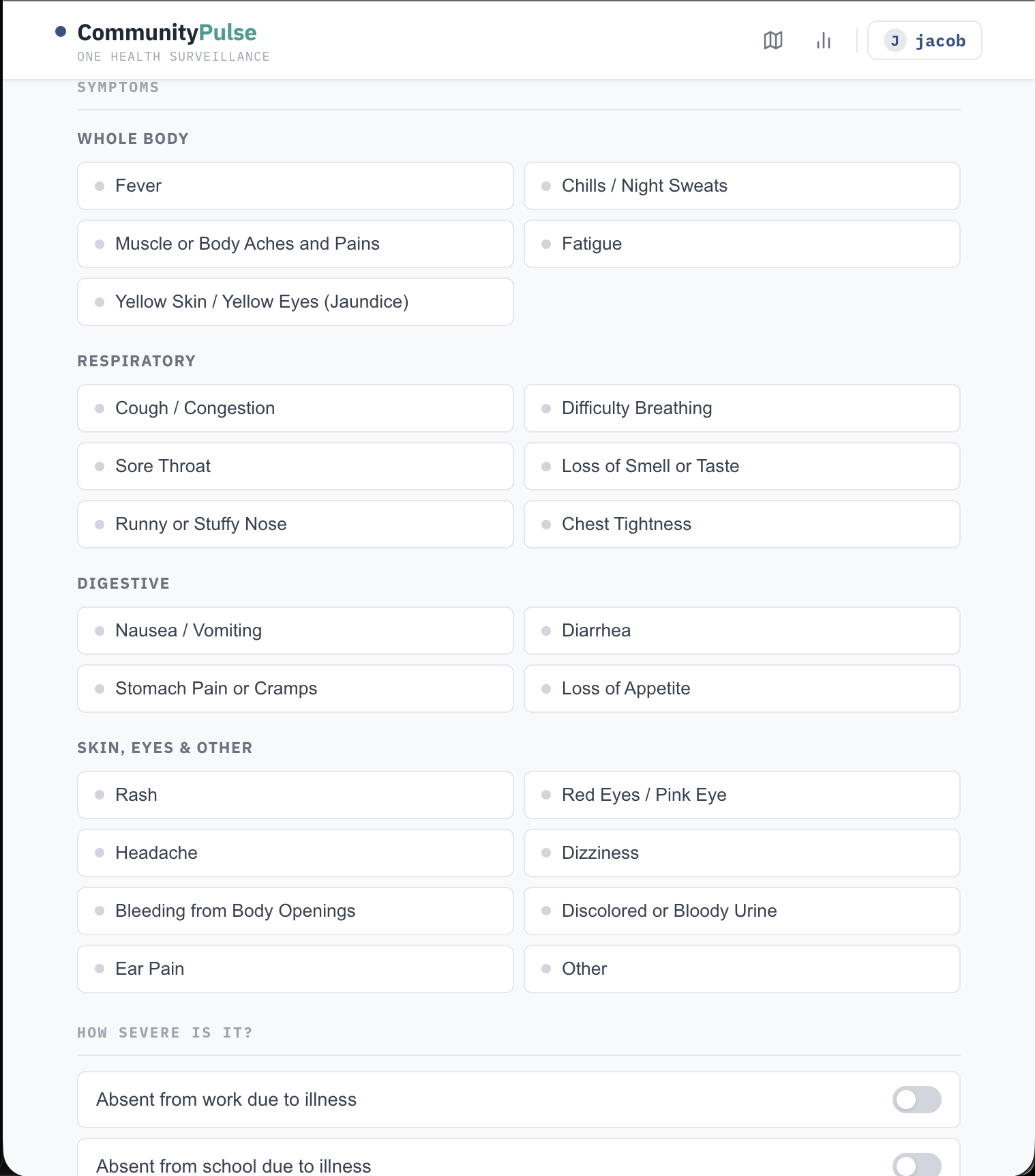
Symptom input page
-
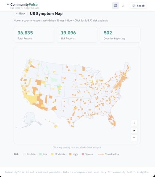
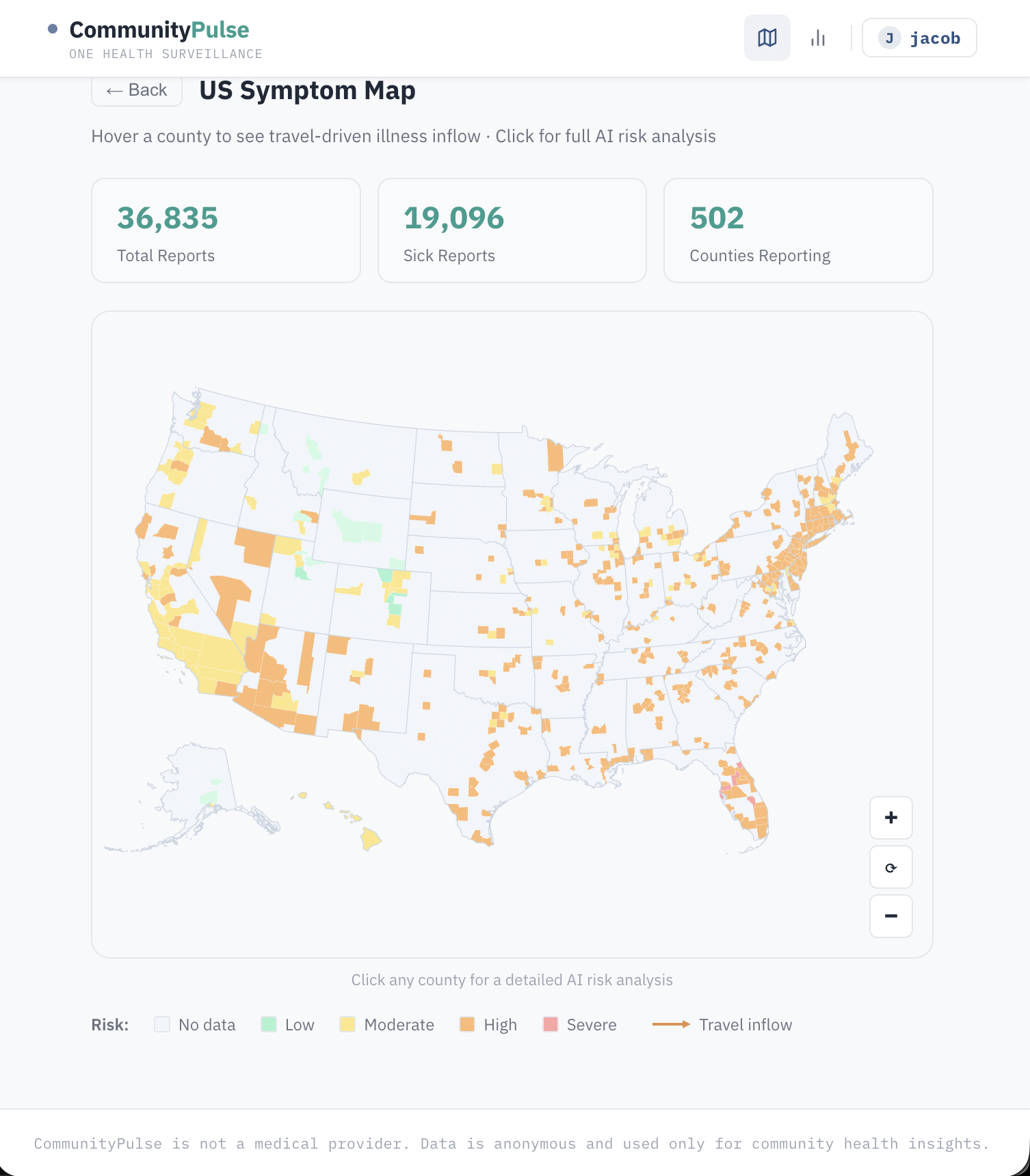
Map showing outbreak threats
-
User symptom OpenAI calculation

CommunityPulse
CommunityPulse is a One Health participatory oversight platform covering all 3,221 U.S. counties. A 60-second check-in captures symptoms, exposures (travel, animal contact, tick bites, event attendance), and household illness, then instantly fuses that report with six live data sources: CDC FluView ILI benchmarks, real-time weather, OpenFlights travel-inflow routes, WHO outbreak alerts, ProMED signals, and animal illness reports for zoonotic risk.
The result is a Cluster Verdict (Active / Emerging / Elevated / Clear), a 30-day epi curve, personalized AI recommendations, and a live SIR epidemic forecast presented in plain English — all returned before the user leaves the page.
Inspiration
Traditional surveillance catches outbreaks after they're already waves. Participatory systems like FluNearYou proved people will report — but they don't fuse self-reports with real-time external signals or deliver AI-synthesized risk back to the contributor. CommunityPulse closes that loop. Arizona made this personal: Valley Fever is endemic and massively underdiagnosed, rural border counties have almost no surveillance infrastructure, and a massive seasonal population creates transmission corridors that hospital-based systems miss entirely.
How we built it
Backend: Python + Flask, SQLite for reports, a background thread pool for async AI jobs. All check-ins return instantly with an ai_job_id; the frontend polls for the enriched result so latency never blocks the UX.
AI layer: GPT-4o synthesizes the cluster verdict and generates personalized recommendations. Gemma 4 (via Ollama, locally hosted) runs the outbreak prediction narrative for the SIR forecast — keeping sensitive health data off third-party servers for that component.
Epidemic modeling: We implement a standard SIR compartmental model:
$$ \frac{dS}{dt} = -\frac{\beta S I}{N}, \quad \frac{dI}{dt} = \frac{\beta S I}{N} - \gamma I, \quad \frac{dR}{dt} = \gamma I $$
where $\beta = R_e \cdot \gamma$ and $\gamma = 1/14$ (14-day infectious period). The forecast runs automatically on check-in and is narrated by Gemma 4 in plain language.
Frontend: React, with a react-simple-maps interactive US county choropleth, travel-flow arc overlays, a searchable county picker across all 3,221 counties, and ElevenLabs TTS reading recommendations aloud.
Data pipeline: CDC FluView HHS region mapping, OpenFlights route graph for travel-inflow risk, WHO RSS parsing, and ProMED feed ingestion all run at check-in time with graceful fallbacks.
Challenges we ran into
- Async AI without blocking UX: GPT-4o and ElevenLabs TTS can take 3–8 seconds. We built an async job pattern where check-ins return immediately and the frontend polls — but wiring the polling, job state, and UI loading states correctly took significant iteration.
- County-level data at scale: Mapping 3,221 counties to the correct CDC FluView HHS region, OpenWeatherMap coordinates, and OpenFlights airport catchment areas required building and validating three separate lookup tables.
- One Health data sparsity: Animal contact and sick animal reports are rare in real-world self-report data. Designing UI that captures this without adding friction — and displaying it meaningfully when present — required multiple rounds of rethinking.
- SIR model calibration: Seeding $I_0$ and $N$ from sparse county report data (not case counts) meant the absolute numbers are illustrative rather than epidemiologically precise. We were careful to label the forecast as a relative signal, not a prediction.
- ElevenLabs integration: The TTS call was silently failing in the background thread due to a missing await pattern. Debugging async failures that don't surface in the UI is harder than it sounds.
Accomplishments that we're proud of
- A fully working One Health check-in form that captures the CDC minimum dataset for participatory surveillance — including zoonotic exposure fields most consumer health apps ignore entirely
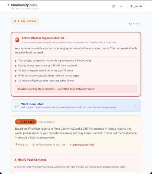
- The ClusterVerdictCard — a single synthesized card that reads your symptoms, your county's trend, WHO alerts, and inbound travel data and produces a plain-English outbreak assessment in real time
- A live SIR epidemic forecast that runs automatically for every county on check-in, narrated in plain English by Gemma 4 — making epidemic modeling accessible without any statistical background required
- Covering all 3,221 U.S. counties with county-level epi curves, travel-inflow risk, neighbor spread, and AI analysis — not just major metros
- Building the full stack — backend, AI pipeline, interactive map, results dashboard — in a single hackathon
What we learned
- Participatory surveillance lives or dies on the feedback loop. If users report symptoms and get nothing meaningful back, they don't return. The entire results dashboard exists to make the contributor feel like their data mattered.
- One Health is undersupported in consumer tools. Capturing animal contact alongside human symptoms is trivially easy to add to a form — but almost no self-report platform does it, despite zoonotic diseases accounting for the majority of emerging infectious disease events.
- Async AI patterns are worth the complexity. Returning results instantly and enriching them in the background is the right UX model for AI-heavy applications where users expect speed.
- Gemma 4 running locally is genuinely capable for structured narrative generation — and keeping the outbreak prediction model local means sensitive health data never leaves the user's county jurisdiction.
What's next for CommunityPulse
ADHS integration for Valley Fever and border-region surveillance, push alerts to alert users when their county crosses an outbreak threshold, wastewater data surveillance, USDA animal disease reports, and state veterinary surveillance feeds to make the zoonotic signal quantitative, and allow school nurses or HR coordinators to aggregate illness trends for their institution without accessing individual records.

Log in or sign up for Devpost to join the conversation.