Inspiration
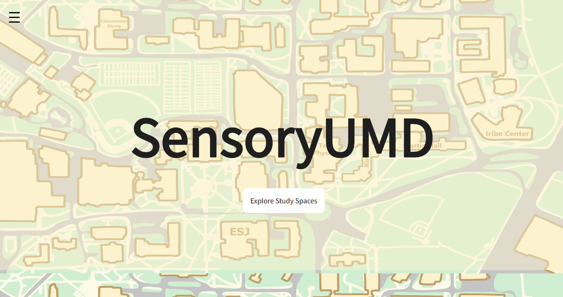
What it does
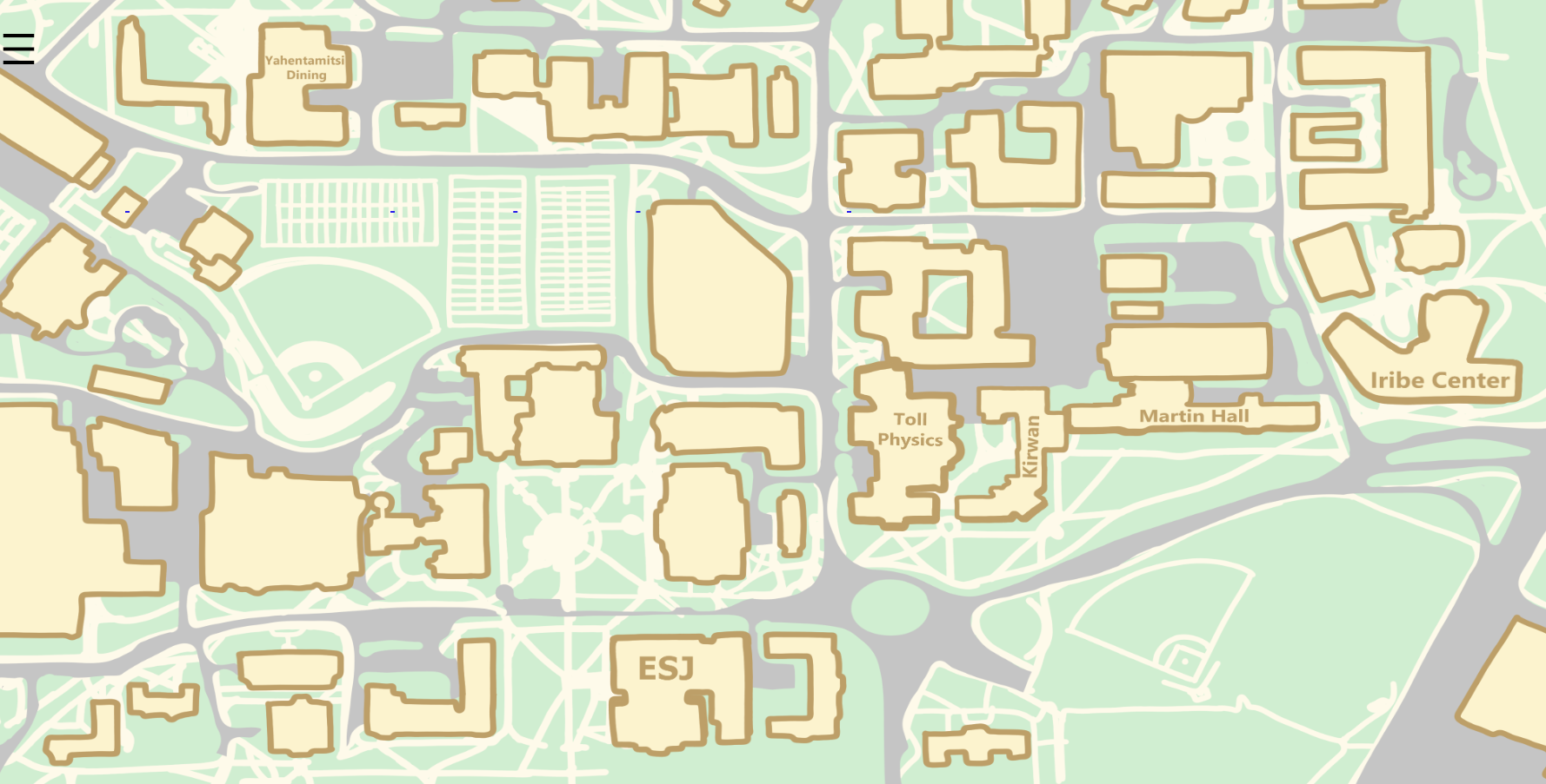
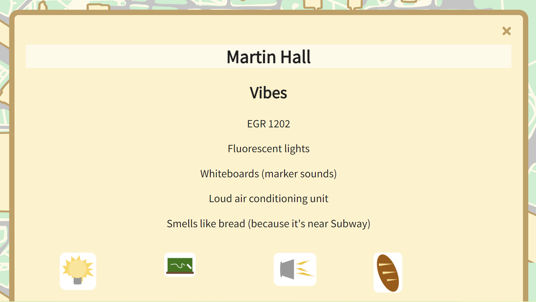
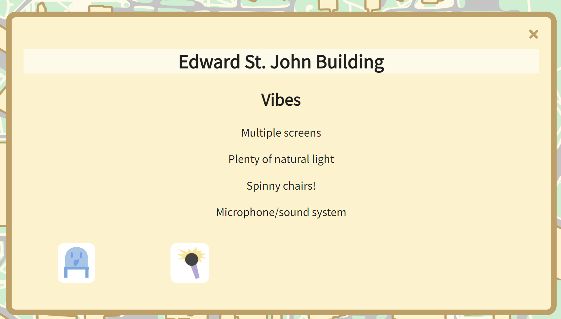
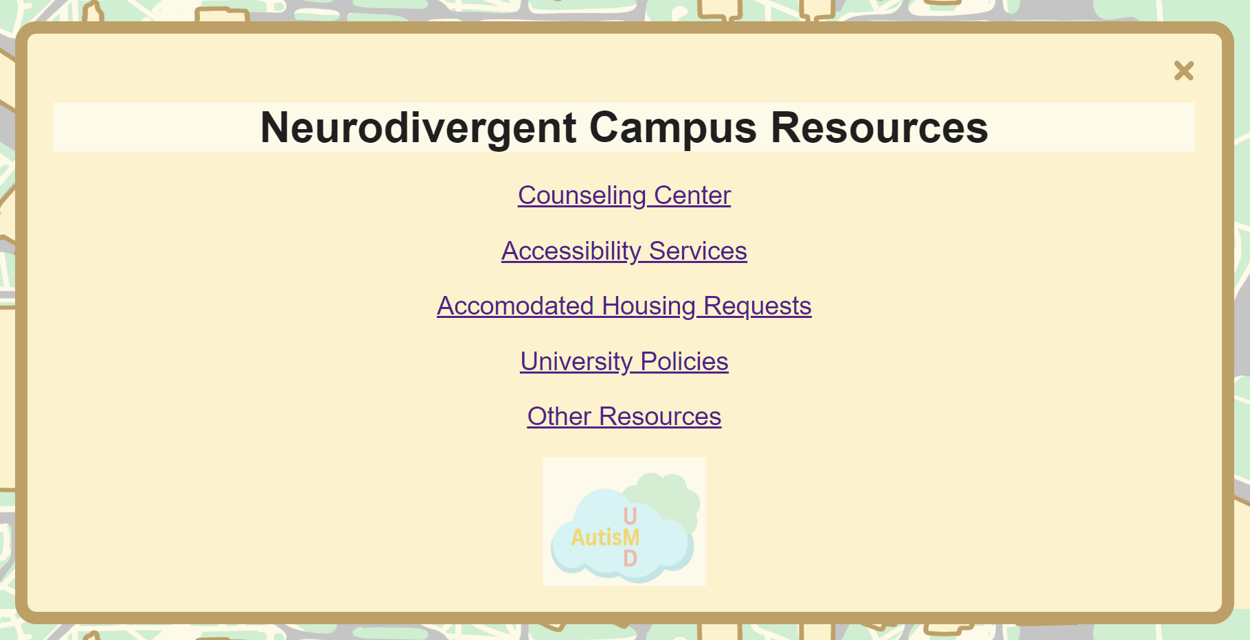
Users can click on the buildings of SensoryUMD's map to learn more about their study environment's pros and cons--from small rooms to the constant smell of fresh-baked bread--and be more informed when picking a space that works best for them.
How we built it
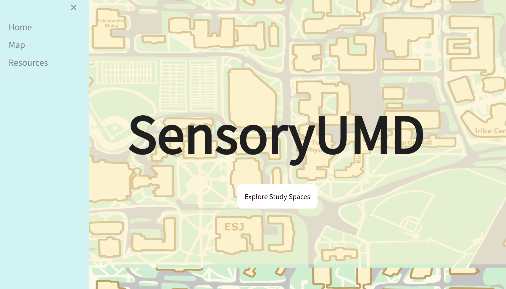
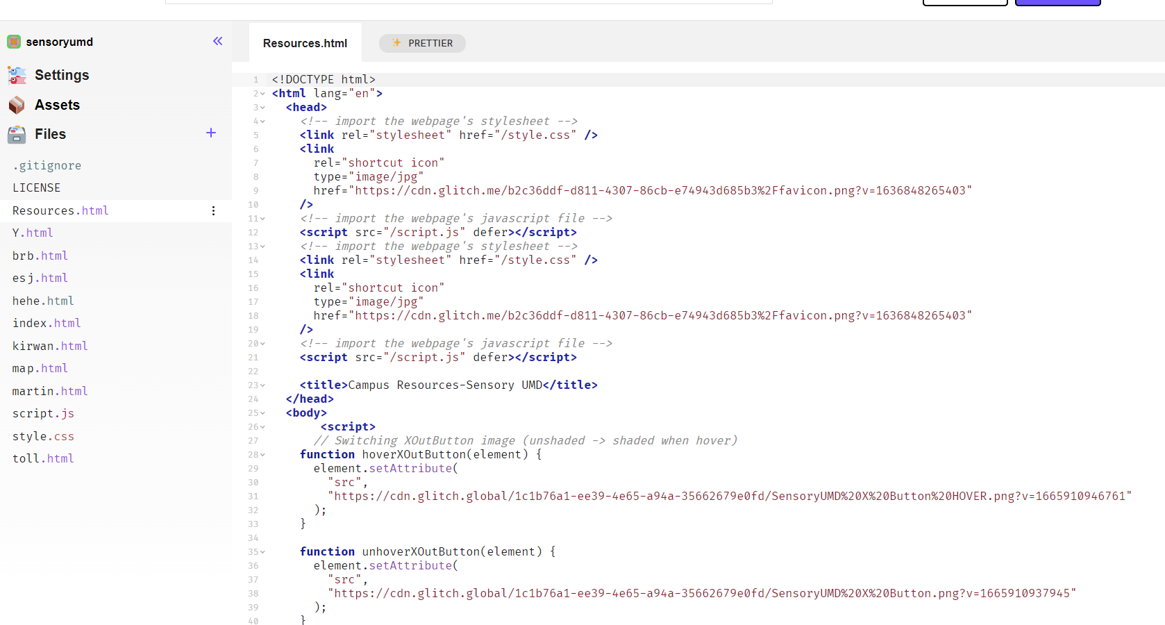
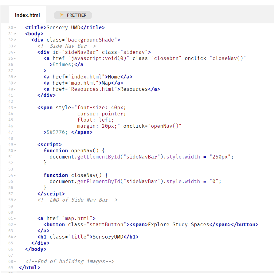
In the online Glitch IDE, we used HTML and CSS for the website structure and JavaScript for minor animations, like the side nav bar and the landing page start button. We also used Clip Studio Paint to draw the map and building buttons, and Canva for the sensory icons.
Challenges we ran into
Drawing the map and building buttons took a lot more time than expected, as well as organizing and presenting all of the information in a clear and digestible way.
Accomplishments that we're proud of
We are proud of creating a minimum viable product (map, clickable buildings, icons in description) that conveys our vision for the project
What we learned
We learned how to intentionally make our designs more accessible, like incorporating icons as visual indicators of each building's study environment pros and cons and adding alt text.
What's next for SensoryUMD
We hope to add a way for UMD students to provide reviews for different buildings, such as giving star ratings in terms of noise, ambience, and more.


Log in or sign up for Devpost to join the conversation.