-

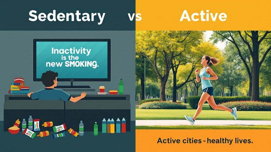
Inactivity is the new smoking <> Active cities = healthy lives
-
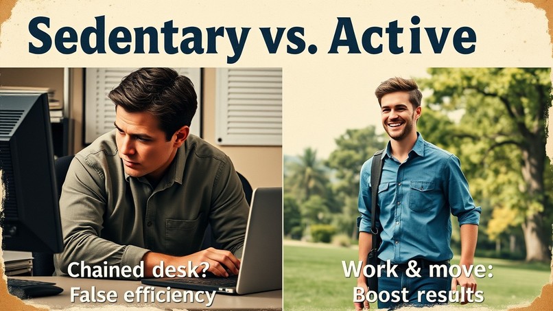
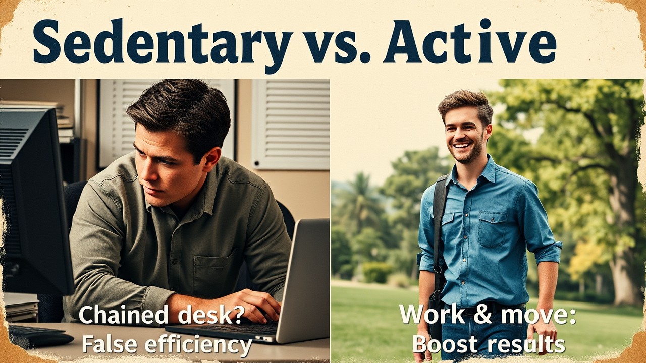
Chained desk: False efficiency? <> Work & move: Boost results
-

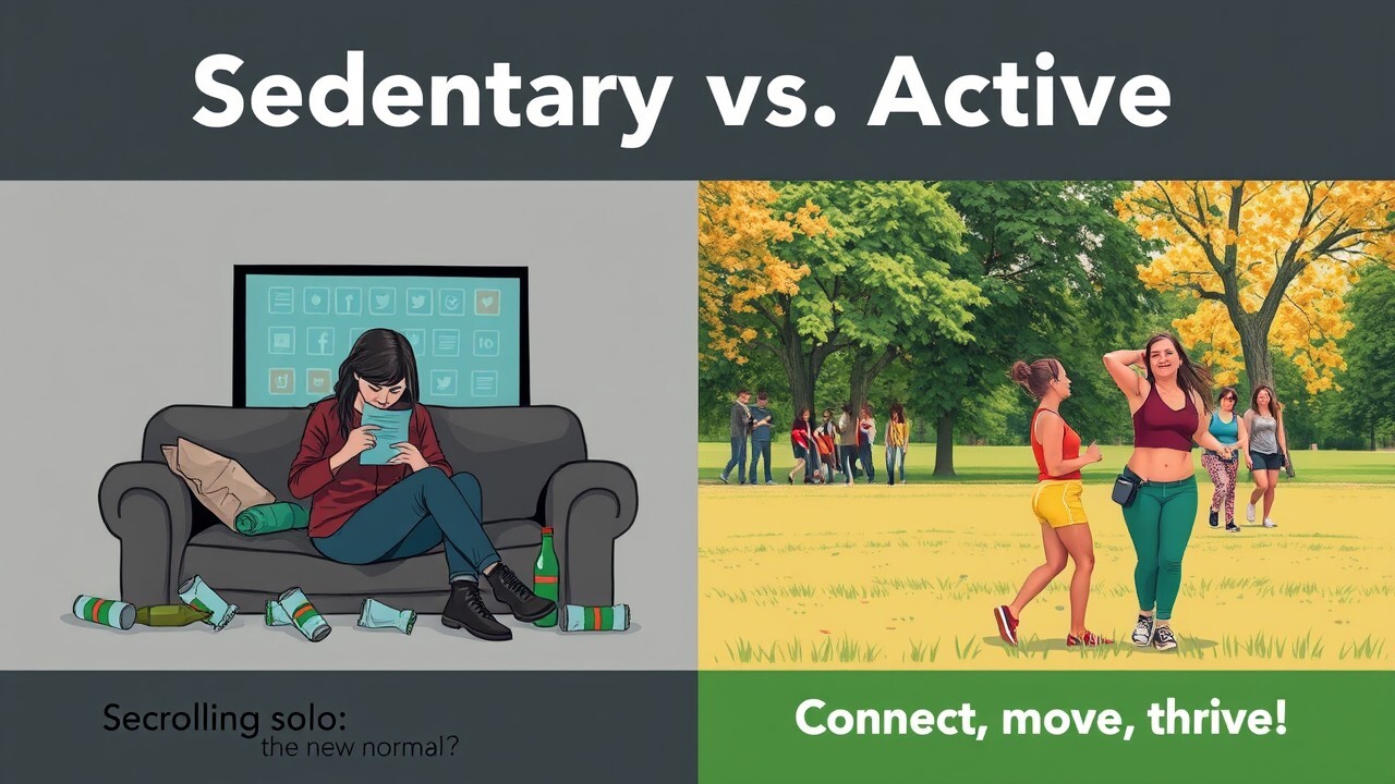
Scrolling solo: the new normal? <> Connect, move, thrive!
Sedentary Snap: AI-Driven Visualizations for Urban Health
Description
Sitting may be the new smoking, and neither of them come with a cool leather jacket (as in those old fancy ads) – just a hefty dose of health risks! Sedentary behavior, especially in urban environments is linked to a range of health risks, including obesity, cardiovascular disease, type 2 diabetes, and even certain cancers. The World Health Organization estimates that physical inactivity contributes to over 3.2 million deaths globally each year (WHO, 2020).
As psychology enthusiasts, we’re interested about the psychological impacts of a sedentary lifestyle. When people spend excessive hours sitting, whether at home or in the office, they miss out on opportunities for social interaction, leading to increased feelings of loneliness and isolation. Without a strong social network, emotional resilience weakens, and people become more vulnerable to stress. Moreover, prolonged sedentary behavior has been closely linked to higher levels of anxiety and depression. Studies suggest that sitting for long periods interferes with the production of neurotransmitters like serotonin and dopamine, which play crucial roles in mood regulation. People who remain inactive often experience mood disturbances, and are more likely to report symptoms of anxiety and depression than their active counterparts (Ellingson et al., 2020).
Sedentary Snap tackles these pressing issues by creating powerful visualizations that highlight the health risks of sedentary urban lifestyle and promote more active, engaging alternatives. These visuals serve two key purposes:
- Raising Awareness: By contrasting sedentary and active lifestyles, these visuals make the consequences of our daily choices in city environments more tangible and understandable.
- Driving Change: These images are designed to inspire action, encouraging individuals to make healthier choices and shaping community health initiatives.
Track Selection
We focused on Track 1, which involves creating AI-generated images with detailed prompt explanations. For our project, we used Flux.1 [schnell], an open-source text-to-image generation platform.
Prompt Overview
- 1. This poster presents a compelling split design comparing lifestyle choices. The left side employs somber greys, blues, and browns to depict someone disconnected from life, slumped on a couch amid scattered junk food debris, with the stark warning "Inactivity is the new smoking." In contrast, the right panel bursts with energetic greens, yellows, and oranges, showing a jogger's vitality in a park setting, paired with the optimistic message "Active cities = healthy lives." Through this dramatic visual contrast, the poster effectively illustrates how our daily choices shape our wellbeing.
Poster Design:
Sedentary vs. Active Lifestyle
Left Section (Sedentary):
Colors: Dark, muted tones (greys, blues, browns).
Image: A person sitting on a couch, disengaged while watching TV, surrounded by junk food wrappers and empty bottles._
Text: “Inactivity is the new smoking.”
Right Section (Active):
Colors: Vibrant, warm tones (greens, yellows, oranges).
Image: A person jogging in a public park, looking energized.
Text: “Active cities = healthy lives.”
- 2. This vintage-style poster contrasts two work approaches with a striking split design titled "Sedentary vs. Active." The left panel, in muted beiges and greys, shows a person trapped in office monotony - hunched over their desk with tense features and poor posture, paired with the questioning text "Chained desk: False efficiency?" On the right, light blues and greens frame an uplifting scene of someone walking outdoors with perfect posture and authentic joy, accompanied by the motivational message "Work & move: Boost results." Using a retro aesthetic, the poster powerfully illustrates how movement can transform our work experience and productivity.
Retro/Vintage Poster Design:
Top title: Sedentary vs. Active
Left Section (Sedentary):
Colors: Dull beiges and greys.
Image: A person hunched over a desk in a cramped office space. Focus on their face showing strain, with furrowed brows and tension in the jaw. Their posture should be visibly poor, with rounded shoulders and a curved spine.
Text: "Chained desk: False efficiency?"
Right Section (Active):
Colors: Light blues and greens.
_Image: A person walking in a park looking happy and having a great posture. His face should be in clear focus, showing genuine smiles and engaged
Text: "Work & move: Boost results"
- 3. This poster design presents a powerful visual contrast between two lifestyles, with the title "Sedentary vs. Active" anchoring the split composition. The left side depicts a depressing scene of modern isolation, showing a person surrounded by junk food wrappers while scrolling on a large screen, all rendered in dark, muted colors and asking "Scrolling solo: the new normal?" In stark contrast, the right-side bursts with vibrant warm tones, featuring an energized woman enjoying outdoor social connection in a park, accompanied by the empowering message "Connect, move, thrive!" Through these deliberate contrasts of colors, environments, and emotional states, the poster effectively communicates the stark difference between isolated, sedentary living and an active, socially-engaged lifestyle.
Poster Design:
Top title: Sedentary vs. Active
Left Section (Sedentary):
Colors: Dark, muted tones (greys, blues, browns).
Image: A very depressed women sitting on a couch, scrolling social media on a big screen, surrounded by junk food wrappers and empty bottles.
Left bottom Text: “Scrolling solo: the new normal?”
Right Section (Active):
Colors: Vibrant, warm tones (greens, yellows, oranges).
Image: A woman in a public park, looking energized, with friends.
Right bottom Text: “Connect, move, thrive!”
Team Composition
Our images create powerful visual narratives contrasting active and sedentary lifestyles. The project generates split-design posters that tell compelling stories about how our daily choices shape our wellbeing, focusing on three key themes: social connection, workplace wellness, and emotional health. Our small but mighty team of two brought different complementary expertise to the project:
Miro (Psychology and Technical): Shaped the behavioral psychology foundation, ensuring our visuals would drive meaningful habit change.
Cornelia (Creative and Technical): Realized the technical execution through AI prompt engineering, crafting balanced and impactful visuals.
Through collaboration and iterative refinement, our small team created a visual language that makes the benefits of active living immediately clear and compelling.
Design Approach
We made these pictures easy to understand so people can see why moving more matters. Each picture tells a story about: making friends vs being alone, working healthy vs being stuck at a desk and feeling happy vs feeling down.
How we built it
We used an AI tool called Flux.1 to make our pictures. For each picture we split each image in a half to show the difference, added simple messages that make sense and showed real-life situations people can relate to. Each poster uses deliberate visual contrasts to illuminate the impact of lifestyle choices:
- Distinctive color palettes: Muted tones for sedentary scenes vs. vibrant hues for active scenarios
- Environmental storytelling: From cluttered indoor spaces to energizing outdoor settings
- Emotional resonance: Conveying isolation vs. connection, strain vs. vitality
Ethical Framework
Our project's ethical foundation centered on creating inclusive and empathetic health communication that respects all individuals. We ensured diverse representation across body types and abilities while focusing on positive enablement rather than shame-based messaging. Cultural sensitivity and accessibility needs were carefully considered in our visual storytelling approach, recognizing that health solutions must work for people of all backgrounds and abilities. By using AI-generated imagery, we maintained privacy while creating relatable visuals that could speak to everyone.
Challenges & Solutions
In developing our images, we faced several significant challenges in crafting our visual message. Fine-tuning AI image generation proved complex as we strived for precise storytelling while maintaining visual consistency across all designs. We grappled with communicating health impacts sensitively while ensuring our visuals would be universally understood across different cultures and contexts. A critical challenge was making our message accessible across various socioeconomic backgrounds, requiring thoughtful consideration of how different communities might interact with and interpret our visuals. A special mention for text in the images is needed. Even with such a great model as Flux.1 there were multiple cases where text was generated incorrectly on the images and multiple iterations were needed.
What we learned
Through this project, we gained profound insights into the intricate relationship between urban living and mental health, discovering how visual storytelling can communicate health concepts more effectively than words alone. Our journey with AI image generation revealed new possibilities for making health information more accessible and engaging, while emphasizing the crucial balance between highlighting problems and offering practical solutions.
Built With
- flux.1-schnell

Log in or sign up for Devpost to join the conversation.