-
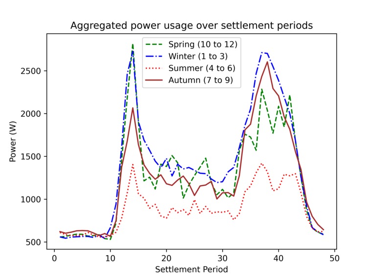
Graph of aggregated power usage over settlement periods
Inspiration
Before delving into the ML, I wanted to do a through data analysis of the aggregate data. This helps later decision making for applying disaggregation techniques.
I wanted to focus on identifying the hot water tank as well as the heat pump which is used in summer and winter.
What it does
This is an easy-to-use Jupyter notebook that takes a CSV of customer data, cleans out rows with missing temperature values and removes outlier peak power usage values that exceed a Z-score threshold of 3. The data is then split into the 4 seasons for a single customer ID.
The data is then averaged over the peak power values per the settlement periods. Plotting these overlapped shows the typical usage of power between the seasons, which exposes thermally related values.
How I built it
This was programmed in Python, using Pandas to load the CSV in smaller chunks before using packages like NumPy, MatplotLib and SciPy for various calculations and tools.
Challenges I ran into
I was a bit rusty with using each python module.
I went this challenge alone while supporting my team with other challenges, so I didn't have as much time as I'd have liked to look for and attempt to apply open-source NILM algorithms.
Accomplishments that we're proud of
Pretty graphs!
What we learned
How to use Python better.

Log in or sign up for Devpost to join the conversation.