Inspiration
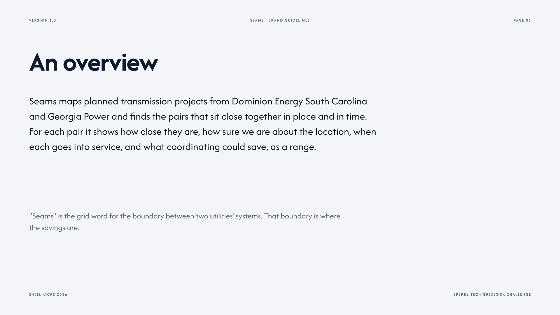
Two power companies can plan a transmission rebuild five miles from each other, five months apart, and never know it. Dominion Energy South Carolina and Georgia Power both file public construction plans years out, and both sit near the Savannah River corridor, but nothing connects those two documents. Sperry Tech's GridLock challenge asked for exactly this: a tool that reads two utilities' public plans and flags where their work overlaps in place and in time. FERC issued Order No. 1920 in 2024 for this exact reason: utilities have historically planned in isolation, leading to duplicated, inefficient work. We wanted to make that overlap visible, ranked, and priced, so a planner can act on it before the trucks are already loaded.
What it does
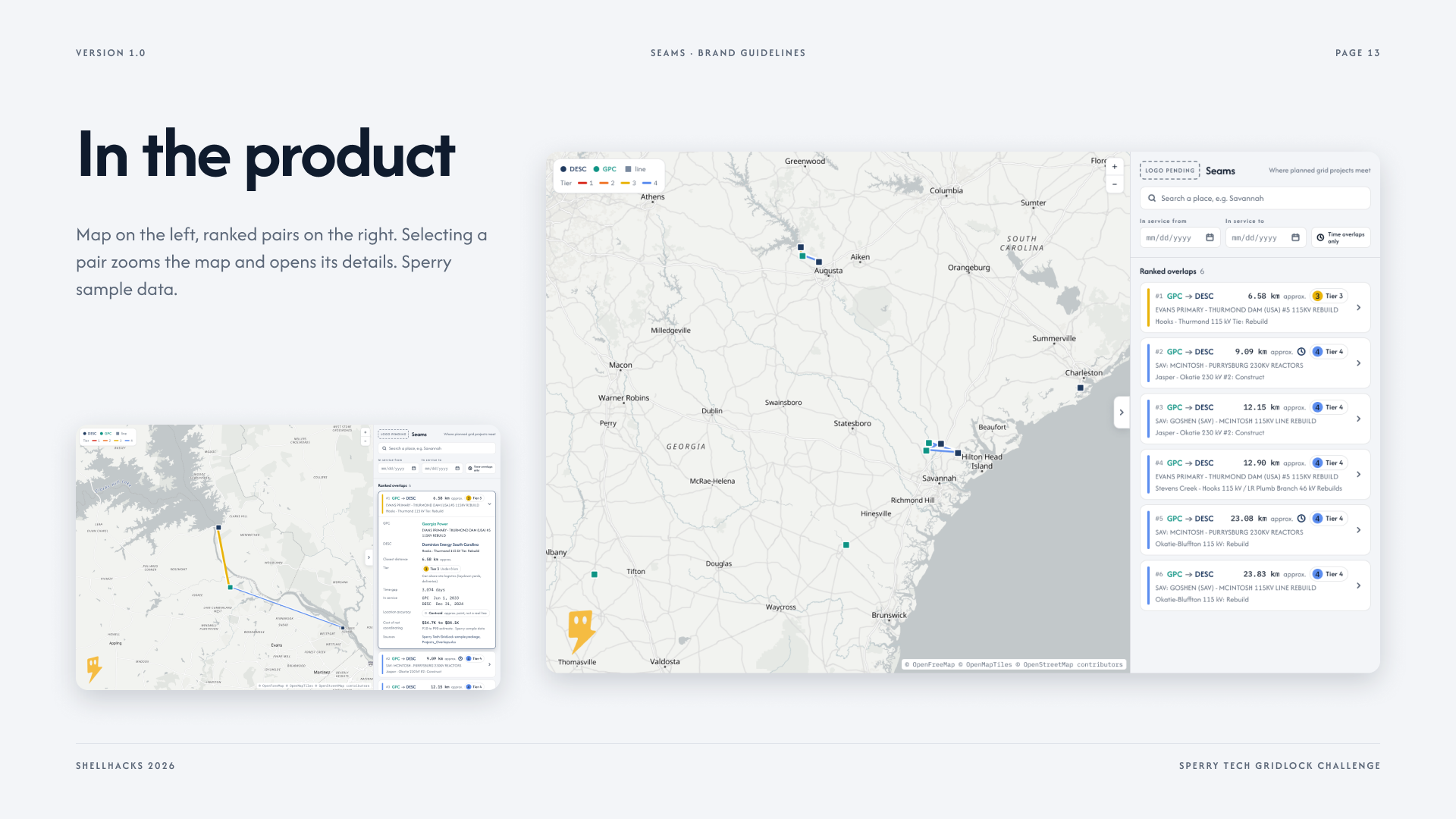
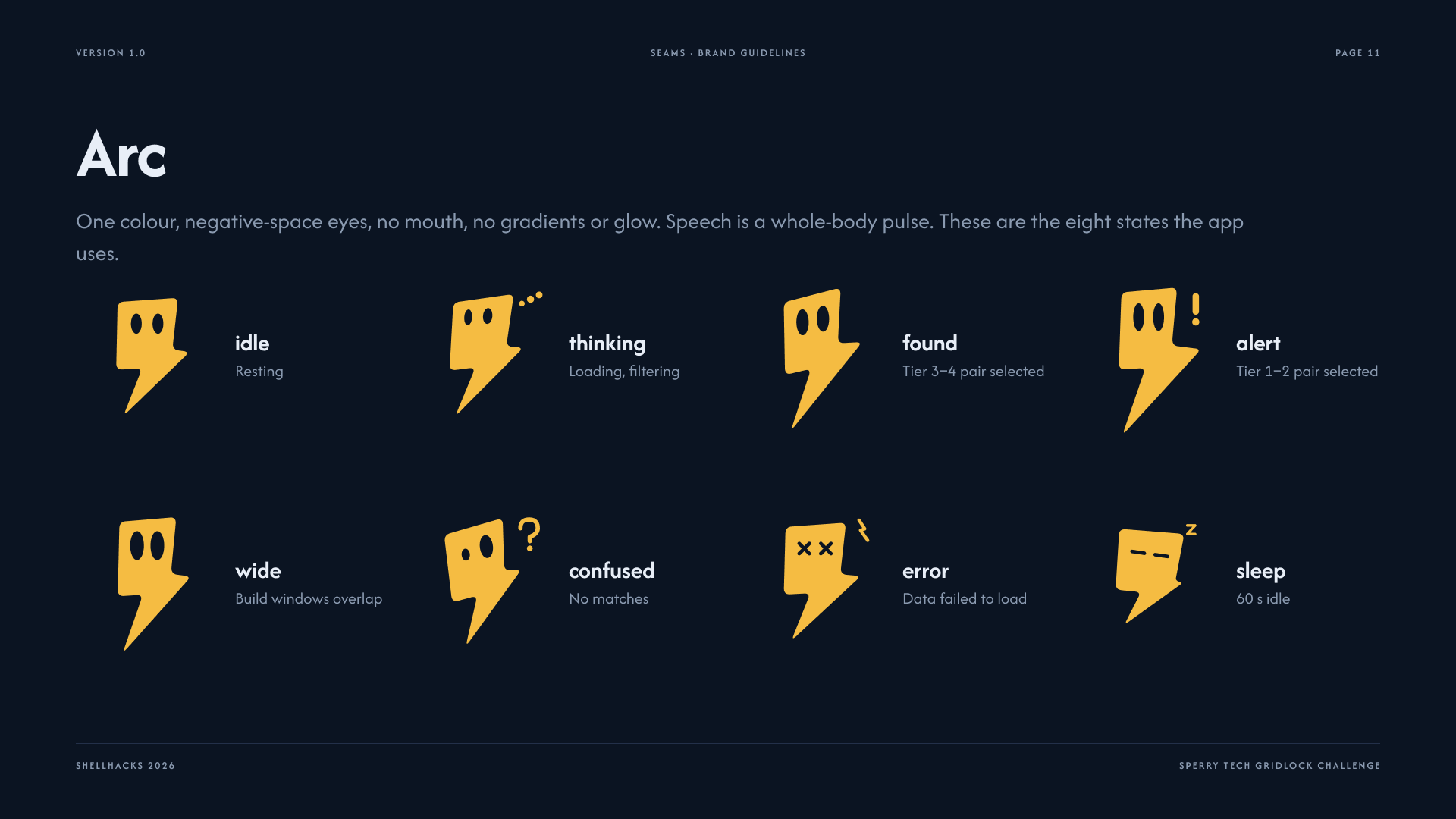
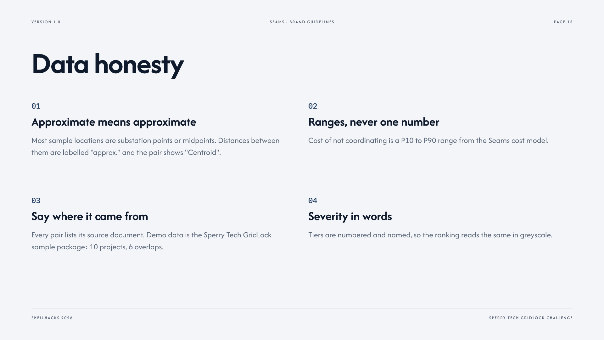
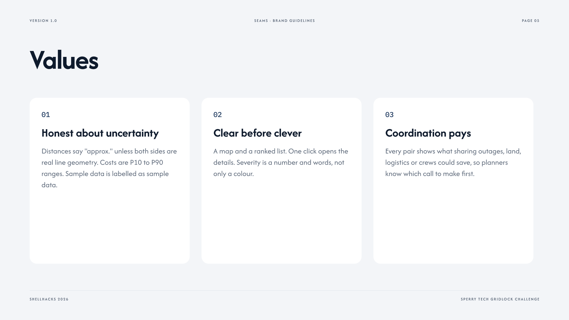
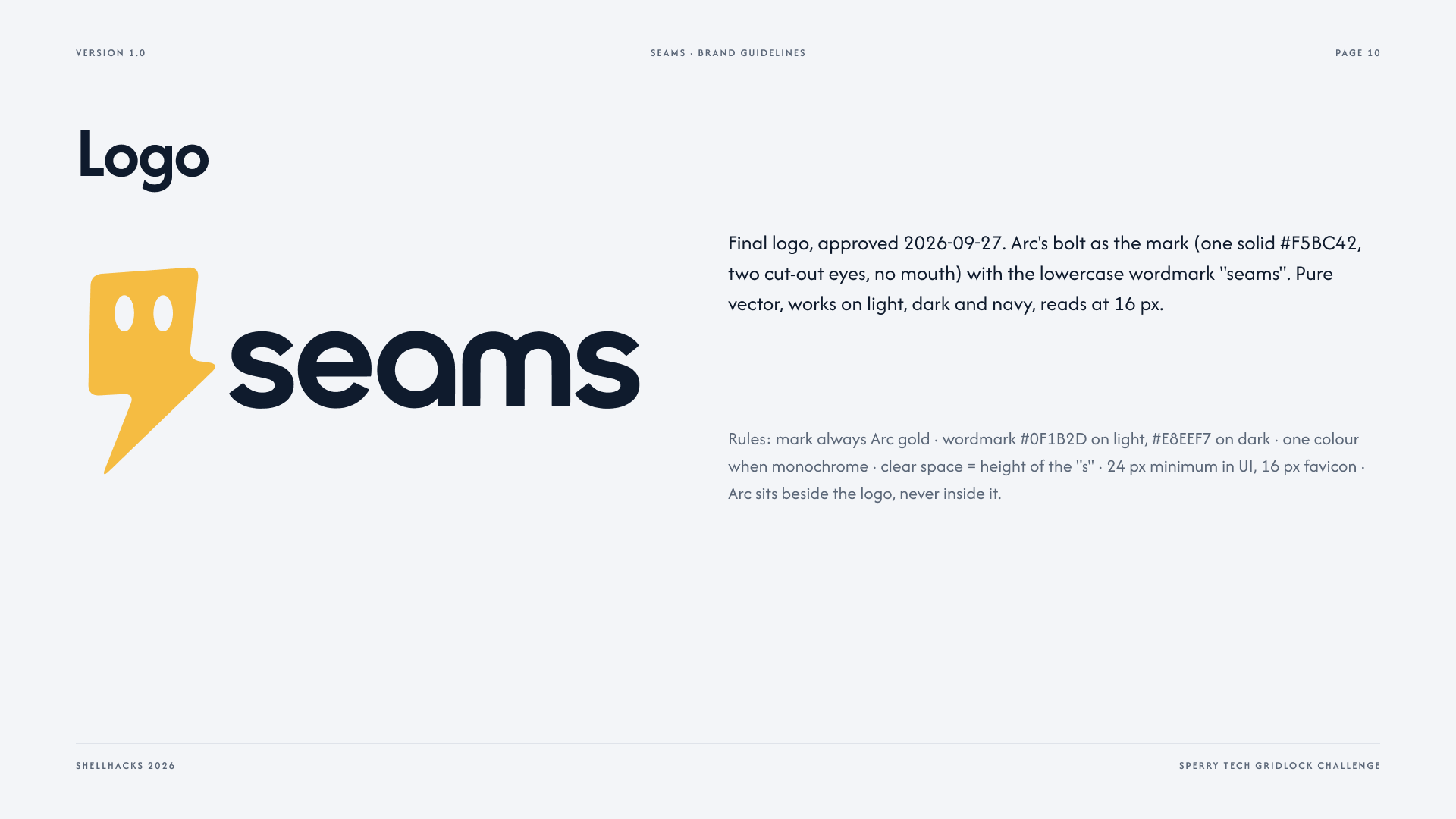
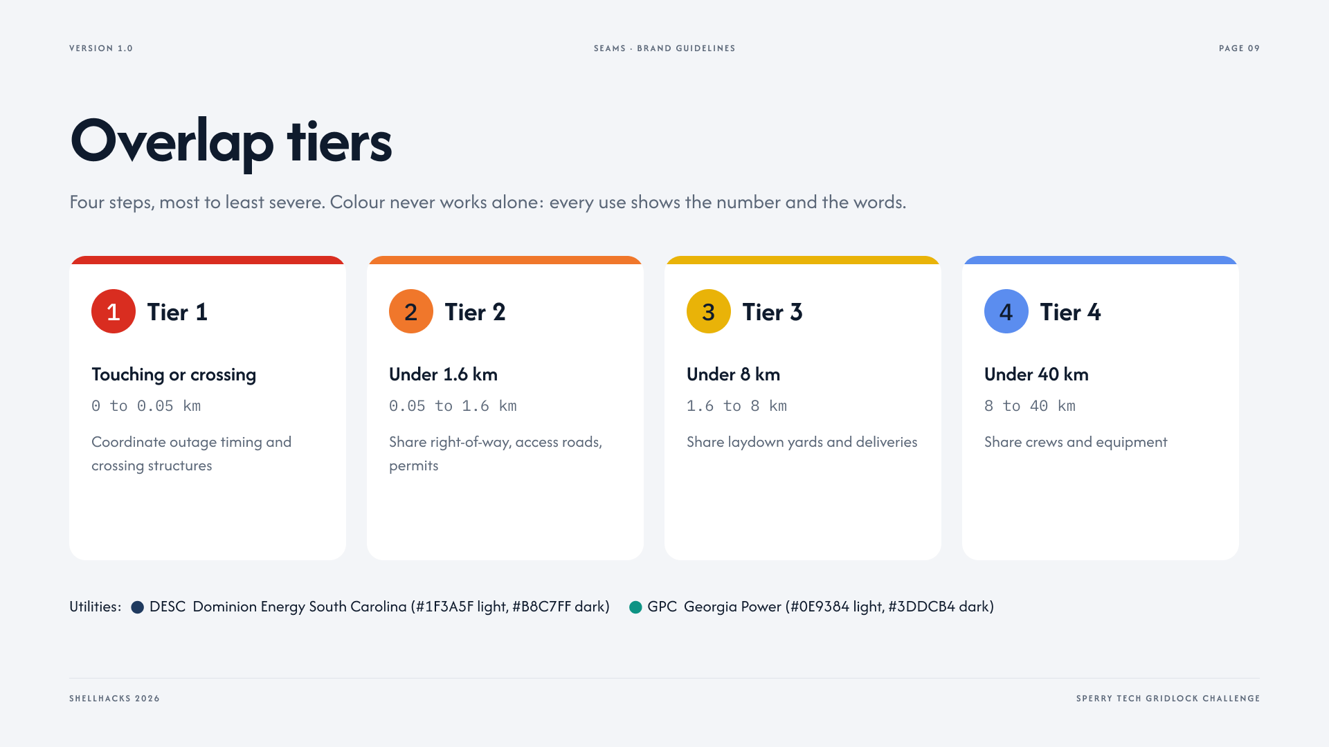
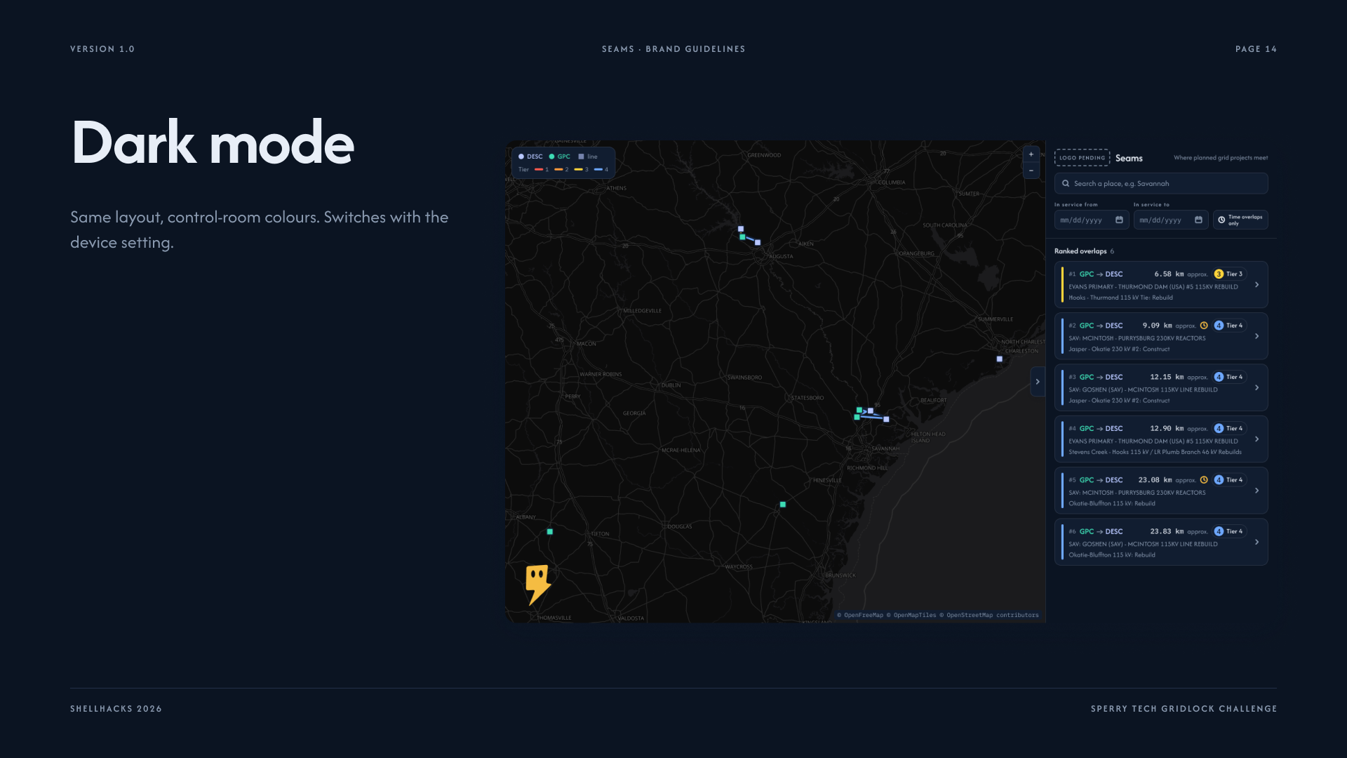
Seams is a flat 2D map that shows both utilities' planned transmission projects side by side. It flags every pair of projects within 40 km of each other, ranks them into four tiers by how much they can realistically share (touching or crossing, under 1.6 km shared right-of-way and permits, under 8 km shared laydown yards and deliveries, under 40 km shared crews and equipment), and layers in a time check: whether the two build windows actually overlap. Click a ranked pair and a detail panel opens with the distance, the time gap, an honest label on whether the location is exact (real line geometry) or approximate (a substation point), the sources behind each project, and a row for the cost of not coordinating. Our cost model produces that as a P10 to P90 range plus trucks and CO2 saved; where it isn't wired into the panel yet, the row says "Not estimated yet" rather than showing a number we can't back. Filters let you narrow to a date range or to pairs whose build windows overlap. Place search flies the map anywhere. Arc, our mascot, a single-color lightning bolt with eyes and no mouth, sits in the corner and reacts when you select a pair, with an extra reaction when the pair's build windows overlap: it's a status indicator, not a chatbot.
How we built it
Four of us split by layer, working against one shared data contract from hour one so nobody waited on anybody else.
- Juan Castillo, product lead, integration, deploy, and brand: Set the direction and wrote the shared data contract every layer built against before a single line of UI or engine code existed, then divided the work across data, engine, and frontend so all three could move in parallel. From there, personally drove the actual build: merged three parallel branches into one working app, diagnosed and fixed the build breaks each merge exposed, wired the overlap engine's output and the finished cost model into the live UI, stood up MongoDB Atlas through Vercel's storage integration, deployed to Vercel, and spent the final stretch hand-fixing DNS at the registrar after the domain didn't propagate the way the dashboard implied it would. Also designed the brand (brand guide, palette, type, Arc's states and animations), built the logo, ran the AI-assisted engineering workflow that shipped most of the codebase.
- Data (Alexandro Galvez-Vega): Built a scraper and a MongoDB loader for utility construction filings, plus an early engine prototype. The real DESC and Georgia Power extraction didn't make it into main in time, so the live demo runs on Sperry's ten sample projects, stored in the shared GeoJSON format with a
geometry_qualityandconfidencefield on every project. - Engine (Charles Seaman): The overlap logic (closest-point distance between two geometries, not center to center, per the challenge's own rule), tiering, time-overlap check, and ranking, tested against Sperry's own six known example overlaps to confirm our tiers match theirs. The cost model runs a Monte Carlo (about 2,000 draws per pair) sampling triangular distributions built from public sources: MISO's transmission cost guide, ATRI's trucking operating cost data, BLS wage data, and an EPA emissions factor, reporting the 10th, 50th, and 90th percentile savings estimate plus trucks and CO2 saved.
- Frontend (Brent Rosen): The map (MapLibre GL, an OpenFreeMap basemap), the ranked sidebar with an expandable detail panel, filters, place search, and the Arc mascot component wired to selection and tier.
Challenges we ran into
The biggest one was data. Neither utility publishes coordinates, only project names, substation names, and dates, so most of our locations start as a substation point rather than a real line route; we chose to label that difference in the app (geometry_quality, an "approximate" flag on every overlap) instead of pretending every distance is exact. The cost model was the second challenge: there is no public source for what it actually costs two utilities to coordinate on a shared corridor, so we built the model from adjacent public benchmarks (fiber and conduit joint-trench cost sharing, trucking and crane day rates, outage cost studies) and treated every input as a range to sample, never a fixed number, then built the UI so a dollar figure can only ever appear as a labeled range. Merging three parallel branches (frontend, engine, data) into one working app under time pressure was the third: a shared data contract, written before any of the code, is what kept the pieces compatible.
Accomplishments that we're proud of
- The overlap engine's output matches Sperry's own six known example overlaps, the actual bar the challenge set.
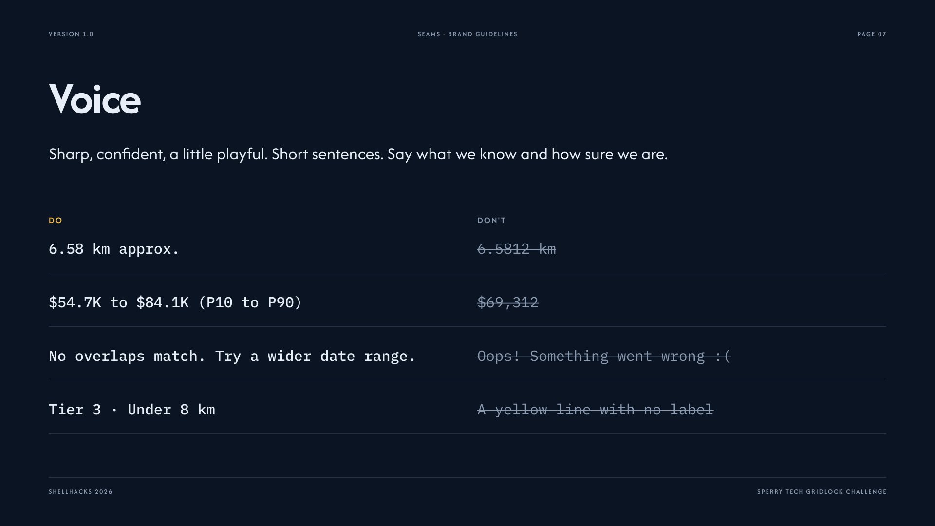
- Every cost figure the model produces is a P10 to P90 range with cited sources, never a bare number presented as fact.
- Arc: a mascot built from one solid shape and eye-shape changes only, no gradients, no second color. He follows the cursor, flips to face either way, and has a waiting animation where his eyes wrap around his head.
- The team never blocked on each other: frontend, engine, and data were built against the same fixture files from hour one, so integrating them was a merge job, not a rewrite.
What we learned
How little public infrastructure planning data actually connects across state lines, even though FERC has now flagged this as a real regulatory problem (Order No. 1920). How much of "showing a cost estimate honestly" is UI discipline, not math: the hard part wasn't the Monte Carlo, it was making sure a range always displays as a range. And how much faster four people move when they agree on the shape of the data before anyone writes UI or engine code.
What's next
- Extract the full DESC 2024-2028 project list and the Georgia Power 2025 IRP Volume 3 filing beyond the ten Sperry sample projects.
- Pull real line geometry from OpenStreetMap wherever it exists, to shrink the share of overlaps still labeled approximate.
- A real routing API (OSRM or similar) to replace the assumed haul-route-distance range in the cost model with an actual driving distance between staging yards.
- A 3D tilt toggle on the map (the underlying map library supports it without a rebuild).
Built With
- claude-code
- codex
- eslint
- figma
- maplibre-gl
- mongodb
- next.js
- openfreemap
- openstreetmap-nominatim
- react
- react-map-gl
- tailwind-css
- turf.js
- typescript
- vitest

Log in or sign up for Devpost to join the conversation.