-
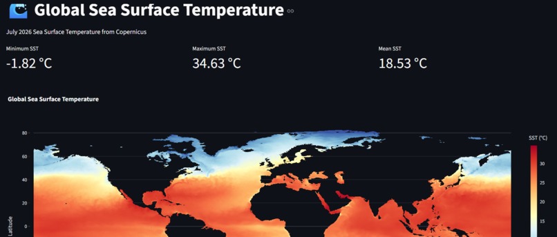
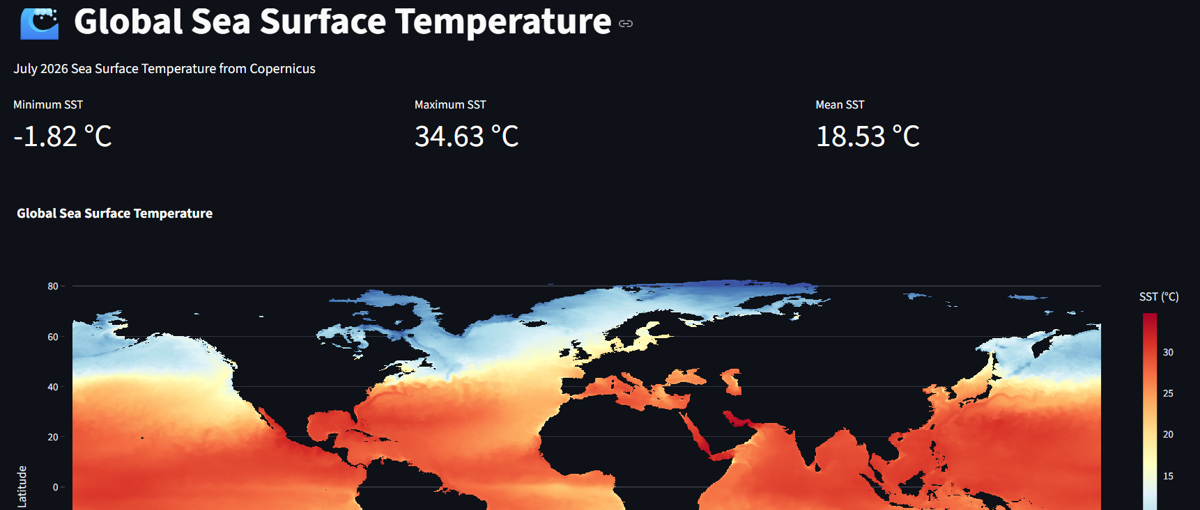
sea surface temperature chart
Inspiration
Sea Surface Temperature (SST) is an important indicator of ocean and climate conditions. However, raw satellite datasets can be difficult to understand because they contain millions of geographical observations. I build a simple, interactive tool that turns complex SST data into an understandable visual experience. The goal was to allow users to explore ocean temperatures geographically and quickly identify temperature patterns and differences across the ocean and find its solutions.
What it does
Sea Surface Temperature Analyser visualizes global sea surface temperature data from Copernicus. The application:
- Displays global SST on an interactive map.
- Converts temperature data from Kelvin to Celsius.
- Removes land areas so users can focus on ocean temperatures.
- Aggregates the high-resolution satellite data to make visualization efficient.
- Shows minimum, maximum, and average SST.
- Uses an interactive color scale to make temperature patterns easier to identify.
- Allows users to visually explore the spatial distribution of ocean temperatures.
How I built it
I built the application using a Python-based data analysis stack. Data source: -Copernicus Climate Data Store (CDS)- Technologies:
- Python
- xarray
- Pandas
- Plotly
- Streamlit
- CDS API
The original dataset contains a global latitude-longitude grid with millions of SST observations. I used xarray to process the NetCDF data efficiently, remove unnecessary variables, convert Kelvin to Celsius, apply the ocean mask, and reduce the spatial resolution before sending the data to the interactive visualization.
Challenges I ran into
- Large NetCDF files and GitHub file-size limitations.
- Memory usage while processing the dataset.
- Understanding the structure of multidimensional xarray data.
- Correctly applying the land/ocean mask.
- Finding an efficient way to display high-resolution geographical data in Streamlit.
- Troubleshooting visualization and deployment issues.
Accomplishments that I'm proud of
I successfully transformed a large, complex satellite dataset into an interactive web application. Successfully accessed real-world SST data from Copernicus and worked with a large multidimensional NetCDF dataset using xarray.Built a preprocessing pipeline to make the dataset suitable for web visualization.Converted raw satellite measurements into a user-friendly Celsius-based visualization. Applied geographical masking to separate ocean from land. Built and deployed an interactive Streamlit application.I learned how to work with real-world data constraints such as memory, file size, and deployment limitations.
What I learned
This project taught us that real-world data analysis is much more than creating charts. I learned how important it is to understand the structure and size of a dataset before choosing a visualization or analysis technique.
What's next for Sea Surface Temperature Analyser
- Historical comparisons between different years.
- Regional analysis for areas such as the Indian Ocean, Atlantic Ocean, and Pacific Ocean.
- More detailed statistical analysis of ocean temperature patterns.


Log in or sign up for Devpost to join the conversation.