-
-
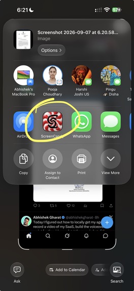
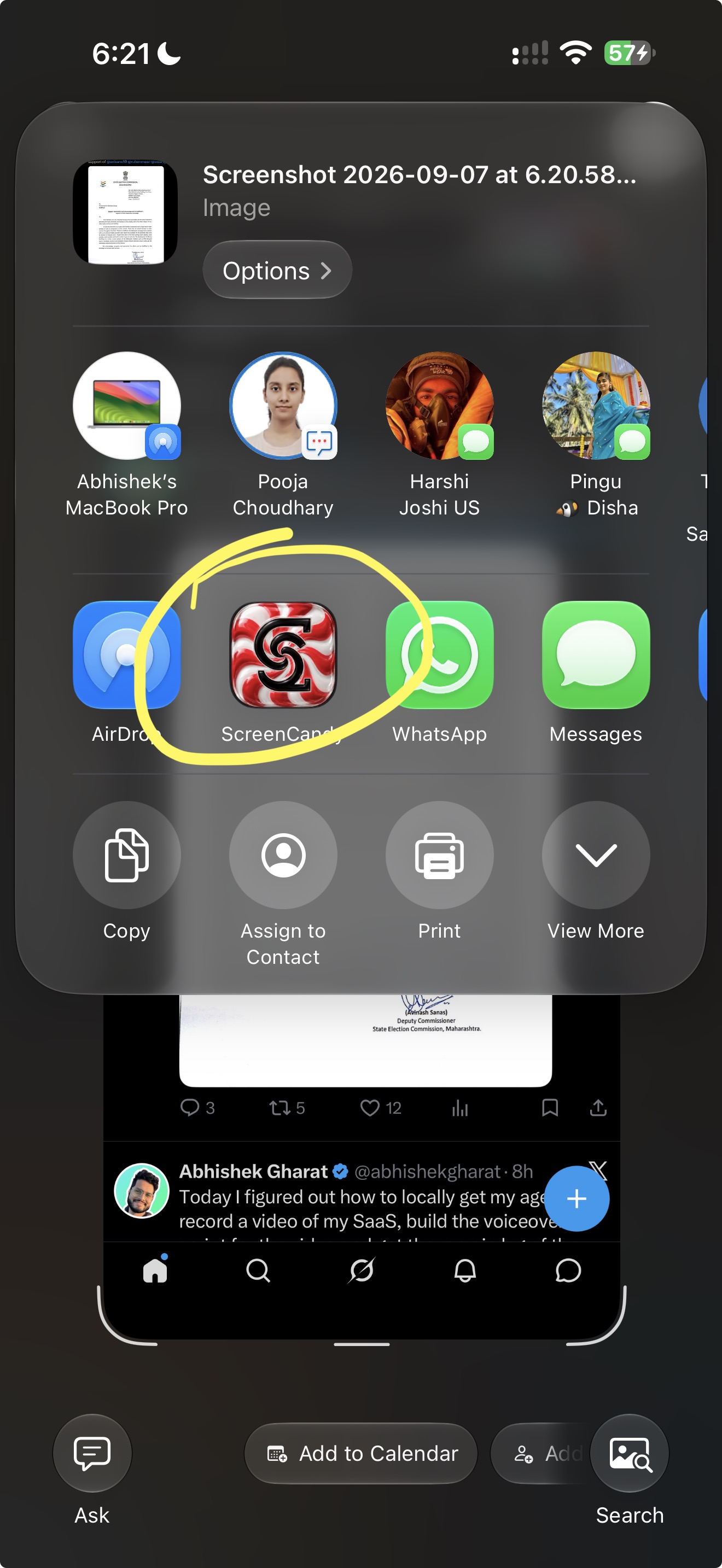
Take a screenshot, choose ScreenCandy from your phone's share sheet and jump straight into editing.
-
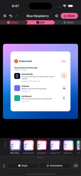
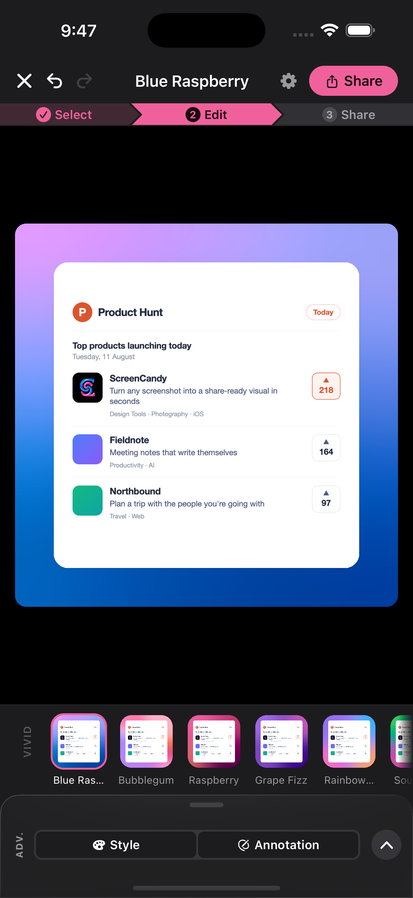
Pick a background preset in one tap. Live thumbnails make it easy to compare colourful looks on your own screenshot.
-
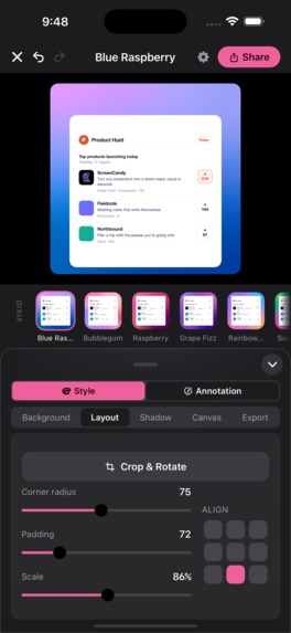
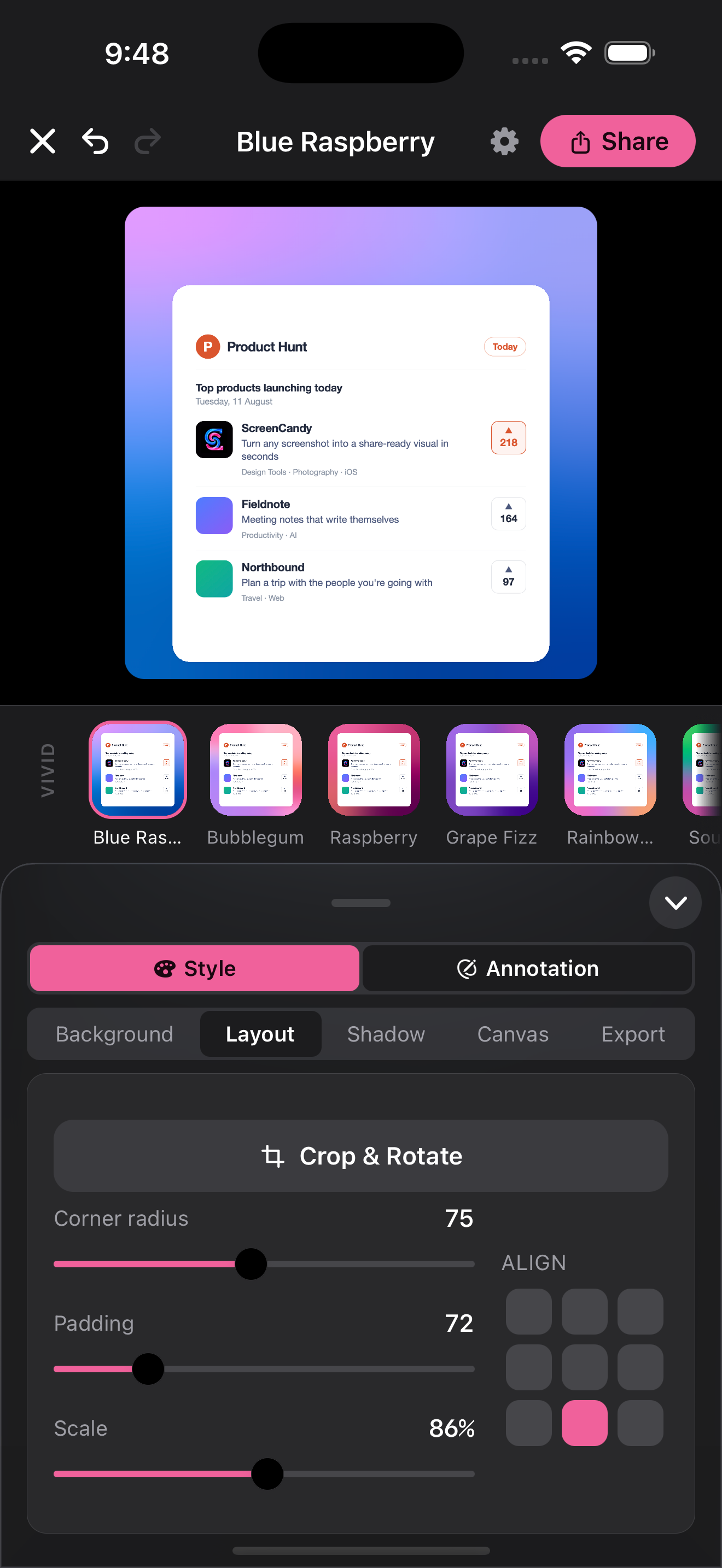
Dial in your screenshot's style with controls for rounded corners, padding, scale and alignment, plus crop and rotate.
-
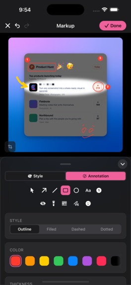
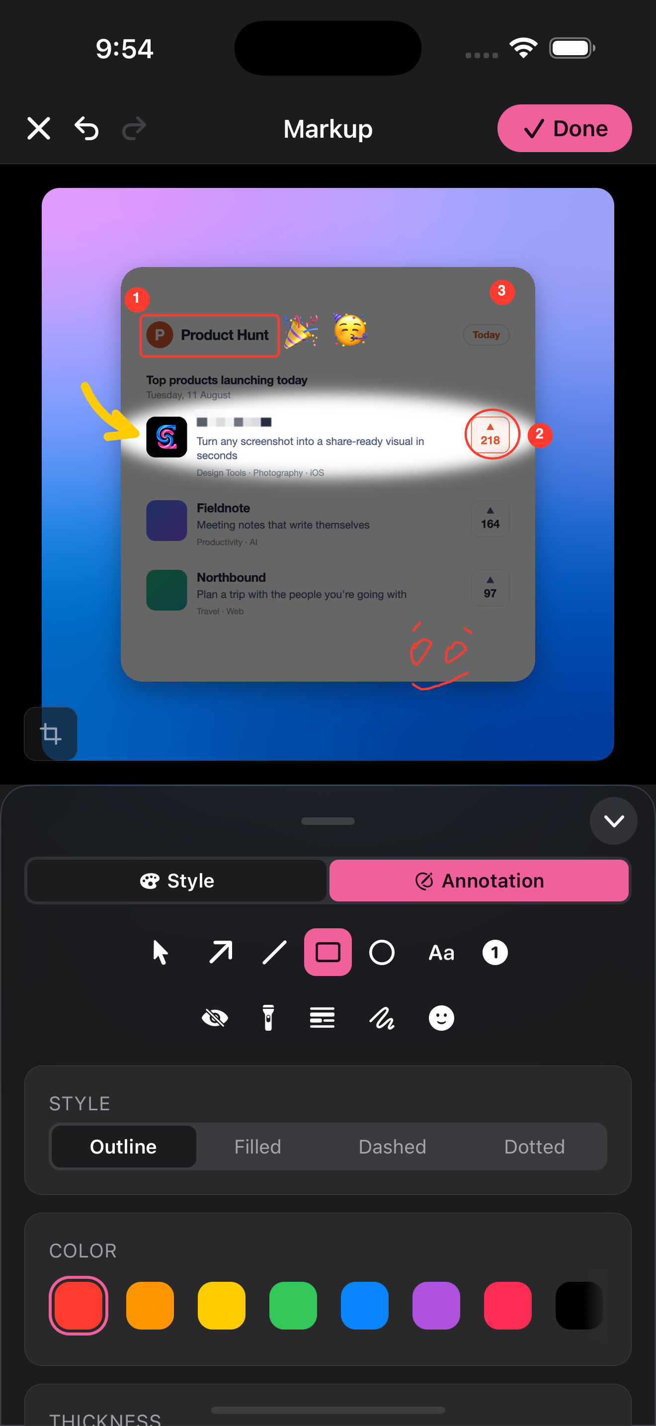
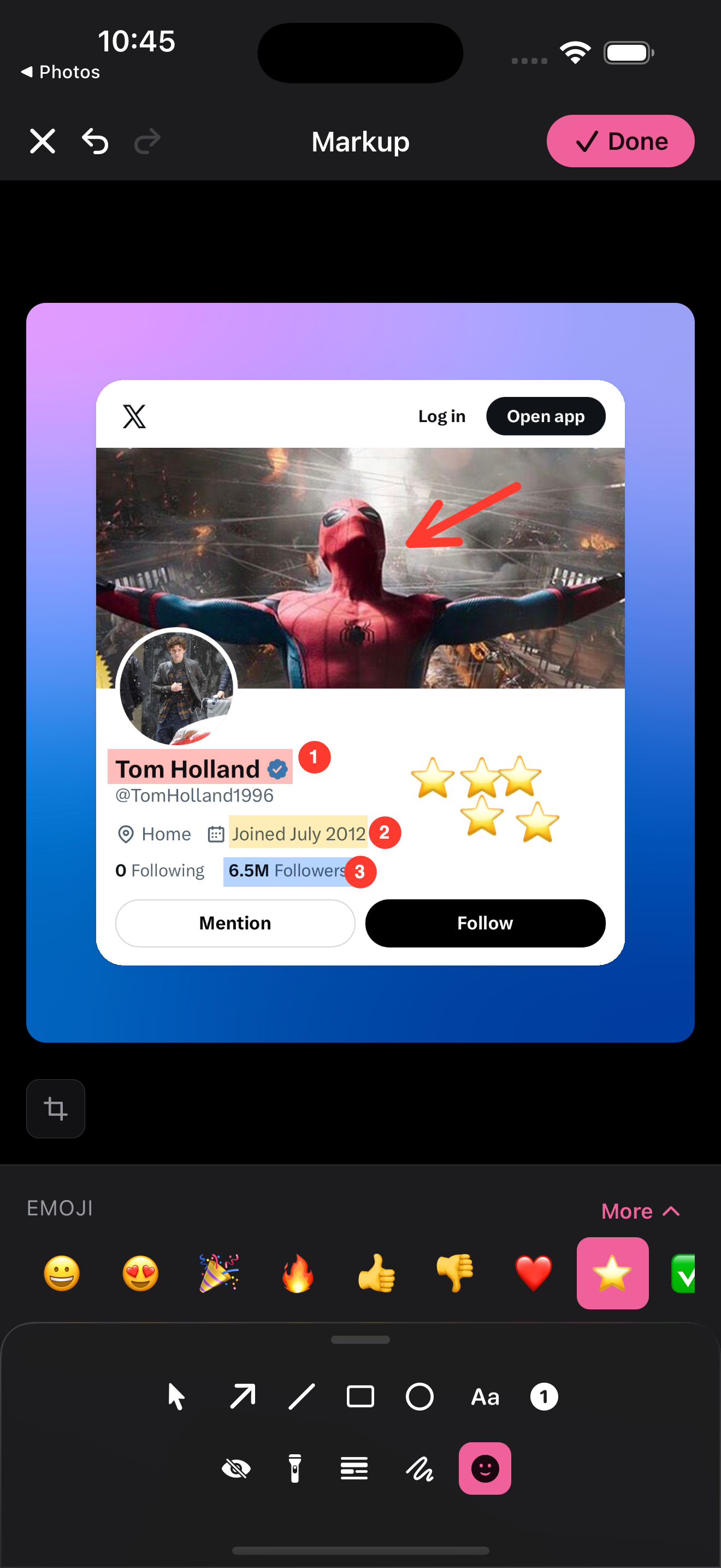
Mark up screenshots with arrows, shapes, text, numbered steps and more. Customise your annotations with styles and colours.
-
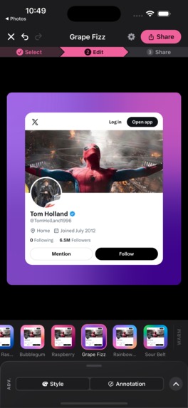
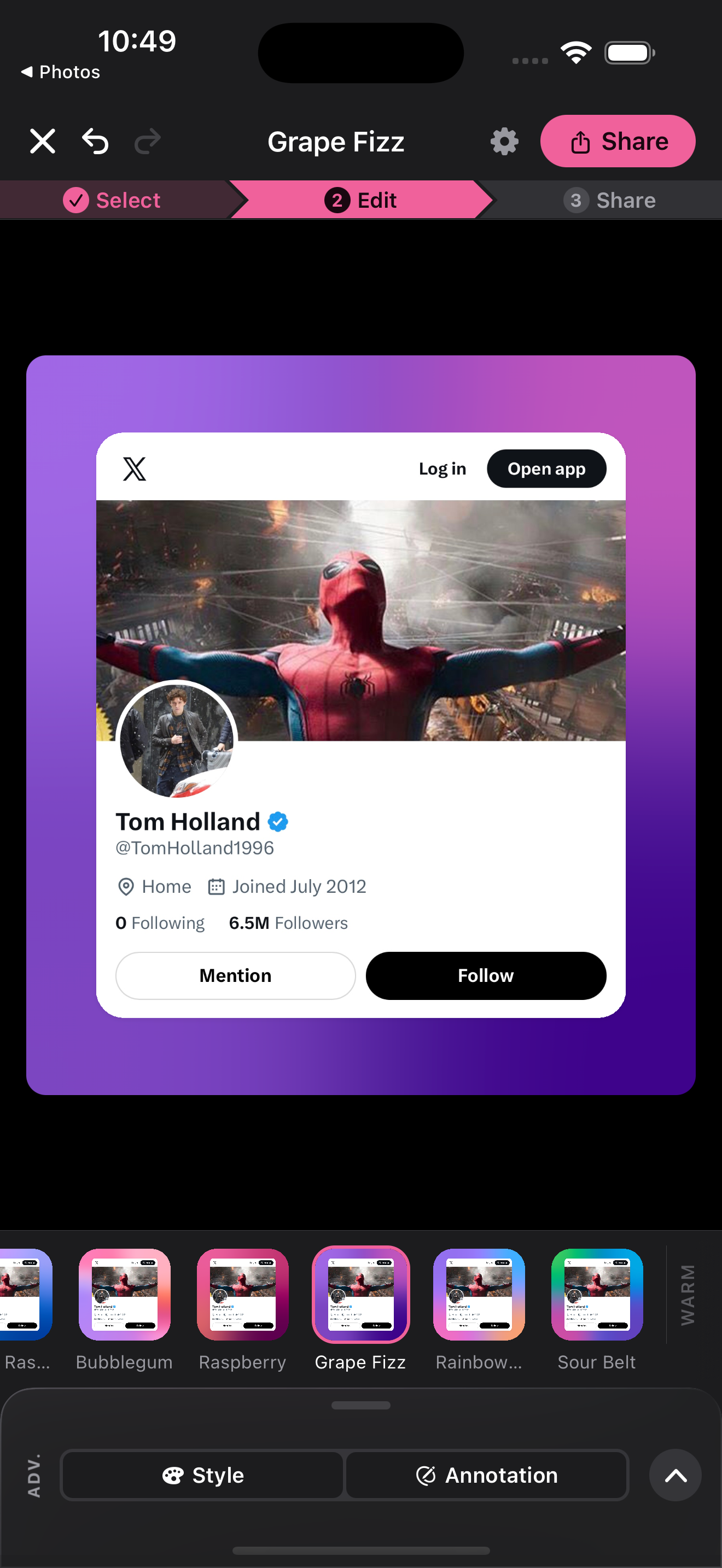
Switch up the mood with candy-inspired gradients. Preview looks like Bubblegum, Grape Fizz and Sour Belt in one tap.
-
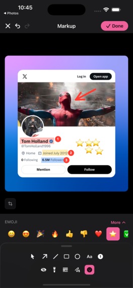
Add personality and clarity with emoji stickers, highlights, freehand drawing and a full set of annotation tools.
-
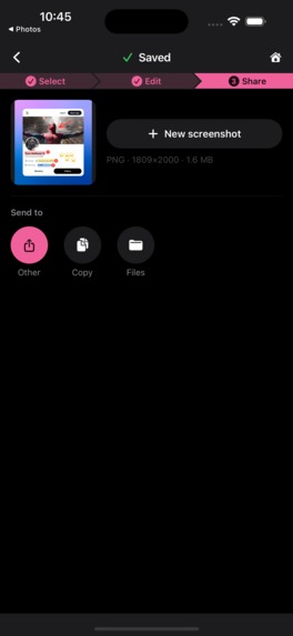
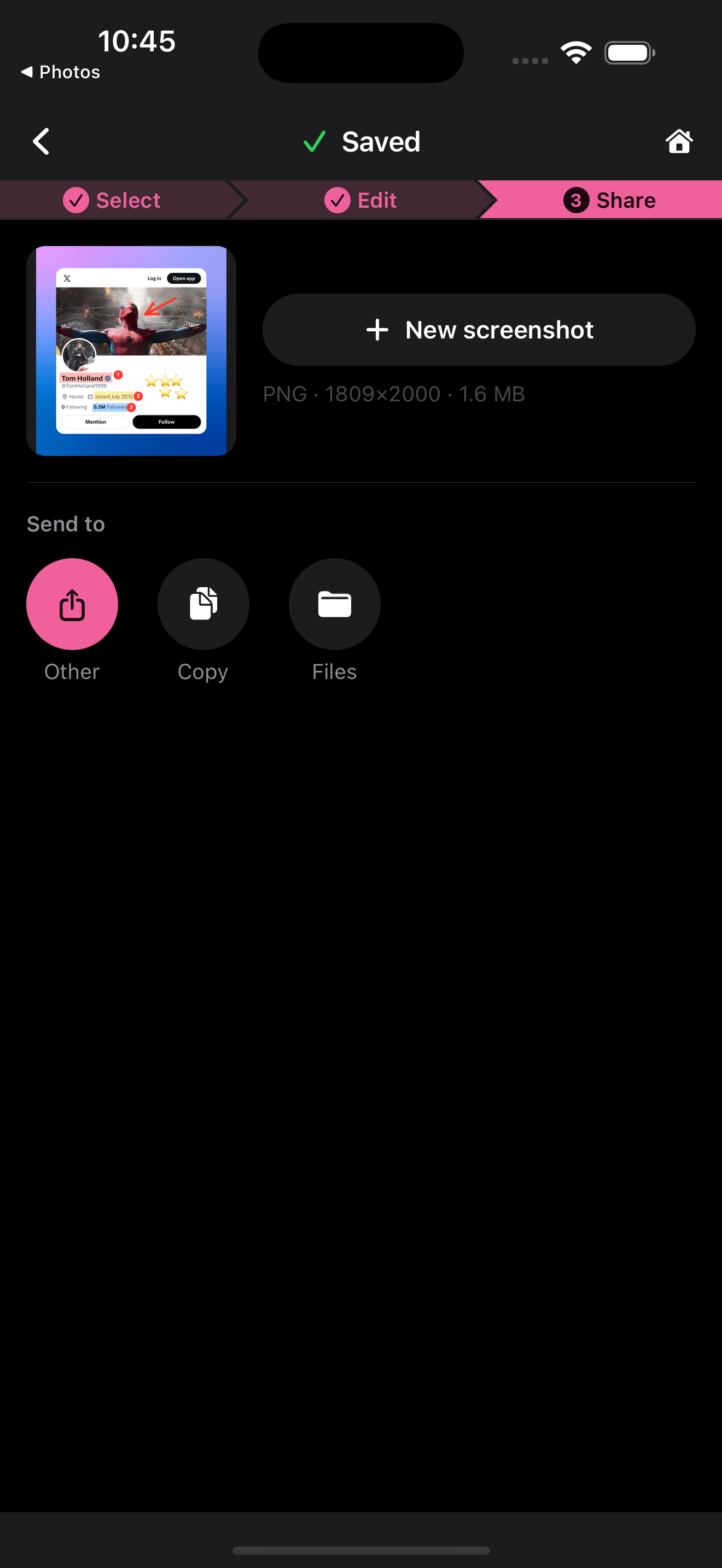
Share your finished screenshot in a few taps. Copy it, save it to Files or send it to another app.
-

1200x1200 App Logo

Inspiration
Screenshots are one of the most common ways we share things from our phones, but raw screenshots rarely look good when posted. They have hard edges, status bars, awkward dimensions and no visual hierarchy.
There are web tools that can beautify screenshots, but the workflow is backwards when the screenshot already lives on your phone: upload it, edit it, download it again, then return to the app where you wanted to share it.
We wanted to collapse that entire loop.
Take a screenshot > Share to ScreenCandy > Post.
What it does
ScreenCandy turns a raw screenshot into a polished, share-ready visual directly on your phone.
Share a screenshot to ScreenCandy and it can open already composed with a background, rounded corners and shadow applied. From there, you can make it as simple or as detailed as you want.
ScreenCandy includes:
- 30 built-in looks, including 24 hand-built mesh gradients
- 7 background types
- 9 aspect ratios and 8 platform-specific canvas sizes
- Custom canvas dimensions
- Controls for padding, scale, alignment, corners, borders and shadows
- CandyMark, an 11-tool non-destructive markup layer
- Arrows, text, shapes, counters, highlights, spotlighting and freehand drawing
- Four redaction styles, including secure blur
- Custom presets that can automatically apply to new screenshots
- PNG, JPEG and supported WebP exports
- Direct sharing to common social and messaging destinations
- Unlimited undo and redo
The goal is not simply to make a screenshot prettier. It is to make the screenshot more worth sharing.
The same screenshot can become a founder update, a product announcement, a tutorial, a support response, an App Store visual or a Product Hunt graphic without needing a desktop workflow.
Built around the share sheet
The interaction we cared about most happens before the editor even appears.
On iOS, ScreenCandy works through the Share Extension, and on Android through the native share intent. A screenshot can move directly from the app where it was captured into ScreenCandy.
A default or recent preset can already be applied when the editor opens. The idea is that for many screenshots, the best editing experience is almost no editing at all.
Select > Edit > Share.
Building the renderer
A deceptively difficult part of a screenshot editor is making sure the thing you preview is actually the thing you export.
ScreenCandy renders both the interactive preview and full-resolution export from the same Skia scene. Backgrounds, gradients, screenshot transforms, shadows, borders and CandyMark annotations are composed through the same rendering pipeline.
We also added decoded-memory pre-flight checks and an upscale guard before large exports.
The result is simple from the outside: what you see is what you save.
Privacy by architecture
Screenshots can contain dashboards, conversations, customer information and other things you would not casually upload to a random website.
ScreenCandy therefore performs the composition on-device. There is no ScreenCandy backend, account system, cloud sync or analytics pipeline receiving your screenshots.
Redaction is also performed on-device, with blur, pixelation, blackout and secure blur options.
The only external validation required by the product is purchase validation through RevenueCat.
RevenueCat and ScreenCandy Pro
RevenueCat powers the purchase layer behind ScreenCandy Pro.
We deliberately designed the monetisation around trying the product rather than blocking the product.
Every preset can be applied to your own screenshot before you pay. Free exports carry the ScreenCandy watermark, while Pro removes it and unlocks sharing with premium looks.
This creates a very natural purchase moment: try everything first, pay when you have made something you actually want to post.
An upgrade also removes the watermark when previously created projects are re-exported. RevenueCat lets us keep the entitlement logic separate from the core screenshot experience while supporting the paid layer across the product.
The details we obsessed over
What started as "put a screenshot on a nice background" became a surprisingly deep product-design problem.
We built:
- A three-position Control Deck that never covers the working canvas
- A 9-point alignment system
- Platform canvases for X, Instagram, LinkedIn and Product Hunt
- Resolution-independent mesh gradients
- Live preset thumbnails
- Non-destructive crop and rotation
- Vector markup that remains part of the same composition
- Automatic counter renumbering
- Secure redaction
- One history entry per slider gesture instead of every tiny movement
- Fallback behaviour when a sharing destination cannot directly accept the export
Each detail exists for the same reason: reduce the distance between "I captured this" and "I want to share this."
What we learned
The biggest lesson was that a focused utility can still deserve an enormous amount of product depth.
Screenshot presentation looks like a tiny problem until you examine the complete journey: capture, crop, compose, annotate, redact, resize, export and share.
The breakthrough for us was treating all of those as one workflow rather than a collection of editing features.
We also learned that the best default is incredibly important. ScreenCandy should produce something good before you start moving sliders. The controls are there when you want them, not because you should need them.
What's next
ScreenCandy v1.0 is focused on doing one job exceptionally well on iOS and Android: turning the screenshot you just took into something worth posting.
From here, the goal is to keep improving that workflow without turning ScreenCandy into another complicated general-purpose editor.
We want the shortest path from screenshot to share-worthy to keep getting shorter.

Log in or sign up for Devpost to join the conversation.