Inspiration
The prompt asked how we design for nostalgia and joy in a world built around automation and optimization. We took that personally.
For Gen Z creatives, right now is one of the most critical windows for developing skills, building a network, and figuring out who you actually are. The internet is supposed to support that. And in a lot of ways it does. But it also pulls in the opposite direction. Doomscrolling flattens inspiration into noise. AI tools make it easy to skip the struggle that actually builds something in you. Social media turns identity into performance, where the pressure to post the finished thing quietly erases the process that made it. The in-between disappears. And with it, so does a piece of who you are becoming.
What inspired Scarlet Capsule was to curate a place that holds the journey. Something that feels warm and personal the way a shoebox of printed photos does. The Y2K aesthetic was a wonderful leverage to the feeling of nostalgia because it represents a specific moment when the internet was genuinely joyful and deeply human. Pixelated and expressive that is completely yours. That is what we wanted to bring back.
What it does
Scarlet Capsule is built around the cycle that most creatives already live in: you explore, you create, you share, and then you start over. Every part of the experience maps to one of those moments.
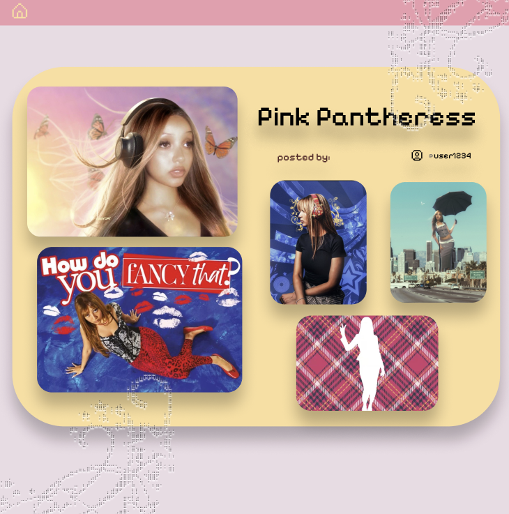
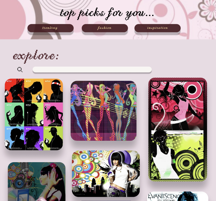
The Explore tab is a curated space for creative input across fashion, art, quotes, and visual references. It is not a feed designed to hold your attention. It is a room designed to spark something.
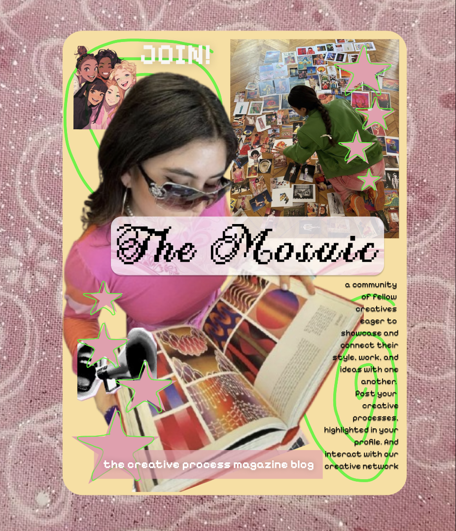
The Share tab connects users to Mosaic, a community blog where creatives write about their own process, read about others, and find people on a similar path. The focus is the conversation around making things, not the finished product.
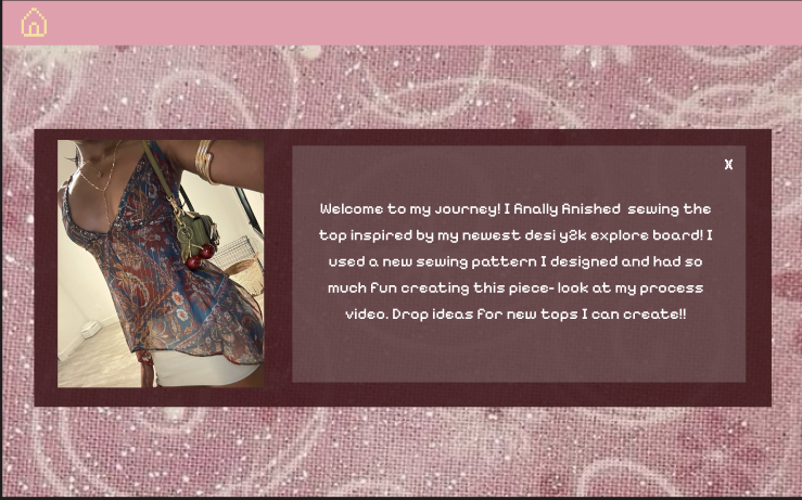
The Create tab is a digital photobooth where users compose their uploaded photos into saveable, printable strips. It makes digital memory tactile. Something you can stick on a wall, tuck into a notebook, or hand to a friend.
The Scarlet Capsule ties it all together as a personal archive. Users leave notes to their future selves, document who they are and what they are working on at a given moment, and return to it over time to see how much has changed. It is a time capsule you keep reopening.
How we built it
We started with research and a clear design direction before anything else. The prompt gave us the brief: nostalgia and joy. We spent time identifying what actually produces those feelings in a digital space.
From there we developed the Chocolate Kisses design system. The color palette, built around deep wine, bubblegum pink, caramel yellow, tangerine, and bittersweet red, was chosen to feel rich and handmade rather than clean and corporate. PF Pixelscript Pro as the display font carried the Y2K pixel aesthetic through every screen. Every type choice, spacing decision, and component was documented as a token so the experience felt cohesive across the full product.
We designed the full user experience in Figma, working through the information architecture first and then the visual layer. The Scarlet Capsule, Mosaic, the photobooth, and the explore tab each went through multiple rounds of iteration. We kept asking whether each screen felt like it belonged to a space that was actually for creatives, or whether it had quietly drifted toward something more generic.
Challenges we ran into
The hardest part was staying honest about what we were designing.
Every feature we considered, we had to ask whether it was actually serving the creative or just adding complexity. Mosaic almost became a likes-based social feed before we caught ourselves. That would have been the exact thing we were trying to push against. Removing the vanity metrics made it better. Keeping the photobooth simple and physical made it more meaningful. The discipline of cutting things was harder than coming up with them.
On the visual side, Y2K aesthetics are intentionally chaotic and that creates real tension with usability. Pixel textures and chrome decorations work beautifully as atmosphere and completely fall apart the moment they get in the way of what a user is trying to do. Finding that balance required a lot of iteration and a lot of honest critique within the team.
There was also the matter of twenty-four hours not being very many hours.
Accomplishments that we're proud of
A shared design language is one of the most underrated forms of clarity in a team. Because Chocolate Kisses existed as a system before we designed anything else, we never stalled on visual decisions. The energy went to the harder problems instead.
We are also proud of the level of detail we brought to this project as a team of beginners and intermediates. None of us came in with years of experience, but we showed up, paid close attention to the craft, worked through every challenge together, and made something that genuinely reflects care. That matters more to us than any individual skill level going in.
What we learned
Going in with a plan changed everything. Before we touched a single frame in Figma, we had already agreed on who we were designing for, what the experience needed to feel like, and what we were not trying to build. That last part mattered more than we expected.
We had to be honest with ourselves early on. We were a team of beginners and intermediates working in 24 hours. Scarlet Capsule was never going to be a highly polished, technically advanced product and we made peace with that quickly. What it could be was something thoughtful, specific, and genuinely made with care. Once we let go of trying to compete on complexity, we started making better decisions. The scope tightened. The details got more attention. Everything felt more like us.
That is probably the realest thing we learned, knowing what you are not building is just as important as knowing what you are.
What's next for Scarlet Capsule
We want to add reflection prompts to the Scarlet Capsule, not to generate content for users but to ask them better questions about their own growth over time. We also want to explore closing the loop between digital and physical with maybe QR-linked photo strips, printable zine exports, and eventually a way for users to send each other capsules. The archive should outlast the app, So that is still the goal.
Built With
- figma


Log in or sign up for Devpost to join the conversation.