Inspiration
Scams are globally on the rise, and every day we are targeted by more and more. Technological advancements have also allowed more sophisticated scams, where it becomes difficult to distinguish what is real. Still, except for some sensational cases we hear in the news, there is still too little done for awareness.
Falling for a scam is a frightening experience that breaks your faith in the world. I have fallen for scams, despite having worked in IT security for many years, and I am not the only one. Why is there no place just to read about every possible scam, and not just the online ones or recent ones? What if that place was the phone we already have in our hands, which is also where so many scams reach us in the first place? I wanted to build that place, a platform to learn about scams and their red flags in your own time, what I wish I had, and wish that many victims of scams which experienced much worse had.
What it does
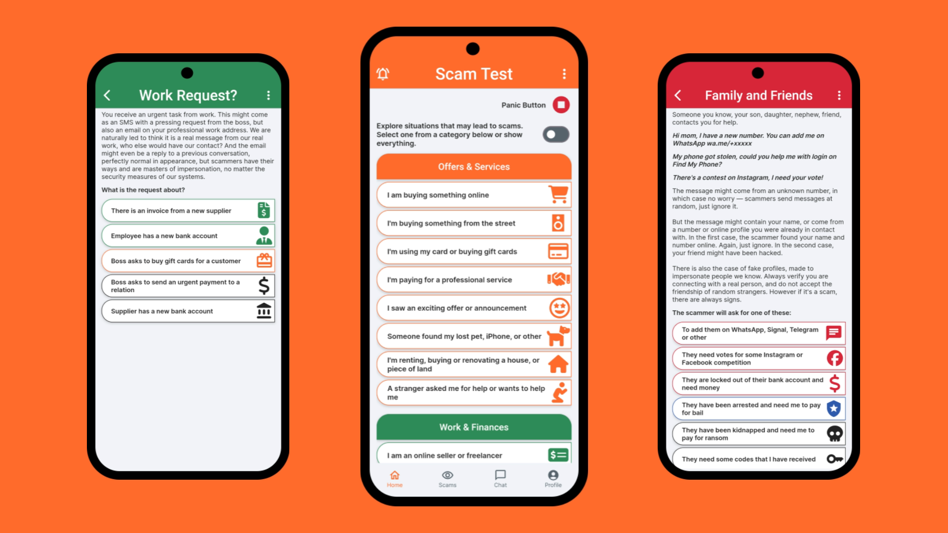
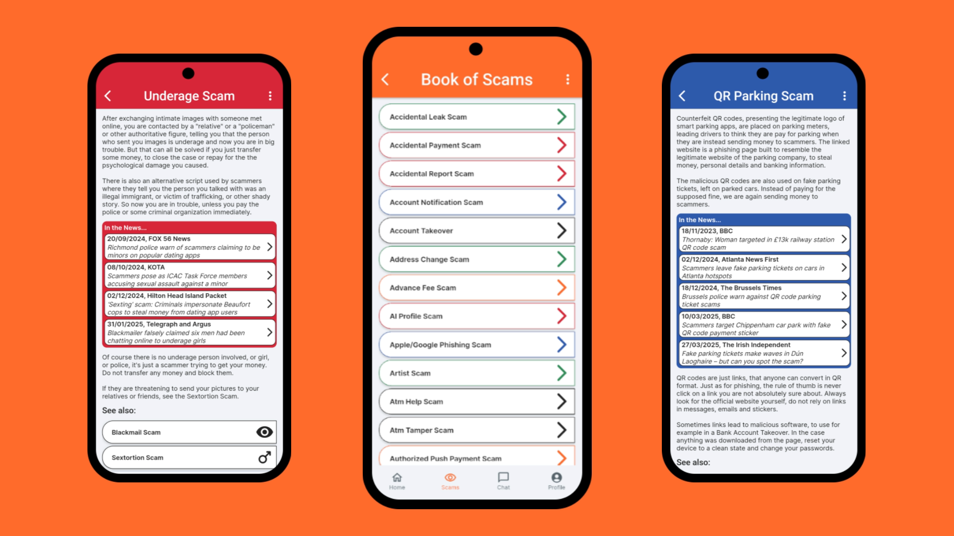
ScamTest presents the user with simple situations like "I'm buying something online" or "somebody is at the door" or "I got a job opportunity". By going through the possible fake scenarios created by the scammer, the user gets to the scam which awaits at the end.
Each scam (145 in total) is described briefly and in simple details. Examples from the news are linked to learn about what happened in real cases of the specific scam. Additional resources are presented where necessary, for example the Apple/Google Phishing Scam contains links to the official Apple and Google page to secure back your compromised account, and the Crypto Scam to the California DFPI Crypto Scam Tracker which collects the latest emerging crypto scam instances.
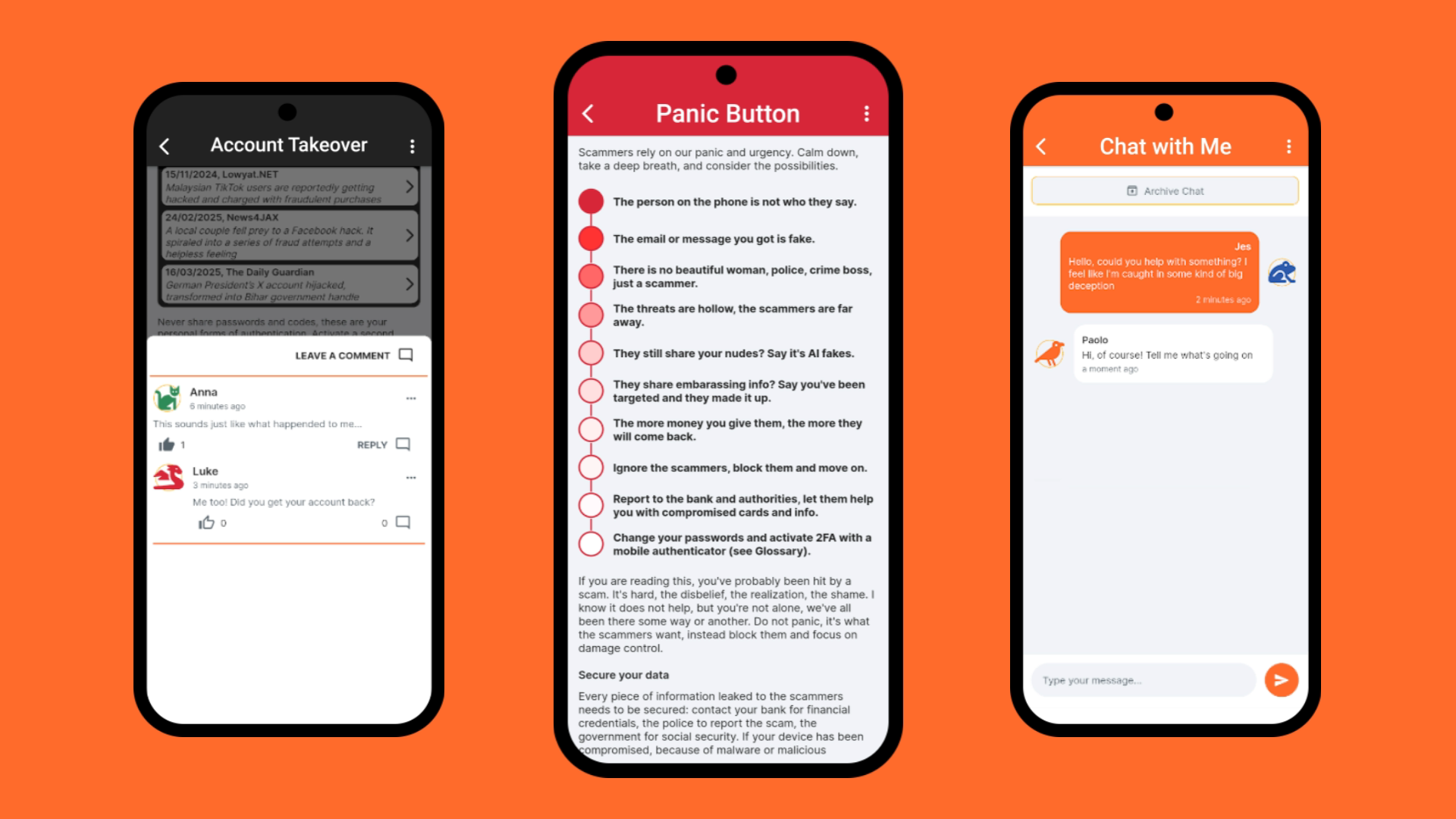
The user can also consult directly the list of scams or the list of all example news categorized by scam, and sort and search through them. For users who might be right now caught in a scam, there is a Panic Button to help with the most immediate actions to take.
With a subscription, ads are disabled, the user can comment, reply and like on every scam, and receive insights (new articles written by me) about scams and their variations and comment on them too. With a yearly subscription and renewal the user also gets one chat token, to initiate a private chat with me about their own scam and receive personal advice. One chat token can be bought if the user has none.
How we built it
With FlutterFlow! And a lot of custom coding. While FlutterFlow helped immensely in building a clean, colorful, responsive interface, there were so many things that I wanted to customize, so I did. Error messages, the App Bar, the Nav Bar, pagination of comments, icons, sorting of scams and news by name, category, dates... The beauty is that FlutterFlow guided me, which I needed especially in the first months since I never used Flutter or built an app, but let me customize it all when I started understanding.
Challenges we ran into
I have experience as developer, but it was my first time creating an app, so everything was a challenge. But the hardest were the ones I did not see until they were right in front of me. I wanted to implement a comment system, and surely many before me did, so I thought I would just find a guide, learn from the best, and implement it in my project. But once I got there, the questions started popping up: how many comments to load, should it be possible to reply, how many replies to show, how to show further replies, and so on and so on. I wanted a place for discussion, so I definitely wanted replies. But that also opened the question, what to do when the parent comment gets deleted? And how to handle moderation? Finding out there were infinite answers to these questions, and infinite ways to implement them, and to go wrong, was... scary.
So I took pen and paper, wrote down my requirements, and started working on a structure, a logic that could work. And it worked, but soon enough I ran into a huge "block": I wanted users to be able to choose a profile name and avatar for their comments, and to be able to change it at any moment and see that reflected in their old comments; I also wanted to show the number of comments under the pages, and the number of replies to each comment. This was possible with the Firebase implementation I created, but also generated an enormous amount of reads. I could choose to let the user only set their profile once, but for the number of comments I could not see a real solution. So I thought, what if I keep using Firebase for authentication, but use my own database for profiles and comments?
And so I created my own database and API, using Google Sheets + Apps Script. I didn't even know it was possible, but it was amazing. I could have the users inserts comments, edit them, delete them, keep a copy of the deleted comment, change their profile, even keep details of their subscription. I could use it to publish new articles and easily organize them. And with simple spreadsheet formulas, I could even show the number of comments under each article and scam page, and the number of replies to them. The only thing that worried me was that the project wasn't easily scalable, for the authentication I could just make a call to Firebase but what if one day I needed a bigger database? And this system would still not be as secure and easy to manage as in the first instance of the app.
So I looked for a different solution, one more reliable, with a secure database for the personal data and authentication for the users, flexible as what I had but professional and all-in-one, and started looking at Supabase, which is the other option proposed by FlutterFlow. And there I found exactly what I needed for the project, a flexible database with APIs, where I could create views to show reply count and profile details always up-to-date. It took me some time to understand yet another system, but after a successful small test I slowly re-created my Google Sheets structure and logic in Supabase tables, built little by little my own API as an Edge Function, and got to a working commenting system.
I was ecstatic, not only premium users could leave comments, although "premium" was just a flag set manually in the database at that time, but they could change their profile, edit their comments, like other comments, or even report them if the content was inappropriate. And on top of that it was privacy friendly, users could delete each comment independently from replies, and by deleting their account all of their content would be automatically deleted. I even implemented permissions to block a user from writing in case of abuse. Little did I know that my next big step forward, notifications of replies, would break my carefully crafted pagination of comments, since I was loading something outside of that system. But then in time I found a solution for that too, and that's another story.
Accomplishments that we're proud of
I made my first app, and it's public on the Play Store!! But more specifically, the comment system and notifications I mentioned above, and the last feature I wanted for the app and implemented before launch, the chat system. I thought initially it wouldn't be that different from the comments, and the insights, just use an API and keep track of what you loaded. Oh I was wrong, of course a chat system must be realtime, so there I went to learn and implement another completely different way of handling the data.
And when it did work, and I understood how to subscribe the user to realtime channels, and only for the data they were authorized to see, and only for the ones with active channels to listen to, I found out the connection would drop as soon as the app went to the foreground. And that happens even when you are just looking at the notifications on the phone, everything that removes the focus from the app. But even getting to this point of understanding what was happening, why the connection would just drop, took learning about the app lifecycle first and exploring the actual library implementations of the connections I was using.
This led me to add a lifecycle listener, activated only in case the user has active chats, and check for chat updates on resuming the app. And in the meantime refine the whole system of subscribing and unsubscribing to channels and loading the messages, going from the default solution of a backend query tied to a ListView which FlutterFlow made very easy to use, to my own default functions decoding messages from JSON and loading them into my messages app state. This would avoid any unnecessary reloads, since I could just send the timestamp of the most recent message in the app state and load only the chat updates newer than that.
One another thing that makes me very proud about the app, that it's beautiful. I might be biased of course, but it wasn't like this when I started the Closed Testing on the Play Store, it became like this after a lot of tinkering and changing and trying following the tips and impressions of my testers, the friends recruited to help me check the app and be accepted in production. A good interface needs to be pleasing and intuitive, otherwise it's a failure.
The first thing my friends noticed is that every link in the app was on the icon, not the container. They would try to push on what understandably looked as a clickable element, but nothing happened. Some thought the links were just broken. The issue was I had created the app with mouse and keyboard, it never even came to me that having the app in your hands you'd expect a totally different experience, the experience of an app. And so I changed every link in the app, a monstrous operation at that point, but totally necessary. And they also suggested me to add a navigation bar for the main pages, the custom widget I added at the bottom, a check to see if there is an internet connection before any call, fixes for many side cases they found during test I didn't even imagine about, and most importantly a more balanced set of colours, especially for the Dark Mode setting, which in the start was just the same as the Light Mode with the white switched to black. I see them now as the classical, more serious look, and the slick, dark/modern version, and love them both.
What we learned
I learned that building an app is not so much as slapping a decent enough design together and publishing it. That an idea is only the start and even with vibe coding it will not bring you that far without determination and real programming skills. That programming, and publishing an app is nothing like making a website, something at least I had experience with. And that there are no easy solutions for features we so easily take for granted in many popular apps, that behind there is so much effort and logic, and no guide can tell you how to implement your specific version of these features, the idea of the app you see in your mind.
What's next for ScamTest
That's another lesson learned, an app is never complete. Many pages in ScamTest have the same structure but different content. Going back, I would have made a template and just passed the content to it, and I'd like to implement that. This would reduce the size of the app and also allow to make translations for it, as the content could be shown based of the user selected language.
Also I had my first review with the suggestion to add more images. ScamTest is exploding with information, and of course images could simplify scam descriptions, they are worth a thousand words. But as the reviewer also suggested, it would need a heavy library of images, at least 145 to characterize each scam. But I like the suggestion and I'm thinking, maybe with some clever solution, and after reducing the size of the app with templates...
And of course I am imagining more features, like a quiz to test your scam awareness, maybe based on your interest on scams for students, employees, pensioners. Maybe an AI to help analyze scam situations. But I think I'll take it slow, proceed step by step based on the reaction of the users, maybe first publishing for iOS if the app is appreciated. And then we'll see :D
Built With
- cloudflare
- flutterflow
- resend
- revenuecat
- supabase

Log in or sign up for Devpost to join the conversation.