-
-
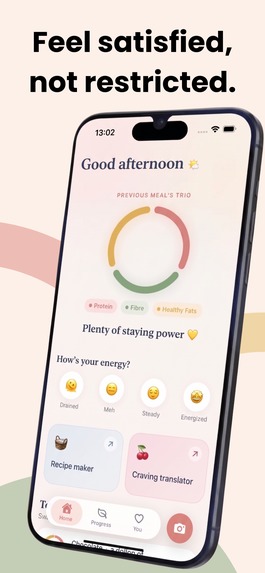
Satisfed helps users build more satisfying meals without calorie counting or guilt.
-
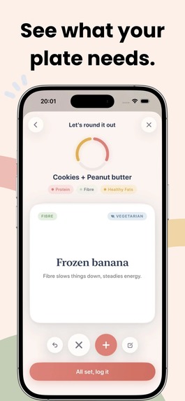
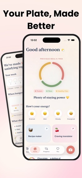
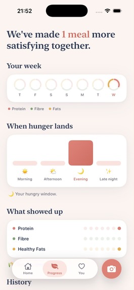
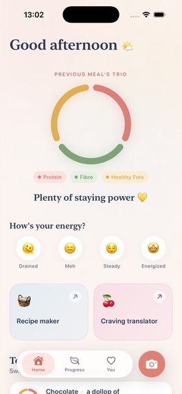
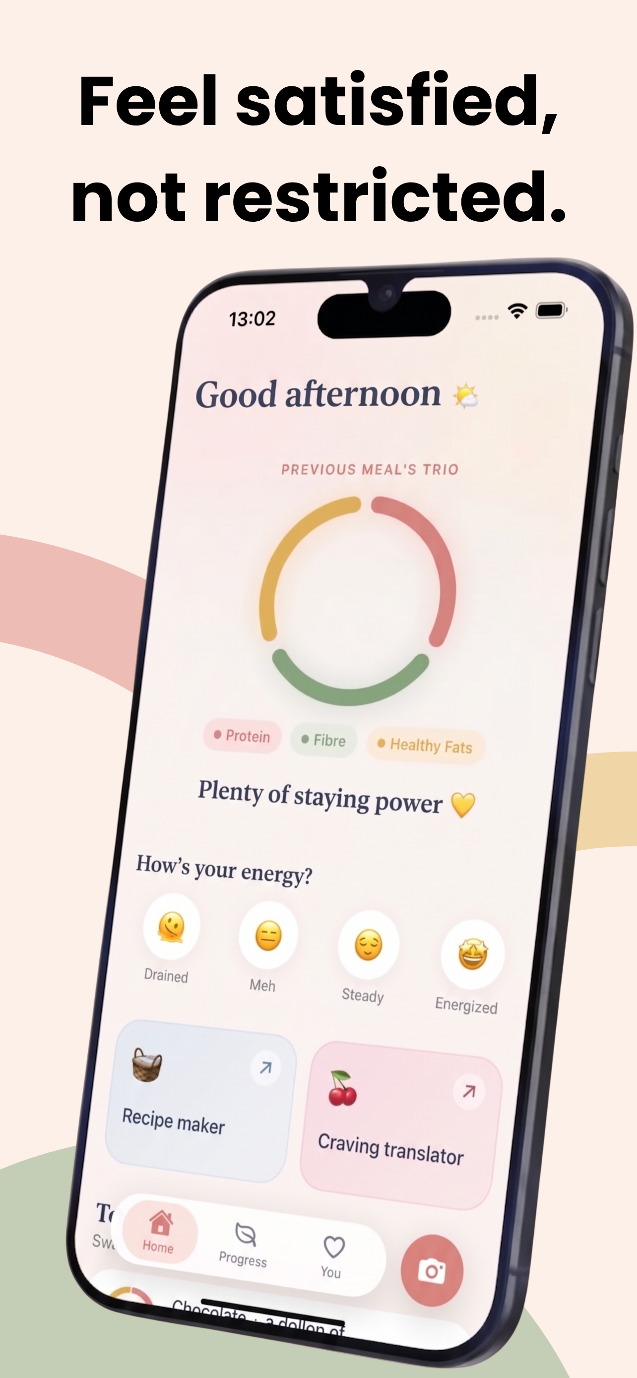
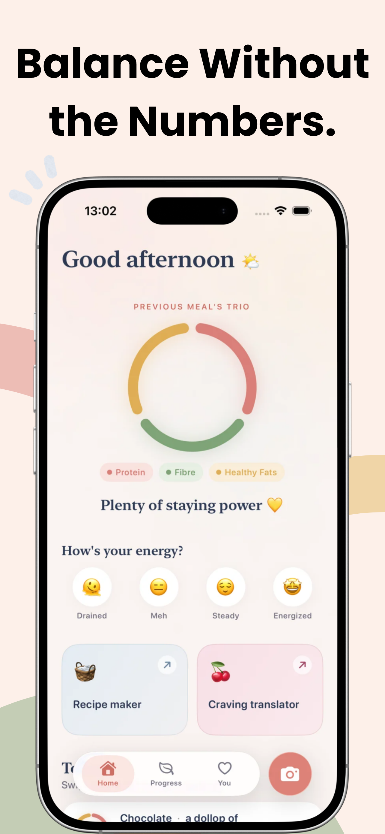
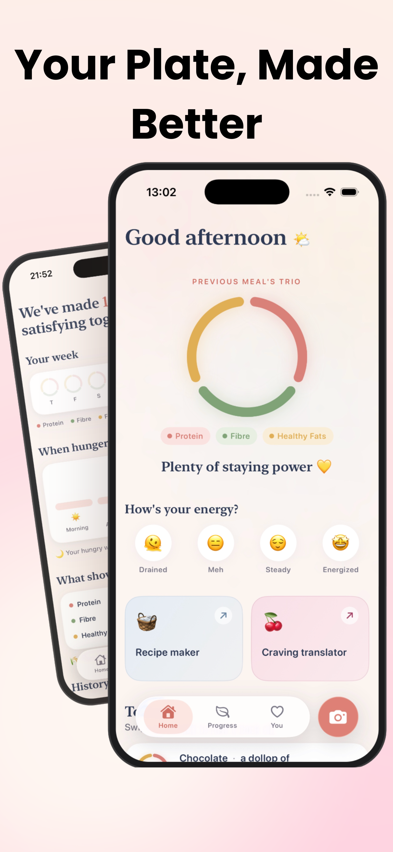
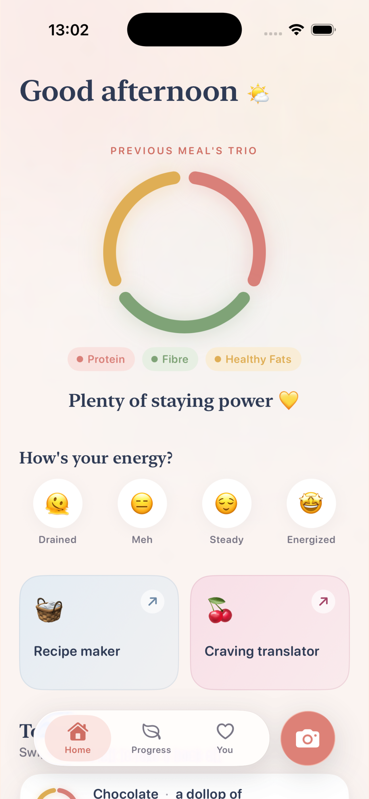
The Trio Ring highlights protein, fibre, and healthy fats at a glance.
-
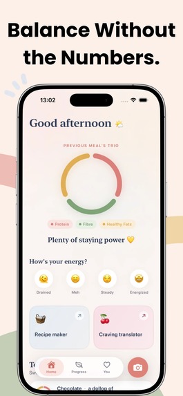
The Trio Ring gives users a simple visual guide without calories, macros, or restrictive targets.
-
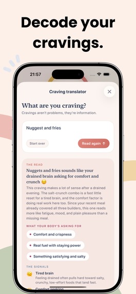
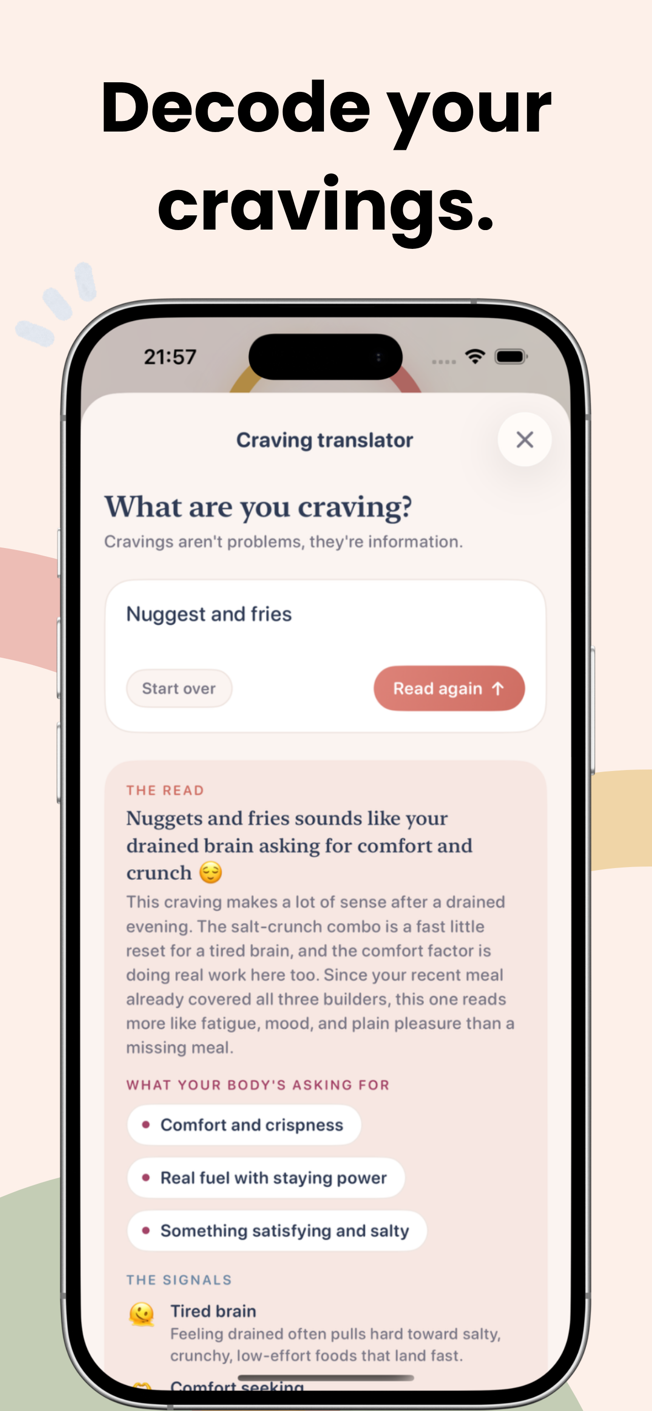
Craving Translator helps users reflect on hunger, mood, energy, and recent eating patterns.
-
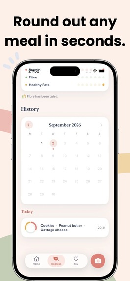
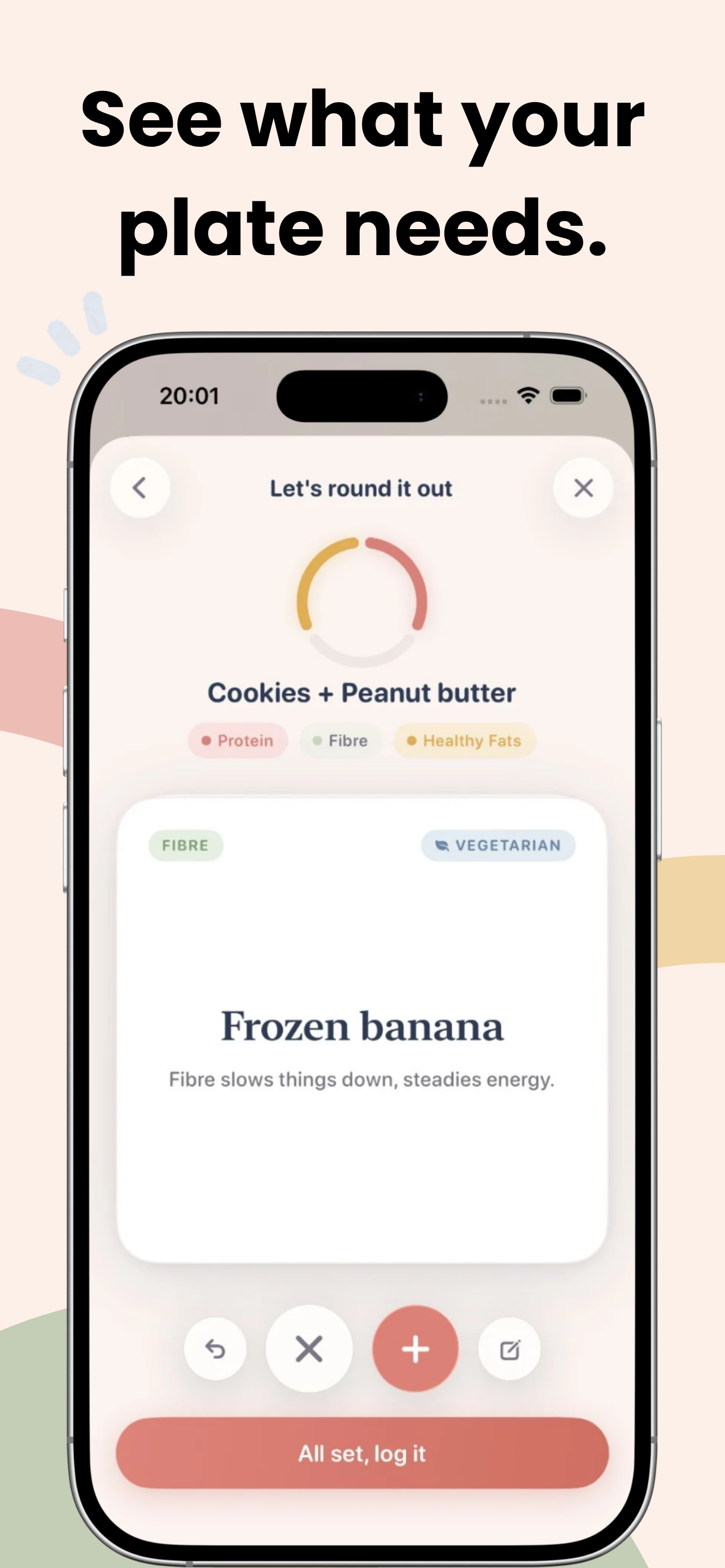
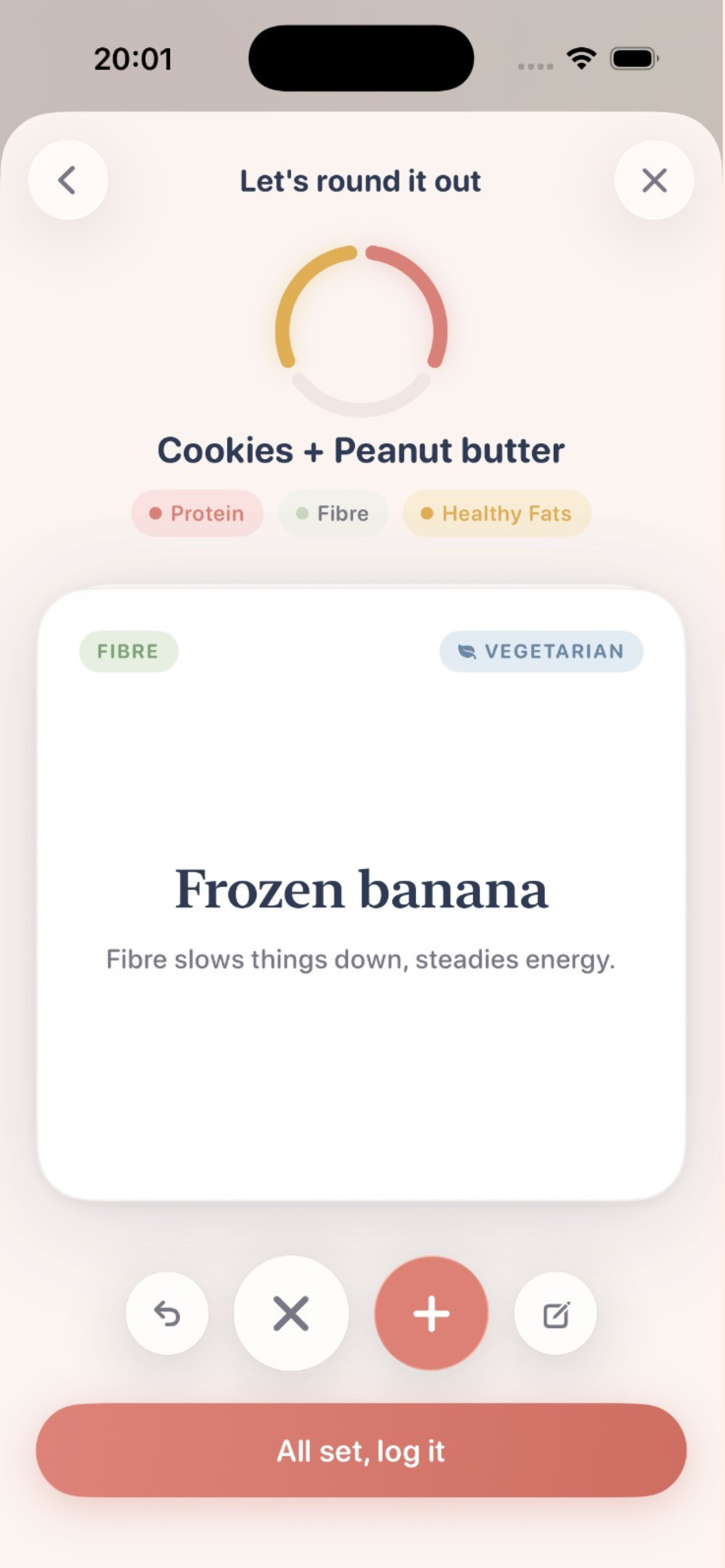
Users can quickly discover simple additions that complement what they are already eating.
-
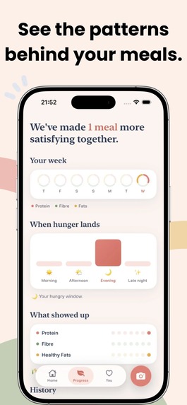
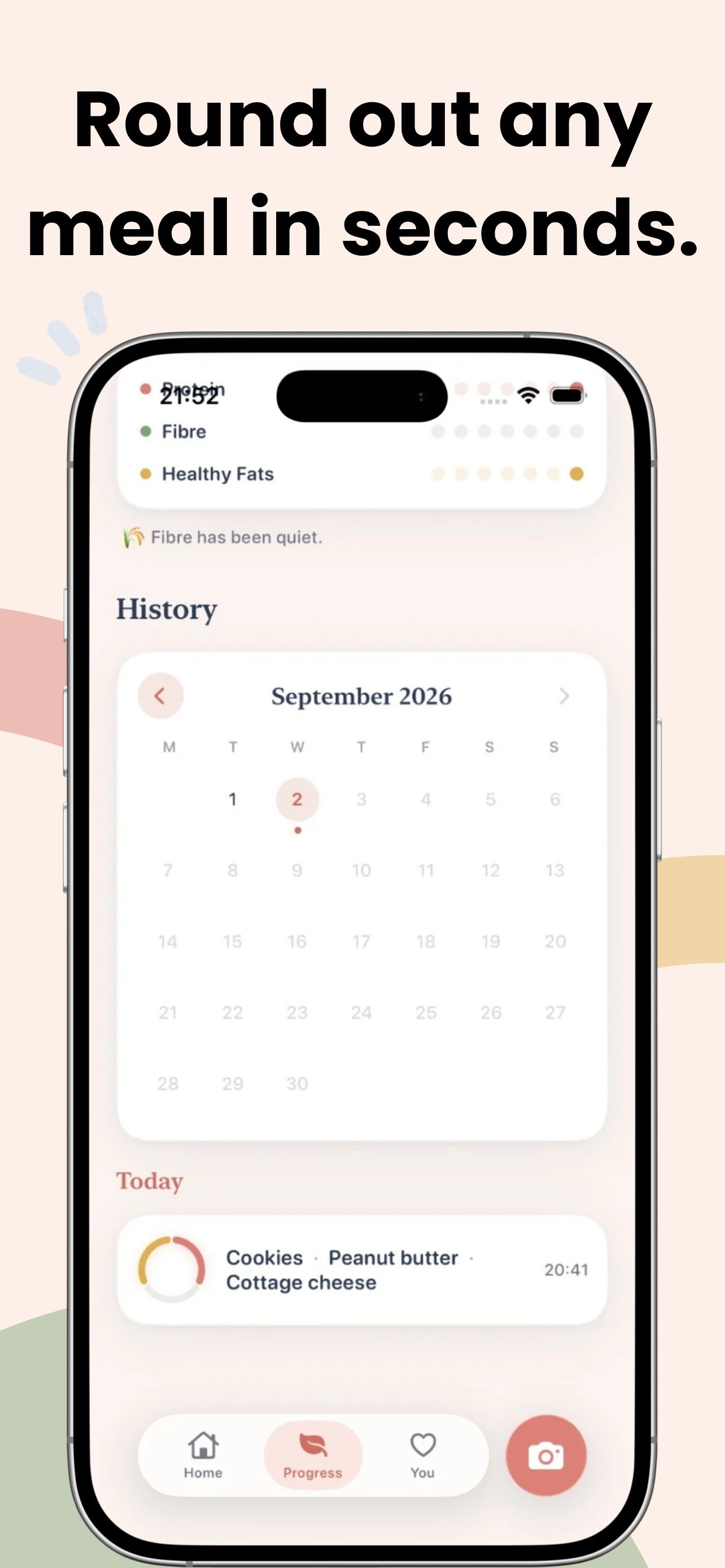
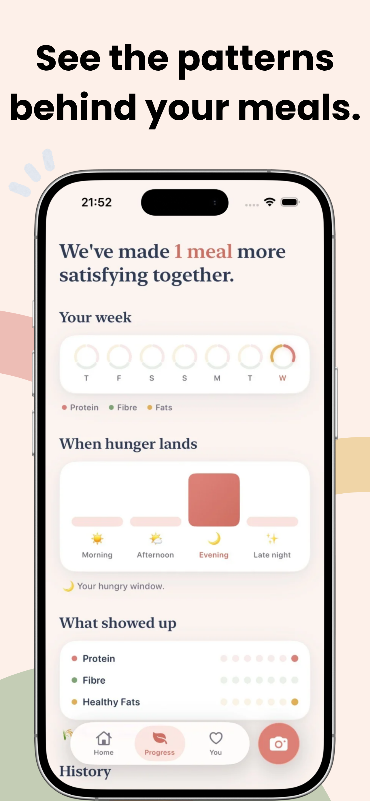
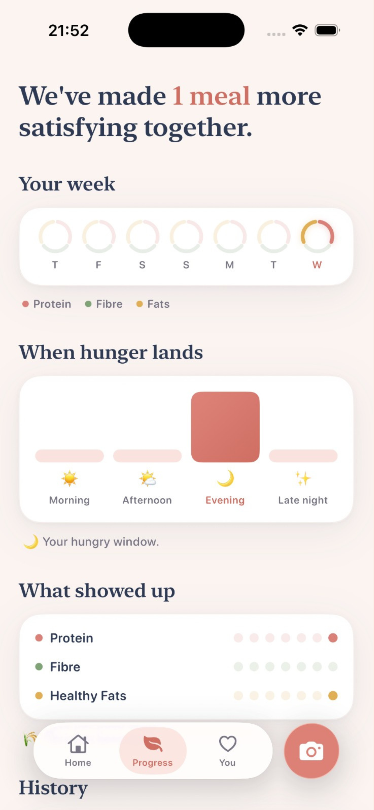
Satisfed helps users notice how their meals and hunger change over time.
-
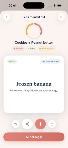
Satisfed suggests small additions instead of telling users what they should remove.
-
-
-
-

app icon

Inspiration
When we saw Abbey's Influencer challenge, we immediately understood the problem she was describing.
We are a team of two who relate to many of the struggles around nutrition. We want to eat healthier, reach certain weight goals, and feel better, but constantly thinking about calories, what we should eat next, and whether a food is "good" or "bad" can become exhausting.
And when we eat something we genuinely crave, like chocolate or chips, it is easy to feel guilty afterward. Sometimes that small moment can negatively affect the rest of the day.
When we saw Abbey's category and the framework she created, it inspired us to build something that approached nutrition differently. Instead of telling people what to restrict, we wanted to help them make their meals more satisfying by showing them what they could add.
What the App Does
satisfed helps users make everyday meals more satisfying without calorie counting or restrictive food rules.
Users can take a photo of their meal or describe what they are eating. satisfed identifies whether the meal contains three key components: protein, fibre, and healthy fats, then suggests simple Easy Add-Ons for anything that may be missing. Users can swipe through those suggestions cards and choose an option that actually fits what they have, want, or feel like eating.
The app also includes a Kitchen Builder for turning ingredients already at home into meal ideas, and a Craving Translator that helps users reflect on factors like hunger, mood, energy, and what they have eaten earlier in the day. The goal is simple: instead of asking users to remove food, satisfed helps them decide what they could add.
How We Built It
satisfed is built in Swift and SwiftUI, with Firebase powering backend services. RevenueCat handles subscriptions, entitlement checks, and purchase restoration.
For the AI layer, we use OpenAI models through Azure to understand meals from photos or text, identify the balance of protein, fibre, and healthy fats, and generate relevant Easy Add-On suggestions. The goal was to keep the intelligence behind the scenes while making the user experience feel simple and immediate.
We also used Claude Code throughout development of the app.
Designing a Supportive, Effortless Experience
Our first step was creating the overall UI and UX. We wanted the app to feel especially relevant to millennial women, who often have to balance work, family, chores, eating on the go, and making the most of leftovers in their everyday lives. We saw a real need for a companion tool that could fit naturally into these situations and support their needs without being judgemental. At the same time, we wanted the experience to remain simple, intuitive, and accessible enough for anyone to use.
More importantly, nothing inside the app should make the user feel judged. The design, language, suggestions, and interactions all needed to feel supportive. If someone eats chocolate, the app should not make them regret it. It should simply help them think about what they could add to make that meal or snack more satisfying.
We knew two parts of the experience had to feel effortless: logging food and choosing an Easy Add-On.
For food logging, we decided to make the process image-based. Instead of manually searching for ingredients or entering calories, users can simply take a photo of what they are eating.
For Easy Add-Ons, we created Tinder-style swipe cards. Users can quickly browse suggestions, swipe left if they do not have or want something, and swipe right when they find an option that works for them. We wanted the interaction to feel familiar, fast, and almost effortless.
Challenges and What We Learned
One of the hardest product questions was also one of the simplest: What should be the main element on the home screen?
It is the first thing users see when they open the app, so it communicates what the entire product values. A calorie counter was obviously not an option. We also did not want to display food in a way that constantly encouraged cravings or pushed people to eat.
Eventually, we found the idea that shaped the whole experience: the Trio Ring. The Trio Ring shows whether the user's previous meal included three important components: protein, fibre, and healthy fat.
Instead of rewarding people for eating less, we reward them for making their meals more satisfying. Filling the three parts of the ring creates a simple positive goal. It encourages users to build meals that can help them feel fuller, more energized, and more satisfied without introducing calorie limits or guilt.
That decision shaped the rest of the product. Once we stopped asking how to measure restriction and started asking how to encourage satisfying additions, the experience became much clearer.
We also ran into some funny AI-related problems while building the recommendation system.
At one point, the AI suggested a boiled egg as an Easy Add-On for chocolate. While testing the app, we reacted by saying, "Eww, that's gross." The AI misunderstood us and thought we were complaining about the boiled egg emoji, so instead of changing the food recommendation, it changed "boiled egg" to "omelette."
It was a funny moment, but it also taught us something important. AI suggestions cannot simply be technically correct. They need to make sense in context and feel natural to a real person. We spent time refining the recommendation logic so the Easy Add-Ons would actually complement what someone is eating.
We also learned how important language is in a product like this. A single word can make a nutrition app feel supportive or judgmental. Throughout development, we kept asking ourselves whether each interaction made the user feel encouraged rather than controlled.
Business Model
After completing the core experience, we worked on the business model.
We decided to let every new user experience one complete Easy Add-On loop for free. This allows them to understand the value of the product before seeing the paywall.
Our goal was to make the value clear through the experience itself: log what you are eating, receive simple additions, choose something that works for you, and make the meal more satisfying without counting a single calorie.
What's Next
Our next focus is growth. We want to introduce satisfed to more people through short-form content, creator partnerships, and real-life meal examples that make our approach easy to understand and share.
We plan to work with nutrition and wellness creators whose audiences connect with a non-restrictive approach to eating, while testing different channels and messaging to understand what resonates most with our users. At the same time, we will keep improving the app based on what we learn from real users and how they use satisfed in everyday life.


Log in or sign up for Devpost to join the conversation.