-
-
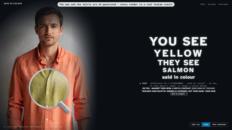
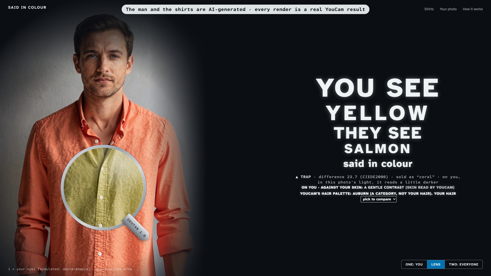
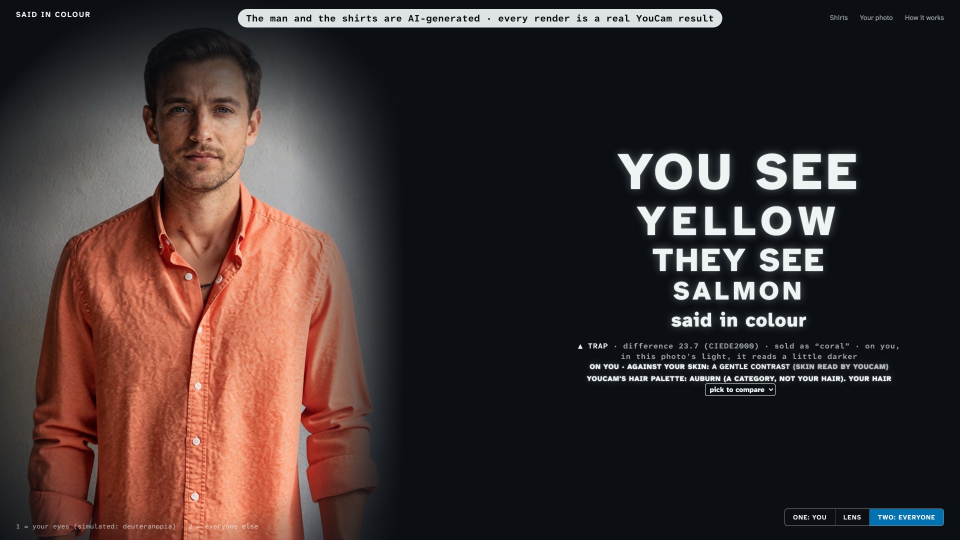
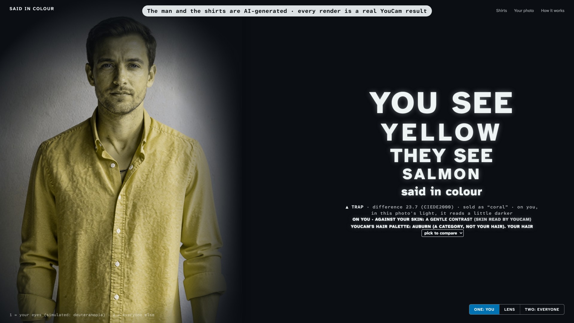
Coral shirt, green-weak eye: you see yellow, they see salmon. TRAP, difference 23.7. The man is AI-generated.
-
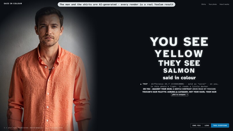
TWO: EVERYONE. The whole picture as everyone else sees it: the same YouCam render of the coral shirt, untouched.
-
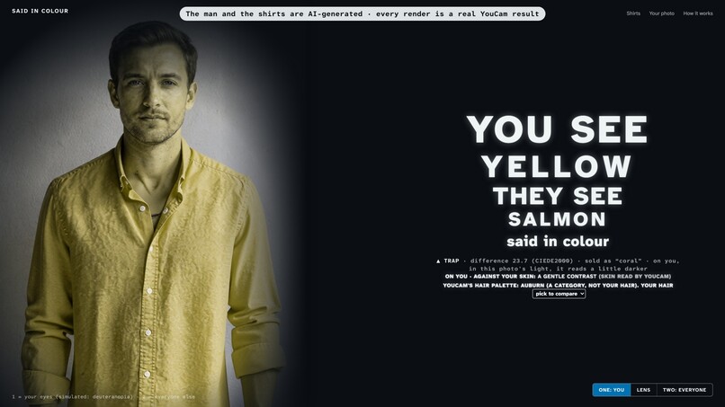
ONE: YOU. The same shirt and the same face through a simulated green-weak eye (Machado et al. 2009). The coral turns yellow.
-
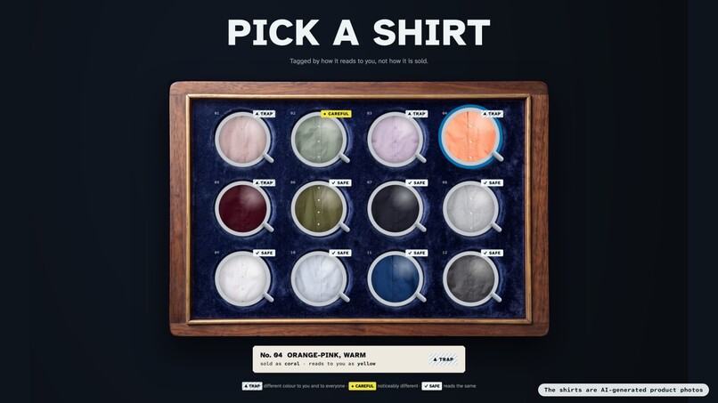
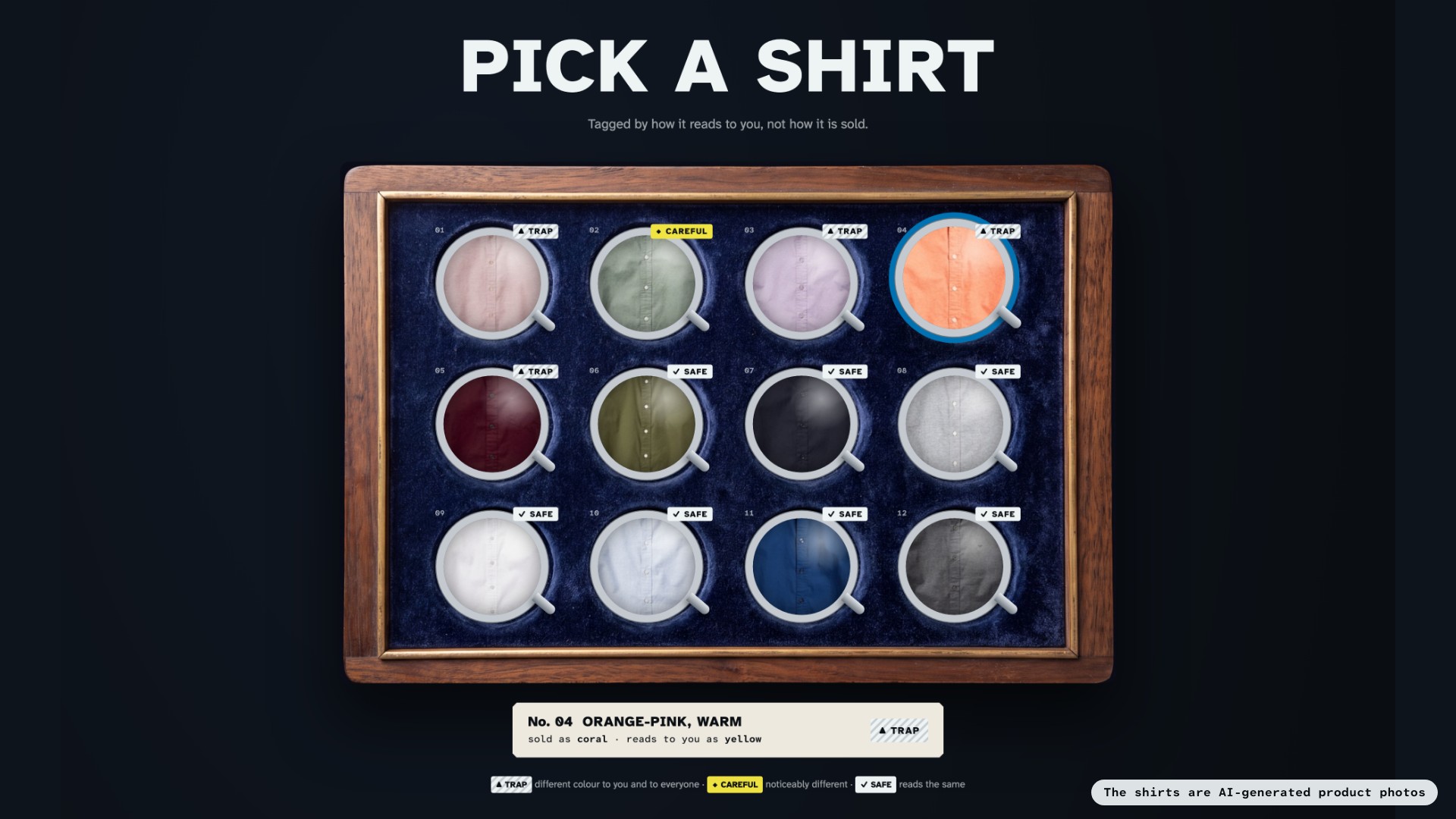
Twelve shirts, tagged by how they read to you: dusty rose, lavender, coral and burgundy are traps; navy, white, cobalt safe.
-
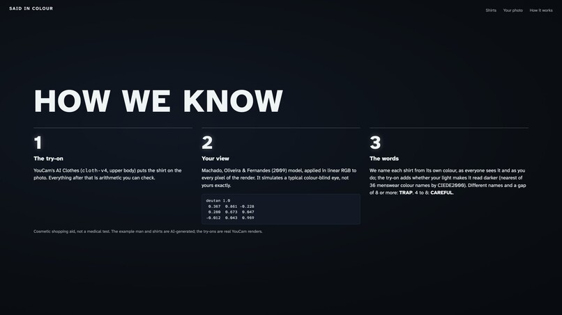
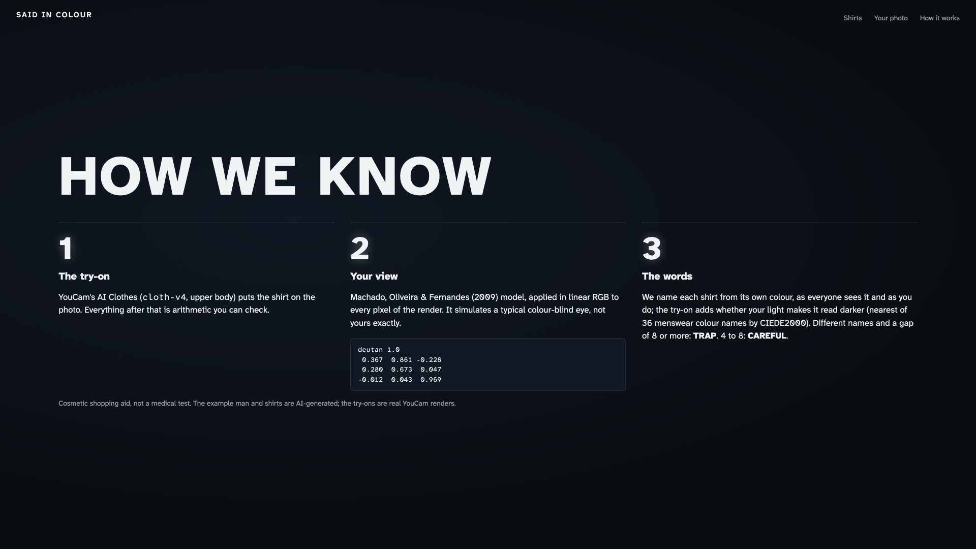
How we know: YouCam AI Clothes for the try-on, the Machado matrix on every pixel, 36 colour names by CIEDE2000.
-
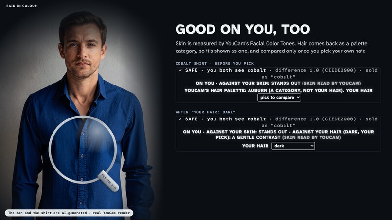
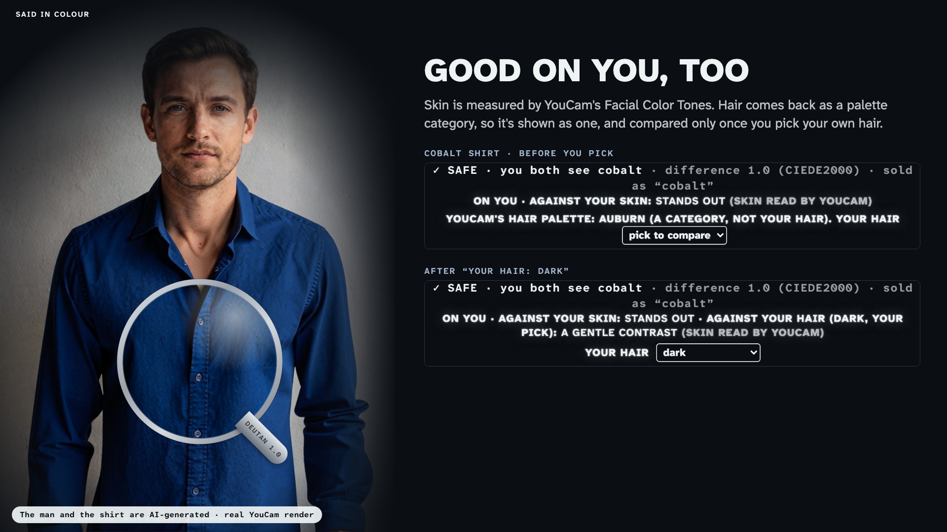
Skin from YouCam's Facial Color Tones. Hair is a palette category, so it's compared only once you pick your own.
The shirt that came back pink
Picture a man ordering a light grey shirt. It looks grey to him in the photo, the listing says "dusty rose", and that means nothing to him. It arrives, he wears it to dinner, and his sister asks why he went for pink.
For a lot of men that's an ordinary week. Red-green colour vision deficiency affects about 1 in 12 men of Northern-European descent and about 1 in 200 women (National Eye Institute; Colour Blind Awareness), and the green-weak kind, deuteranomaly, is the most common. Their world isn't grey. A few colours fold into each other, so pink and khaki can end up as the same word. The usual fixes are asking someone every time, or giving up and wearing black, navy and grey.
Shops pay for it as well. In a 2023 Coresight Research survey of 100 US apparel brands and retailers, colour came second only to size and fit among reasons for online returns: 16% of respondents named it, against 53% for size and fit (Coresight Research, 2023).
A fitting room that says the colour out loud
You give it one photo from the chest up. YouCam's AI Clothes puts the shirt on you, and the page answers the question he would otherwise text to someone: what colour is this, really?
It answers twice. The big words say what you'll see and what everyone else will see, "You see light grey. They see pink." A verdict sits under them, TRAP, CAREFUL or SAFE, with the colour difference as a number you can check. When a shirt is safe there's one name only: "you both see navy".
Then there's the picture. A steel loupe sits on the shirt; inside the lens is your view, outside is everyone's. You can drag it, or flip the whole photo between ONE: YOU and TWO: EVERYONE. The words are for him. The loupe is for the partner who keeps getting asked, so they can see the problem for once.
A few more things around it:
- The case. Twelve shirts in a trial-lens case, each tagged by how it reads to you, not how it's sold. For a green-weak eye, dusty rose, lavender, coral and burgundy come up as traps, while navy, white and cobalt read the same to everyone.
- Your eyes, your setting. Green-weak, red-weak or blue-yellow, with a strength slider. Every tag and word follows it.
- Your light. The app finds the shirt by the pixels the try-on changed on your photo, and says when your light makes it read darker or lighter.
- Good on you, too. YouCam's Facial Color Tones reads your skin, and the same colour maths says whether the shirt stands out against it, sits in a gentle contrast, or is close enough to wash you out. Hair is different: the API returns a palette category, not a measurement (a grey-haired man and a dark-haired man both came back "Auburn"). So the page shows it as "YouCam's hair palette: Auburn" and only compares the shirt with your hair once you pick your hair colour yourself.
What we got wrong on the way
Our first version called the same shirt two different things. The big words read the photo and the case read the product, and in shadow a navy shirt came out "black" in one place and "navy" in the other. For an app whose whole job is naming colour, that was the worst bug we could have. Now one reading names every shirt from its own colour, and the photo only adds "darker" or "lighter".
The second problem was our own interface. The people we built it for are the one audience we can't signal to with red and green. Every verdict carries a shape and a word as well as a colour (▲ trap, ◆ careful, ✓ safe), and a test runs each text and background pair on the page through our own simulation and checks it still has 4.5:1 contrast.
And we had to make the problem obvious in about five seconds. The loupe and the whole-picture flip came out of that: one shirt, two colours, the same face.
Two YouCam calls and a 2009 paper
- AI Clothes,
POST /s2s/v2.0/task/cloth-v4withgarment_category: upper_body, puts the shirt on your photo. Most try-ons exist to tell you that you look good. We use the render to find the shirt on you, and then tell you the truth about its colour. - Facial Color Tones,
POST /s2s/v2.0/task/skin-tone-analysis, gives the skin colour behind the "good on you" line, plus a hair palette category we show as a label, not a verdict. - Uploads go through
POST /s2s/v2.0/file.GET /s2s/v1.0/client/creditlets the live demo hold back a reserve of units.
Everything else is our own code. Your view uses the Machado, Oliveira & Fernandes (2009) model in linear RGB on every pixel. For milder settings it takes the paper's own matrix for each 0.1 step of strength instead of blending. The names come from the nearest of 36 menswear colour names by CIEDE2000, and our CIEDE2000 matches the published test data for the formula. The shop's own name wins when the colour really is that colour, so cobalt stays cobalt. Different names plus a difference of 8 or more is a TRAP, 4 to 8 is CAREFUL, anything else is SAFE. There are 17 tests, the contrast check among them.
Where it stops
It's a shopping aid, not an eye test, and the page says so. It simulates a typical colour-blind eye; yours may differ. The method panel shows the actual Machado matrix, so anyone can check the working.
Your photo goes to YouCam for the try-on and the tone reading, and we keep none of it. The API key lives in one server function that only answers our own page, with an hourly share per visitor and a daily ceiling.
The man in the demo and the shirts are AI-generated. Every render of him is a real YouCam result, kept so the demo opens instantly without spending units. Your own photo always runs live.
Next fittings
- A study with colour-blind shoppers: how often they name the shirt right with the app and without it. We haven't run it yet.
- A real retailer's catalogue, each product measured the same way, so the tags sit on live listings.
- An outfit check, two garments at once, for the clash that's invisible to him and obvious to everyone else.
Try it
- Live: https://said-in-colour.netlify.app. The example shirts open instantly; your own photo runs a live try-on.
- Code: https://github.com/chainwright/said-in-colour
Built With
- ciede2000
- css3
- google-fonts
- html5
- javascript
- netlify
- node.js
- youcam-api

Log in or sign up for Devpost to join the conversation.