Try it out!
Inspiration
I've spent over two years interning at the Fred Hutchinson Cancer Center, witnessing the excitement researchers have for interactive and intuitive dashboards that bring their data to life. I joined a team building these tools, and saw firsthand how transformative they could be. With the huge leaps in AI over the past year, I wanted to attempt implementing a solution that could be applicable in a bioinformatics setting.
I got into programming young through game development, but knowing the stories of people affected by cancer made me realize I wanted my work to matter in a deeper way. At 15, I started teaching myself bioinformatics because I saw a field where technology could genuinely accelerate life-saving research.
Right now, there are very limited tools that combine interactive visualization with intelligent natural language interpretation, leaving a gap between seeing patterns in data and understanding what they mean biologically. For this reason, I created Sagene.
What I Learned
Building Sagene taught me that the most powerful AI applications aren't just about intelligence—they're about context. Integrating the Gemini API with the Model Context Protocol (MCP) showed me how combining a generative model with domain-specific tools like STRING-DB creates something greater than the sum of its parts. The AI doesn't just answer questions; it answers your questions about your data.
I learned that user experience decisions ripple through the entire architecture. When I added the ability to select points on the volcano plot and automatically pass those genes as structured context to the chat, it fundamentally changed how the tool felt. It went from "visualize then ask" to "explore and discover together." Small details—like context controls for disease type and comparison groups, hover tooltips showing gene names, or the way selected genes turn into JSON context invisibly—transformed Sagene from a simple dashboard into one that can be used in a flowing conversation.
On the technical side, I discovered the challenges of orchestrating multiple systems. Running a Python MCP server alongside a Node.js backend required careful process management, working directory handling, and robust error recovery. Getting Plotly's WebGL scatterplot to scale smoothly with thousands of genes while maintaining snappy selection events taught me the value of choosing the right rendering engine. And designing the chat to parse Markdown, render images inline, and handle function-calling responses from Gemini pushed me to think carefully about state management and UI responsiveness.
Most importantly, I learned that democratizing complex tools isn't about dumbing them down. It's about respecting both the sophistication of the science and the researcher's need for clarity.
How I Built It
Sagene has three core layers working in harmony:
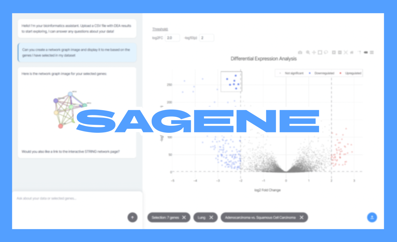
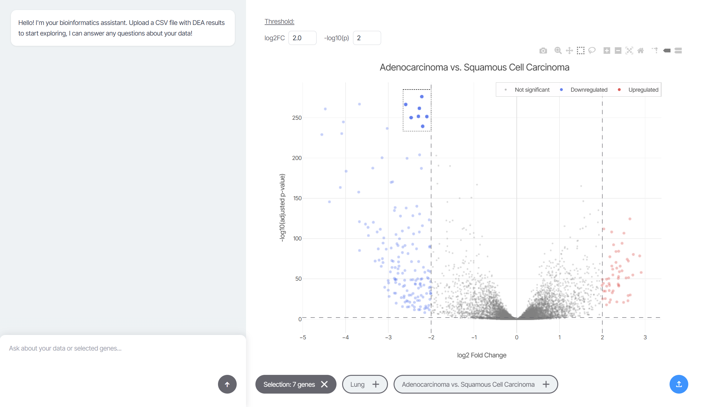
Frontend (Interactive Visualization): Built with HTML, CSS, and JavaScript to keep it fast and dependency-light. Plotly.js powers the volcano plot using scattergl for WebGL-accelerated rendering, which handles thousands of data points without lag. The plot supports box and lasso selection tools, and every selection triggers an event that captures the genes, their fold changes, and significance values. That selection data gets serialized into structured JSON and stored as context.
The interface includes three "context pills" at the bottom: one for the current gene selection, one for disease type, and one for the comparison groups (like "Adenocarcinoma vs. Squamous Cell Carcinoma"). These pills control what invisible context gets injected into every AI prompt. If a pill is active, its data flows into the conversation. If it's disabled, the AI ignores it. This gives researchers fine-grained control over how much biological context shapes the answers.
Backend (Node.js + Express): The server acts as a bridge between the frontend and two external systems. First, it proxies requests to the Gemini API (gemini-2.5-flash) with the user's chat messages plus any active context from the pills. Second, it manages a local Python MCP server that wraps STRING-DB functionality.
The MCP integration was one of the most exciting breakthroughs. Using the @modelcontextprotocol/sdk, I set up function-calling so Gemini can invoke STRING tools directly. When the AI decides it needs a protein-protein interaction network, it calls a function like get_network, the MCP server queries STRING, and returns both the network image URL and metadata (enrichment terms, interaction scores). The backend then streams that response back to the frontend, where the chat renders the image inline.
MCP Server (Python + FastMCP): This lightweight wrapper communicates with STRING-DB's API. It exposes tools for fetching interaction networks, querying genes, and retrieving functional enrichment. The server runs over stdio/HTTP transport and returns structured JSON responses that Gemini can parse and use.
Data Pipeline: For the demo, I used a Jupyter notebook with PyDESeq2 to perform differential expression analysis on lung cancer RNA-seq data from cBioPortal. The notebook compares two groups—Adenocarcinoma vs. Squamous Cell Carcinoma—and outputs a CSV with log2 fold changes and adjusted p-values. Sagene auto-detects common DEA column names during upload, so it works with outputs from DESeq2, edgeR, or other tools without manual configuration.
Challenges
MCP Reliability: Getting the Python MCP server to start consistently was harder than I expected. Issues with working directories, environment variables, and Python version differences across systems meant I had to add fallback logic and detailed error logging. When it finally worked—when I saw the first STRING network render in the chat—I actually got up from my chair. That moment of seeing the AI call a function, query a real biological database, and return a scientifically accurate network felt like magic.
Context Architecture: Designing how context flows from the visualization to the AI required careful thought. I didn't want users to manually copy-paste gene names. The solution—invisible JSON context attached to every message, controlled by pill toggles—took several iterations to get right. But once it clicked, the experience became seamless. You select genes, ask a question, and the AI just knows what you're talking about.
Plotly Selection Events: Making box and lasso selection feel natural required tuning Plotly's event handlers. I had to distinguish between clicks (which should show hover info) and drag selections (which should capture gene sets). Getting the selection summary (count, mean fold change, etc.) to update instantly without blocking the UI took some async coordination.
Rendering AI Responses: Parsing Markdown from Gemini, handling images (especially network graphs), and escaping user input to prevent XSS required careful attention. I built a custom formatter that handles code blocks, images, links, and plain text while keeping the chat UI clean.
What's Next
SaGene is just the beginning. Here's where I want to take it:
Session Persistence: Save selections, context, and chat history so researchers can return to their analysis later or share findings with collaborators.
Enrichment Pipelines: Add built-in GO (Gene Ontology) and KEGG pathway enrichment so users can explore functional categories directly in the interface.
Multi-Omics Support: Expand beyond RNA-seq to proteomics, metabolomics, and epigenetics data. Imagine selecting protein expression changes and asking the AI how they relate to gene regulation.
Batch Export: Let users export selected genes, enrichment results, and network images as publication-ready reports.
Deployment: Containerize the entire stack (Node backend, Python MCP, frontend) for deployment to cloud platforms. This would make Sagene accessible to labs without technical infrastructure.
Collaborative Mode: Enable multiple researchers to explore the same dataset simultaneously, with shared selections and AI conversations.
Every biologist should be able to ask their data questions and get answers that accelerate discovery. Sagene is a step toward that, where the barrier between raw data and actionable insight disappears, and research teams spend less time deciphering spreadsheets and more time curing disease.
Built With
- css
- express.js
- fastmcp
- gemini
- html
- javascript
- mcp
- plotly
- python
- string-db


Log in or sign up for Devpost to join the conversation.