-
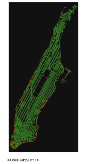
NYC_Safe_Regions
-
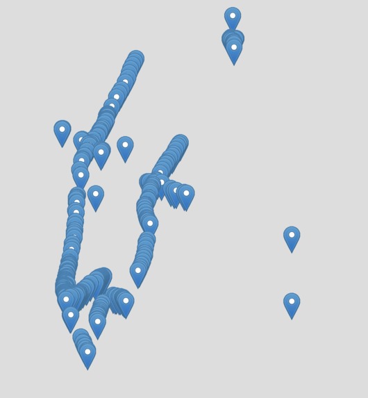
NYC_Safe_Regions_Folium(slow to load)


Inspiration
Traveling safely during the pandemic
What it does
Streams real-time NYC road traffic data on a map to help people decide where it's safe to travel
How I built it
1) Web scrapping real-time traffic information using python 2) Spark to stream data and plot it on a map The visualization includes red and green regions, Red color indicates areas where the traffic is greater than 15 cars The green is the rest of Manhattan Further, I've used folium (map visualization) to visualize each car on the map, using the longitude and latitude of the car. However, folium takes a long time to load, hence I've also used osmnx to cluster cars that are near by and mark these regions as red.
Challenges I ran into
Streaming data in real-time. Real-time data is hard to get. Further, pyspark resources are minimal, at least regarding spark streaming.
Accomplishments that I'm proud of
Different visualization techniques Streaming real-time data
What I learned
Spark is a new technology that I'm slowly trying to get a grasp of, this was a good experience in that sense. Also, web scraping and a little bit about how to break down real-time information and aggregate it to form visualizations.
What's next for SafeTravel
Expand it further beyond just NYC, maybe across the country. Predictions on road traffic, using SparkMLlib

Log in or sign up for Devpost to join the conversation.