Inspiration
The challenge brief had a line that stuck with us: spot the spark before it becomes a raging fire. The other thing that hit us was the framing of One Health. 75% of new infectious diseases in humans originate in animals, but most surveillance systems treat human, animal, and environmental health as separate problems. There's no real-time, person-level surveillance system in Arizona that connects all three.
We also kept thinking about the engagement question. Apps like Flu Near You ran for almost a decade and struggled to keep users reporting. We didn't want to build another symptom checker that nobody opens twice.
What it does
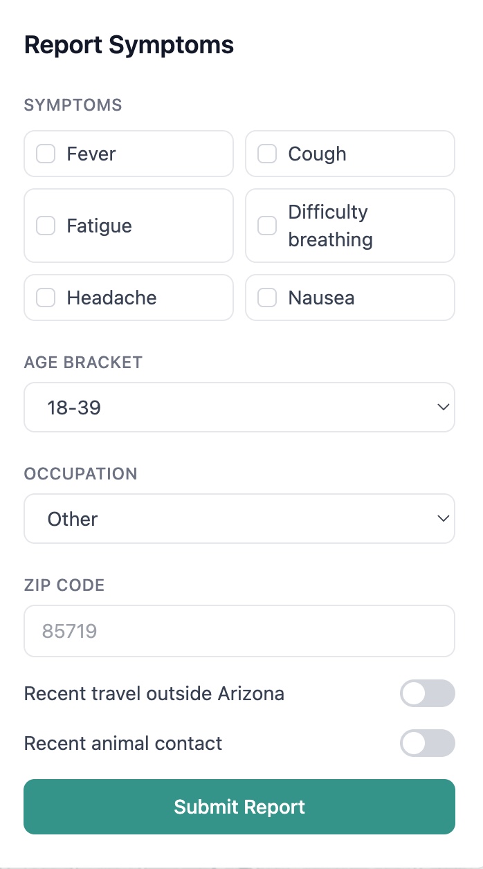
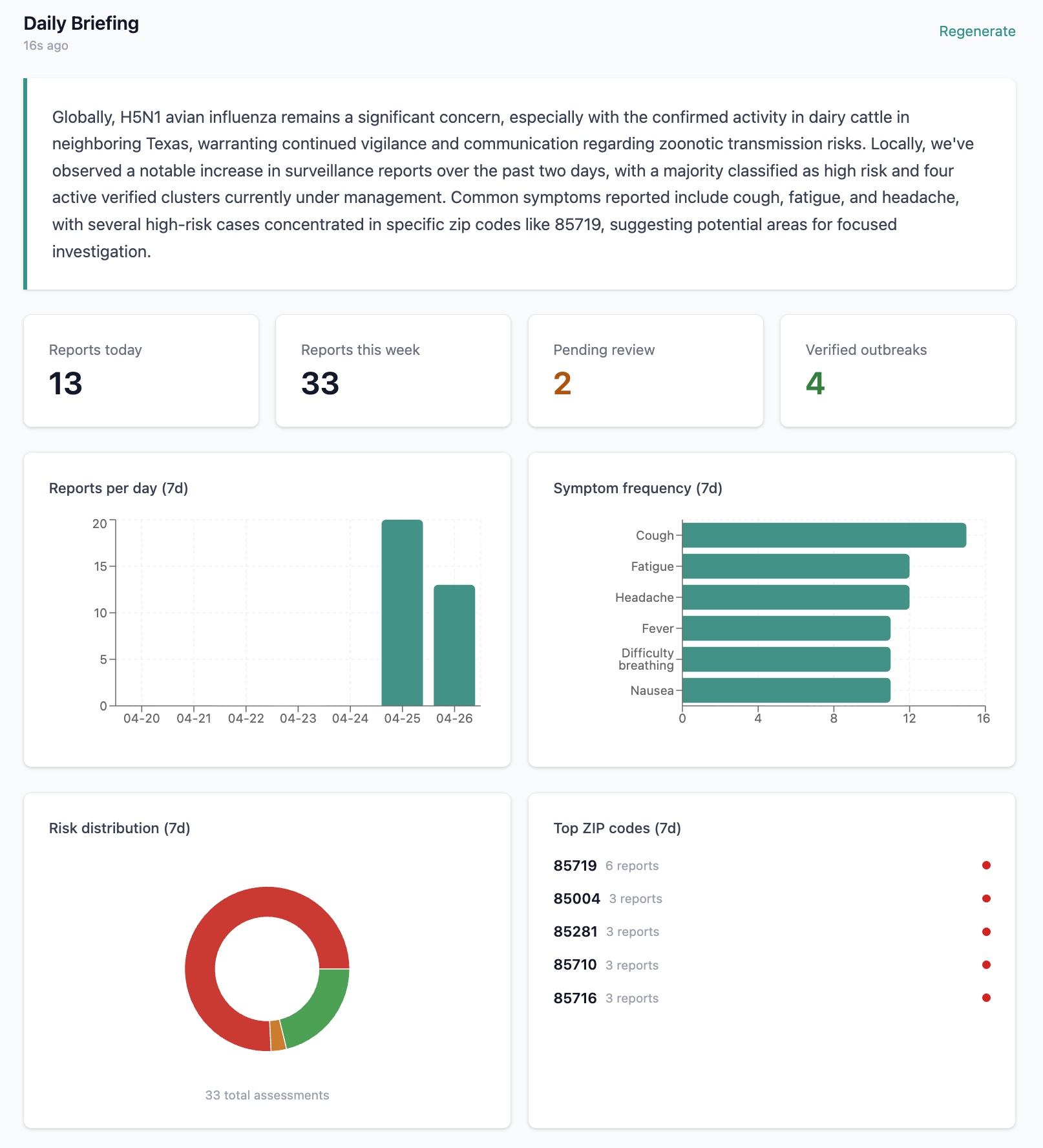
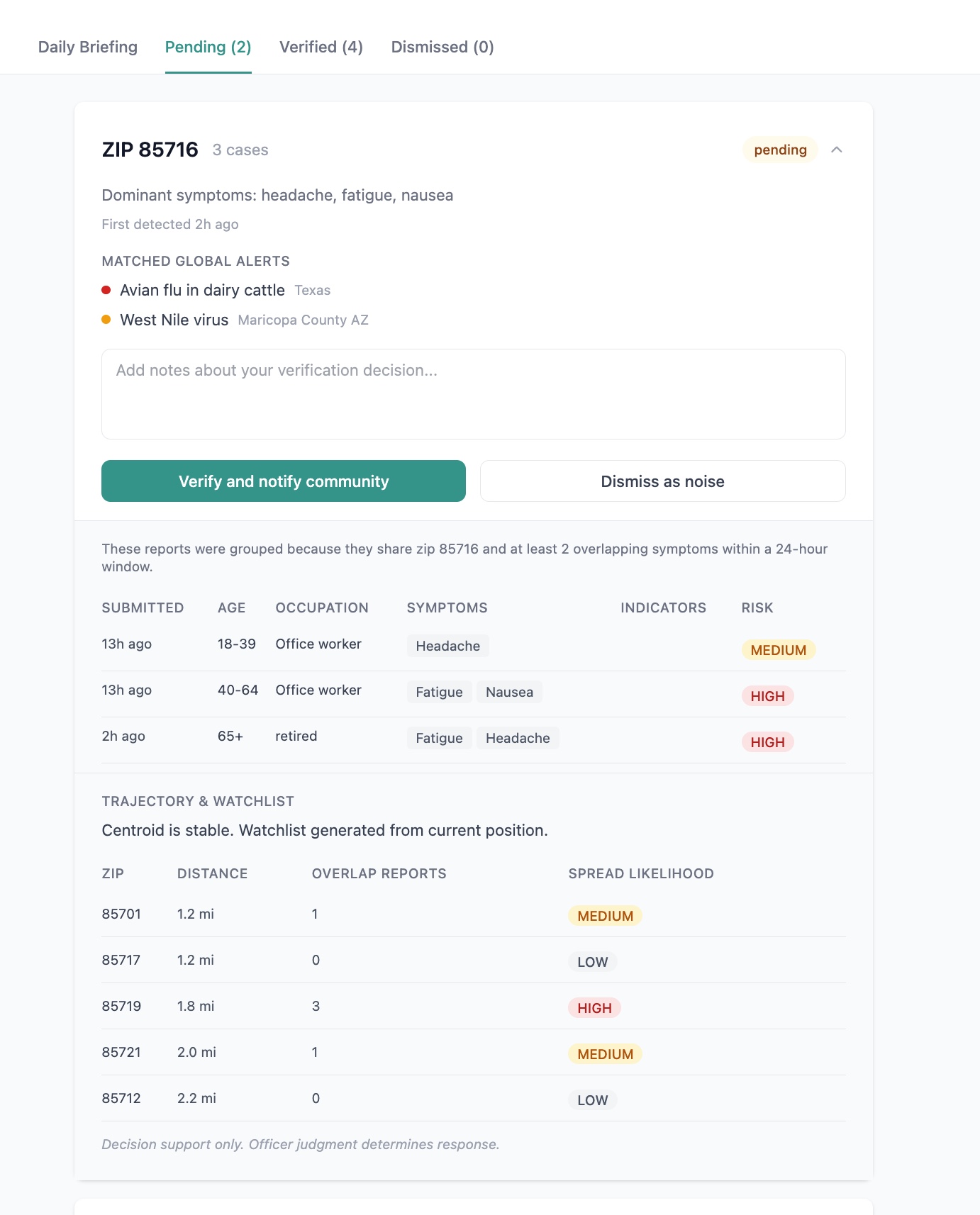
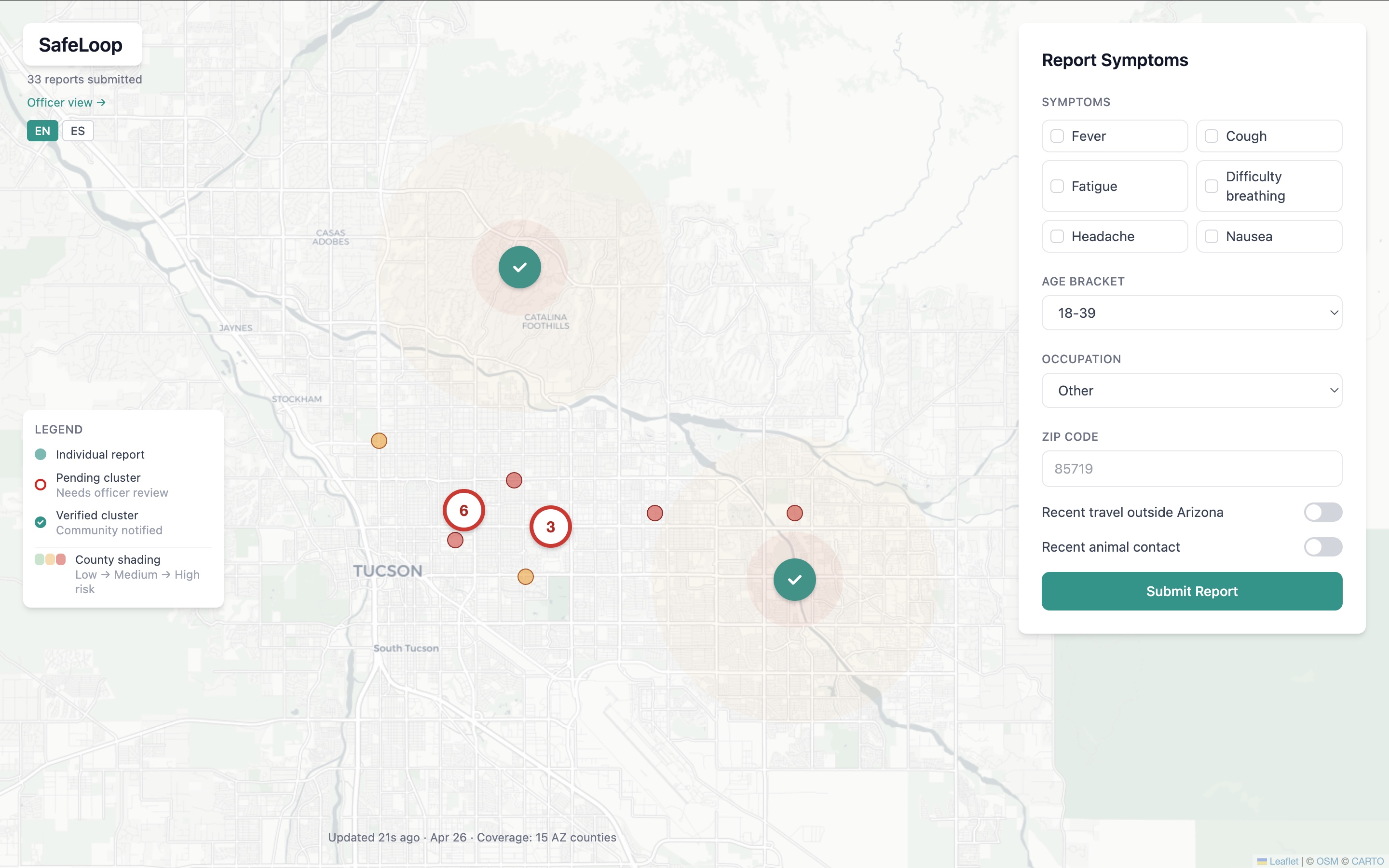
SafeLoop is a participatory disease surveillance system for Arizona, built for two audiences. Residents submit a 30-second symptom report and get a personalized risk profile that fuses their input with weather, local pathogens, and global outbreak intelligence. The output is a plain-English explanation, a copy-paste message for their doctor, and nearby clinics with wait times. Public health officers see a real-time dashboard that surfaces clusters when several people in the same zip report similar symptoms. They review, verify, and notify the community. AI assists, humans decide.
The risk model uses the One Health framework, scoring three independent dimensions: Human, Animal, and Environment. The maximum drives the overall risk level, so a vet with fever after handling animals registers as HIGH risk through the Animal bucket alone, even when their other signals look mild. A flat scorer would miss that.
How we built it
The backend is Go, with concurrent goroutines fanning out four data fetches per report (weather, CDC activity, local pathogens, global outbreaks modeled on EpiCore). REST and WebSocket APIs. JSON file persistence so demo state survives restarts.
The AI layer is Gemini 2.5 Flash, used only for narrative generation. The risk score itself is computed by deterministic Go code with auditable factor weights. The LLM cannot change the score, so it cannot hallucinate a wrong risk level. It just writes plain English. This separation is what makes the system genuinely explainable.
The frontend is React with Tailwind and Leaflet. Charts use Recharts. The app supports English and Spanish, since roughly 30% of Arizonans speak Spanish at home. We wrote a full model card following the Mitchell 2019 framework, naming our limitations and biases honestly.
What we learned
The most important call we made was keeping risk scoring deterministic and using the AI only as a narrator. That gave us auditability and prevented hallucination from corrupting risk levels. Most AI projects can't honestly claim explainability. We can.
We also learned that engagement is solved at the partnership layer, not the feature layer. Public health tools scale through institutions like university student health and county health departments, not through consumer download. That changed how we framed the project.
Challenges we ran into
Three of our four data sources are mocked, since CDC, ADHS, and EpiCore all require either weekly reporting cycles or credentialed access we couldn't get in 24 hours. We modeled the mocks faithfully and designed the architecture so swapping in real APIs would be a one-function change per source.
Calibrating the risk model without ground truth was the conceptual challenge. With no labeled outbreak data, we couldn't measure accuracy directly. We chose deterministic scoring with weights based on clinical reasoning, and described validation explicitly as future work using retrospective comparison against real outbreak records.
What's next
Live integration with EpiCore once API access is granted, migration of the AI layer to Gemma 4 running on state public health infrastructure, a 48-hour symptom follow-up loop for outcome validation, expanded language support beyond English and Spanish, and a validation pilot with ADHS to tune the system against confirmed outbreak records.
Built With
- gemini
- go
- leaflet.js
- react
- recharts
- tailwind
- websocket

Log in or sign up for Devpost to join the conversation.