Inspiration
Regensburg is a city rich in history, but navigating its modern streets can sometimes feel like a step back in time when bus delays strike unexpectedly. We have all stood at a bus stop in the freezing rain, watching the minute display on the digital sign tick up or remain frozen, wondering: Why is the bus late? Is it the rain? Is it the rush hour traffic on the Nibelungenbrücke? Or is it a systemic issue on this specific line?
To answer these questions, we created RVV Ratisbonalyzer. Our inspiration was to bridge the gap between complex raw transit logs and daily commuter reality. By combining GTFS (General Transit Feed Specification) transit data, real-time ITCS (Intermodal Transport Control System) logs, and historical weather records, we wanted to build a beautiful, interactive analytical dashboard. We aimed to empower both city planners and everyday passengers to inspect transit health, visualize vehicle movement, and use AI to query Regensburg’s transit network performance in natural language.
What it does
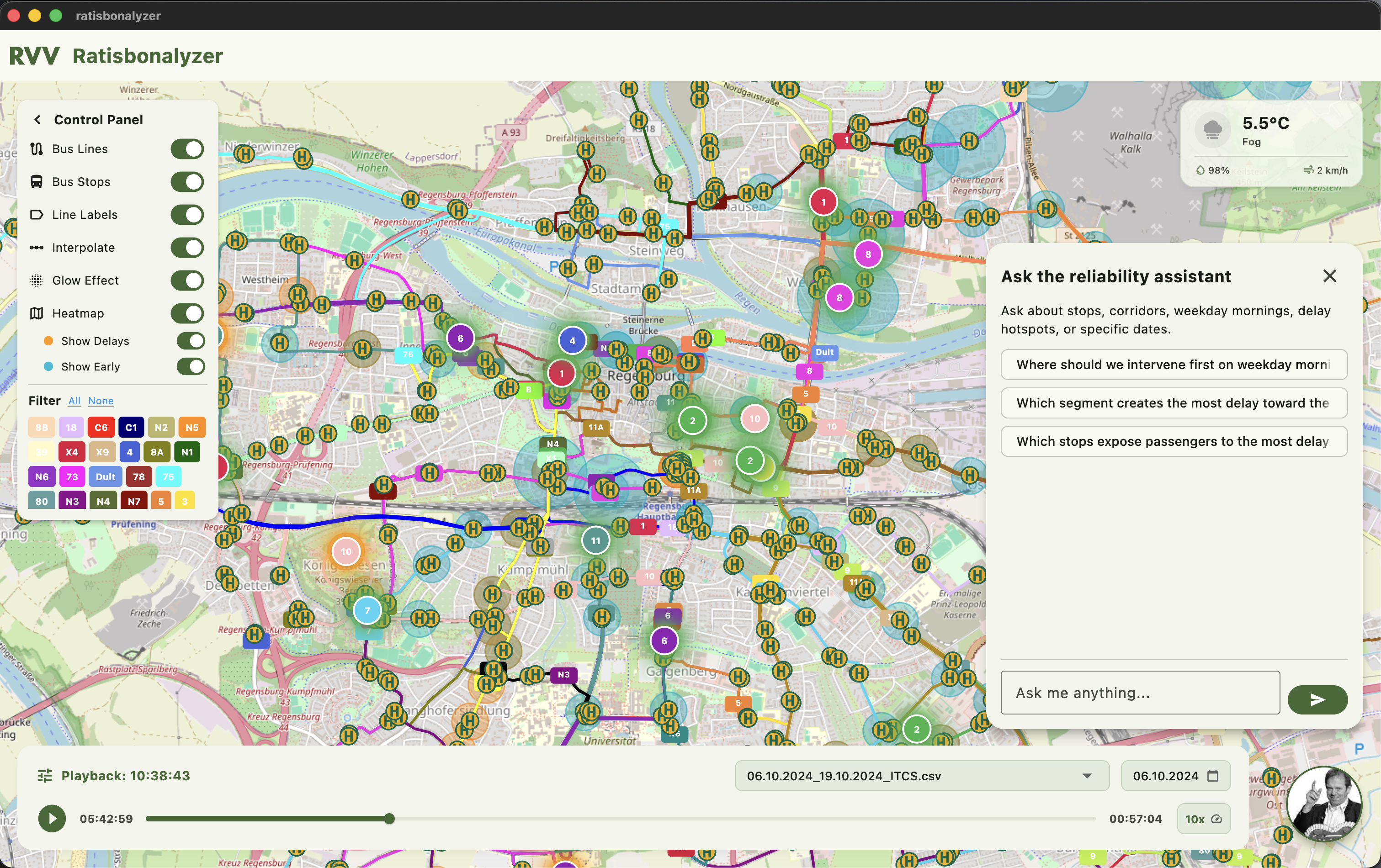
RVV Ratisbonalyzer is a high-performance interactive dashboard built with Flutter that visualizes and analyzes public transit efficiency in Regensburg:
- Interactive Playback & Map Visualization: Commuters and planners can load raw ITCS records and watch buses move across the city map in real-time. Features include smooth position interpolation along actual route shapes rather than crude straight-line jumps.
- Dynamic Delay & Early Arrival Heatmaps: Color-coded hot zones light up on the map based on actual schedule deviations. Orange glow areas show where buses are delayed, while cyan overlays pinpoint where vehicles are running ahead of schedule.
- Weather Correlation: The dashboard overlays historical weather data (precipitation, temperature, wind speed) matching the transit log timestamps, exposing direct relationships between bad weather and system bottlenecks.
- AI Chat Assistant (KURT): An integrated chat panel enables users to ask actionable public-transport reliability questions in plain text, such as “Which segment creates the most delay toward the city center?” or “Which stops expose passengers to the most delay after 16:00?”
How we built it
We architected RVV Ratisbonalyzer using a layered, modern stack:
- Frontend UI/UX (Flutter): Built with Flutter for a highly responsive, cross-platform experience. We used the
flutter_mappackage with OpenStreetMap tiles for geographic rendering. - High-Performance Caching (Hive CE): Raw ITCS logs can easily exceed 160MB for a few weeks of data. We implemented a local database system using Hive for lightning-fast, lazy-loaded key-value access to avoid loading massive CSVs into memory repeatedly.
- Background Processing (Dart Isolates): To parse heavy CSV logs without dropping frames or freezing the interface, we offloaded file ingestion and data grouping to background Dart
Isolates. - Data Pre-processing (Python): We built custom Python scripts to parse shape vectors and generate smooth line coordinates matching the stop IDs.
- AI Chat Engine: Built a lightweight Python backend running locally to handle dataset queries, parsing user intent and executing analytical comparisons to feed response summaries back to the app.
Data Analysis and Machine Learning
We also analyzed all datasets to find potential pain-points. They could be certain bus stops, or buses who cause cascading delays. Some highlights that we found are:
- Line 10, stop Kaulbachweg
- Line 2, stop Krankenhaus St. Josef
- Line 1, stop Taxistr.
- Line 11, stop Gumpelzhaimerstr.
Overall discovered reasons behind a delay:
- End-station/Depot/Pause-station: terminal points on a route, including final destination, depot, driver break stops and places where driver shifts or vehicle handovers occur. At these points, buses may experience increased dwell time due to scheduled breaks or operational transitions between drivers.
- Time of the day: For specific routes, such as those serving OTH Regensburg or the university area, peak rush hours were identified. These time periods were used to capture increased passenger demand and traffic congestion, which can lead to higher probabilities of delays on affected route segments.
- Consecutive delays: Some delays are propagated from earlier buses along the same route or shared stops. At high-demand stops, multiple lines may accumulate delays due to congestion, leading to a cascading effect where late arrivals increase passenger boarding times and further amplify subsequent delays. Additionally, delays may arise from unforeseen events and infrastructure-related constraints that are not fully captured in the available data. These include traffic accidents, roadworks, narrow or complex street layouts, and bridge crossings, all of which can introduce irregular and difficult-to-model disruptions in bus travel times.
Based on the discoveries we built a Random Forest model in order to predict future delays. It achieved good results on the testing set (MAE: 1.509 minutes, RMSE: 2.966 minutes, R2 Score: 0.462) and provided insides into importance of the features for different datasets.
Challenges we ran into
- Handling Giant CSV Files: The 160MB ITCS log file containing millions of records caused severe memory pressure and UI stutters when parsed synchronously. Solving this required writing a custom chunking algorithm that parsed files in background isolates and cached them by day keys in a Hive lazy box, allowing instant subsequent app launches.
- Polyline Path Reconstruction: Matching raw schedule coordinates to roads was difficult because raw logs only indicate stops, not the exact streets taken. To solve this, we generated custom GTFS shapefiles using Valhalla routing and OpenStreetMap's bus cost model. This enabled us to accurately interpolate bus positions along the true curved polyline paths.
- Data Incompleteness: In many records, halt points and stop codes were represented by cryptic internal abbreviations (like
KILLorHBF). We built mapping dictionaries to translate these into human-readable locations (e.g. Killermannstraße, Hauptbahnhof) to ensure clean UI labels.
Accomplishments that we're proud of
- Performance: Achieving a constant, smooth 60 FPS rendering rate even during 100x playback speed with dozens of active buses traversing the map simultaneously.
- Data Synergy: Merging three completely different sources (static GTFS, real-time ITCS logs, and historical weather CSVs) into a unified, interactive timeline.
- User-Friendly Analytics: Designing an elegant interface with panels, glowing heatmap indicators, and a slide-out chatbot that makes heavy transit data feel intuitive and fun to explore.
What we learned
- Threading in Flutter: Mastered Dart isolates and multi-threaded data pipelines. Offloading CSV serialization is key to building responsive data-heavy mobile and web clients.
- Transit Domain Expertise: Learned the structural intricacies of public transit datasets—namely the differences between static schedule specifications (GTFS) and operational real-time control system feeds (ITCS).
- Environmental Factors: Confirmed through visual correlation that even minor precipitation changes transit travel times by a higher percentage in specific bottleneck areas, proving that event-adaptive scheduling is essential.
What's next for RVV Ratisbonalyzer
- Live GTFS-RT Streaming: Integrate live GTFS-RT (Real-Time) feeds to allow commuters to track live delays and current bus locations in real-time alongside historical replay.
- Predictive Machine Learning: Train models on weather forecasts and historical bottlenecks to dynamically predict delays up to 2 hours before they occur, alerting commuters before they leave home.
- Route Optimization Engine: Build a smart routing assistant that doesn't just recommend the shortest route, but the most reliable route based on historical delay probabilities for the current time and weather.


Log in or sign up for Devpost to join the conversation.