-
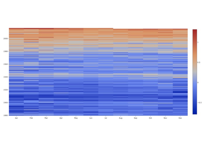
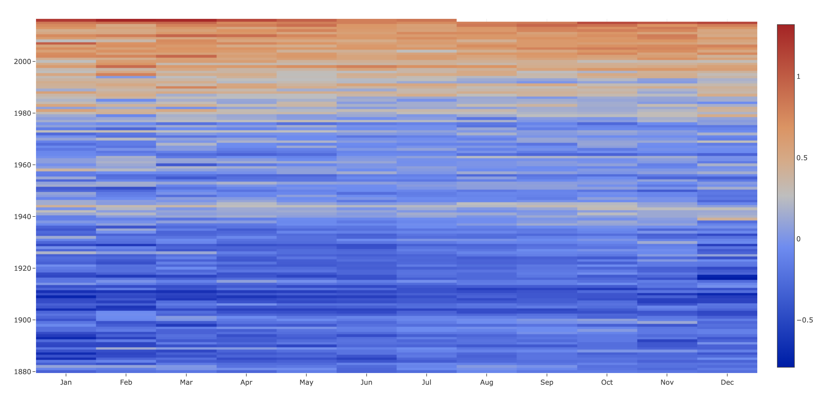
heat map
-

pendulum
-
inspiration


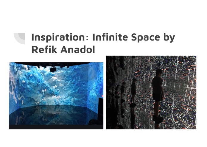
Inspiration
ARTECHOUSE's last exhibition Infinite Space by Refik Anadol inspired us to visualize data in an interesting way to appeal to viewers.
What it does
Running Out of Time is a way for the layperson to understand and visualize global problems where mankind's actions are needed right now.
How we built it
We used plot.ly to do the data visualization, dash to create dashboards, and python to program.
Challenges we ran into
Compiling everything into one website was a huge obstacle we encountered. Additionally, creating a radial bar chart was something we really wanted to do, but we were not able to quite figure out how to accomplish it.
Accomplishments that we're proud of
Just being able to familiarize ourselves with plot.ly and dash in this time crunch was a huge accomplishment for us.
What we learned
We learned how to interpret data and represent it in the best way possible.
What's next for Running Out of Time
We'd love to compile our all data into one web site and incorporate other data sets relating to other global and domestic issues like the opioid drug crisis.

Log in or sign up for Devpost to join the conversation.