Inspiration
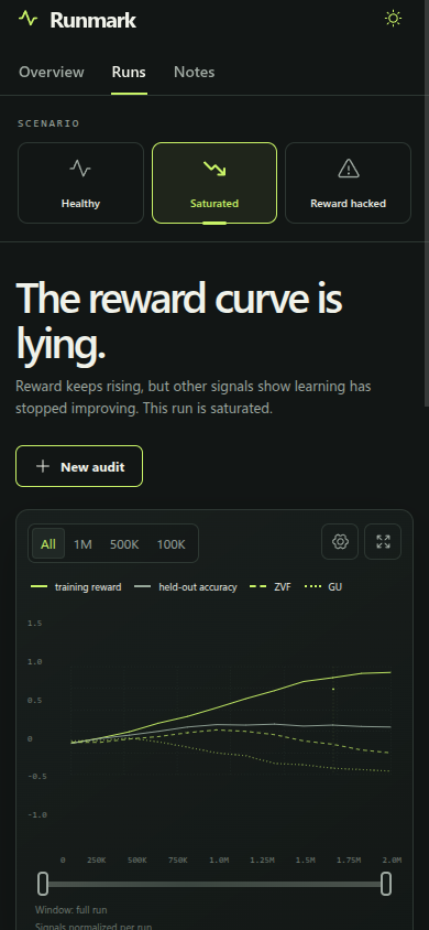
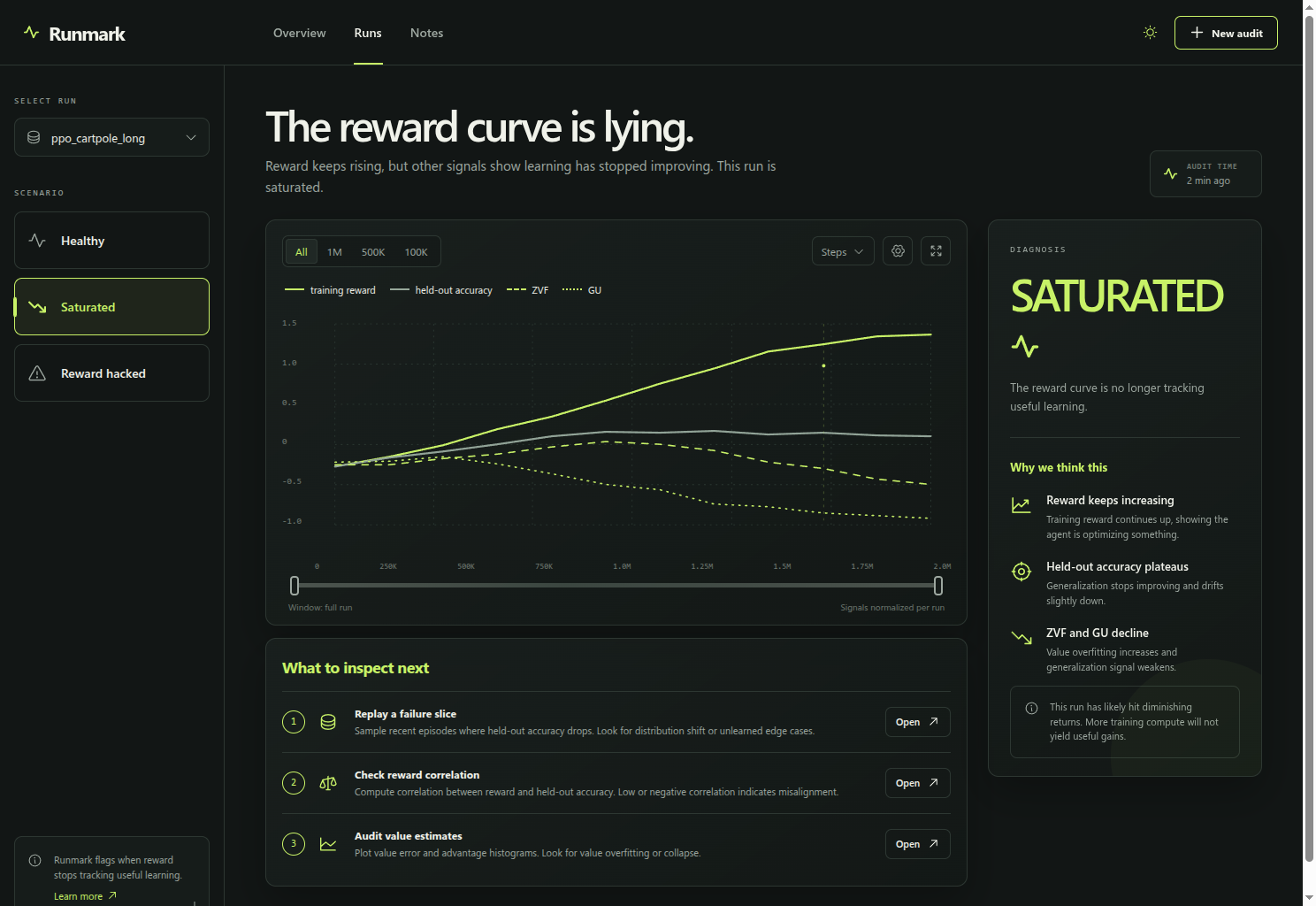
Reward curves are persuasive even when they are wrong. A run can keep improving its training score while generalization plateaus, value estimates drift, or the verifier becomes exploitable. Runmark turns that gap into a clear decision and a short evidence trail.
What it does
Runmark is a visual audit desk for reinforcement learning runs. It compares training reward with held-out accuracy, zero-variance fraction, and gradient usability. The demo includes three deterministic scenarios: healthy learning, saturation, and reward hacking. Builders can switch chart windows, mute individual signals, open evidence checks, create a named audit, and move into a notes view.
How I built it
I built Runmark as a React and Vite prototype with a local fixture layer so the story stays reproducible without a backend. The charts are lightweight SVG and the UI uses CSS and Phosphor icons. The layout is responsive and includes dark and light themes.
Challenges I ran into
The hard part was making a dense training dashboard readable at a glance. I used one accent color, a strong information hierarchy, and plain-language diagnosis cards so the interface communicates a decision instead of just showing more metrics.
What I learned
Reward is only useful while it agrees with evidence that generalizes. A small set of aligned signals can be more actionable than a larger wall of telemetry.
What's next
Connect the audit board to real checkpoint streams, add verifier replay and checkpoint comparisons, and persist the evidence trail for team review.
Built With
- css
- javascript
- react
- svg
- vite

Log in or sign up for Devpost to join the conversation.