-
-
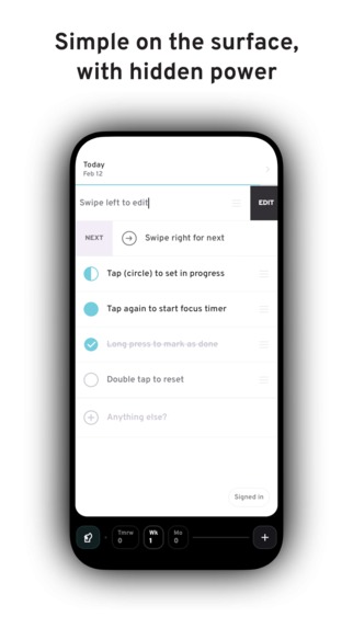
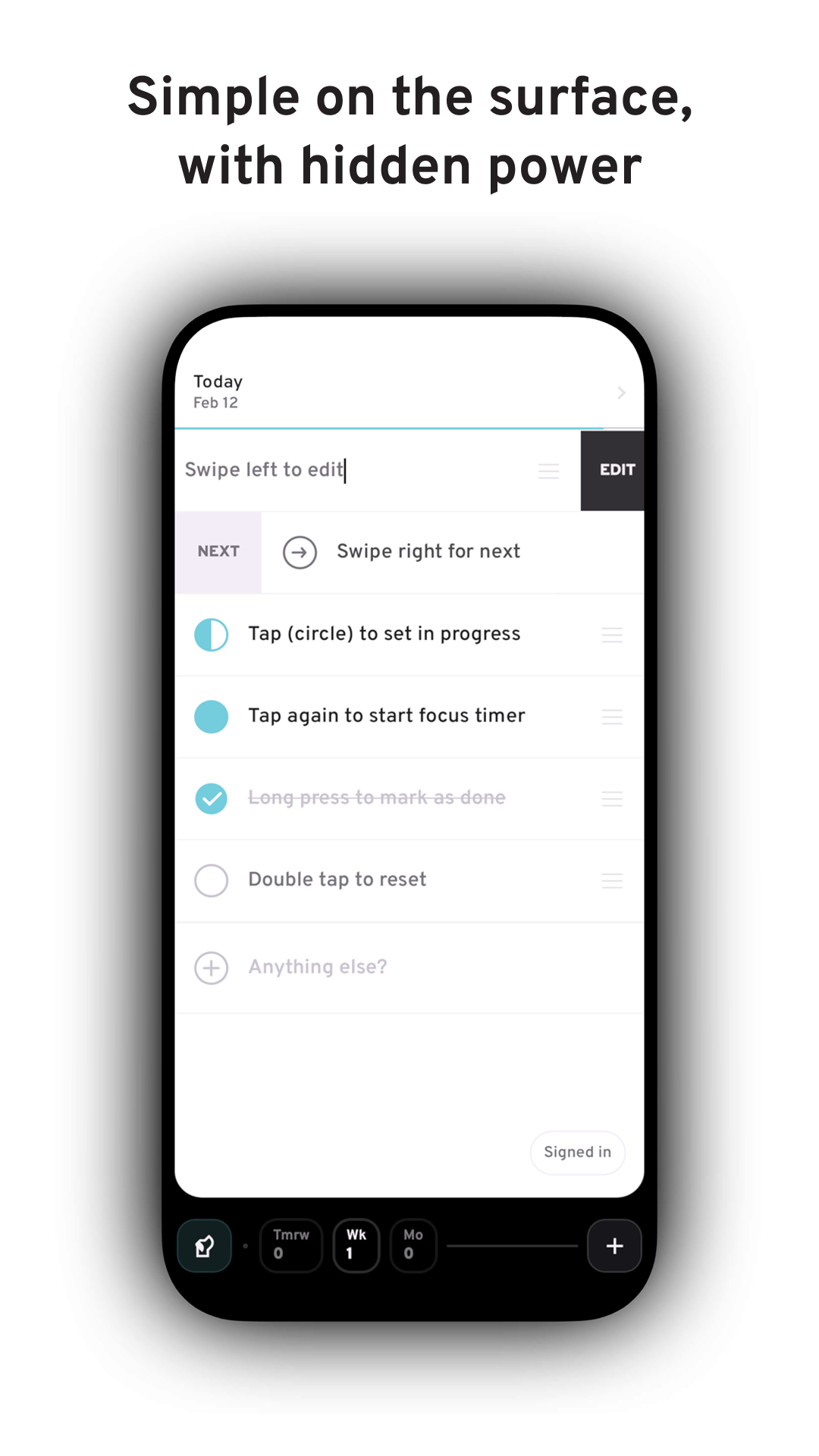
Today list
-
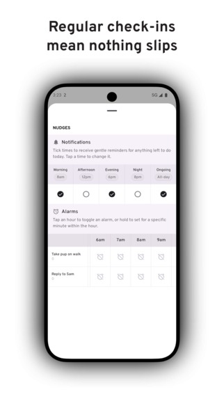
Timely notifications
-
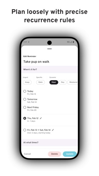
Dynamic scheduling and smart recurrence rules
-
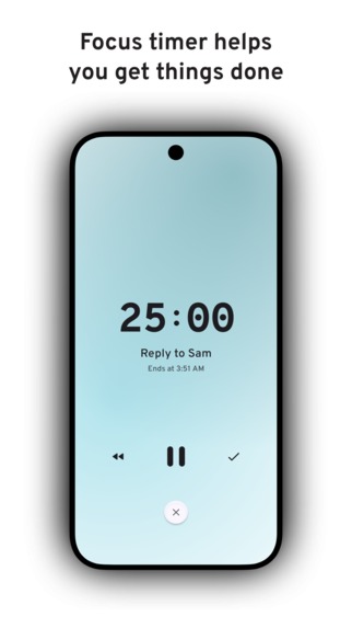
Focus timer
-

Alarms with customisable snoozing

Inspiration
I’ve always worked best with something physical in front of me, like a simple sheet of paper or a Post-it. Digital tools are powerful, but they often pull me away from what matters most today. Too many views, not enough flexibility, ill-timed tasks competing for my attention. That’s why I built Ruff Reminders, a digital take on how I’ve always managed my day.
What it does
Ruff Reminders prioritises today. On the surface, it’s a simple list of what needs doing, bringing clarity without distraction. Interacting with it feels natural, with gestures and taps that feel deliberate. Beneath that simplicity is a powerful set of features built to keep you focused and get things done:
- Regular check-ins at personalised times to keep you on track throughout the day.
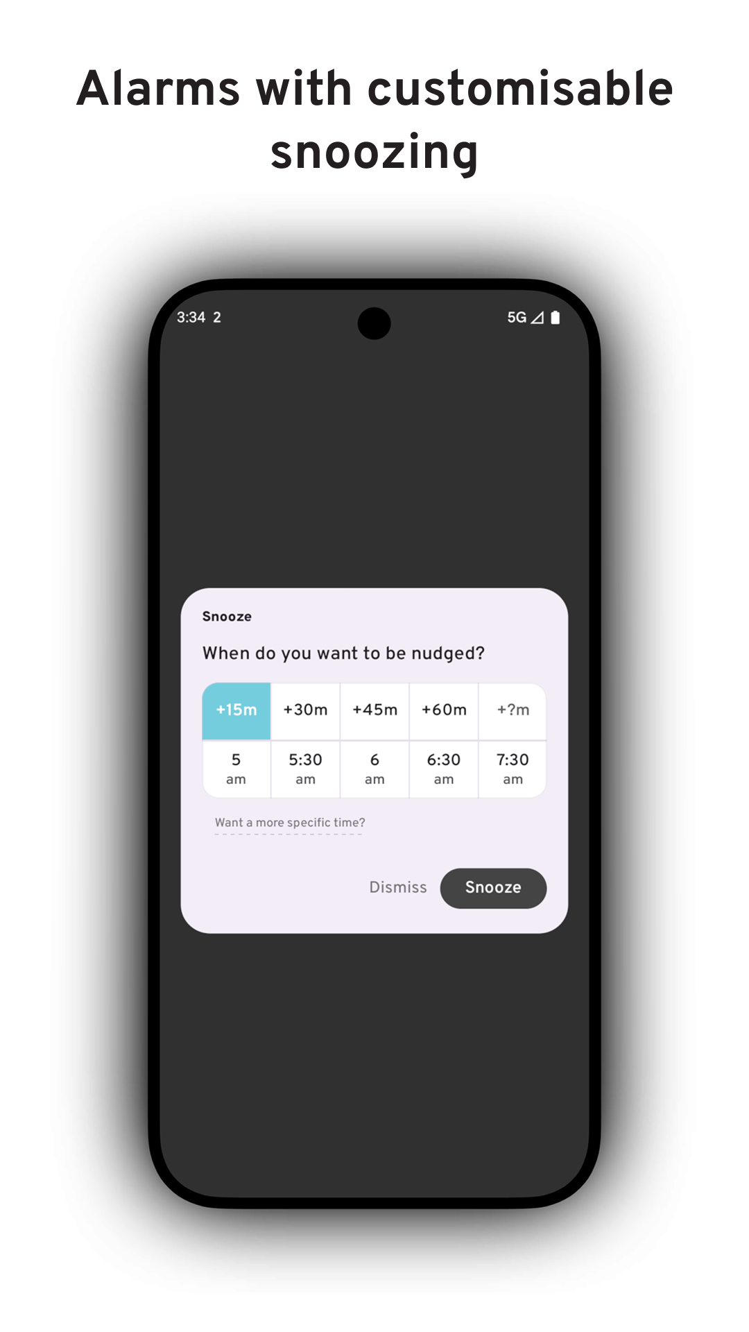
- Custom alarms per reminder for when you need to be alerted into action, with flexible snoozes by specific minutes (22!) or exact times.
- Status bar counter so you’re never more than a glance away from what’s left today.
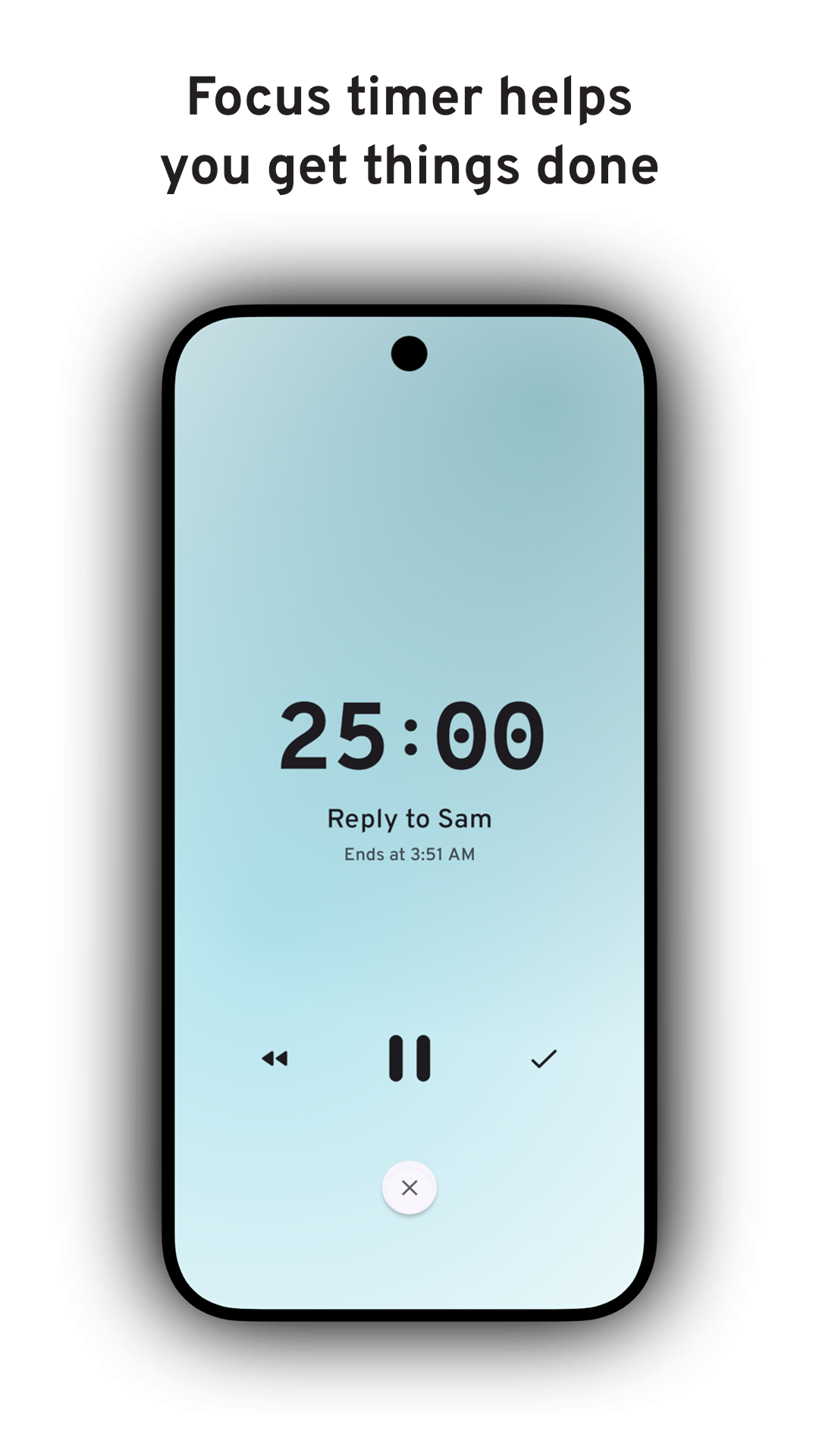
- Focus timer to help you stay with the task once you’ve started.
- Home screen widget so your list is always visible without opening the app.
- Instant sync so your reminders stay with you across devices.
And to help you beyond today, there are a couple of additional features:
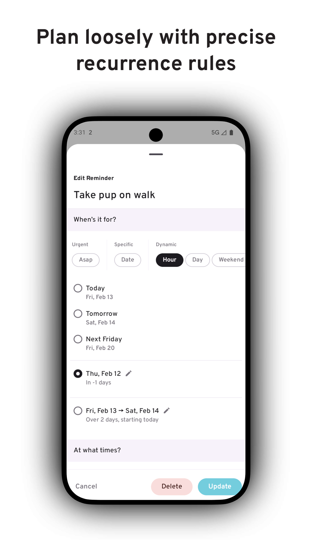
Dynamic scheduling lets you add things without committing to a specific date. Set something for ASAP, any weekend, sometime this month, or over the summer. You can even add check-ins at specific points in the year, like when you’re 50% of the way through.
Smart recurring allows you to repeat reminders at natural intervals, like the first week of every month or hourly between 9–5 on weekdays.
One more thing: a hard-working pup. Productivity apps can feel cold and mechanical. I wanted Ruff Reminders to feel different. Not like a system you have to manage, but like a companion you can rely on throughout the day. That’s where the pup comes in. The mascot and name are a reminder that staying on track doesn’t have to feel rigid or clinical. When your tool feels good to use, you’re more likely to stick with it and see results.
How I built it
I knew Sam primarily uses Android, so I prioritised delivering a polished Android experience first, alongside a sync foundation that would transfer seamlessly to iOS.
Ruff Reminders is built with Kotlin Multiplatform. The core logic and scheduling engine are shared across platforms, while each platform uses its native UI toolkit — Jetpack Compose on Android and SwiftUI on iOS. This keeps the experience truly native while ensuring improvements benefit every platform in parallel.
Supabase handles accounts and keeps reminders in sync across devices. The app is designed to work offline, updating instantly on your device and quietly syncing in the background. Firebase is used to send lightweight push signals so other devices know when to refresh. This helps changes feel immediate.
This architecture provides a strong foundation not only for Android and iOS, but for future expansion to web, desktop, and additional form factors.
Challenges I ran into
The biggest challenge for me was managing the tension between simplicity and power. I wanted Ruff Reminders to feel light and effortless at first glance, while still supporting complex scheduling needs underneath. Whether someone just wants a basic list for today or has more specific requirements, it needed to feel natural to use.
The hardest part wasn’t adding power, it was deciding where, and when, to hide it. For something to reach the surface, there had to be a compelling reason. If it didn’t belong on the front, I had to question whether it needed to exist at all. And for the features that made the cut, they still had to be discoverable and easy to access in regular use.
It would have been easy to build just another reminders app that was functional, neutral, and ultimately forgettable. Instead, I challenged myself to break convention and give it personality without letting that become a gimmick. That wasn’t straightforward. In early builds it felt like too much, so I had to tone it down to more subtle, meaningful touches.
From a technical perspective, making sync feel instant was genuinely hard. Keeping data consistent is a challenge in itself; making it feel immediate is another level of difficulty entirely. I didn’t want anyone to question whether a change had gone through.
I got it working relatively quickly, but getting it to feel fast enough took real iteration. It required careful coordination between local updates and background syncing to make changes propagate seamlessly.
Accomplishments that I’m proud of
Building something in a short time that feels like a complete 1.0 is something I’m genuinely proud of. Even in a saturated category, the app has a clear, distinct vision and enough utility that I’m comfortable charging for it.
Cracking sync was a major technical milestone. Seeing a change on one device appear almost instantly on another was incredibly satisfying.
Dynamic scheduling is easily the feature I’m most relieved about. The challenge was surfacing reminders at the right moments. It took significant iteration to optimise their timing so they never felt overbearing or distracting.
What I learned
Honestly, there was one big lesson: deadlines are a shipping booster.
Being an indie, and admittedly a perfectionist, isn’t the most productive combination. I’m a sucker for polish, and there’s always “one more feature” before shipping. An immovable deadline kept me focused and forced me to prioritise effectively.
I didn’t expect to get this much done in such a short time without compromising on quality, but the constraint left no room for scope creep. It’s a lesson I plan to carry into future projects.
Another important lesson was the value of hyper-focus: pick one problem and go deep. That meant giving users as many tools to reinforce reminders as much as they need. There are plenty of reminder apps. None are as unashamed though about helping you bring your attention back to what matters, throughout the day.
What's next for ruff reminders
A lot.
First, finishing the final polish on Android and launching to Google Play, with optimisation for foldables from day one. After that, building out the SwiftUI screens for iOS and shipping a native version for the App Store. Web isn’t an immediate priority, but larger screens are — starting with a minimal Mac client.
Beyond these short-term releases, the focus shifts to meaningfully expanding the app’s utility in preparation for a Pro subscription tier. This will be aimed at users with more demanding workflows who are willing to invest more time in the app to get more from it.
Few early areas of exploration:
- Lists, reimagined thoughtfully so they don’t become overwhelming or difficult to manage.
- Metadata and filtering, allowing tasks to be expressed in whatever way works best for the user, and surfaced at exactly the right time.
- Giving people the building blocks to create their own system for managing today.
Built With
- firebase
- jetpack-compose
- kmp
- kotlin
- multiplatform
- supabase

Log in or sign up for Devpost to join the conversation.