-
-

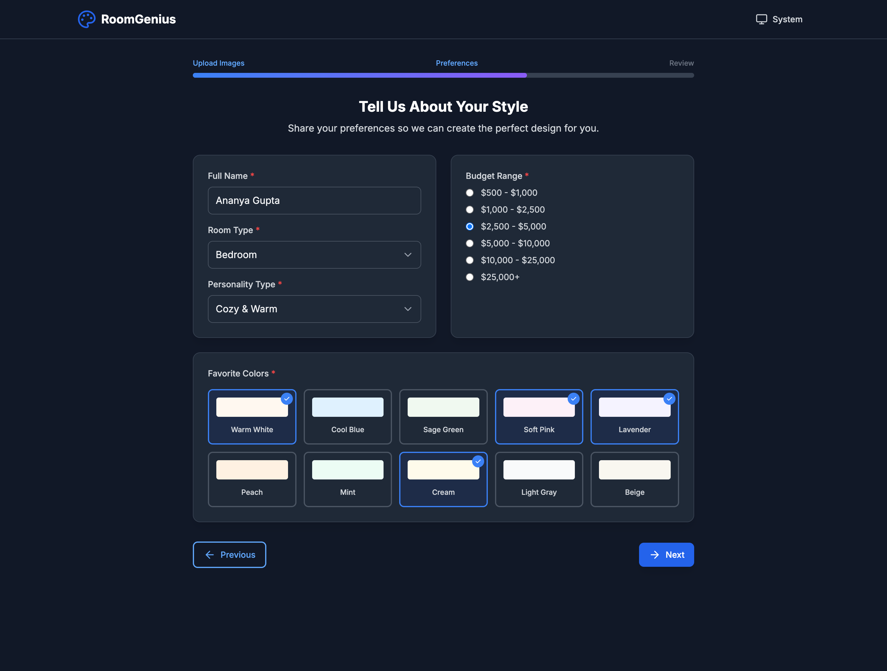
Personalization Page
-
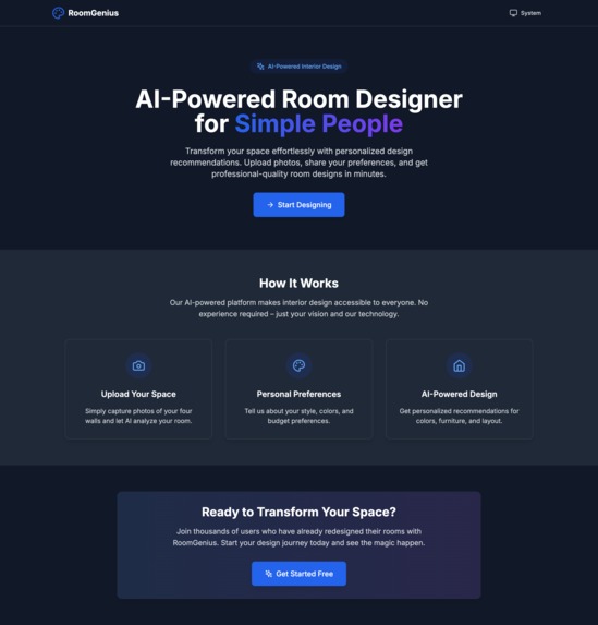
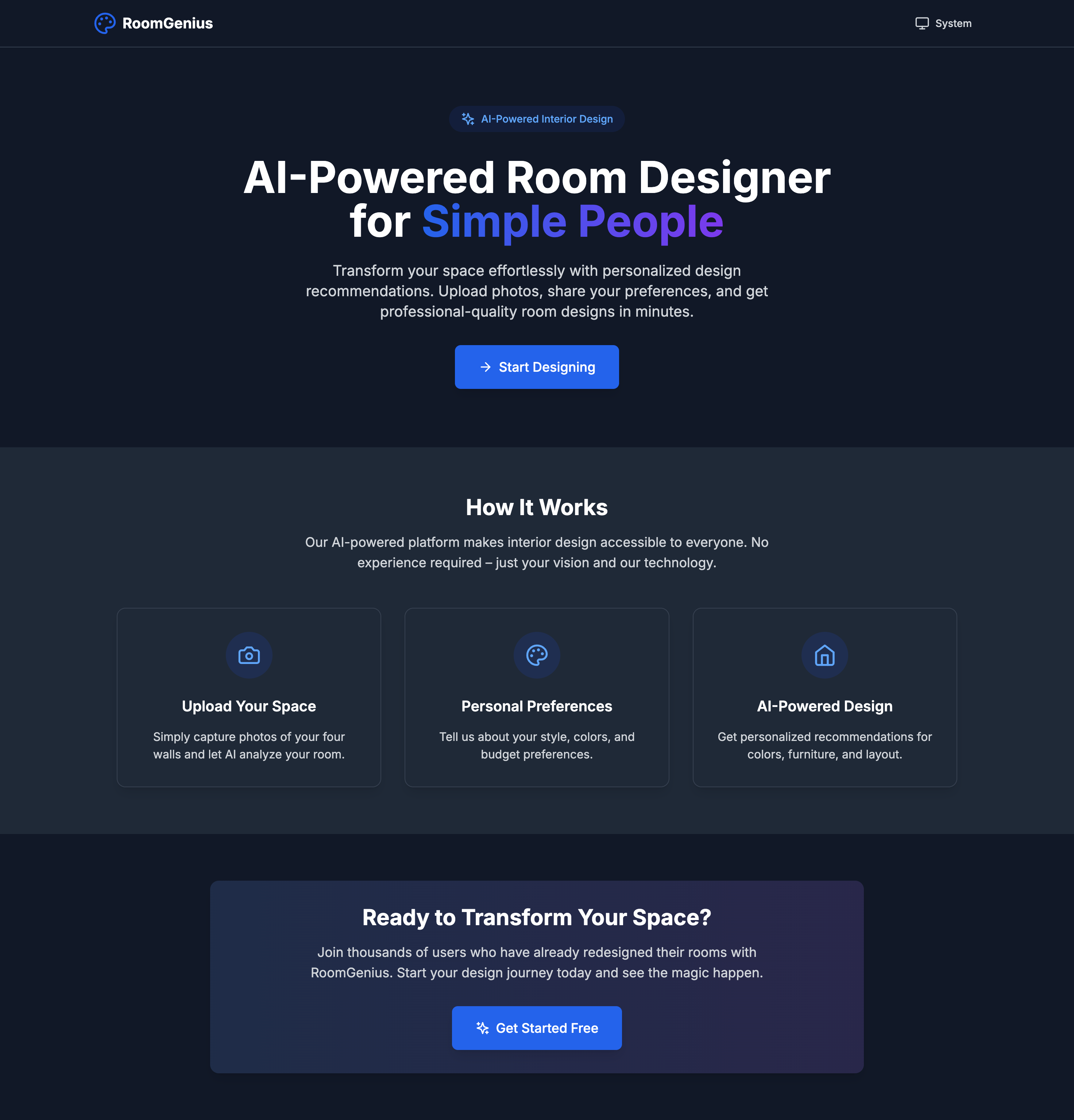
Landing Page
-
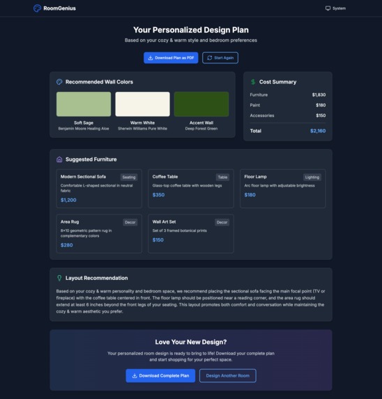
Results Page
-

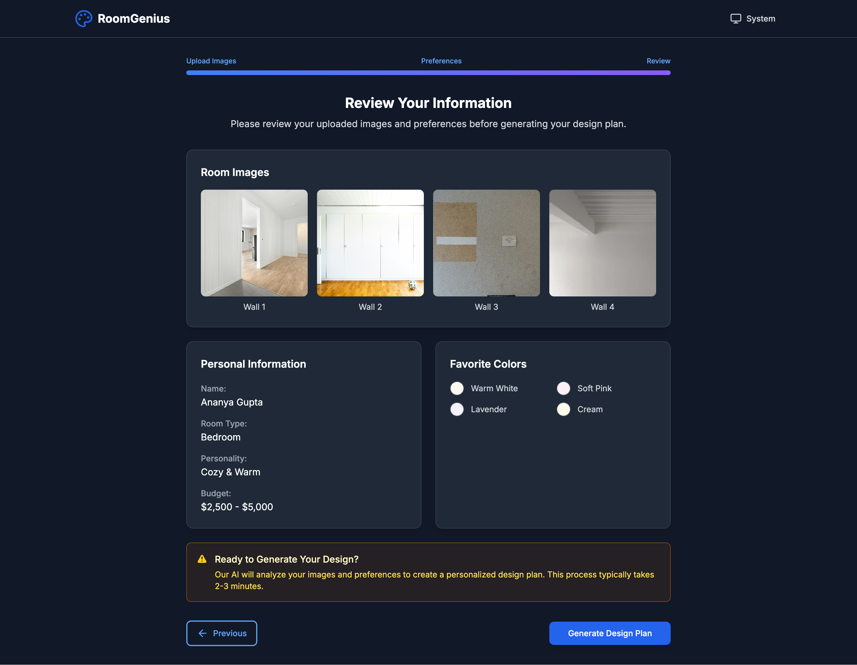
Finalization Page
-
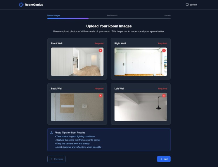
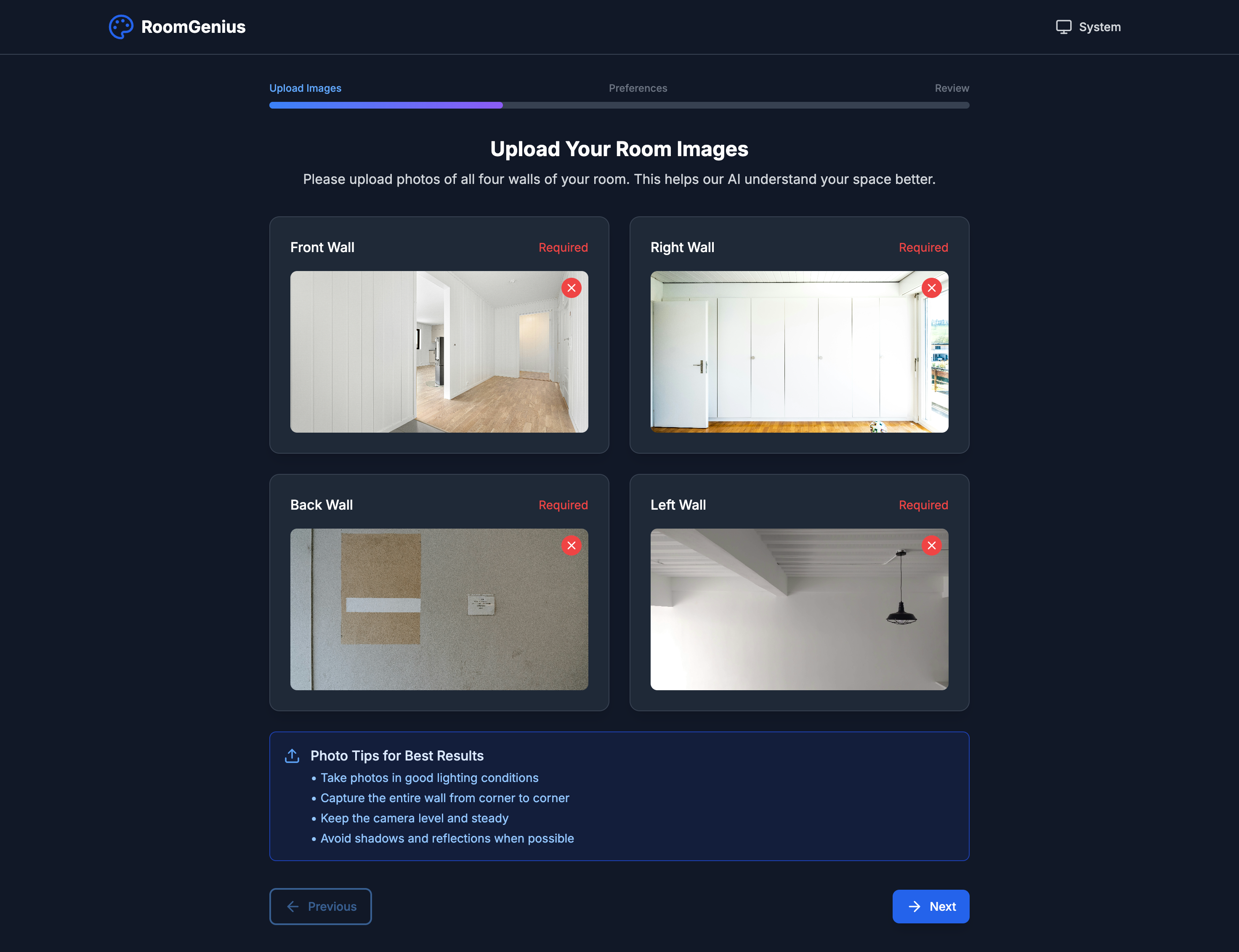
Image Upload Page

🏠 RoomGenius - AI-Powered Room Designer
AI-Powered Room Designer for Simple People
RoomGenius is a modern, responsive web application that helps users design and plan room interiors using artificial intelligence. Simply upload photos of your four walls, share your preferences, and get personalized design recommendations including color palettes, furniture suggestions, and layout plans.
✨ Features
🎨 Smart Design Wizard
- Multi-step guided process for easy room design
- Image upload for all four walls of your room
- Personal preferences collection (personality, colors, budget)
- Real-time validation and error handling
🤖 AI-Powered Recommendations
- Intelligent color palette suggestions based on your style
- Furniture recommendations with cost estimates
- Layout optimization for your specific space
- Budget-conscious design plans
🎯 User Experience
- Responsive design - works on desktop, tablet, and mobile
- Dark/Light/System theme support
- Smooth animations with Framer Motion
- Accessible design following WCAG guidelines
- Progressive disclosure to manage complexity
📊 Comprehensive Results
- Visual color previews with paint brand recommendations
- Detailed furniture list with descriptions and costs
- Cost breakdown by category (furniture, paint, accessories)
- PDF export functionality for your design plan
🚀 Quick Start
Prerequisites
- Node.js 18+
- npm or yarn package manager
Installation
Clone the repository
git clone https://github.com/DebdootManna/roomgenius.git
cd roomgenius
Install dependencies
npm installStart the development server
npm run devOpen your browser Navigate to
http://localhost:5173to see the application.
Build for Production
npm run build
npm run preview
🛠️ Tech Stack
Frontend Framework
- React 18 - Modern React with hooks and concurrent features
- TypeScript - Type-safe development
- Vite - Fast build tool and development server
Styling & UI
- Tailwind CSS - Utility-first CSS framework
- Custom Color Palette - Vibrant, accessible color system
- Framer Motion - Smooth animations and transitions
- Lucide React - Beautiful, customizable icons
Routing & Navigation
- React Router DOM - Client-side routing
- Multi-step wizard navigation
Form Handling
- React Hook Form - Performant form validation
- Custom validation logic for each step
Development Tools
- ESLint - Code linting and quality
- TypeScript ESLint - TypeScript-specific linting
- PostCSS - CSS processing
- Autoprefixer - Automatic vendor prefixes
🎨 Design System
Color Palette
Our vibrant color palette creates an engaging, modern aesthetic:
- Primary Blue (
#2E86AB) - Main actions, links, primary UI elements - Secondary Magenta (
#A23B72) - Secondary buttons, accent elements - Accent Orange (
#F18F01) - Highlights, success states, CTAs - Warning Red (
#C73E1D) - Error states, required fields, warnings - Dark Purple (
#3B1F2B) - Dark theme backgrounds, depth
Typography
- Font Family: Inter (Google Fonts)
- Font Weights: 300, 400, 500, 600, 700
- Responsive scaling across all device sizes
Spacing & Layout
- 8px grid system for consistent spacing
- Responsive breakpoints for mobile-first design
- Consistent component spacing and alignment
📁 Project Structure
src/
├── components/           # React components
│   ├── layout/          # Layout components (Header, Layout)
│   ├── ui/              # Reusable UI components
│   ├── wizard/          # Design wizard components
│   ├── HomePage.tsx     # Landing page
│   └── ResultsPage.tsx  # Design results display
├── hooks/               # Custom React hooks
│   └── useTheme.ts      # Theme management
├── types/               # TypeScript type definitions
│   └── index.ts         # Shared interfaces
├── utils/               # Utility functions
│   └── api.ts           # API simulation
├── constants/           # Application constants
│   └── index.ts         # Shared constants
├── App.tsx              # Main application component
├── main.tsx             # Application entry point
└── index.css            # Global styles
🔧 Configuration Files
tailwind.config.js- Tailwind CSS configuration with custom colorsvite.config.ts- Vite build configurationtsconfig.json- TypeScript configurationeslint.config.js- ESLint rules and settingspostcss.config.js- PostCSS plugins
🎯 Key Components
Design Wizard (/design)
Multi-step form with three main phases:
- Image Upload - Upload photos of all four walls
- Preferences - Personal style, colors, budget, room type
- Review - Confirm all information before generation
Results Page (/results)
Displays the AI-generated design plan:
- Wall color recommendations
- Furniture suggestions with costs
- Layout recommendations
- PDF export functionality
Theme System
Supports three theme modes:
- Light - Clean, bright interface
- Dark - Easy on the eyes for low-light use
- System - Automatically matches OS preference
🔮 Future Enhancements
Phase 2 Features
- [ ] Real AI Integration - Connect to actual AI design services
- [ ] 3D Room Visualization - Interactive 3D room previews
- [ ] Shopping Integration - Direct links to purchase furniture
- [ ] User Accounts - Save and manage multiple room designs
Phase 3 Features
- [ ] Social Sharing - Share designs with friends and family
- [ ] Designer Marketplace - Connect with professional designers
- [ ] AR Visualization - Augmented reality room preview
- [ ] Collaboration Tools - Multi-user design sessions
🤝 Contributing
We welcome contributions! Please follow these steps:
- Fork the repository
- Create a feature branch (
git checkout -b feature/amazing-feature) - Commit your changes (
git commit -m 'Add amazing feature') - Push to the branch (
git push origin feature/amazing-feature) - Open a Pull Request
Development Guidelines
- Follow the existing code style and conventions
- Add TypeScript types for all new code
- Include responsive design for all new components
- Test on multiple devices and browsers
- Update documentation for significant changes
📄 License
This project is licensed under the MIT License - see the LICENSE file for details.
🙏 Acknowledgments
- Design Inspiration - Modern interior design trends and AI-powered tools
- Color Palette - Coolors.co
- Icons - Lucide React
- Fonts - Google Fonts (Inter)
- Images - Pexels for stock photography
📞 Support
For support, questions, or feature requests:
- Email: support@roomgenius.app
- GitHub Issues: Create an issue
- Documentation: Project Wiki
Made with ❤️ by the RoomGenius Team
Transform your space effortlessly with AI-powered design recommendations.
Built With
- react
- typescript
- vite
Log in or sign up for Devpost to join the conversation.