-
-
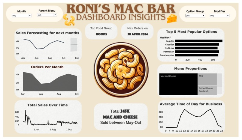
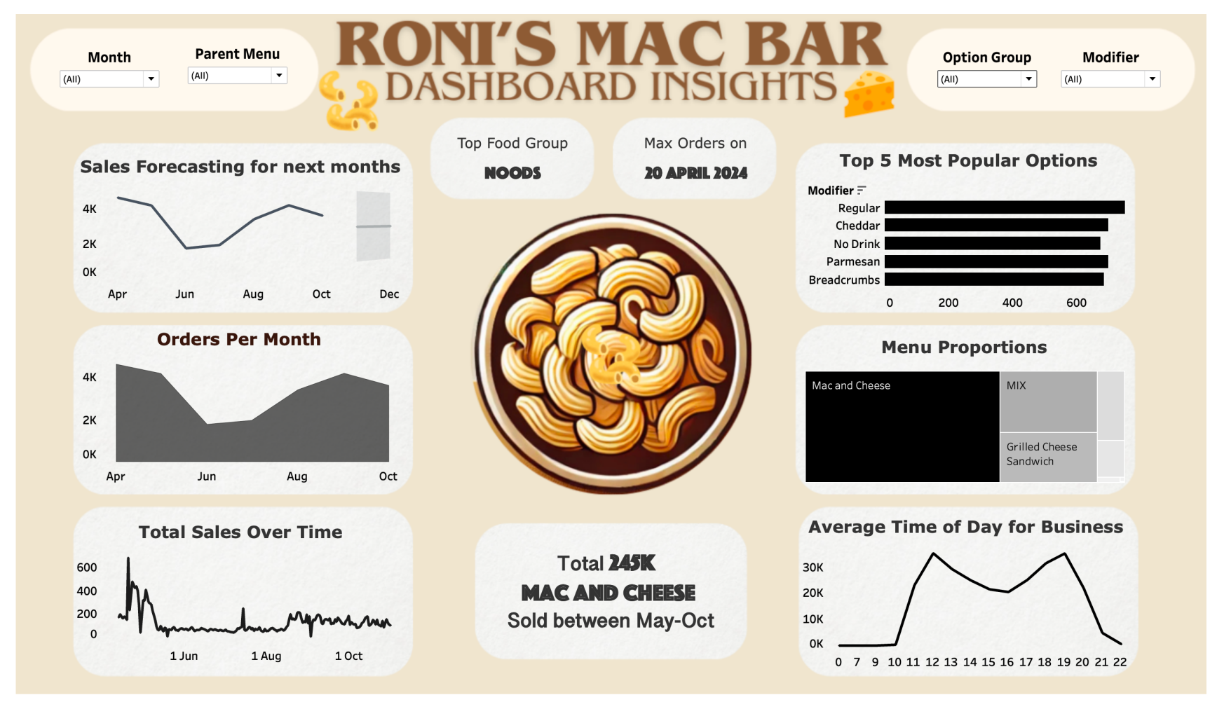
RONI's MAC BAR - DASHBOARD INSIGHTS
Roni's Mac Bar Dashboard
"Empowering Roni's Mac Bar with data-driven insights for smarter decisions and improved operations."
Overview
This dashboard was created to assist Roni's Mac Bar, a popular local spot in College Station, Texas, in enhancing their business operations through data insights. With a user-friendly and interactive design, the dashboard provides Roni’s team with essential metrics on customer preferences, product performance, and sales trends over time. Built to support data-driven decisions, this tool makes it easy to understand and act on key business insights.
Key Features
- Sales Forecasting: Predicts future sales trends, helping with inventory and staffing management.
- Monthly and Total Sales Tracking: Displays monthly sales data and long-term trends for strategic planning.
- Top Food Group and Most Popular Options: Shows the most popular food categories and item modifiers, aiding in inventory planning and menu optimization.
- Interactive Filters: Allows filtering by Month, Parent Menu, Option Group, and Modifier for a customized view of the data.
- Menu Proportions: Provides a breakdown of orders by menu items, helping Roni's team identify popular products and consider potential menu adjustments.
- Peak Hours Analysis: Highlights average busiest times, assisting in scheduling and planning promotions.
Dashboard Components
Sales Forecasting
A line chart that projects future sales, offering insights into anticipated demand for upcoming months.
Orders Per Month
A bar chart visualizing monthly order volumes, helping to identify high-traffic periods and potential seasonal trends.
Total Sales Over Time
A line graph offering a historical view of total sales trends, showcasing long-term growth or any dips in sales.
Top Food Group
Displays the most popular food category, enabling the team to focus on high-demand items.
Top 5 Most Popular Options
A bar chart listing the top 5 most popular item modifiers, such as Cheddar or Parmesan, supporting ingredient planning.
Menu Proportions Treemap
A treemap chart showing order composition by menu item, clarifying what percentage of sales each product represents.
Average Time of Day for Business
A line chart identifying peak business hours to optimize staffing and resource allocation.
Interactive Filters
Filters at the top of the dashboard allow users to explore data by Month, Parent Menu, Option Group, and Modifier for a tailored view of insights.
Setup Instructions
Prerequisites
- Tableau Desktop: This dashboard is built in Tableau and requires Tableau Desktop to view and interact with the data.
- Data Source: Ensure any external data files used by the dashboard (e.g., CSV or Excel files) are accessible and correctly linked.
Steps to Open and Use the Dashboard
- Open Tableau: Launch Tableau Desktop.
- Load the Dashboard File: Open the
.twbxTableau workbook file for Roni's Mac Bar Dashboard. - Verify Data Source Links: Confirm data source paths are correct. Re-link data sources if prompted to ensure all visualizations load.
- Interact with the Dashboard: Use filter options at the top for custom views. Hover over charts for additional details.
Customizing Data
Updating Data Source
To update with new data, replace the original files with updated versions and link them in Tableau if necessary.
Refresh Data
Once linked, refresh the data in Tableau to update all visualizations.
Usage Notes
- Insights for Decision-Making: Use the dashboard to inform menu adjustments, inventory planning, and staffing.
- Custom Filtering: Apply filters to focus on specific time periods or categories, providing insights for targeted strategies.
Built With
- dashboard
- filters
- forecasting
- insights
- kpi
- tableau


Log in or sign up for Devpost to join the conversation.