-
-
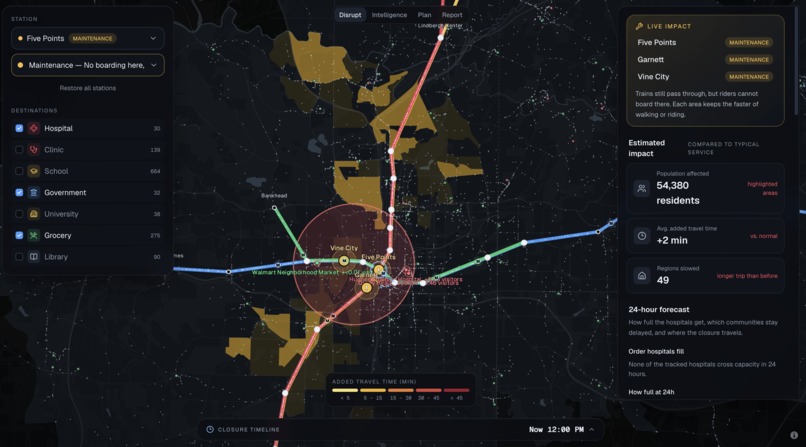
Analyze the impact of shutdowns and how they affect average travel time, number of people affected, and specific demographics
-
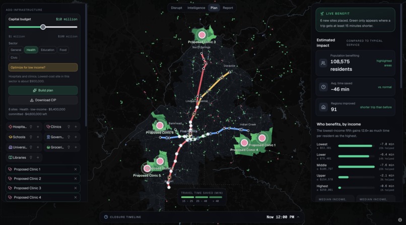
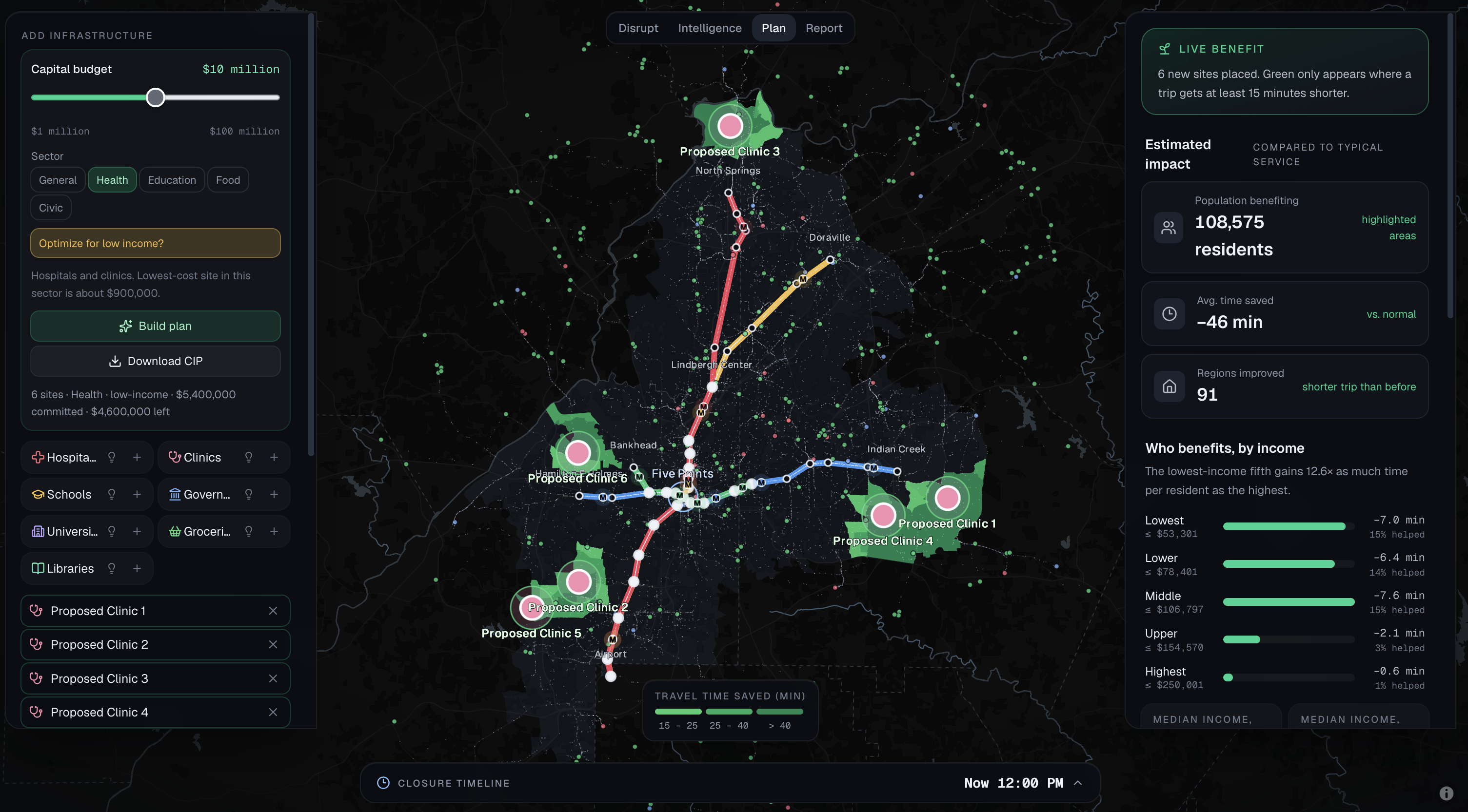
In the "Plan" tab, you can find optimal infrastructure creation plans based on parameters, or manually add certain facilities
-
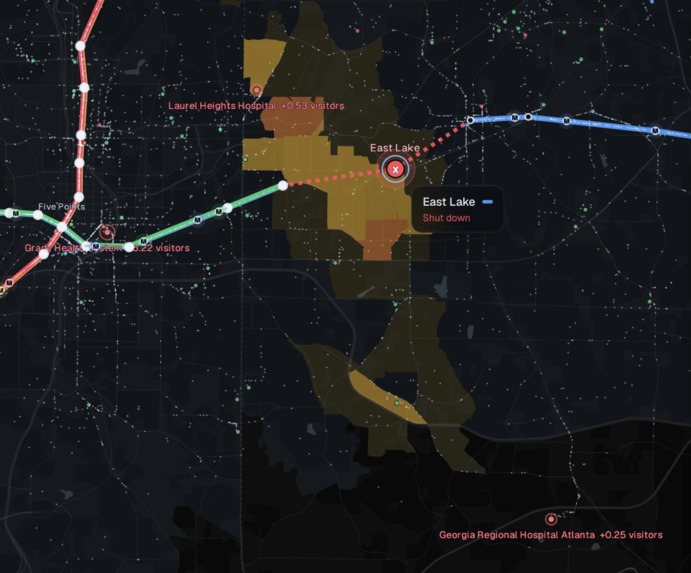
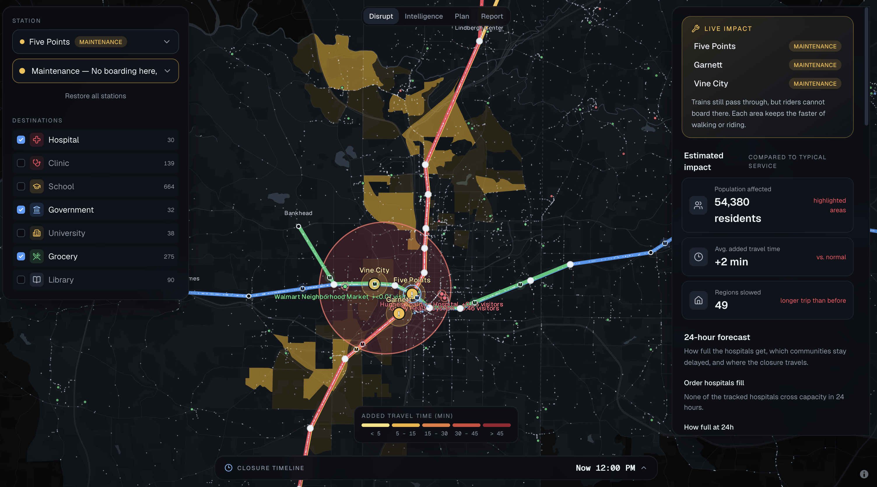
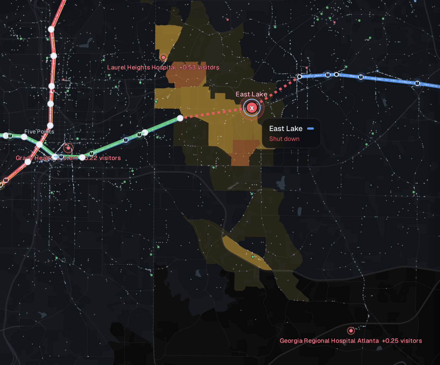
Simulating individual stations either being out of service or completely breaking shows the resulting accessibility limitations created
-
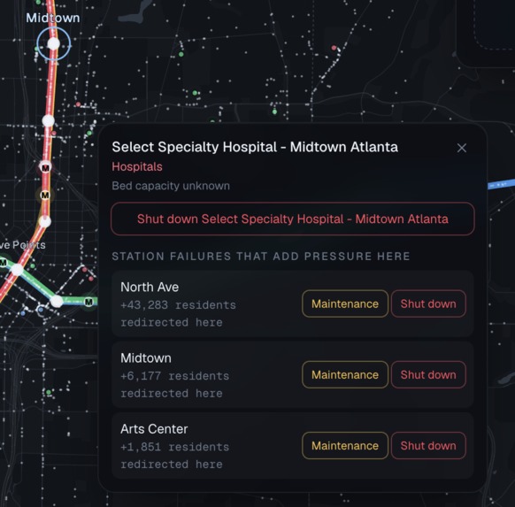
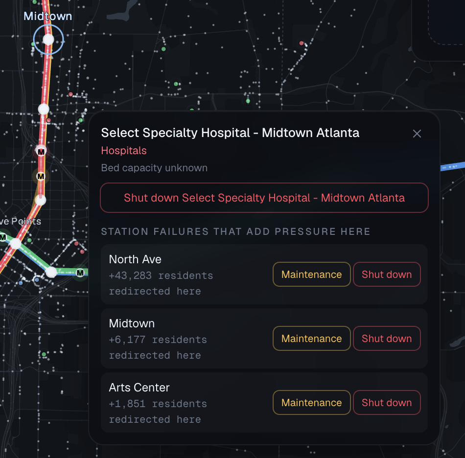
Clicking infrastructure points on the map (hospitals, grocery stores, etc.) shows which stations would cause the greatest damage if impacted
-
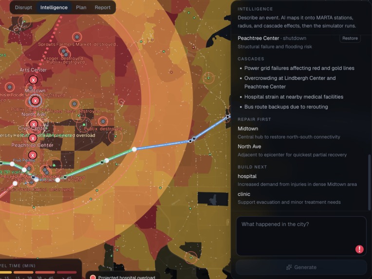
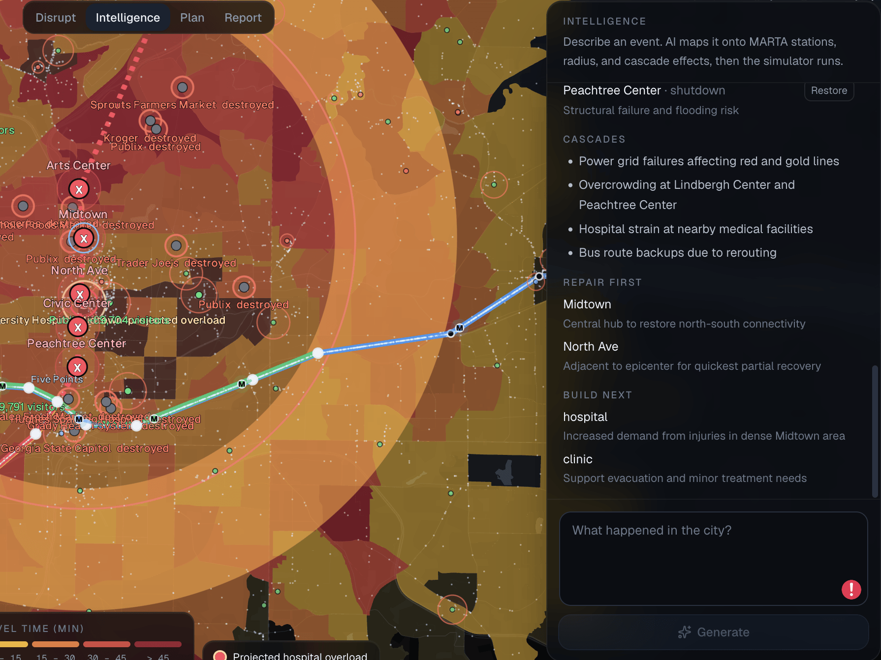
With natural language input, the neural network turns descriptions of events/disasters into specific forecasted impact
Inspiration
American public transport has a reputation of being quite poor: Constant delays, the massive car culture, and a general lack of infrastructure are all common problems. Despite this, many people are entirely dependent on it. This systemically underrepresented group is hit the hardest when disasters strike, being denied access to key utilities like healthcare or groceries.
As Georgia Tech students, we’re right in the middle of Atlanta, so HackGT felt like the perfect opportunity to look at just how vulnerable and critical public transport is to the people who rely on it. Thus, we decided our project would focus on visualizing the impact of failing infrastructure on Atlanta.
Building the system
We started with a simple goal: Get a map of Atlanta, put MARTA into it, and see who and what gets affected by it. For the map, we found LibreMap was a great library that provided a high level of detail and geographical accuracy.
From there, we had to figure out how we wanted to store the data. One of the sponsors, TigerData, interested us since it was a new type of software that we hadn’t played with before. We implemented PostgreSQL to store a) a graph representation of the MARTA train stations, b) regions of households based on ZIP code, and c) points of interest that people go to every day. Specifically, these are high-impact locations like hospitals, clinics, and grocery stores that people need to go to every day to survive. We found this data from the MARTA GTFS, the U.S. Census, and OpenStreetMap. Putting data into the database was helpful for aggregating different data sources into one database.
We rendered this data onto the map with Deck.gl, finishing our visualization. However, now came the hard part of seeing how critical infrastructure closing impacted people’s everyday lives. For that, we developed a unique simulation algorithm:
- We trained a statistical model to figure out what points of interest (hospitals, grocery stores, libraries, etc., POIs for short) people went to every day and at what frequency based on their location. To train this, we used data from OpenStreetMap and the Centers for Medicare & Medicaid Services.
- Then, we established the nearest POIs to each household region and cached this into our database.
- For any closure of infrastructure, we re-calculated where people would be displaced. For example, if Housing Region 1 would originally go to Hospital A through Station A, the closure of Station A would make it faster for them to go through Station B and go to Hospital B instead.
- This calculation is run on every housing region, which lets us figure out which region is most affected by this infrastructure closing. Additionally, we can now figure out which other POIs would incur extra stress from the new visitors who go there.
- We highlight all of these changes on our map using colors and dots. The colors form a heatmap which shows which regions and POIs are most stressed, and the dots represent people — the movement of dots represents the flow of people going toward POIs.
Making the simulation realistic
This algorithm didn’t work immediately though. We ran into some challenges. Originally, we used absolute distance to detect which places were nearest to each housing region. This made our data completely unrepresentative of reality. Many times, the POI that was closest according to absolute distance was not actually the closest after factoring in public transport and road routes. The other issue we ran into was that it made sense to go to the second-nearest hospital or grocery store in the event of a closure, but people would likely only go to one school or town hall. In those cases, we made it so that they had to go to their original schools/government buildings.
Finding inequality in the data
We realized that we could repurpose leftover data we had collected from the U.S. Census Bureau and the Centers for Medicare & Medicaid Services to obtain interesting insights. For example, we used income data to realize that lower-income regions could be up to 3x more affected by infrastructure closure than higher-income regions. Some of these trends helped us realize structural inequalities: Lower-income regions are more likely to take public transport, which makes them more vulnerable and less financially stable in the first place.
Going from analysis to action
The next step was figuring out how we could actually take action to resolve this gap. For that, we created a feature where we could test out how new infrastructure impacted people around. By taking the algorithm above and basically inverting it, we could figure out how the creation of, say, a new hospital decreased travel times and pressure on other local hospitals. We also created an algorithm that detected both:
- The most optimal spot for a new POI to decrease the average travel distance for everybody.
- The most optimal spot for a new POI to benefit lower-income regions.
Interestingly, these two spots had extremely high overlap, providing tangible policy suggestions.
Natural language scenarios
We realized that using UIs and manually assuming how infrastructure would react to extreme weather, natural disasters, and other events could be cumbersome. Thus, we decided it might be useful to have a natural language input so that people could test open-ended scenarios. For that, we integrated Grok and Gemini to take in a prompt, e.g. “There was an earthquake around Five Points station,” and apply the effects to nearby infrastructure. From there, our simulation would calculate the results and the AI would return both a summary of what happened and a visualization of what happened projected onto the map.
Handling disasters and imperfect data
Another challenge that we faced was ensuring that the model could accurately represent what would happen if a natural disaster occurred. At first, the model would simply disable the incident point and only simulate based on this. To improve this, we adapted our simulation to increase the population in the surrounding area of the incident. This would simulate people evacuating from the disaster and make it more realistic. We also adapted the simulation to have higher pressure on hospitals during disasters to simulate real-life responses.
Finally, an important flaw that was brought up was the lack of reliable public transport data. Although Atlanta’s public transport data is quite good, we couldn’t always expect such high-quality data, especially in regions where local governments can’t afford to spend resources on collecting data. Therefore, we decided to add a report feature where users could manually report train station data themselves and add it to our database.
Built With
- deck.gl
- fastapi
- maplibre
- postgis
- postgresql
- psycopg
- python
- react
- tailwind
- timescaledb
- typescript
- uvicorn
- vite


Log in or sign up for Devpost to join the conversation.