-
-
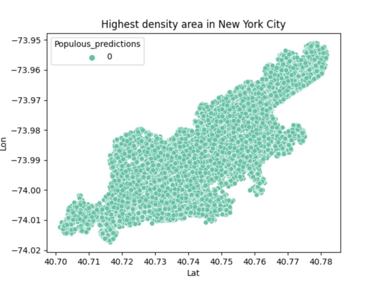
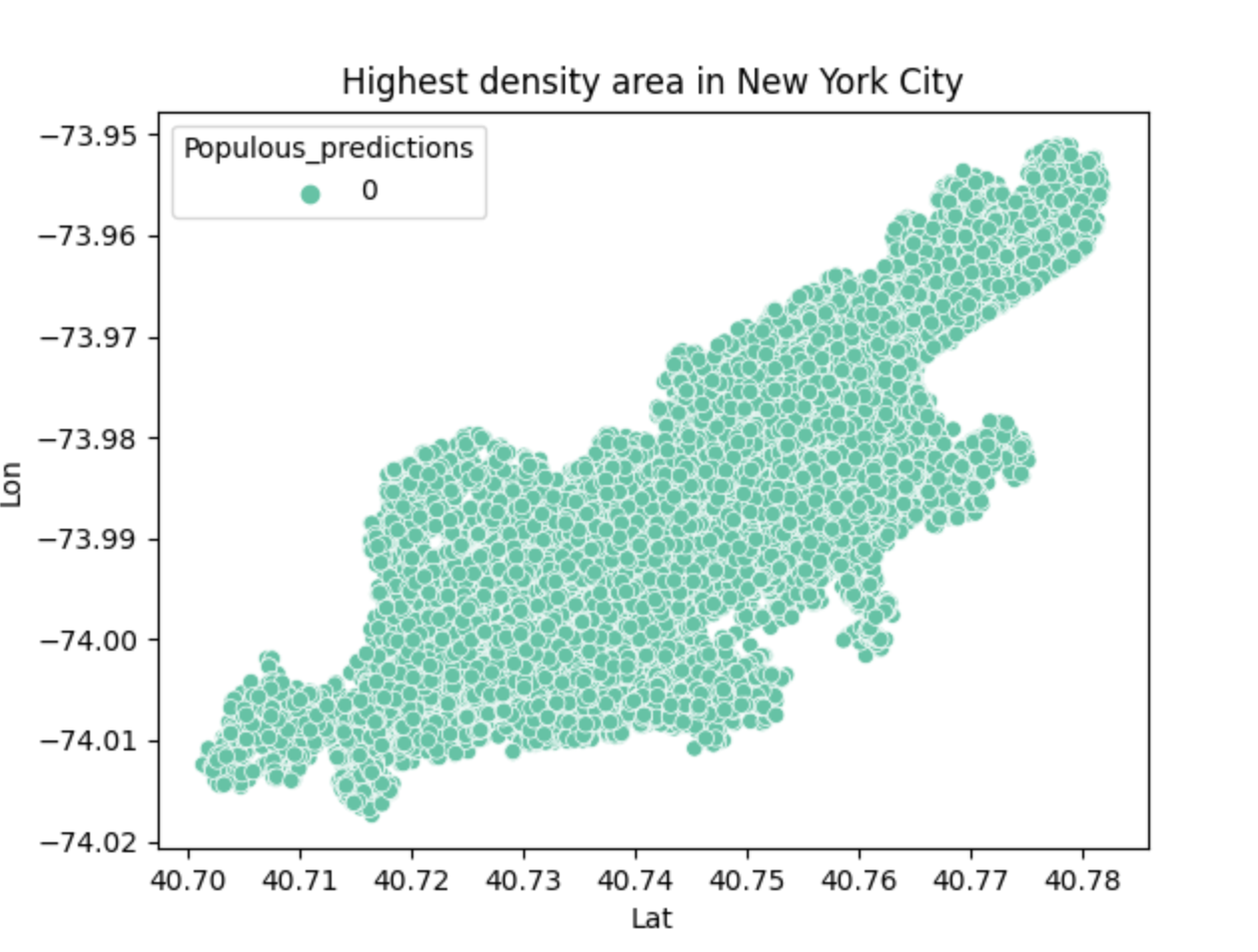
This is the final result of the program, which represents the densest region of the city.
-
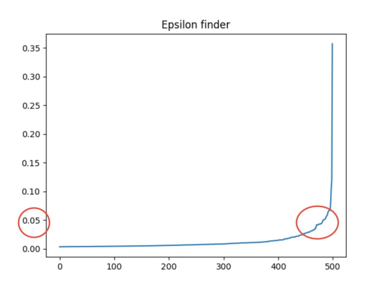
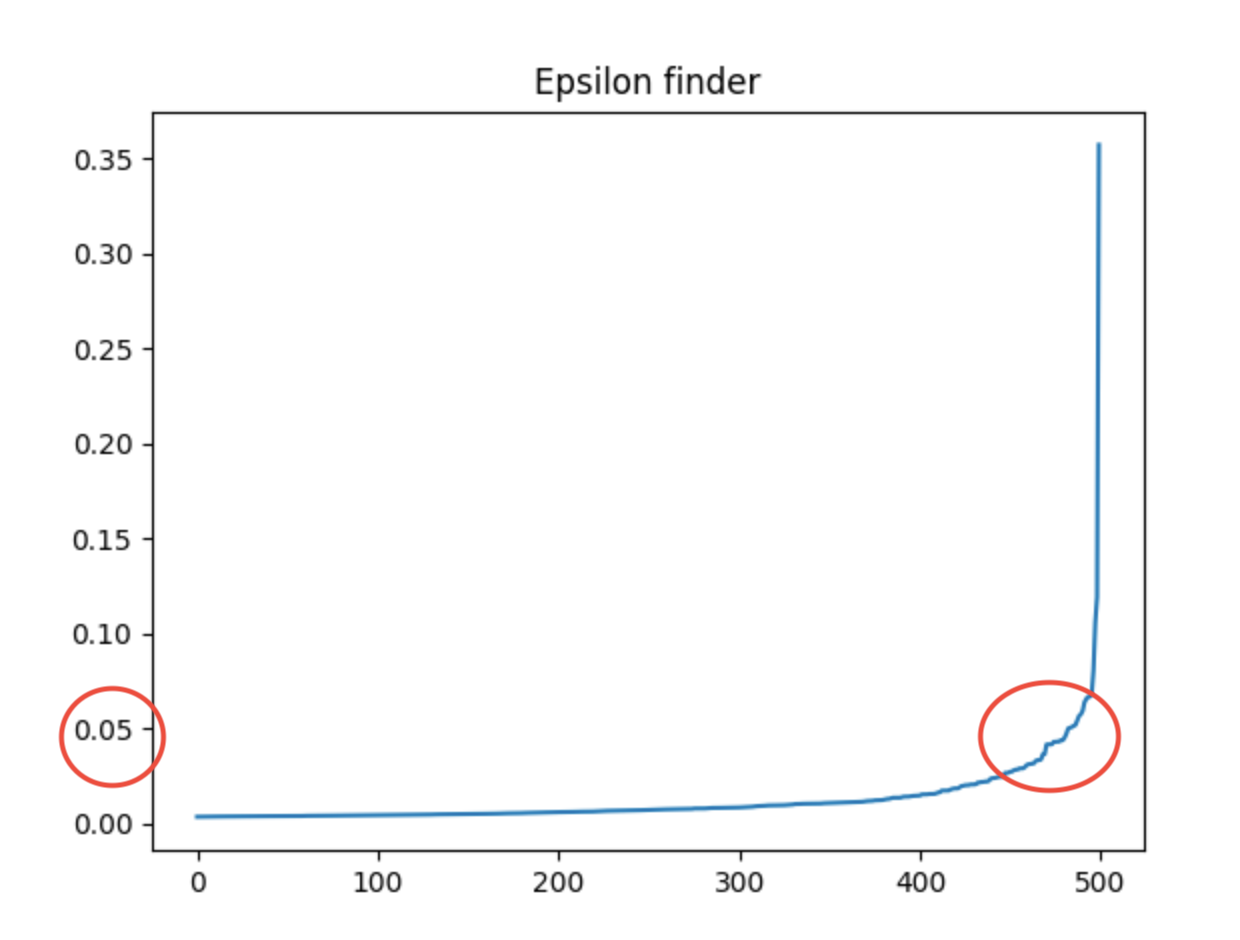
The red circles represent how I got the optimal epsilon value.
-
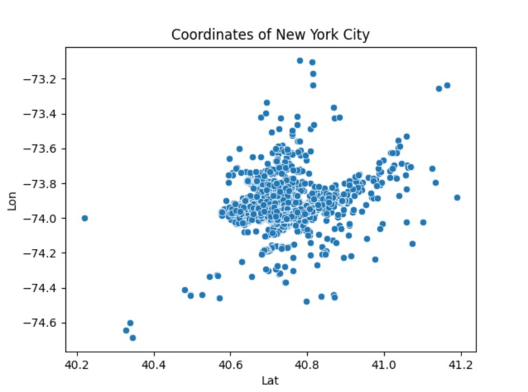
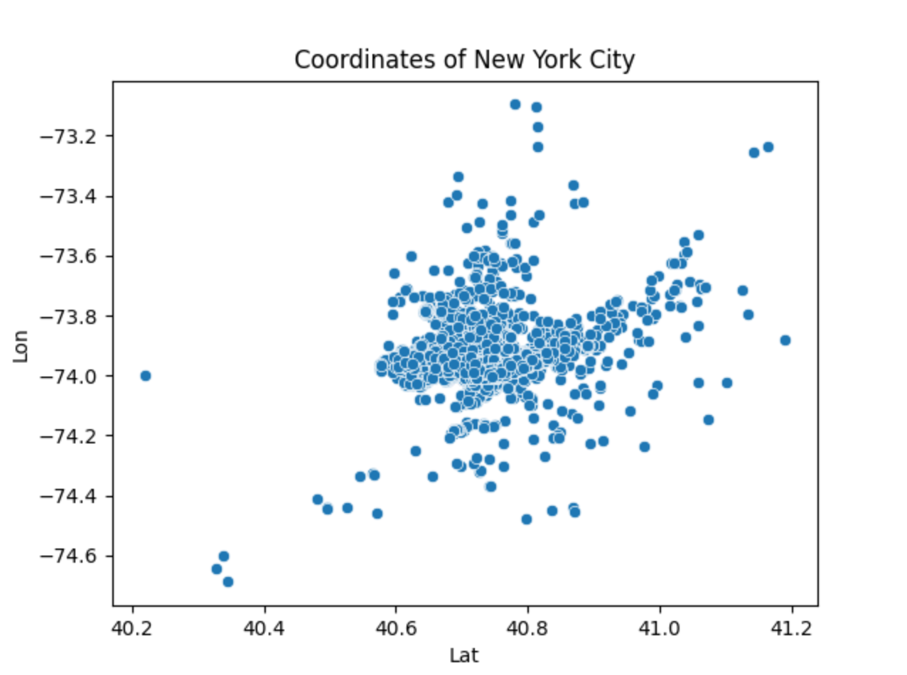
This is a generalized scatter plot of the coordinates of New York City.
-
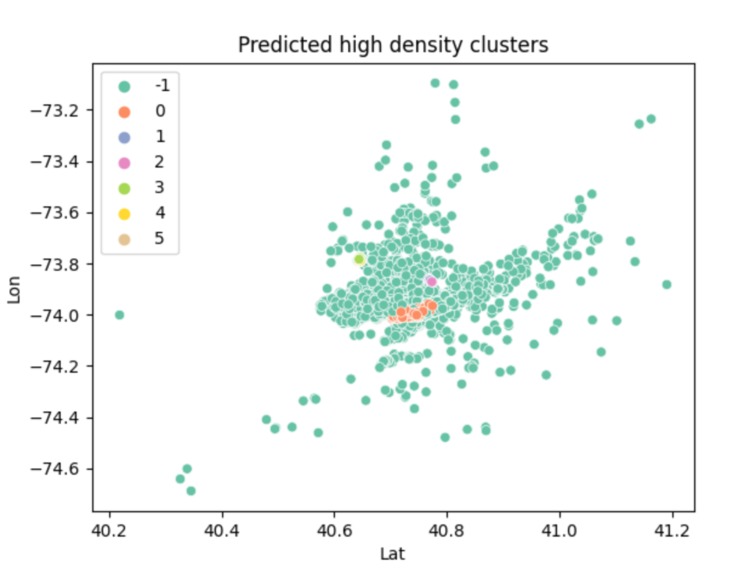
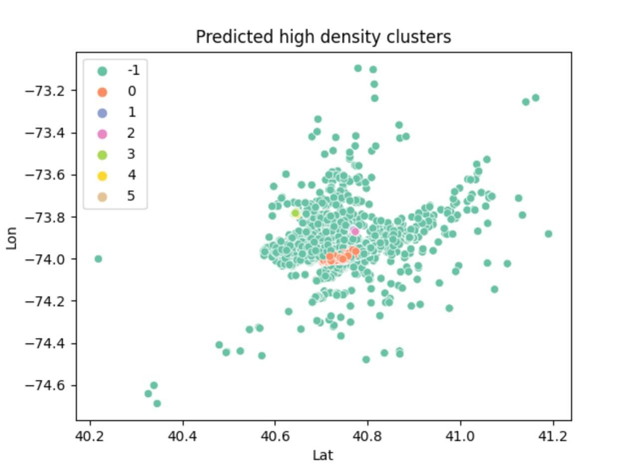
This shows the high density clusters aka the most populated areas of the city.
Inspiration
I have recently taken an interest to data science and machine learning. I do not have the most experience with these fields and wanted to do something that challenged me but also brought me excitement. I've noticed that over the years, ride share companies such as Uber or Lyft have become increasingly popular. I've talked with many ride share drivers in different locations and multiple times, I've been told that they have had a slow night. I wondered if it would be helpful for these drivers to visually see which areas were more populated so they could drive to those areas instead.
What it does
Using raw data from public data link, this program aims to produce a cluster map that shows the most populated areas within a particular region, which in this case is New York City. It is supposed to be a tool for ride share drivers to identify which areas will require the most pickups so they can acquire more rides.
How I built it
This program is based on raw data collected from public data link. I first acknowledged the format of this csv file (uber_raw_data_may14.csv)and parsed it so that only the coordinates (latitude and longitude) remained. This is a huge data set so I minimized the sample size so that it did not take as long to run and plotted this data through a scatter plot to show the representation of the city in coordinates. From there, I standardized the data and then attempted to find the high density clusters. The high density clusters show the parts of New York City that are highly populated. This was done by using the density based spatial clustering of applications with noise (DBSCAN) algorithm. This required a value that helps determine if two points are neighbors called epsilon. I had a separate function to calculate the epsilon by using the kth nearest neighbor algorithm. Once I got the high density clusters figured out, I used a scatter plot to show the different high density regions through different colors. After analyzing that scatter plot, I could tell that when the key of the data was 0, that was where the absolute most populated area was. It is represented by orange in the graph and it is evident compared to the smaller amount of colors on the total part of the graph. I replotted the graph based on this parameter so that it shows the overall most dense part of New York City. I personally think there's a resemblance to Manhattan: )
Challenges
I ran into many challenges when doing this project. I did not have that much prior experience with this field. I had to figure out which libraries I needed to use and research them. I also had to figure out which public data set to use, which was hard to find. There are so many python libraries that exist that this was a very daunting task and I felt very overwhelmed at first. After I gathered the resources I needed, I read the documentation but I really struggled understanding how to use these libraries at first. I also wanted to create a heat map using an API from the Google Maps Platform. I struggled identifying how to create the API key and using it, so I hope to figure how how APIs work better in the future. I also had a hard time with finding the optimal epsilon. I have it hard coded at a value but I hoped I wouldn't have to do that. The graph that shows the optimal epsilon is an exponential graph and I was attempting to return an approximate value of the turning point (when it curves the most). However, I was unfortunately unable to figure it out and had to base it off what I see visually from the graph and hard code it.
Accomplishments that we're proud of
I am very proud that I was able to get a final program that worked. I am proud that I was able to research new documentation and remain calm for a majority of this Hackathon. I felt really excited and motivated to delve into a project that allowed me to see what else python has to offer. Overall, I'm simply proud of the effort I put into this project.
What I learned
I learned that python is a very powerful language when it comes to stuff that involves data. There is so much new information and new libraries that I did not know to exist. As a result of this, I learned that I need to go back and really understand each part. For example, I'm still learning why standardization of data is necessary and all I know from my research is that it is necessary to do so, especially in machine learning. Or the fine details of how DBSCAN actually works, since I decided to use it based off of the high level description of it. I learned a lot of how plots work and how to create clusters based on data. I acknowledged how data visualization provides an easy to understand output for users. When I attempted to use an api key, I learned that you have to be careful with the key and ensure that you restrict access to it to provide better security. A realization I have made over this past weekend is that remaining calm and focusing on my interests, has allowed me to really enjoy working on this project. It did not feel like a chore and it was fun. I also noticed that there was a lot of new information and there are so many libraries that exist for python. I definitely have a lot of learning to do but I'm excited to do so.
What's next for Ride Share Population Map
Ideally, this program can be applied to multiple cities, not just New York City. I want to narrow it down further to identify the hot spots within a city and then more particularly a region. Such as, the final result of this program shows a map that resembles a bit like Manhattan but I would hope that I could show a heat map with more specific clusters using an API from the Google Maps Platform. I attempted some code but I did not have the time to make it work but I want to in the future. I would also hope to create an application with code similar to mine or embed it directly into a ride share app to make it more accessible to ride share drivers. As of now, it is a bit limited to a particular data set and I plan to make it more dynamic and be more flexible with the data sets in the future. I'm also very passionate about the environment. I wonder if I would be able to implement something similar that dealt with the ocean temperatures around the world. Such as compare two data sets from different years and create a heat map to help show or predict what the ocean temperatures will be like in the future.

Log in or sign up for Devpost to join the conversation.