-
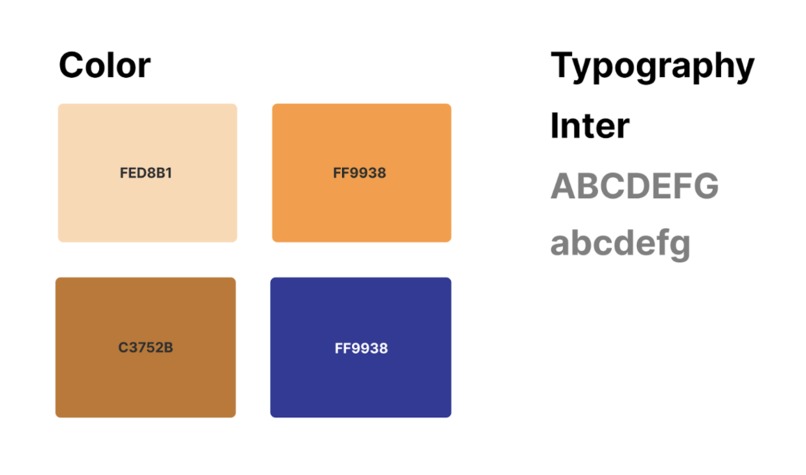
Typography and Color Sample
-
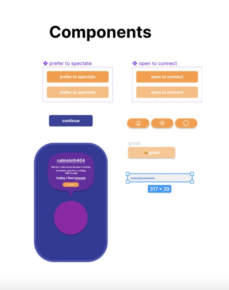
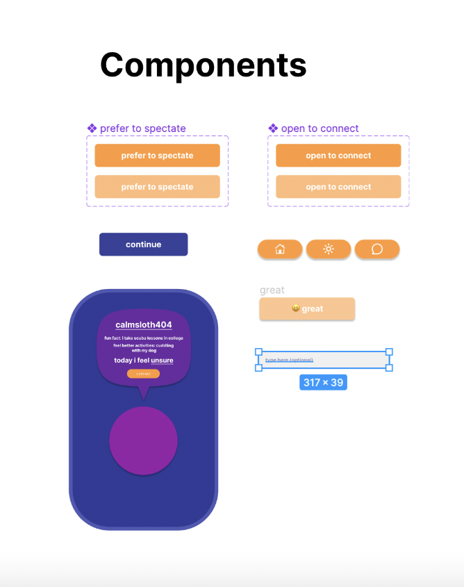
Components
-

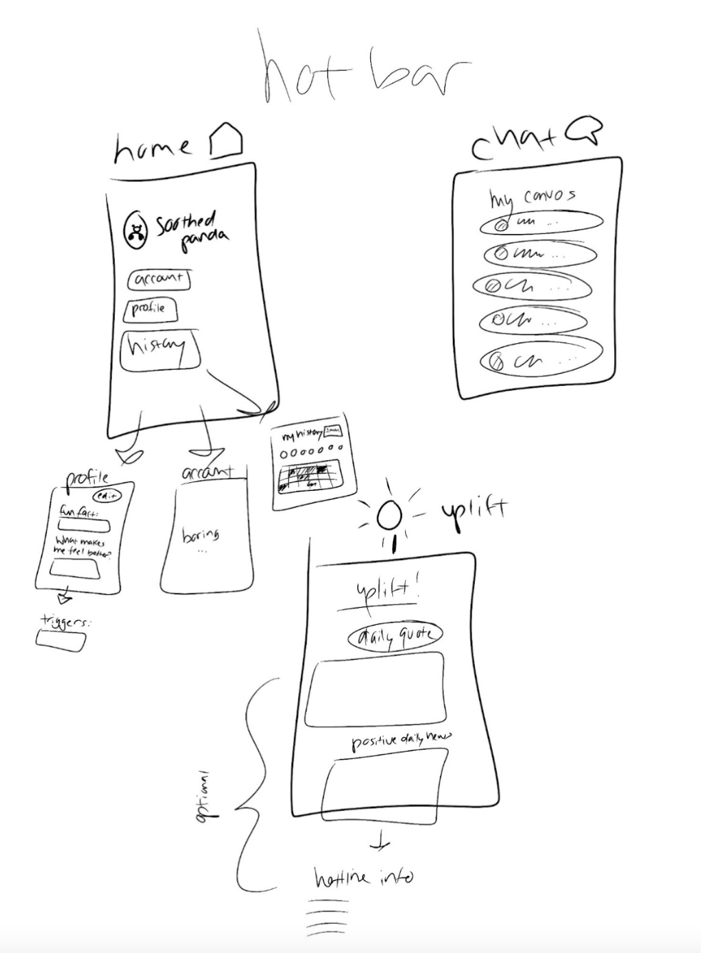
Wireframe (1)
-
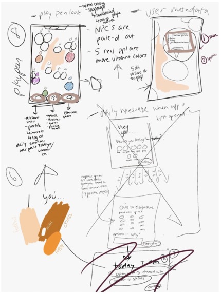
Wireframe (2)


Scope of the Problem
Our team chose Track 2: Health and Lifestyle. The specific problem space we chose was mental health.
We observed that people did not check in on their mental health consistently. With the rising popularity of social media apps like BeReal, we wanted to follow a similar model and incorporate aspects of mental health into the interface. We wanted to create a product that prompted people to check in with themselves in an easy and fast way while also promoting more conversations and transparency around mental health. In this interest, the objective was to show the nearest 5 users anonymously so the user would know they were not alone, while feeling no pressure to divulge personal details unless they chose to. Users are free to share the states of their metal health to carthardic activities or even helpful resources, all without the emotional pressure of close interpersonal interaction.
Problem Statement
How might we encourage people to be more authentic, reflective, and communicative around mental health?
User Research
We wanted to investigate our observations around the consistency of mental health checkins. We began by conducting user surveys, followed by user interviews to gather quantitative and qualitative data to gather more information on our problem space.
User Surveys
What we wanted to learn Demographical information about our primary users The frequency and consistency of self-mental health check-ins and mental health outreach Comfortability and confidence around discussing mental health Familiarity with technology and social media
User Interviews
What we wanted to learn Current methods of maintaining mental health Their idea of a support system What would allow them to be more open about mental health Why do they use their favorite apps (what makes an app fun for them?)
Key Findings Age range: 19-22
Occupation: ⅔ students, the rest are in workforce (designing for students)
Gender: Decent split of male and female
Stressors: School, Career, Money
Weekly mental health check-ins: Everyone has radically different schedules when checking in with their mental health
People are most comfortable being open about mental health when anonymous Current methods of mental health check-ins are quite limited People like it when mental health conversation is non-confrontational Mental health support systems are usually tight-knit People believe the current state of social media is toxic for mental health
Example Scenario If there was a community issue or natural disaster, users would know through the six users in their area how everyone was feeling. There would be an understanding that communities feel and grieve together, free to share their emotions anonymously online.
Design
We started our designs by sketching out wireframes to get a baseline idea of our features and layouts. We wanted the app to prompt users to check in on their mental health and be able to communicate with others around them anonymously through an open map setting.
Color
Our team chose a primarily orange color palette since its color psychology is associated with optimism and energy, which is a positive mindset we wanted to emphasize in a mental health app. As a complimentory color, blue acted as a weighted color that draws the eye some of the more important parts of any given page.
Typography
We chose Inter as our primary font becaue we wanted a clean and simple interface, one where the user is more focused on the use of the app than deciphering the interface. We believe with simplicity, an intuition of app usage/experience takes over.
Built With
- figma

Log in or sign up for Devpost to join the conversation.