Reusable Framework for Mapping Poverty, Education, and Mortgage Denials Using School District-Census Tract Pieces
Inspiration
It is commonly suspected that poverty in its various forms has a negative effect on the educational achievements of an area. Our project aimed to pull back the curtain and make it clear how poverty and education interact, as well as introduce Mortgage denials as an additional indicator of economic hardship. Even from before we started, we wanted to make it easy to visualize geographically areas that are harder hit, and provide a ranking system so that officials can easily see where additional government support can have the most impact. Finally, we wanted to work with technologies that would make it simple for future work to use and combine these data sets.
What it does
The report presents a comprehensive analysis based on the Small Area Income and Poverty Estimates (SAIPE) dataset. It explores poverty percentages among school-aged children in various US school districts, particularly focusing on Texas. The report showcases the disparity in poverty levels, provides visual representations through mapping, and offers insights to guide targeted interventions.
How we built it
For our project we used Docker, Postgresql, bash scripting and python. We hosted a Postgresql server out of a docker container and used the python sqlalchemy library to write out SQL queries programmatically in python, run them natively in Postgresql, and reviewed and visualized summarized reports using pandas.
Datasets with a large number of files were imported to postgresql using python and pandas, and Datasets with one huge file (i.e. HMDA) were imported using pure sql and pgadmin's interface. (The code is available in a notebook in the repository.)
Challenges we ran into
We were not able to get polygons out of the geographic dataset (downloaded from https://data.amerigeoss.org/gl/dataset/school-district-boundaries-current-75ed0) so we found the dataset which we successfully merged (missing only 4 rows) with the SAIPE information for accurate mapping and analysis of poverty in Texas by school district.
Census tract IDs in the HMDA data set have 6 digits following the format of xxxx.xx where census tract IDs in the SDGR either have 10 or 11 digits in the format of STATEID|COUNTYID|TRACT which made it extremely hard to merge these datasets without knowing the formatting and the paddings in the concatenation. We only managed to solve this issue in the last hour of the contest and hope to expand our work at a later time.
Accomplishments that we're proud of
Creating a choropleth map to visualize poverty percentages in Texas school districts.
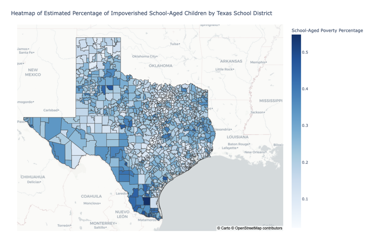
Comparing Texas to other states in terms of poverty in schools

Depicting poverty rates in different states

Highlighting the need for tailored interventions to address the varying levels of poverty across school districts.
What we learned
- Importance of utilizing multiple datasets for more accurate and comprehensive analysis.
- After some initial hesitance, we found that using ChatGPT really did help speed development.
What's next for our project
- Enhancing the precision of poverty estimations by integrating additional datasets such as CRDC. Further research and collaboration to enhance the understanding of poverty distribution among school-aged children.
- We were going to school-districts and census tracts into school distrct/census tract pieces, and divide mortgage denials for a census tract between school district/census tract pieces. We would then add up the pieces to get the mortgage denial rate by school district, and see if there was a strong correlation to the poverty number in the SAIPE dataset.
- Instead of evenly splitting a census tract’s mortgage denials between relevant school district/census tract pieces, it is possible that there is a way to use linear algebra to precisely determine the proportion of mortgage denials to go to each piece.
- Now that we have a choropleth map, it is possible to integrate more data. For example, it is possible to draw another map for different features of the data at hand such as demographics, population, etc. Then it is possible to see possible correlation using the map as a visualization agent.


Log in or sign up for Devpost to join the conversation.