-

Rethread
-
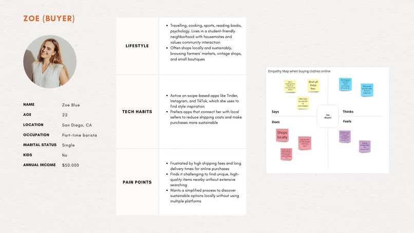
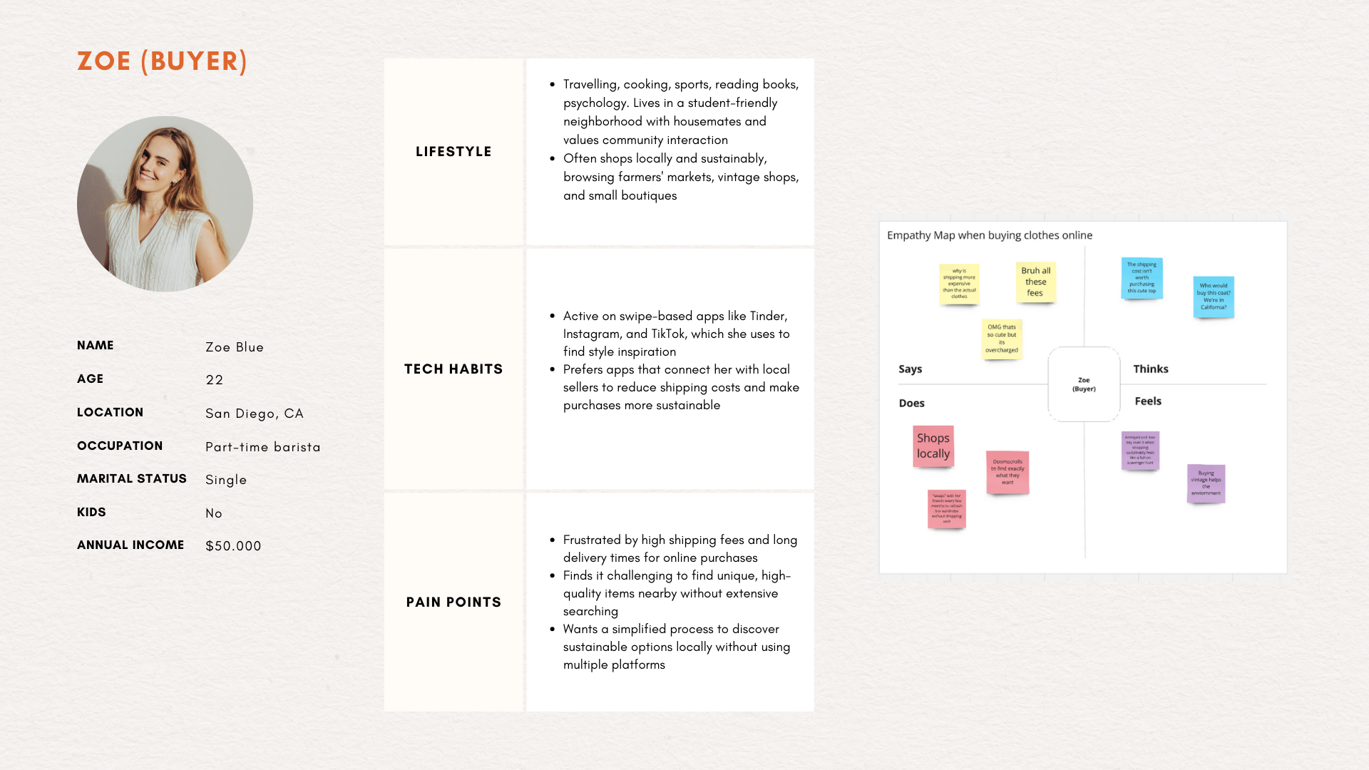
User persona
-

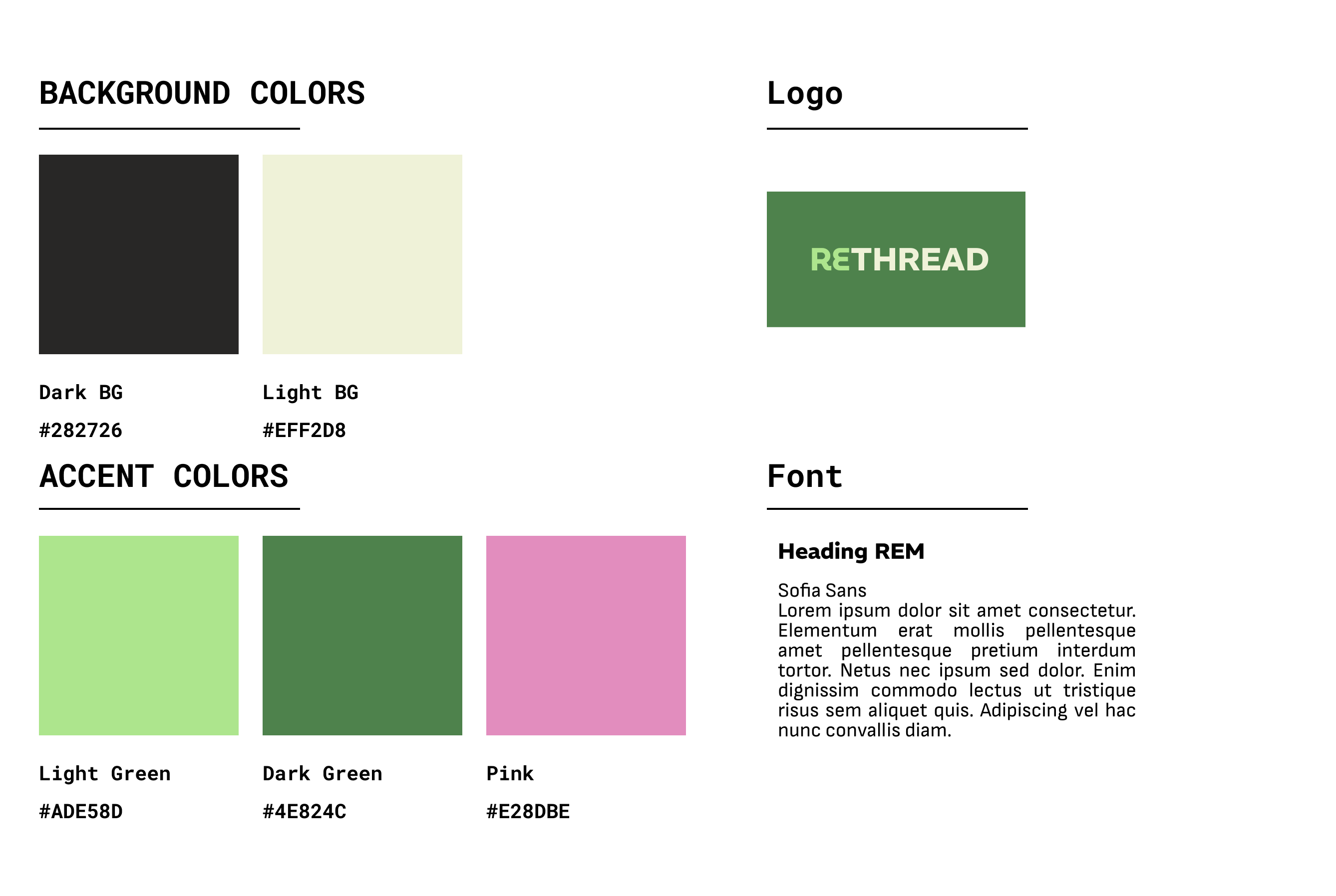
Brand Guideline
-
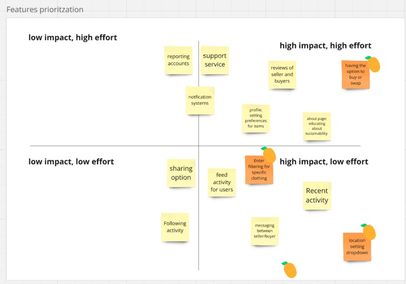
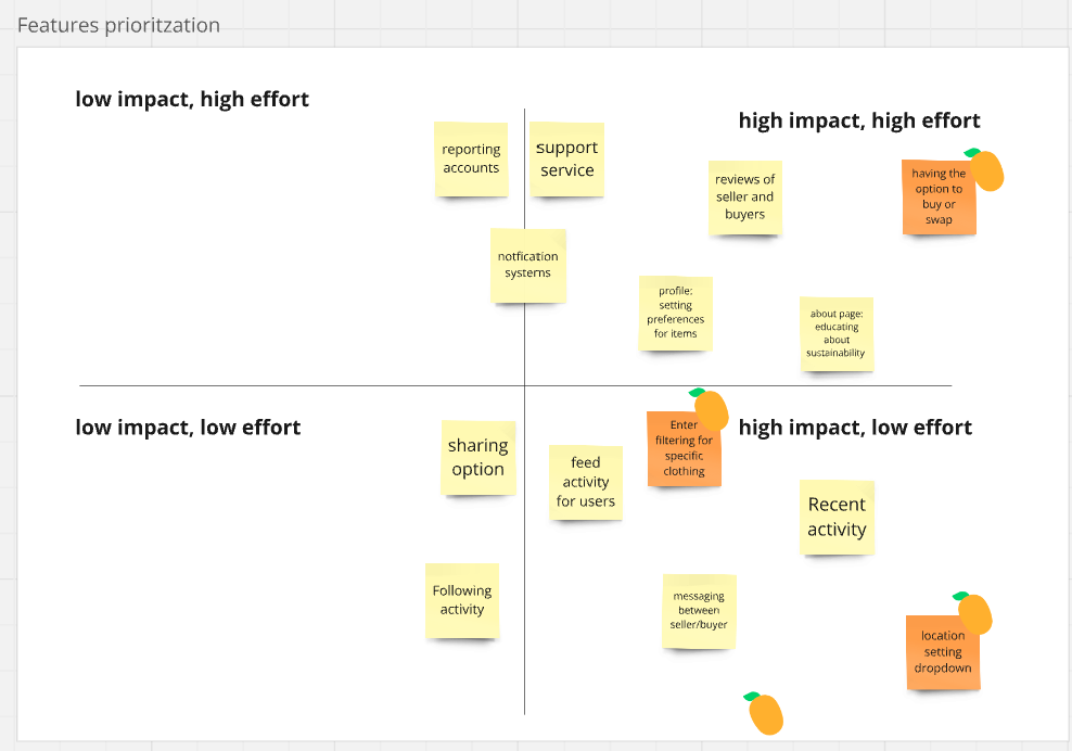
Affinity map-features prioritization
-
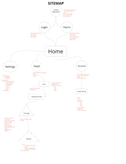
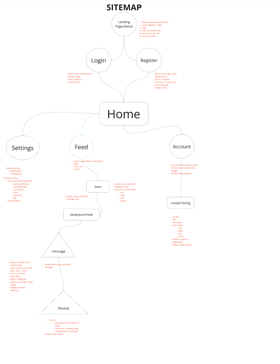
Site plan
Inspiration
We took inspiration from multiple apps such as Tinder, Depop, and Grindr. We wanted to bring the idea of selling or swapping second-hand clothing and mesh it with the UI of popular apps like Tinder and Grindr.
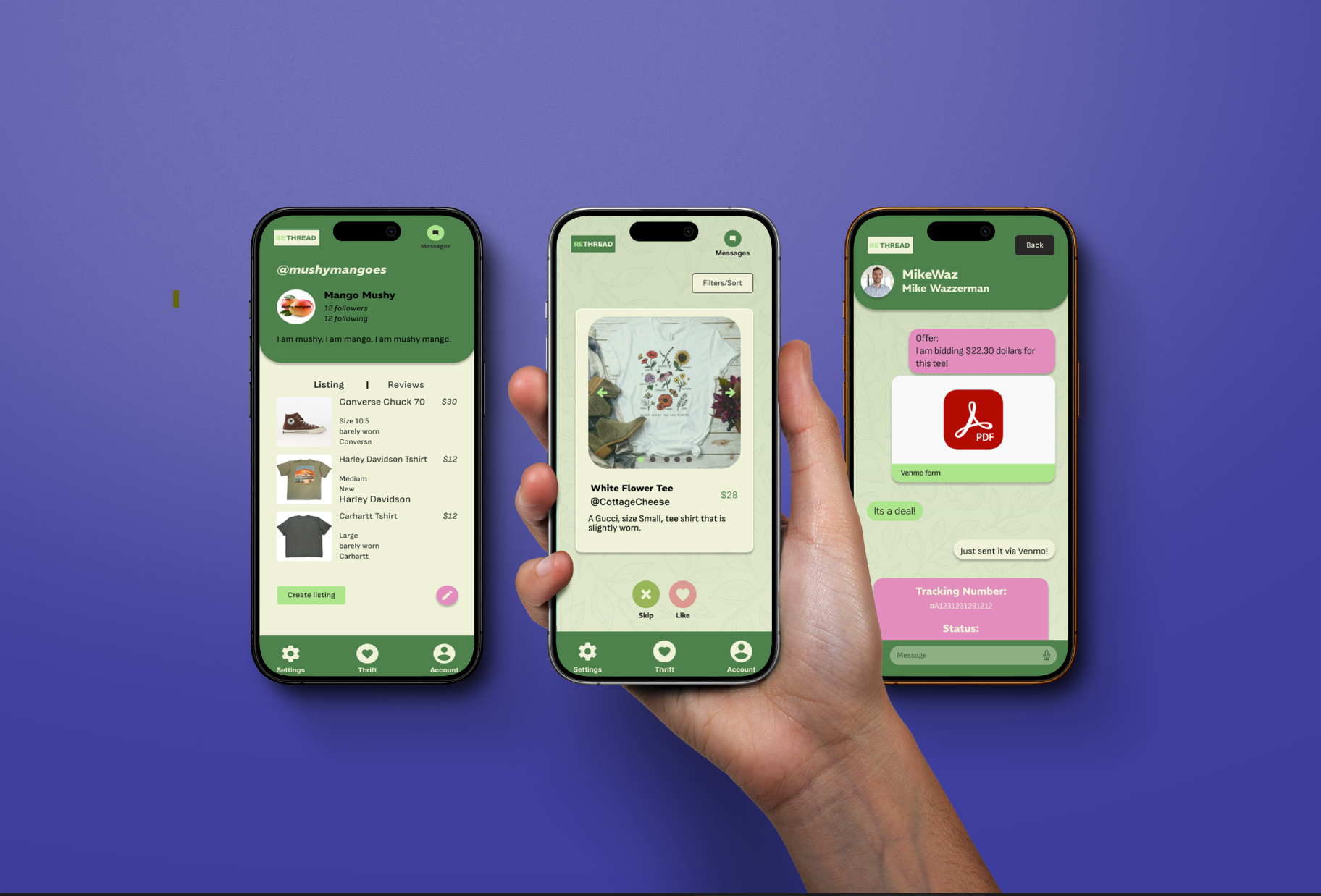
What it does
Our app helps Eco-conscious, young adults, and Fashion enthusiasts lower their carbon footprint by allowing them to partake in eco-friendly consumer behavior such as second-hand fashion. Users can swap, buy, or sell second-hand clothing with sellers/buyers from nearby, lowering carbon footprint and high shipping fees. Transactions between sellers/buyers have also become more transparent with features like confirmation forms, receipts, and messages. Filters for the item have also been implemented to help users find their needs without excessive scrolling.
How we built it
We built this using multiple design strategies starting from the problem statement and its breakdown. We generated research by discovering our target audience, researched data, analyzed competitors, and developed User personas. We developed the pain points of these users and made empathy maps, feature prioritization maps, and sitemaps using Miro. For visual conceptualization, we developed our brand name, logo, and color scheme by gathering inspiration from Pinterest, utilized Web Content Accessibility Guidelines (WCAG) to ensure accessibility, and created cohesive brand guidelines. Afterward, we began the low-fidelity wireframing process to outline the layout of the app via Figma. Finally, we developed the final, high-fidelity prototype, implementing a smooth user flow while also using the color scheme and fonts we had decided on prior.
Challenges we ran into
While talking to our mentor, we found out that our original project sitemap and features were too complex to develop within our time parameters. Afterward, we reduced the feature prioritization to 3 key features and redeveloped our wireframe.
Accomplishments that we're proud of
We are proud to have successfully finished our first design-a-thon project, learned better design techniques, and gained insight into using Figma at a higher level!
What we learned
Since this was our first design-a-thon, we learned that timing and pacing are important. We also learned to focus on the main features and not have too large a scope. We learned more advanced Figma techniques and general design principles, too!
What's next for RETHREAD
Following generating a more complex design including activity tracking and sharing features, we plan to utilize more Alpha testing and start implementing beta testing. Utilizing user testing questions and surveys, we can edit and incorporate features to smoothly transition our app to the development process with a user-focused design.
Built With
- figma
- google-docs
- miro

Log in or sign up for Devpost to join the conversation.