Inspiration
Every creator has done this: you open YouTube Studio, look at the retention graph, and see a cliff at 4:12. A fifth of your audience walked out at that exact moment. And you have absolutely no idea why.
The graph knows when people left. It has never seen your video. It doesn't know that at 4:12 you were holding a single shot for eighteen seconds without cutting, that your delivery had slowed to a crawl, or that a sponsor read was playing.
Meanwhile your editing timeline knows everything about the video and nothing about the audience.
Nobody joins the two. TubeBuddy, VidIQ, Studio itself — they can all show you the curve, but none of them have ever seen the footage. So the single most important question an editor can ask, "what did I do that made people leave?", has no tool that answers it.
That gap is the entire project.
What it does
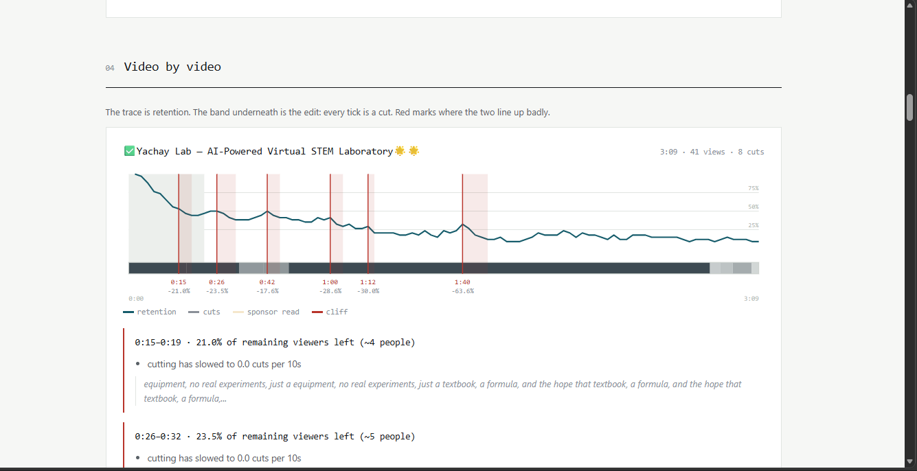
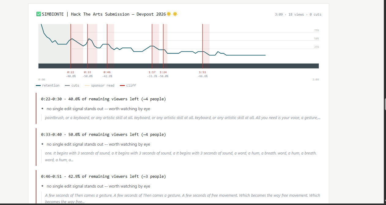
Retention Autopsy joins your YouTube retention data to your actual edit, second by second, and tells you which editing decisions are costing you viewers.
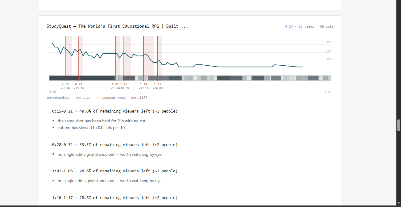
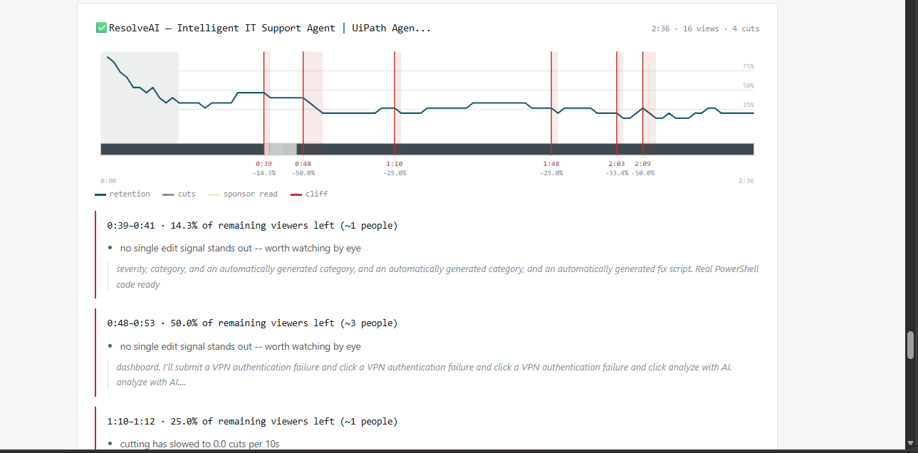
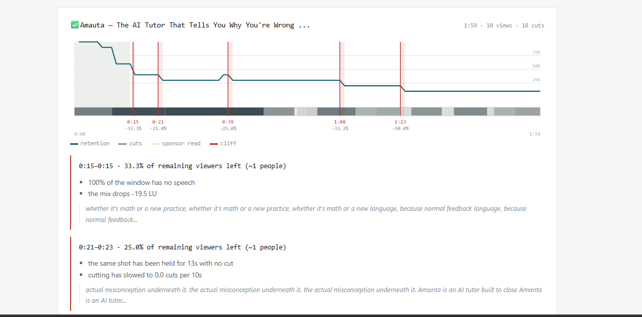
For every retention bucket YouTube reports, it records what the edit was doing at that exact timestamp — how long the current shot had been held, how fast you were cutting, your speech rate, whether the mix dropped, whether a sponsor read was playing — and puts it in the same row as the churn at that moment.
From there it produces four things:
Per-video cliff detection. It finds the runs of buckets where you're losing audience faster than that video's own baseline, then attributes a cause in plain language: a shot held too long, cutting that slowed down, dead air, a mix drop, a sponsor read, or an end-card call to action arriving too early.
Cross-catalogue patterns. This is where it stops being an anecdote. Pooling every video on the channel gives thousands of data points, enough to ask which editing decisions actually predict people leaving on this specific channel. The output isn't a regression coefficient — it's a rule you can tape to your monitor:
Sponsor economics. Not what a sponsor paid you — what the read cost you in audience, net of the churn any sixty seconds of video causes anyway. And whether placement (early vs. late) makes a measurable difference. That's a pricing decision for the next contract.
A self-contained HTML report. Inline SVG, no CDN, no build step, no network at render time. The signature element is the strip: the retention trace sitting directly on top of the edit timeline, where a dark block (a long shot) sitting under a dip in the curve is the finding, visible at a glance.
How I built it
The architecture separates the four concerns cleanly: Four decisions I'd defend:
Churn, not slope. The target variable is the share of remaining viewers lost per bucket, not the raw derivative of the curve. Raw slope is dominated by the first thirty seconds — everybody bleeds viewers there, for reasons that have nothing to do with the edit — and it makes late-video problems invisible because there's barely anyone left to lose. Losing 5% of who's left at 8:00 should register as loudly as losing 5% at 0:20.
Breakpoints, not quartiles. Asking "do long shots hurt?" with fixed quartiles systematically understates the answer. If shots only start costing you past 12s but the top quartile begins at 7s, that bin averages harmless shots together with harmful ones. So the tool searches ~25 candidate thresholds for where behaviour actually changes — and reports it, because "your edge is 14 seconds" is something an editor can use and "the top quartile" is not.
Sponsor detection by keyword scoring, not an LLM call. It's deterministic, so a judge re-running the demo gets the same segment every time. It runs offline. And it's auditable: when it flags a read, you can see exactly which phrases fired.
One core dependency: numpy. Everything needed to run the demo, pass the tests, and render a report installs in seconds. Google clients, PySceneDetect and Whisper are optional extras — because a heavy install that fails on conference wifi is a demo that doesn't happen.
Challenges I ran into
Proving the numbers aren't nonsense. This was the hardest problem, and it isn't a coding problem. Anything can print a confident number from a retention curve. How do you know it's measuring what it claims to measure?
The answer was to build a fixture generator that plants known effects — long shots cost 2.2x, sponsor reads cost 4x, early reads cost another 1.8x on top — generate retention curves that obey them plus noise, and then check the pipeline recovers those figures from the curves alone, with nothing telling it the ground truth.
That approach immediately caught two bugs that would otherwise have shipped silently:
Quartile binning reported the planted 2.2x effect as 1.39x. The true 12s threshold sat at the 92nd percentile, and the search range was capped at the 85th — so the search literally could not reach it. The tool would have understated a real editing problem by half, while looking perfectly confident. This is what led to the breakpoint search.
ratio_bootstrap_ci returned exactly 1.0 on groups too small to resample. That reads as "measured, no effect" when the truth is "not measured yet" — a silent lie, and the worst kind, because it's indistinguishable from a real finding. It now returns the point estimate with an unbounded interval instead.
The multiple-comparisons trap. Searching 25 thresholds and keeping the best one means some split will always look impressive, even on pure noise. Solving it honestly required a max-statistic permutation test: shuffle the target, redo the entire search, and compare the observed ratio against the best one the search finds under the null. There's a test that feeds the search random data and asserts it does not invent an effect.
Sponsor boundaries. The first implementation scored 20-second sliding windows, which told you whether a read was present but made terrible boundaries — a single trigger phrase at second 5 would mark the whole window from zero. Fixed by mapping cue phrases back to word-level timings and anchoring segments to where the commercial language actually sits, with padding capped as a share of runtime so short videos don't get swallowed whole.
Making the visualisation actually communicate. The first version of the report drew one tick per cut. On a fast-cut video that's 300 ticks across 900 pixels — a solid grey bar carrying zero information. Replaced with a shot-length heatmap where dark means a long shot held. Now the thesis of the whole project lands instantly: dark block sitting under a dip in the curve.
Accomplishments that I'm proud of
The estimator recovers the planted 2.2x effect as 2.15x, with a 95% confidence interval of [2.02, 2.27] — the true value lands inside the interval. That's the difference between a tool that measures and a tool that prints plausible-looking numbers.
Every number the report shows ships with a confidence interval, a p-value, and a sample size. When there isn't enough data, it says "weak" or omits the section entirely rather than rounding up. The sponsor section disappears on a channel with no sponsored content instead of fabricating a figure.
And it's genuinely defensible: retention is owner-only data from the YouTube Analytics API. No third-party tool can compute this for a channel it doesn't own, which is precisely why the gap existed in the first place.
What I learned
The gap between "passes its own tests" and "works when real data hits it" is where the interesting bugs live. Synthetic fixtures are clean by construction — sequential workflows, always-present signal, well-formed responses. Real catalogues have livestreams with no duration, videos below the retention privacy threshold, and hidden view counts.
Statistical honesty is a feature, not a disclaimer. The instinct is to make every number look strong. But a tool that says "not measured yet" when it doesn't know is worth far more to a creator than one that always sounds confident — because the first one can be trusted the moment it does sound confident.
Choosing the right target variable mattered more than any algorithm. Switching from raw slope to hazard (share of remaining audience) was a two-line change that made every downstream finding meaningful. Late-video problems were simply invisible before it.
What's next
Export markers to the NLE. A .edl or CSV importable into Premiere or Resolve, dropping a marker at each cliff directly on the editor's timeline. Seeing the problems inside the software where you actually fix them is the natural endpoint of this tool.
Compare against your own best video, not the channel average. The most useful benchmark isn't "the average of everything you've made" — it's the one that worked.
Sponsor detection in more languages. Currently English-only keyword scoring. It's a dictionary in transcript.py, so it's extensible by design.
Retention curves for A/B'd thumbnails. Once you know which edits cost you viewers, the next question is which packaging brought the wrong ones in.


Log in or sign up for Devpost to join the conversation.