-
-
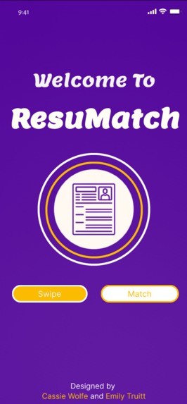
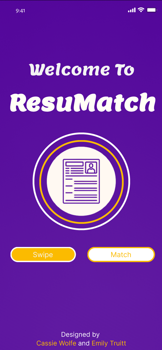
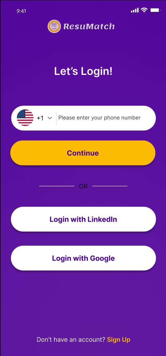
The First Screen of ResuMatch
-
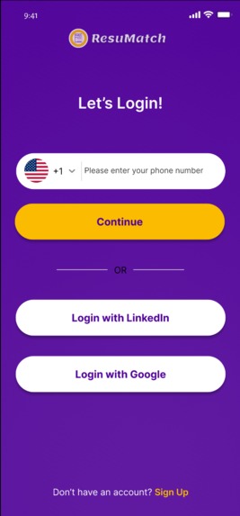
The Initial Login for the User
-
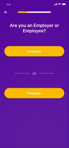
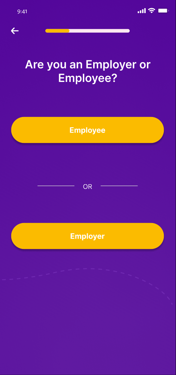
The User Selects Whether they are an Employee or Employer
-

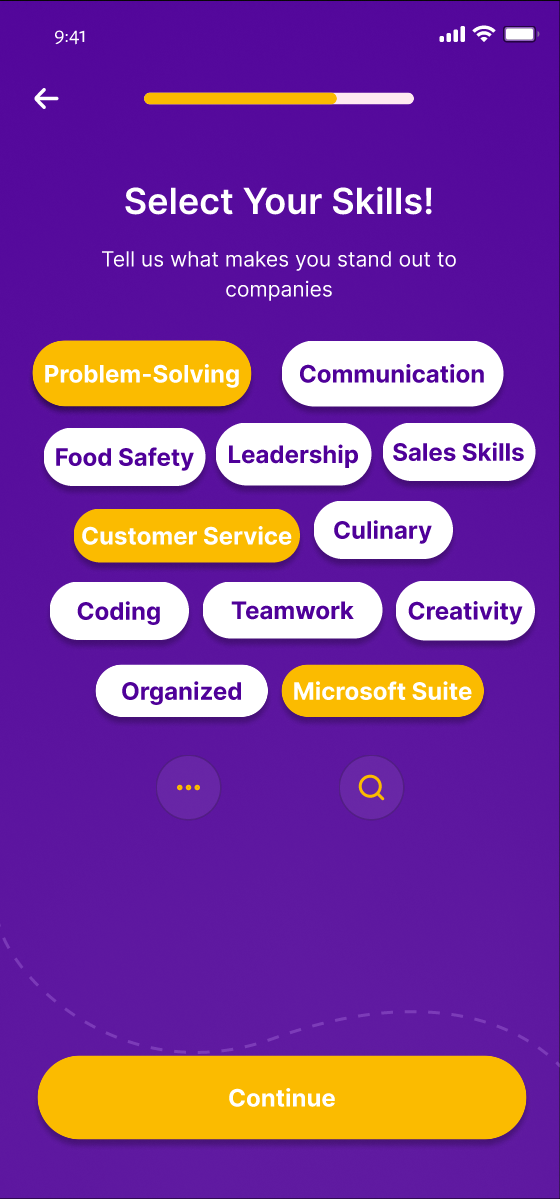
The Skill Web the User Selects From
-
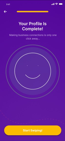
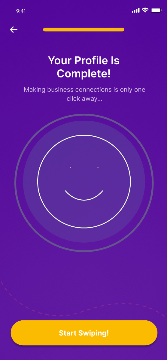
The Page When a Profile is Complete
-
-
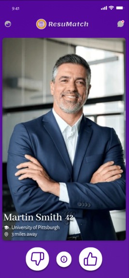
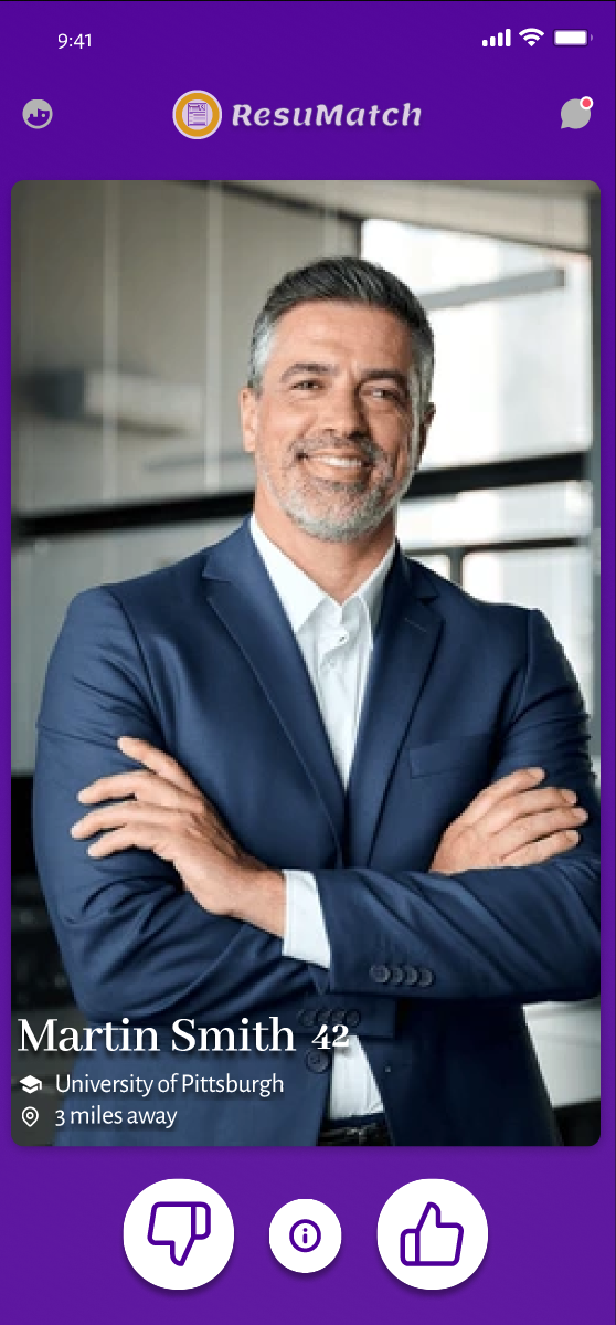
Example Profile for Swiping Algorithm
-

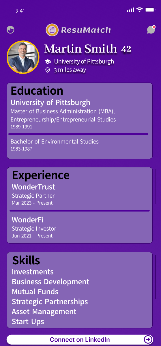
Information for Profile Page
-

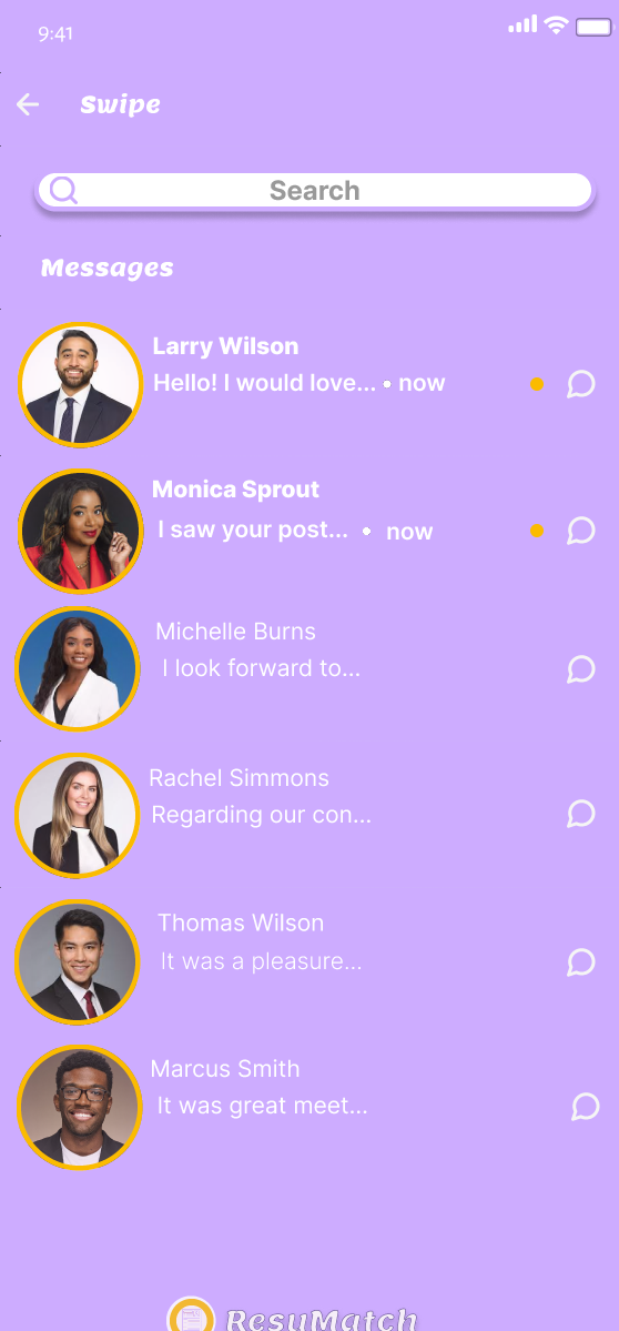
Message Section of ResuMatch
-
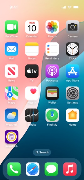
ResuMatch as an Application on the Home Screen


Inspiration
When discussing resumes and the average time spent looking at them, it brought to mind the concept behind Tinder. What if the recruiter could simply look at an applicant's profile and swipe left or right on them? What if the employee could simply look at a company/manager's profile and swipe left or right on them? When both swipe right, they will find a match! We proceeded with our vision because it would be the perfect opportunity for employees and employers alike, different than all other job-searching apps that precede it!
What it does
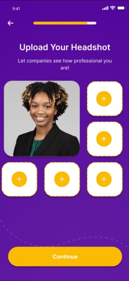
When loading into the app for the first time, the user is prompted to create an account/login. The process is as follows; login with user's phone number/LinkedIn/Google, asks the user's name and email, and is then prompted to answer whether they are an employee or employer. If they select "Employee," they are then asked to upload their resume, what type of job they are looking for, what type of work they are looking for, preferred annual salary, where they are located, and their education level. They are then brought to a web of skills/talents that they select from and can search for that are not included. Next, they are prompted to upload their headshot and other professional photos if they so choose. Their profile is now complete and they can start swiping! However, if they chose "Employer," they are asked to verify their company, what type of job their hiring for, what type of work they're searching for, their company's annual salary, where the company is located, and preferred education level. They are brought to the same web of skills, yet with the intent of what they are searching for. Finally, they are prompted to upload their company's page. Their profile is also complete! It then brings the users (employee or employer) to the swiping portion of the app. The user is brought to the profile page of another person that has their name, age, educational background, and location included. When they click the button for more information, it brings them to a page that has their education, experience, skills, and more. They can then swipe up back to the profile to make their decision. They can either swipe right or click the thumbs up button to approve the profile. They can swipe left or click the thumbs down button to disprove the profile. They are then given another person to decide on. The user can also select to go to their messages from their matches. To close the application, they simply swipe up as if they were closing another other app!
How we built it
We used the cloud-based design tool Figma to plan and design ResuMatch. We created sketches and mockups to show how the app would look and work, focusing on making the profile set-up and swiping experience smooth and easy to use. Throughout the process, we made improvements based on setbacks to make sure the app would be user-friendly and effective for matching job seekers with employers.
Challenges we ran into
One of our biggest challenges was that neither of us had ever used Figma before, so we had to learn and adapt to new software as we went. Figuring out the tools and features took time, but we gradually got the hang of it. Another major setback was when Emily’s (ResuMatch's co-creator) computer suddenly stopped working halfway through the project, making it difficult for us to collaborate. Despite these obstacles, we found ways to adapt and keep moving forward.
Accomplishments that we're proud of
We’re proud that we were able to bring our idea to life despite the challenges we faced. Learning Figma from scratch and using it to design a functional and visually appealing app concept was a big achievement for us. We’re also proud of how we worked as a team, especially when Emily’s computer stopped working—we adapted, problem-solved, and kept pushing forward. Seeing our vision take shape and being able to present a polished concept is something we’re really excited about! Especially because this is the first hackathon either of us have attended!
What we learned
This project taught us a lot about the design process and how to bring an idea from concept to prototype. Since we had never used Figma before, we learned how to navigate its tools and features to create an interactive design. We also learned the importance of adaptability—when unexpected challenges came up, like Emily’s computer breaking, we found ways to adjust and keep moving forward. Most importantly, we gained experience in teamwork, problem-solving, and turning an idea into something tangible.
What's next for ResuMatch
We’re excited about the potential of ResuMatch and would love to take it beyond just a concept and initial version. With a working prototype already in place, the next step for ResuMatch is refining and expanding its features. We’d like to improve the user experience, gather feedback, and explore ways to integrate real job listings and employer profiles. Additionally, we would like to have potential partnerships or collaborations with developers to help bring ResuMatch to a larger audience and make it a fully functional platform for job seekers and employers.
Built With
- figma


Log in or sign up for Devpost to join the conversation.