-
-

Desktop
-

Tablet
-

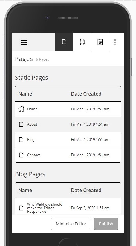
Mobile


Inspiration
I have wanted to provide my clients with a responsive editor for a while, so they could edit content from their phones if they needed to.
What it does
This is a simple prototype of what a responsive Webflow Editor could look like and it is responsive for all screen sizes.
How I built it
I used Webflow!
Challenges I ran into
Getting the editor to minimize and maximize nicely took quite a bit of time. That is why I wasn't able to make the tabs switch and provide a full prototype.
Accomplishments that I'm proud of
It was fun taking the current design and making it a little more the way I would prefer.
What I learned
I learned that it is possible to do a small web app prototype in just a few hours with enough motivation!
What's next for Responsive Webflow Editor!
Anyone can clone this project and if you want, you can build on to it by making the content in the editor change. For instance, if a person clicks the collections tab, it should show a table of collections.


Log in or sign up for Devpost to join the conversation.