-
-
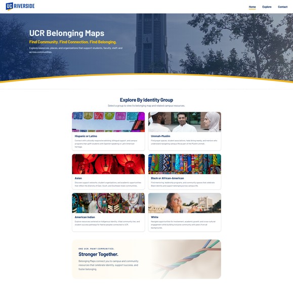
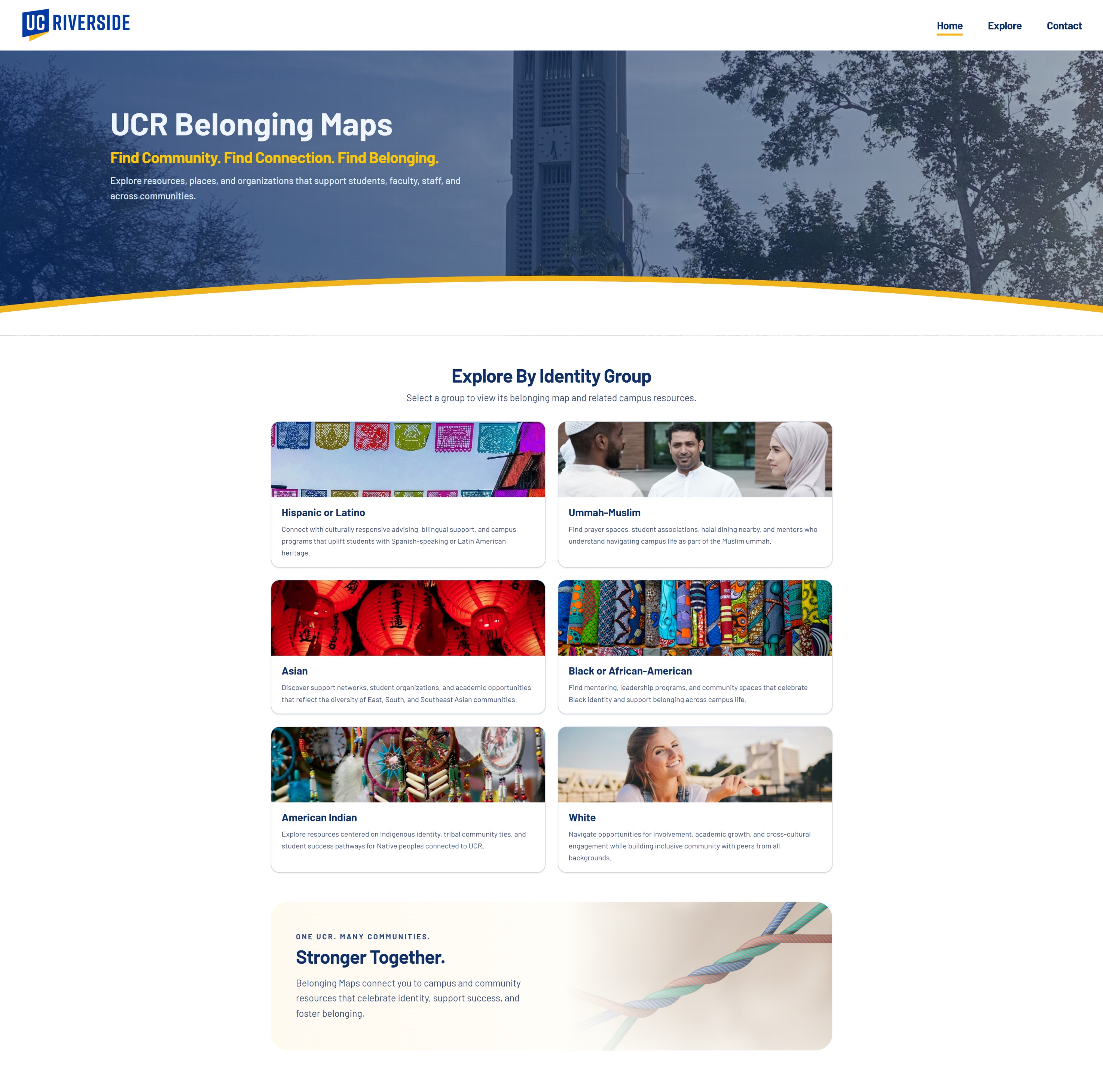
Home page
-

Subpage
Inspiration
We were inspired by Sacramento State’s Belonging Maps model: a single, approachable place to discover both official campus resources and community-rooted spaces around the university. We wanted something similar for UC Riverside—grounded in how students actually look for support, food, culture, and connection in Riverside and the Inland Empire.
What it does
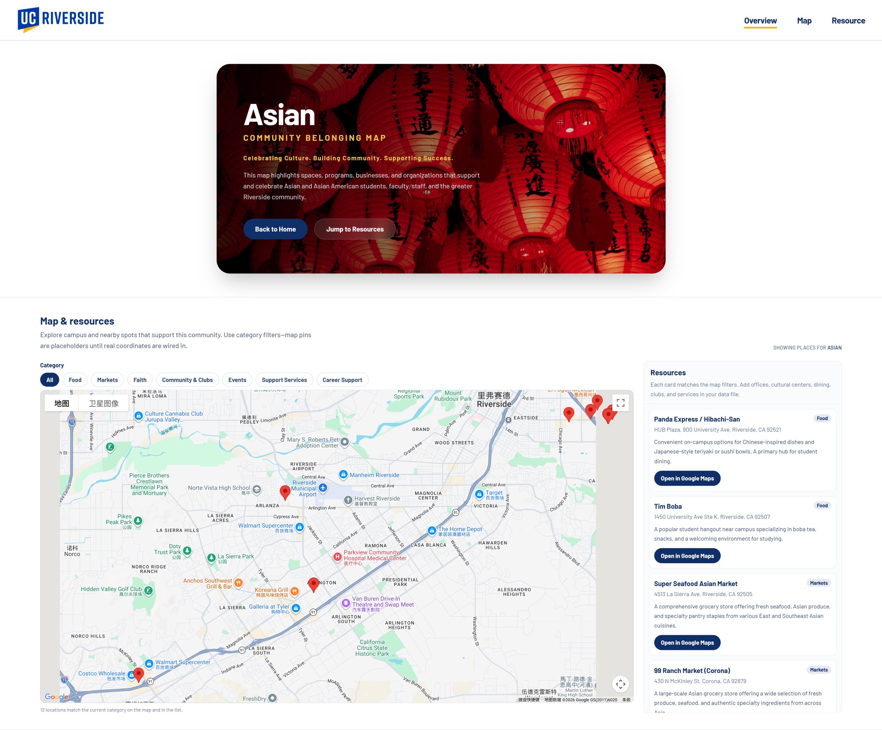
Resource Map UCR is a multimedia-style campus and regional guide. Users browse community hubs (for example Hispanic or Latino, Asian / AAPI, and others). Each hub combines an interactive map with a filterable list of resource cards so the map and the list always match. Cards highlight services, student orgs, dining, faith spaces, and local spots, with addresses and “Open in Google Maps” style links so people can go from discovery to directions quickly. The goal is stronger visibility, access, and belonging for students, staff, faculty, and visitors.
How we built it
We built the main experience as a React app with Vite, TypeScript for shared data types, and Tailwind CSS for layout and styling. We also integrated Google Maps for markers and exploration, and we store curated place data in TypeScript modules under src/data/. Screenshots in the README document the current UI.
Challenges we ran into
-- Finding reliable information: It was time-consuming to gather accurate details for community resources and businesses, especially when information like hours, services, or contact details was incomplete or inconsistent.
- Design trade-offs: We prioritized accessibility and simplicity over complex design so we could focus more time on building out meaningful data for the app.
- No backend setup: We initially faced issues setting up a backend, so we shifted to a frontend-focused approach to keep development moving.
- Rapid prototyping: Instead of using a full Figma workflow, we worked from a basic paper wireframe, which made iteration faster but required more adjustments during development.
- Layout decisions: Even with inspiration, creating a cohesive and functional layout took more time than expected.
- Time constraints: Given the scope of the project, we need more time to expand and verify resources in the directory.
Accomplishments that we're proud of
- Shipping a cohesive map + resources flow that feels useful for real navigation, not just a static list.
- Community-first organization (hubs per identity/community) instead of a single generic directory.
- Practical details on cards (categories, blurbs, Google Maps links) so the product is actionable.
- A clean, extensible data layout that makes it easier to add more places and more communities later.
What we learned
- Belonging is spatial: maps change how people notice resources they might never find on a PDF or buried website.
- Design and data are equally important: good UX only shines if the dataset is intentional and maintained.
- TypeScript data modules help keep categories, slugs, and map fields consistent as the project grows.
What's next for Resource Map UCR
- Expand and verify listings (hours, contacts, accessibility) with campus partners or student orgs.
- Add more community hubs and deeper multimedia (photos, short audio or video where appropriate).
- Optional backend features: saved favorites, suggested routes, or light admin tools to update places without editing code.
- Accessibility and internationalization (language options, screen-reader polish). Longer term: explore official collaboration with UCR offices so the map stays current and trusted.
Built With
- react
- tailwindcss
- typescript

Log in or sign up for Devpost to join the conversation.