Inspiration
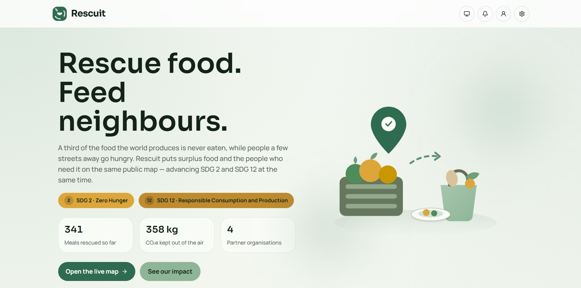
A third of the food the world produces is never eaten. At the same time, hundreds of millions of people do not get enough.
These are usually treated as two separate problems, handled by separate organisations, measured separately, funded separately. But they are frequently happening on the same street. A bakery closing for the night and a family three doors down have no shared surface on which to see one another.
That gap — not a lack of food, and not a lack of willingness, but a lack of visibility — is what Rescuit exists to close.
What it does
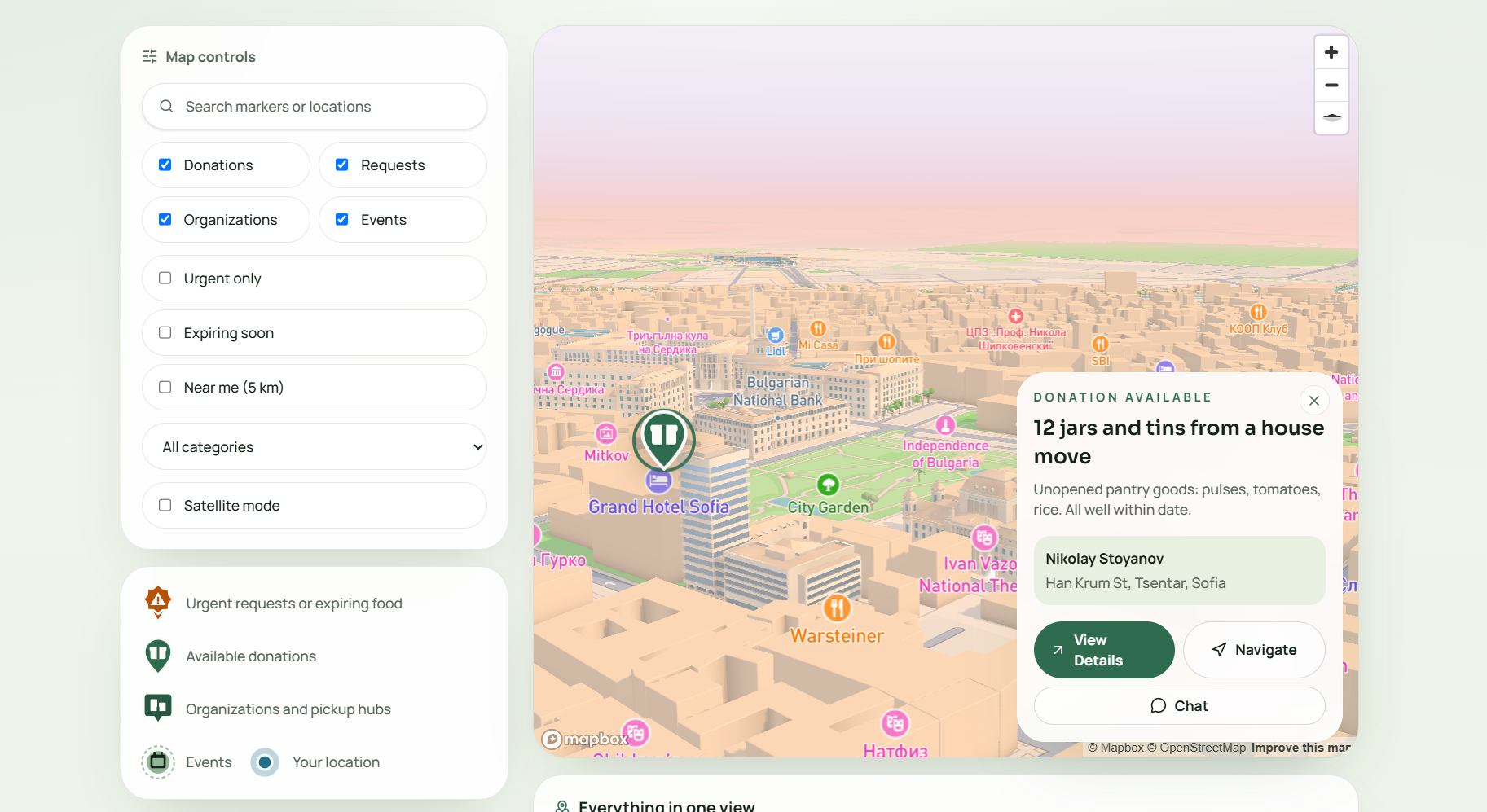
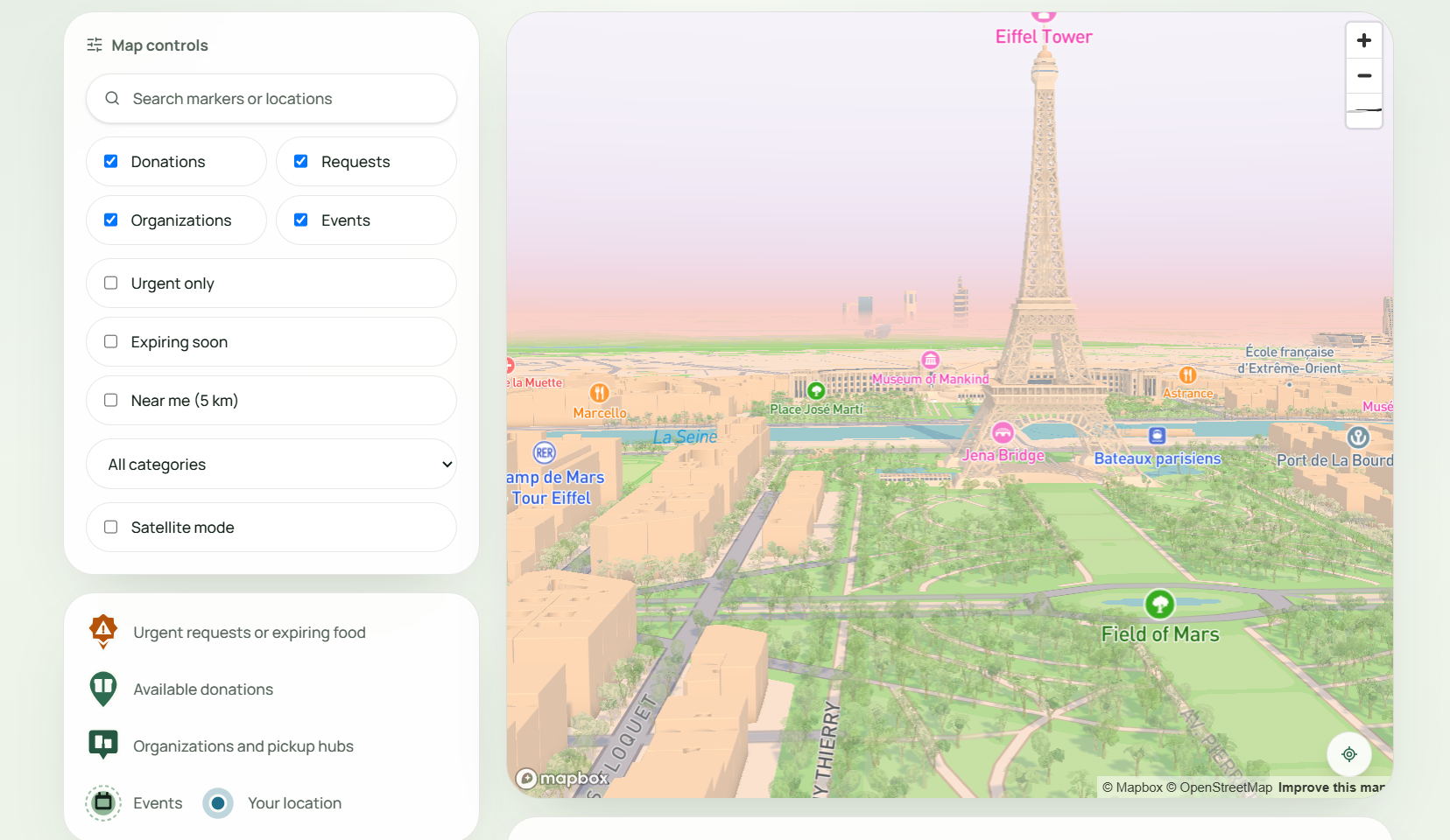
Rescuit is a public map where surplus food and the people who need it can find each other.
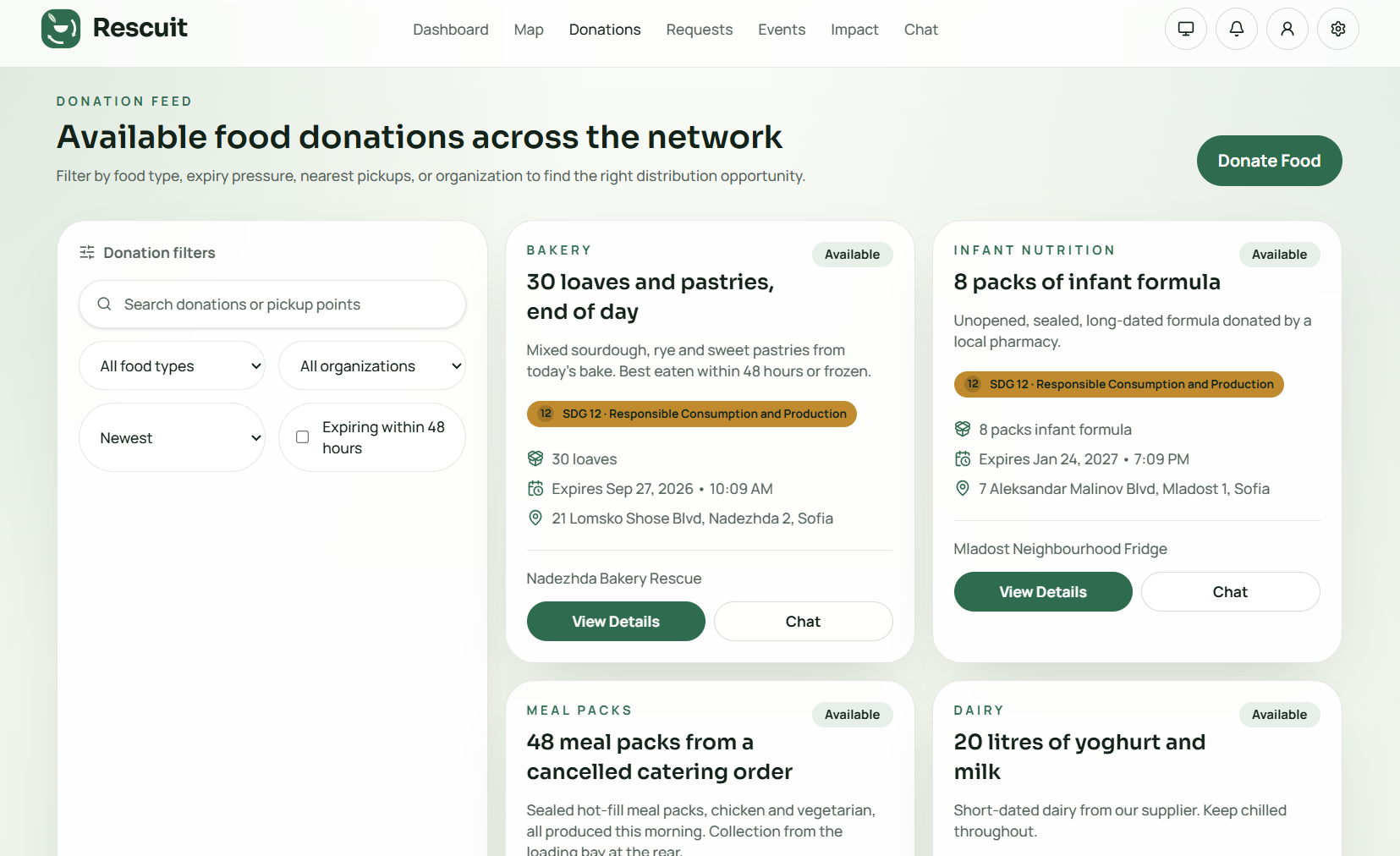
- Anyone can list surplus. Shops, kitchens, NGOs and households post food they cannot use, with category, quantity, expiry, pickup window and location.
- Anyone can browse it. The map is public. A person who needs food should not have to register, be referred, or explain themselves before they can see what is nearby.
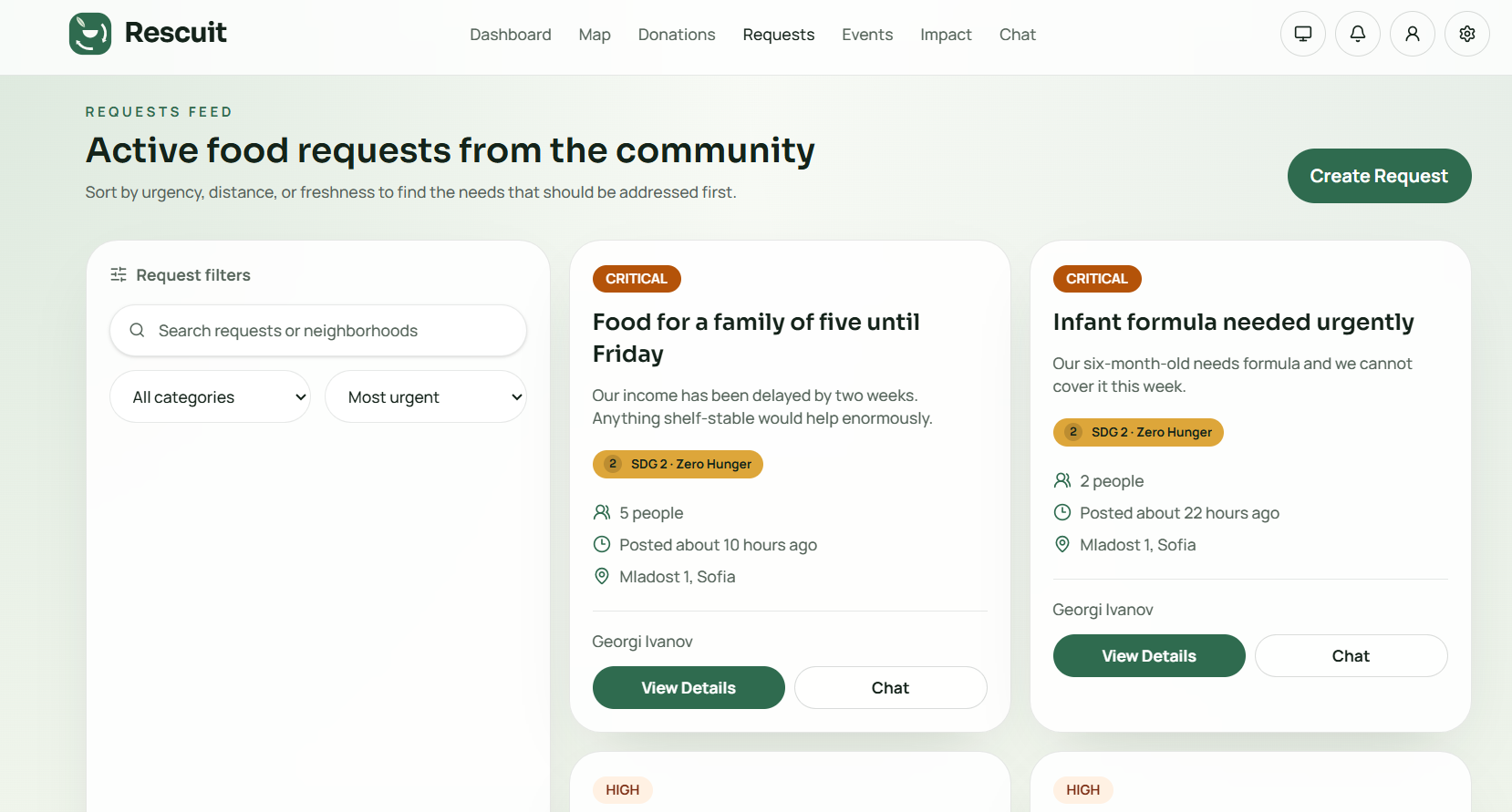
- Requests carry urgency. People say what they need and for how many. Low through critical urgency decides where each request lands in the response queue.
- Claiming closes the loop. A claim reserves the food so two people never travel for the same bag. Marking it collected is what turns an offer into a measured outcome.
- The priority centre triages. Critical requests and food inside the 24-hour expiry window rise to the top automatically.
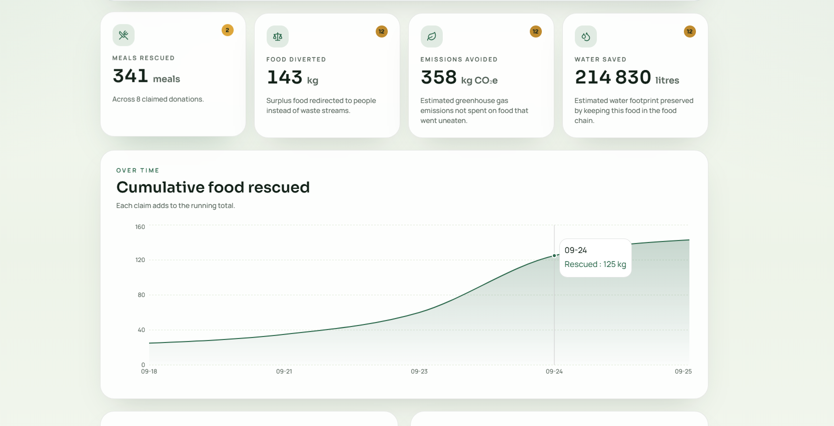
- Impact is published, not asserted. Meals, kilograms, CO₂e and water — derived from real claim records, with every conversion factor and its source printed next to the number.
How we align with the SDGs
Rescuit serves two goals at once, because hunger and food waste are the same problem seen from two ends.
SDG 2 — Zero Hunger, Target 2.1
"By 2030, end hunger and ensure access by all people, in particular the poor and people in vulnerable situations, including infants, to safe, nutritious and sufficient food all year round."
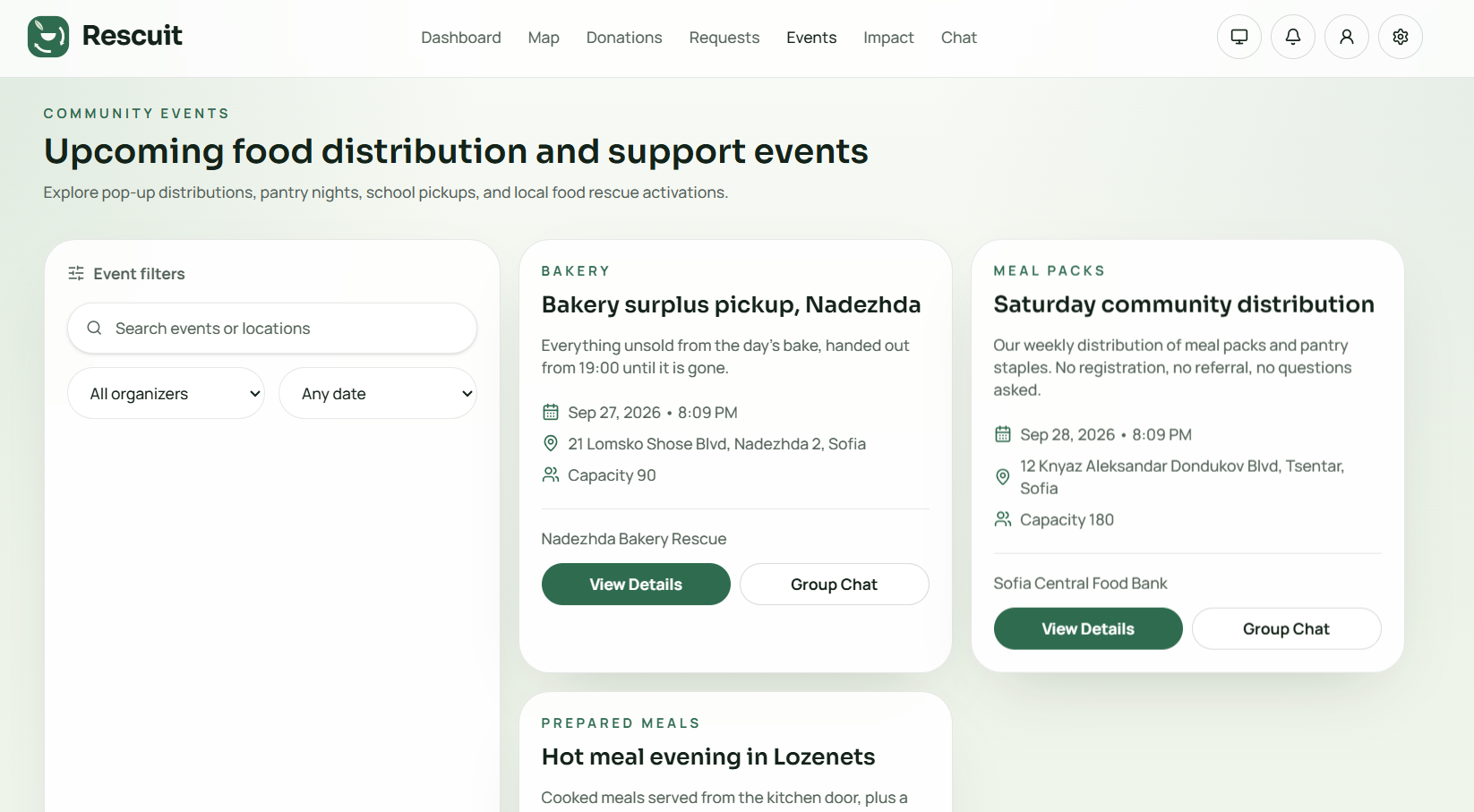
The public map, the urgency-triaged request system and community distribution events all serve access — deliberately with no gatekeeper between a hungry person and the information about where food is.
SDG 12 — Responsible Consumption and Production, Target 12.3
"By 2030, halve per capita global food waste at the retail and consumer levels and reduce food losses along production and supply chains, including post-harvest losses."
Donation listings, expiry prioritisation and the claim flow move surplus before it spoils — and record how much moved.
The in-app /sdg page maps each individual feature to its specific target.
How we measure impact
Impact is computed only from donations that have actually been claimed — not from listings, which would count food that never moved.
\( \text{kg rescued} = \sum \left( \text{quantity units} \times 0.42 \right) \)
$$ \begin{aligned} \text{meals} &= \frac{\text{kg rescued}}{0.42} \[4pt] \text{CO}_2\text{e avoided} &= \text{kg rescued} \times 2.5 \[4pt] \text{water saved} &= \text{kg rescued} \times 1{,}500 \end{aligned} $$
| Factor | Value | Source |
|---|---|---|
| Mass per meal | 0.42 kg | WRAP UK average meal mass. Feeding America uses 1.2 lb (~0.54 kg); we deliberately use the lower figure, so the number errs against us. |
| Carbon per kg of food | 2.5 kg CO₂e | FAO, Food Wastage Footprint: Impacts on Natural Resources (2013) — mixed food basket, covering production, transport and landfill methane. |
| Water per kg of food | 1,500 L | Mekonnen & Hoekstra water-footprint means, mid-range across cereals (~1,600 L/kg), vegetables (~322 L/kg) and animal products (~15,400 L/kg). |
These are estimates, and the app says so. They apply published sector averages to real claim records; they are not measurements of the specific food rescued. All of this is stated in the interface next to the numbers it produces, not buried in a README.
We took the same approach with the forecasting. The demand projection is a linear trend over a four-day observed window — deterministic, reproducible, no black box. We label it as such rather than calling it AI.
How we built it
React 19 + TypeScript + Vite on the front end, Supabase (Postgres, Auth, Storage, Row Level Security) on the back, Mapbox GL JS for the map, Recharts for the data, Tailwind CSS v4 for the design system.
A few decisions we are glad we made:
Claiming runs through a security definer Postgres function, not a permissive RLS policy. Postgres RLS cannot restrict which columns an UPDATE touches through USING alone — a policy permissive enough to let someone claim a donation would also let them rewrite its address and expiry. The function also makes claiming atomic, so two simultaneous claims cannot both succeed.
Profile creation happens in a database trigger. Writing it from the client fails the moment email confirmation is enabled: signUp returns a user but no session, auth.uid() is null, and the insert is rejected — leaving an auth account with no profile. A trigger runs inside the signup transaction as the function owner and needs neither.
The theme is one palette, not two stylesheets. Every surface, border and text colour goes through a semantic CSS token, so light and dark are a variable swap. The theme resolves in three states — explicit light, explicit dark, follow-the-system — and is applied before React mounts, so the page never flashes the wrong one.
Zero dependencies were added for dark mode, the PWA, realtime, achievements, notifications or the Bulgarian translation. All of it is hand-rolled against what was already in the bundle.
Challenges we ran into
Matcha green cannot carry white text. We wanted a recycling-green identity, and the colour that actually reads as matcha (#8DB596) measures 2.29:1 against white — far below the 4.5:1 accessibility floor. The fix was a two-green system: a deep #2F6B4F (6.29:1) for anything interactive, with the soft matcha reserved for tints — where it becomes the accent in dark mode and measures 6.98:1.
Removing red nearly destroyed the urgency signal. If everything is green, "critical" stops meaning critical. We solved it with three redundant channels rather than one: burnt amber roughly 130° away in hue, fill versus tint (the critical chip is the only solid-filled badge in the entire app), and an alert icon. The acceptance test was a greyscale simulation — with all colour removed, critical still stands out.
Two greens side by side are invisible to colour-blind users. Our charts needed a second series, and a second green would have collapsed under deuteranopia. We used gold instead — already in the system as the UN SDG 2 colour, so it was free and on-brand.
Map markers had the same problem. Five markers in one hue family are five identical shapes to anyone who cannot distinguish the hues. So they are distinguishable by silhouette: teardrop, spiked teardrop, square pin, tailless circle, bare dot. Verified in greyscale.
The UN goal colours are fixed, so contrast had to come from the text. White on SDG 2 gold is 2.19:1. We kept the official published colours and changed the foreground to dark ink — 7.46:1.
A CSS cascade trap that would have shipped silently. When we centralised page spacing, the obvious implementation was a responsive default. Measuring the compiled CSS showed why that was wrong: Tailwind emits responsive variants after plain utilities, so a lg:py-10 default would have silently outranked an explicit py-12 — at desktop widths only. We made the default non-responsive and traded a little polish for total predictability.
Accomplishments we are proud of
- Impact numbers a judge can check. Every conversion factor is printed with its source, and we chose the conservative figure where sources disagree.
- Accessibility as a constraint, not a checkbox. Contrast was measured, not eyeballed. Motion respects
prefers-reduced-motion. Every marker and status is legible in greyscale. - Honest language. We removed every claim the product could not back — "real-time" before realtime existed, an invented "84% forecast confidence", hardcoded statistics on the landing page. Real numbers, or none.
- It works offline. An installable PWA with an offline app shell — but food availability is never served from cache, because sending someone across a city for a donation claimed an hour ago is worse than showing nothing.
What we learned
The hardest part of this project was not technical. It was deciding what we were not willing to fake.
It would have been easy to leave the impressive-looking "4,820+ meals redirected" on the landing page. It would have been easy to keep calling heuristics "AI". It would have been easy to generate photographs of people in poverty for the demo. Each of those would have made the submission look better and meant less.
We also learned that accessibility work improves design rather than constraining it. Being forced off white-on-gold, off red-as-the-only-urgency-signal, and off colour-as-the-only-marker-difference produced a clearer interface than the unconstrained version would have been.
What's next for Rescuit
- Partner verification — anyone can currently self-register as an organisation
- Push and email notifications — the feed is in-app only today
- Extending the Bulgarian translation to long-form editorial copy
- Route-level code splitting to cut the initial bundle
- A real pilot with one neighbourhood and one bakery, because the only honest test of this idea is whether food actually moves
Built With
- css
- framer-motion
- html
- javascript
- mapbox
- plpgsql
- postgresql
- pwa
- react
- recharts
- rest-api
- supabase
- tailwindcss
- typescript
- vite


Log in or sign up for Devpost to join the conversation.