-
-
Splash Screen
-
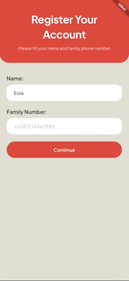
Register Screen
-
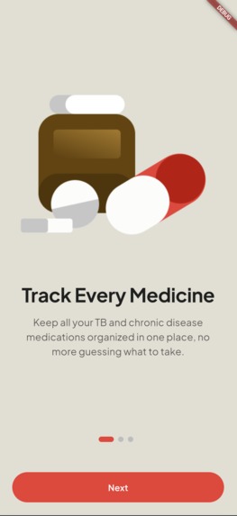
Onboarding Screen
-
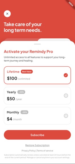
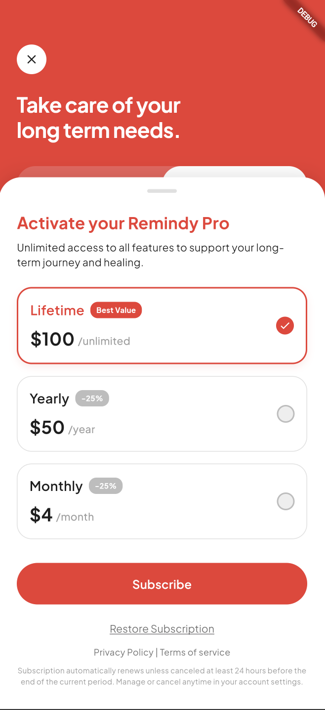
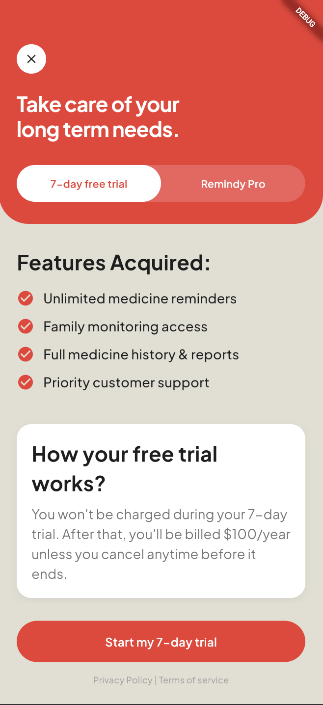
Subscription Screen
-
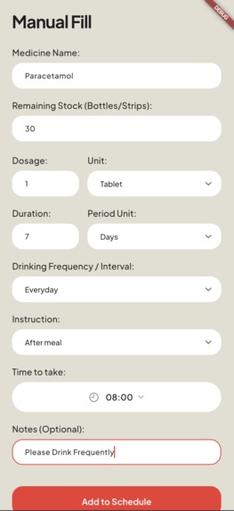
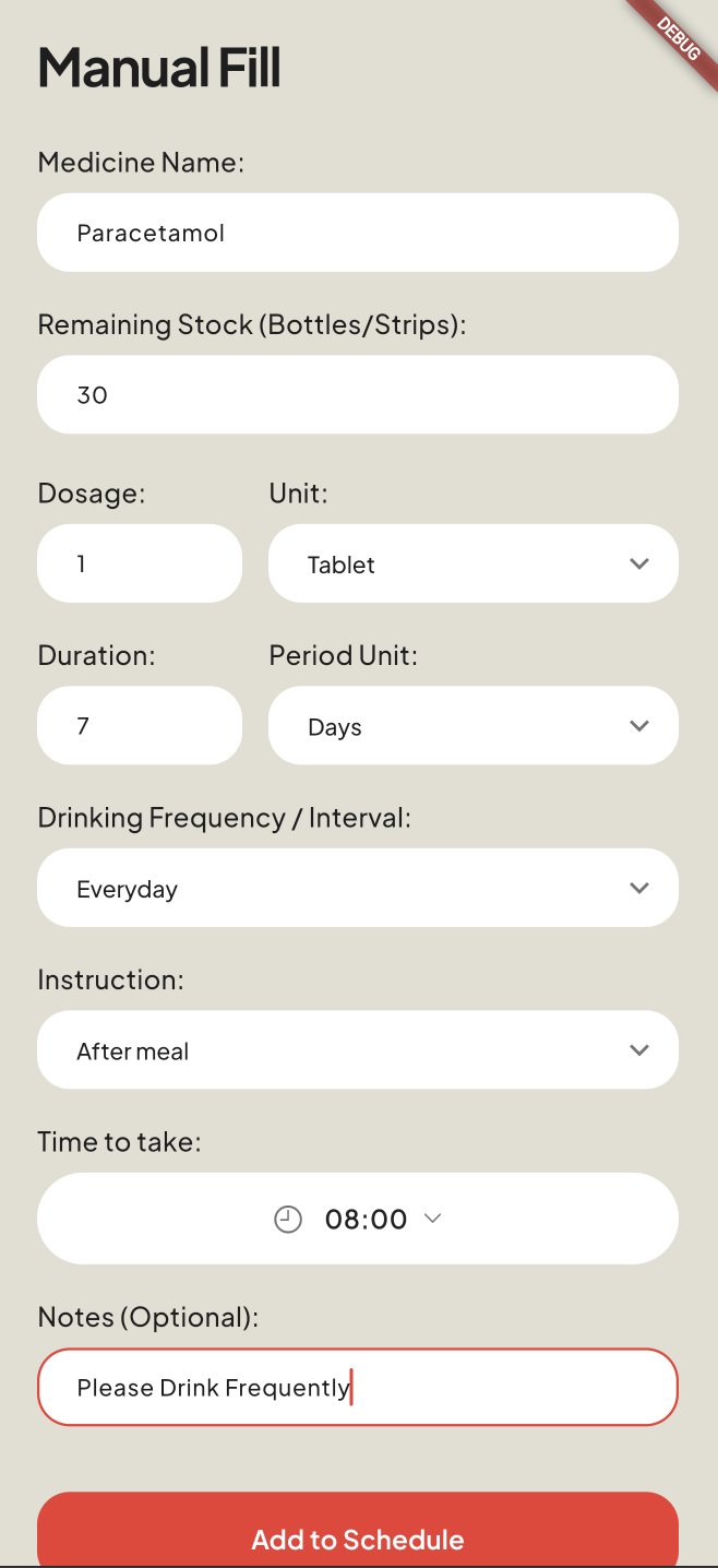
Manual Fill Screen
-
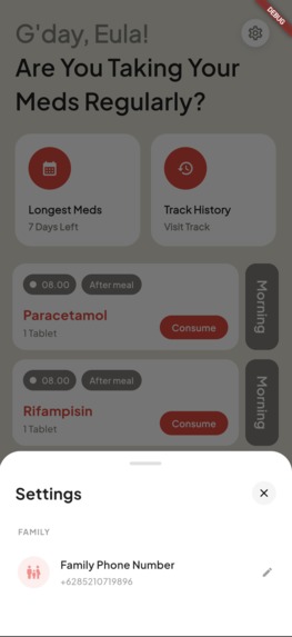
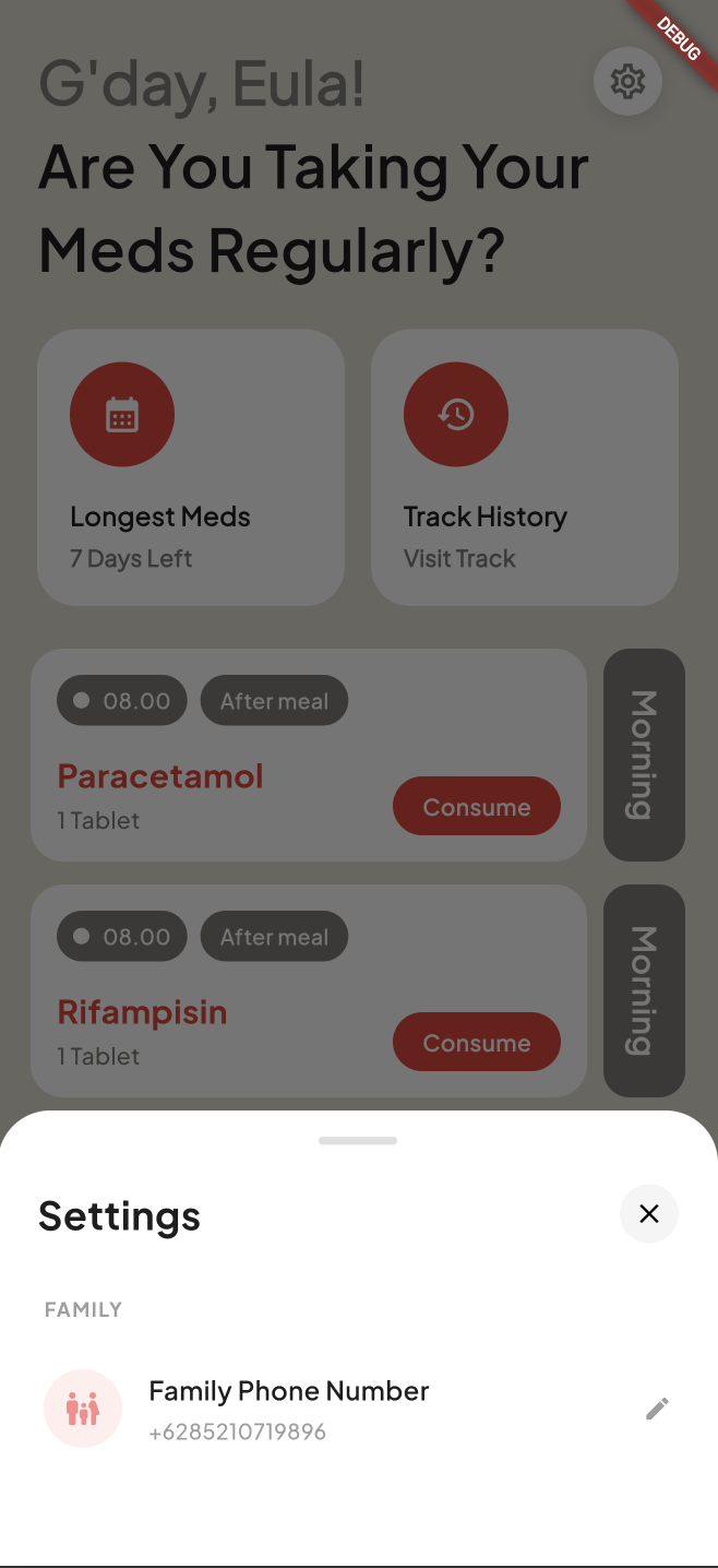
Settings Screen
-
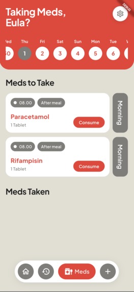
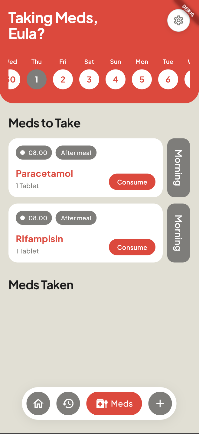
Meds Screen
-
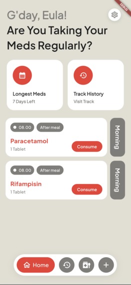
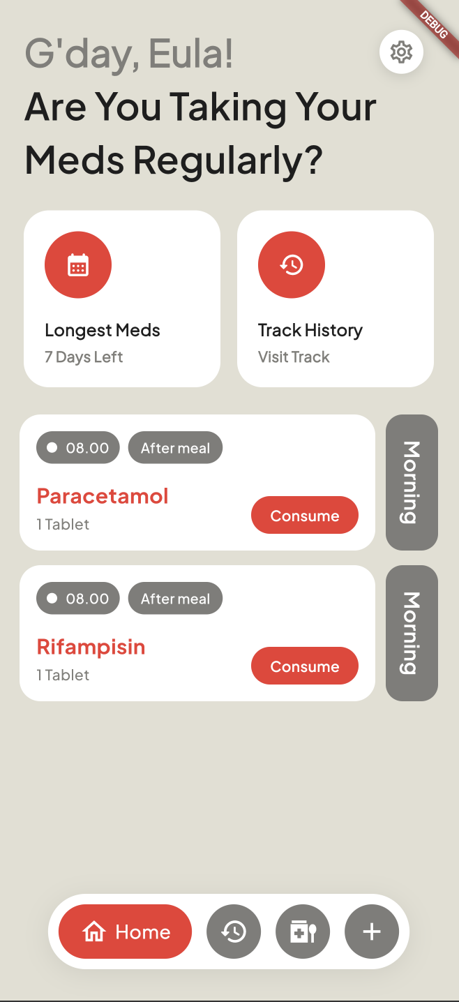
Home Screen
-
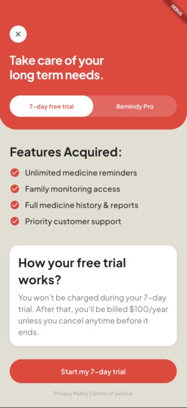
Subscription Screen
-
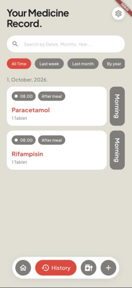
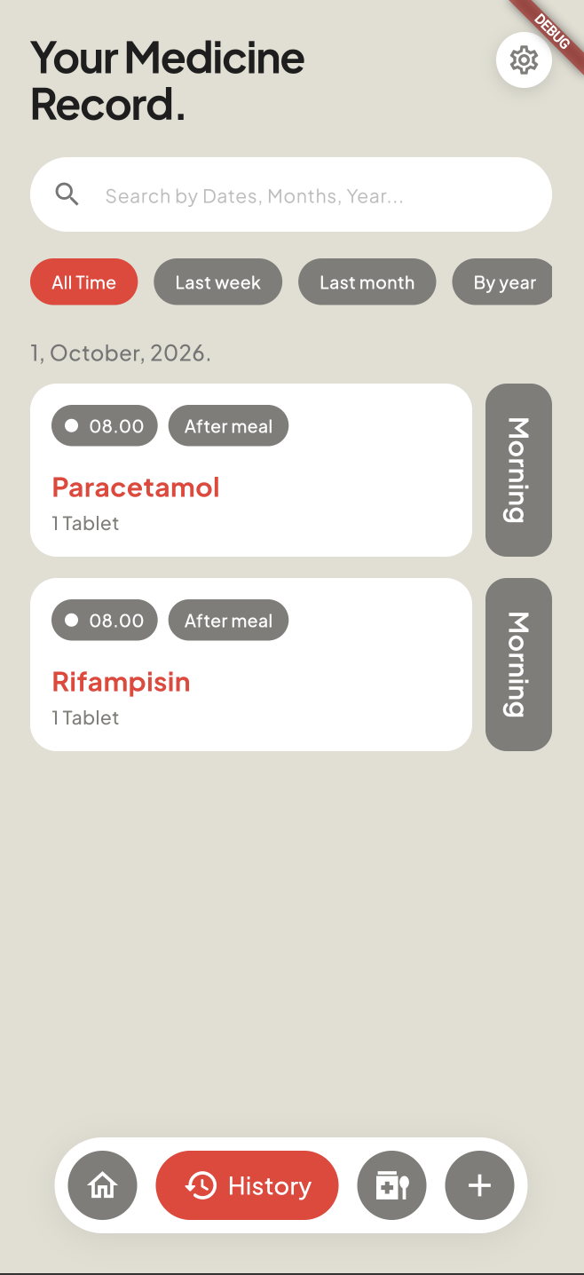
History Screen
-
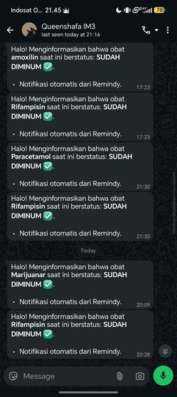
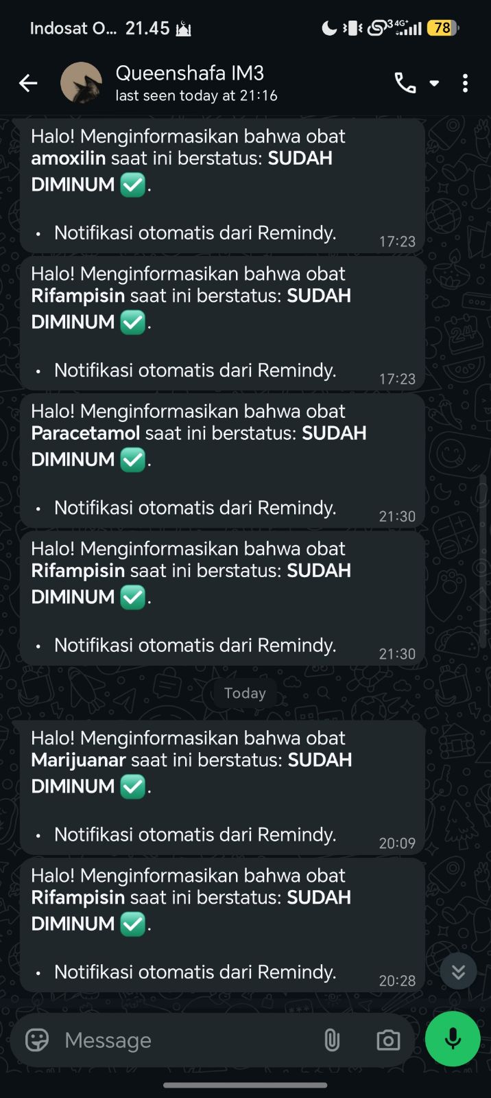
Whatsapp notification
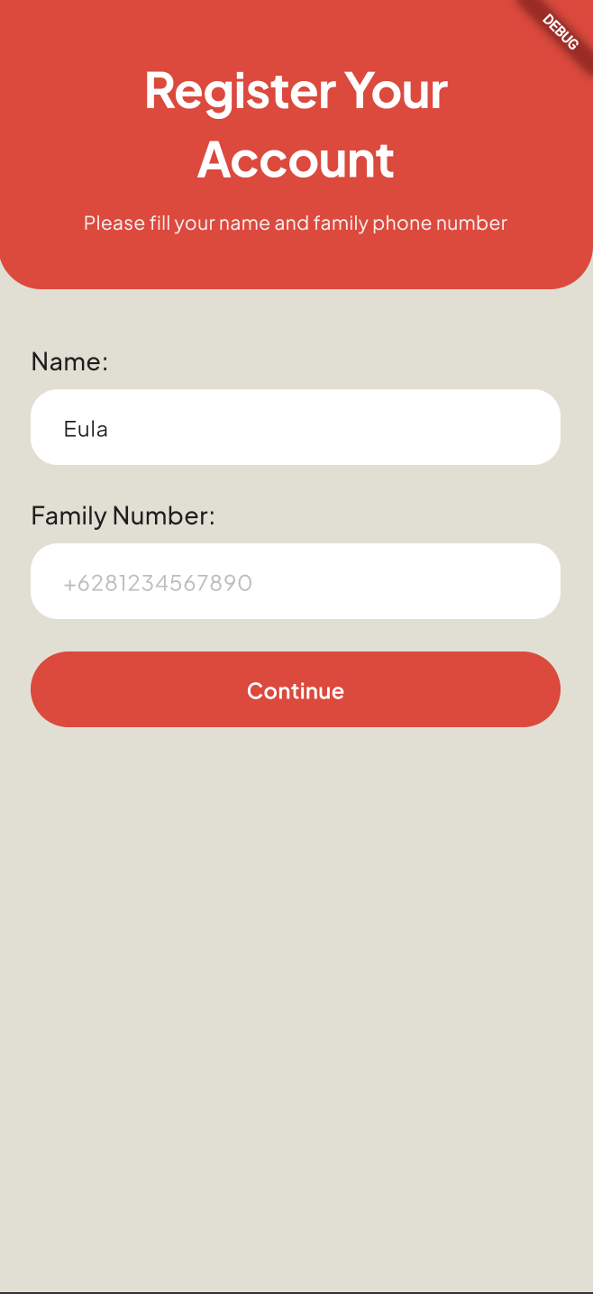
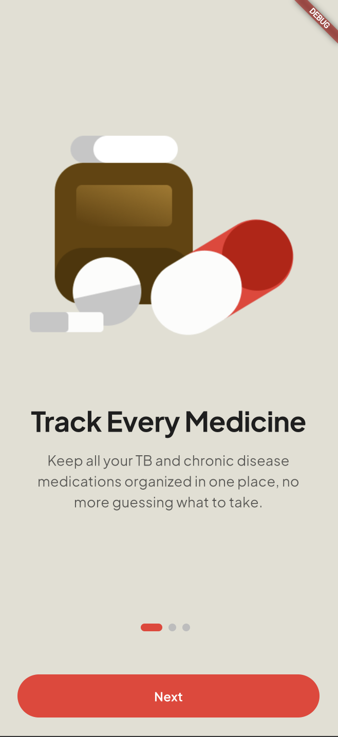
Inspiration
Indonesia ranks second in the world for TB burden, with an estimated 1.08 million cases and around 125,000 deaths every year, meaning 14 people die from TB every hour in this country alone. Behind these numbers lies a quieter, more persistent problem: medication adherence.
According to Indonesia's 2023 Health Survey (SKI), national TB medication adherence sits at only 62.5%, far below the treatment standard. Patients are required to take medication daily for at least six months, and missing doses doesn't just delay recovery, it can lead to drug-resistant TB (MDR-TB), a far more dangerous and expensive condition to treat.
We didn't want to design this app based on assumptions, so we conducted research before building anything. We interviewed both TB patients undergoing treatment and doctors who manage TB cases directly. Patients told us they often lost track of their schedule, especially once symptoms started improving around the second month, a critical point where many patients mistakenly feel "cured" and quietly stop treatment. Doctors, on the other hand, told us they frequently have no way of knowing whether a patient actually took their medication between visits, they can only rely on the patient's word.
That gap between what doctors need to know and what patients actually do, is what inspired Remindy.
What it does
Remindy helps patients stay consistent with their treatment through:
Quick medicine input, adding a new medication only takes a few steps, with fields for dosage, schedule, and instructions (before/after meals).
Adherence tracking, a home screen summary showing adherence rate and treatment progress (e.g. Day 45/180), so patients can see how far they've come.
Medicine history, a searchable record of every dose, taken or missed, organized by date, something doctors told us would help them follow up more effectively.
Family monitoring access, so loved ones can stay updated without needing to ask, since our interviews showed family support is one of the strongest factors in patient adherence.
How we built it
We started with research, not wireframes. Before designing a single screen, we gathered data on Indonesia's TB situation and conducted interviews with patients and doctors to understand the real, everyday friction in TB treatment, not just the clinical side of it.
From there, we built low-fidelity, greyscale wireframes to lock down the core flow: Home, Medicine Details, Add New Medicine, and Report/Upload, before touching any color. This let us focus entirely on hierarchy, spacing, and usability first.
Once the structure felt solid, we moved into visual design. We iterated through several color directions, from a high-saturation blue and green concept, to an orange and navy palette, before settling on a calmer, muted teal system with dusty rose accents. Each color was assigned a single clear meaning (teal for primary actions, green for "taken," soft rose for warnings) so patients could understand status at a glance, without needing to read every label.
We also designed the onboarding flow, a subscription/paywall screen, and supporting copy (taglines, microcopy, and a short pitch script) to present Remindy as a complete product experience.
Challenges we ran into
Designing around real stigma, not assumptions. TB still carries heavy social stigma in Indonesia. Patients we interviewed were hesitant to talk about their condition openly, which confirmed our decision to move away from alarming, high-saturation colors (like solid red) that could make an already anxious patient feel worse every time they opened the app.
Translating doctor needs into patient-facing design. Doctors wanted detailed, verifiable records. Patients wanted something simple they wouldn't dread opening every day. Balancing both without overwhelming the patient-facing side took several rounds of revision.
Status clarity. Early versions made it hard to tell which medicine had been taken versus which was still pending. We solved this by giving every status its own dedicated color and icon, instead of relying on text alone.
Keeping data consistent across screens. Details like dosage instructions (before/after meals) needed to match exactly between the home screen and the detail page, small inconsistencies could easily confuse patients taking real medication.
Accomplishments that we're proud of
Grounding the entire product in real research, national TB data and direct interviews with both patients and doctors, instead of designing in a vacuum.
Designing a complete end-to-end flow, from onboarding to daily use to subscription, with a consistent design system.
Building a color system grounded in both usability and the emotional needs of chronic illness patients, not just aesthetics.
Including a family monitoring feature, recognizing that treatment adherence isn't just an individual effort, something both our patient and doctor interviews pointed to repeatedly.
Iterating through dozens of design revisions to arrive at a UI that's simple enough for first-time or elderly users.
What we learned
We learned that Indonesia's TB adherence problem isn't about awareness, most patients we spoke to understood why the medication mattered. It's about consistency over a long, invisible stretch of time, especially once symptoms fade. That reframed how we designed Remindy: less about reminding, and more about giving patients a reason to stay engaged day after day.
We also learned that in healthcare-related products, color and tone carry as much weight as functionality. A well-structured feature can still fail if its visual presentation creates stress instead of reassurance.
What's next for Remindy
Partnering with local clinics (Puskesmas) and TB programs for real-world pilot testing, following up directly with the patients and doctors we interviewed during research.
Adding multi-language and regional dialect support to reach more patients across Indonesia. Expanding medicine input to support barcode or package scanning for faster logging.
Building a companion dashboard for doctors and health workers to monitor multiple patients at once, directly addressing the visibility gap doctors told us about.
Exploring integration with Indonesia's supervised treatment (DOTS/PMO) programs at the Puskesmas level.
Built With
- dart
- figma
- flutter
- gowa


Log in or sign up for Devpost to join the conversation.