-
-
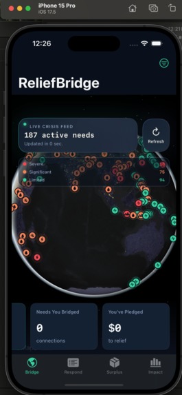
Main Interactive Globe
-

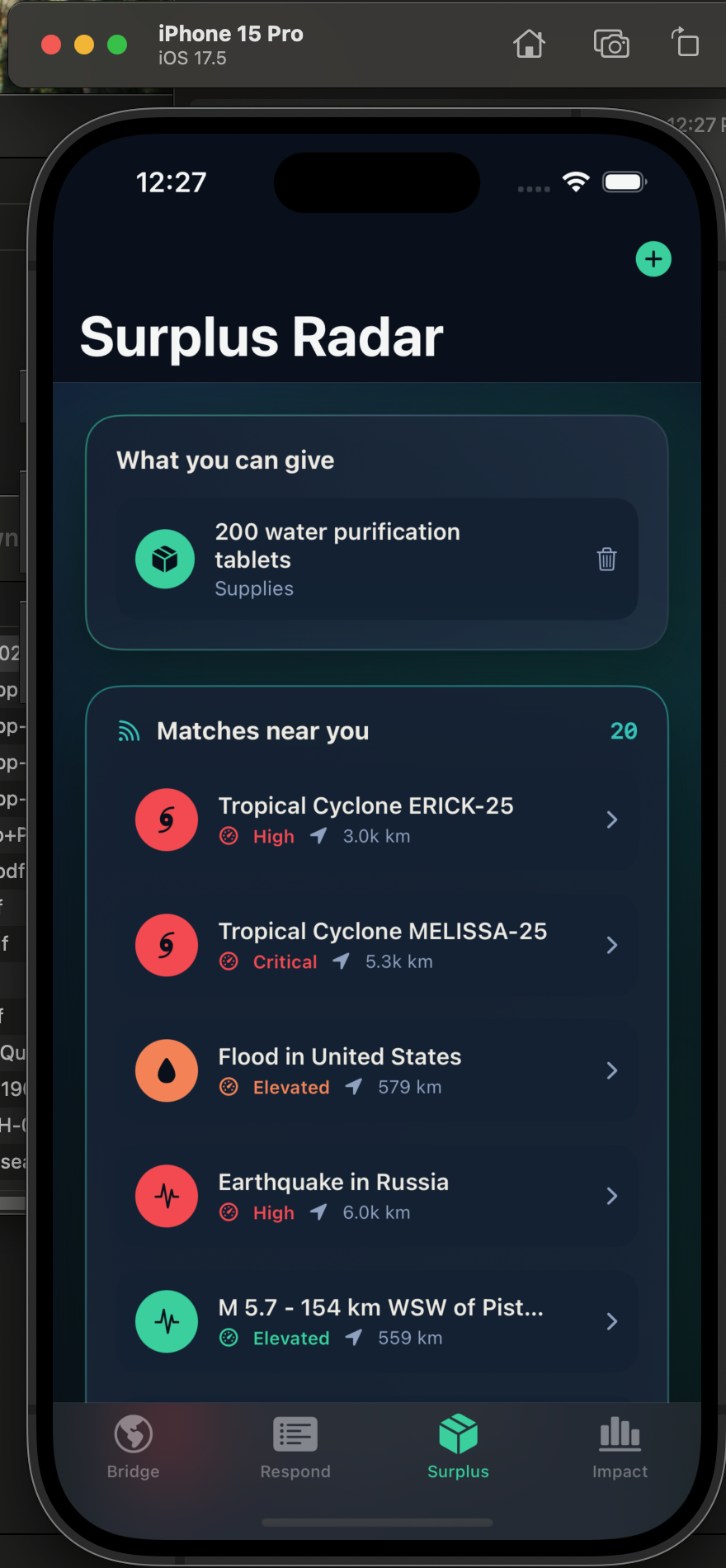
What you can Contribute
-
Interactive Menu w/in Globe Page
-
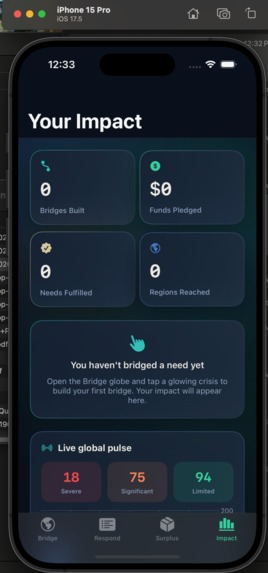
Personal Dashboard
-
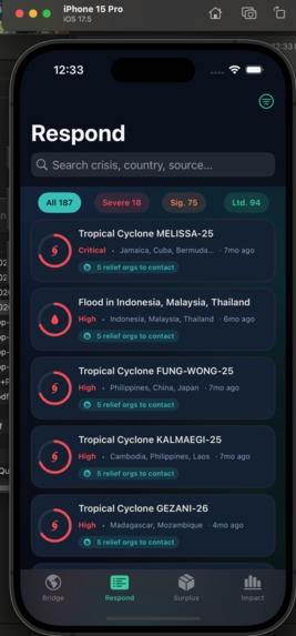
Response List


Inspiration
We were struck by the disconnect between the amount of real-time crisis data available and how difficult it is for everyday people to act on it. Organizations like USGS and GDACS publish detailed disaster feeds, but they're buried behind raw data that most people will never interact with. We wanted to transform that information into something visual, intuitive, and actionable. By placing live disasters on a 3D globe, ReliefBridge helps users see where crises are happening and immediately connect with ways to help. The name reflects our mission: building a bridge between people who want to make a difference and communities that need support.
What it does
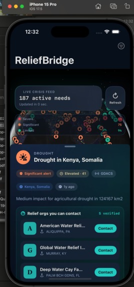
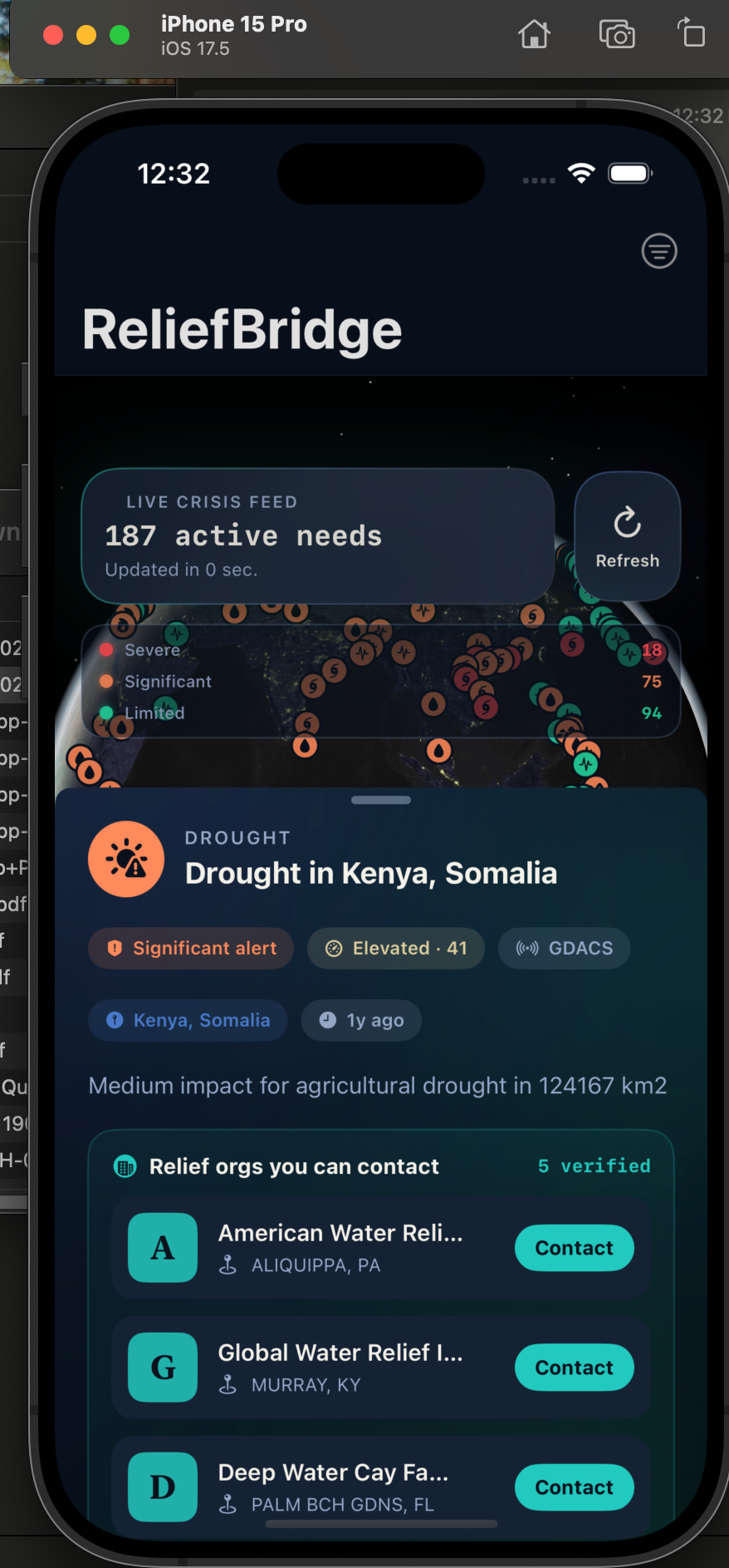
ReliefBridge is a real-time humanitarian response platform that transforms live disaster data into meaningful action. Using data from USGS and GDACS, the app visualizes active earthquakes, floods, cyclones, wildfires, and other crises on an interactive 3D satellite globe. Users can explore ongoing disasters, view urgency rankings, connect with verified relief organizations through Every.org, and pledge support directly from the app.
ReliefBridge also allows users to register resources they can provide, such as supplies, volunteer hours, blood donations, or specialized skills. These contributions are matched to nearby crises using location-based proximity calculations, helping users quickly identify where they can have the greatest impact. With dedicated views for global crisis monitoring, urgency-based triage, resource matching, and impact tracking, the platform bridges the gap between awareness and action. Every piece of information shown in the app comes from live humanitarian and government data sources, with no mock data or manual curation.
How we built it
We started by validating real data sources before writing any app code, testing disaster APIs, and designing our data model around live responses rather than mock data. From there, we built a centralized ReliefService that acts as the app's single source of truth, managing crisis data, user contributions, organization matching, and location updates.
The core experience is powered by MapKit's 3D globe, where live disasters are visualized as interactive hotspots and connected to users through animated bridge arcs. On top of this foundation, we built four connected experiences: a globe view for exploration, a triage feed that prioritizes urgent crises, a resource-matching system that connects user contributions to nearby disasters, and an impact dashboard that visualizes activity and trends.
To make action possible, we integrated Every.org and cached verified nonprofit organizations by disaster type, allowing users to quickly find relevant relief groups without excessive API requests. Finally, we focused on polish, adding a glassmorphism-inspired interface, live status indicators, severity visualizations, automatic refreshes, and a cohesive brand identity that made the app feel production-ready.
Challenges we ran into
One of our biggest challenges was data availability. We originally planned to integrate ReliefWeb, but its v1 API has been retired, and the v2 API requires pre-approved credentials, so we chose to focus on building a richer experience around USGS and GDACS instead.
We also ran into development challenges with Xcode project management. Without tools like XcodeGen or CocoaPods, every new Swift file had to be manually registered in the project configuration, where even a small mistake could cause difficult-to-diagnose build errors.
Another obstacle was inconsistent data formatting from GDACS. Date fields arrived in multiple formats, requiring custom parsing logic and fallbacks to ensure reliability.
Finally, with more than 180 active crises in the system, the challenge became helping users focus on what mattered most. We addressed this by creating an urgency scoring model that ranks events based on factors such as severity, recency, magnitude, and geographic impact, allowing the most actionable crises to surface first.
Accomplishments that we're proud of
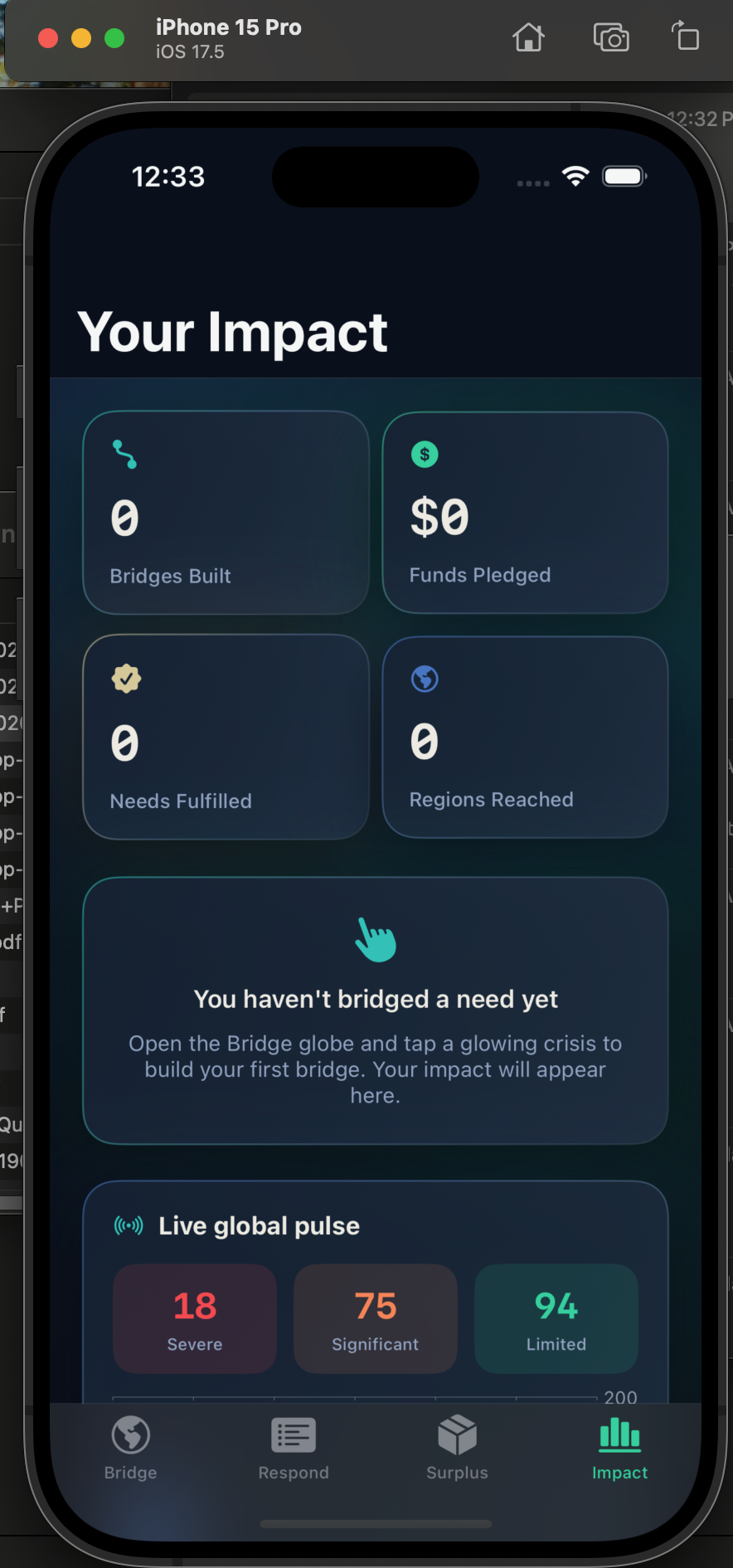
Built a truly live crisis platform: ReliefBridge visualizes 187+ active disasters on a 3D globe using real-time data from multiple humanitarian and government sources.
Created a transparent urgency ranking system: We developed a deterministic scoring model that prioritizes crises based on severity, recency, magnitude, and impact, helping users focus on where they can make the biggest difference.
Optimized nonprofit discovery: By redesigning our Every.org integration with smart caching, we reduced API requests dramatically and made verified relief organizations available almost instantly.
Implemented real-world proximity matching: Users can register resources and be matched to nearby crises using GPS-based distance calculations, making humanitarian action more immediate and practical.
Stayed committed to real data: Every crisis, organization, and metric in the app comes from live sources. Rather than rely on placeholders or mock content, we built the experience entirely around real-world humanitarian data.
What we learned
Live APIs are messy. USGS and GDACS use different schemas, severity scales, and formats, so making them feel like a single real-time feed required extensive normalization and error handling.
MapKit's 3D globe takes experimentation. Building animated great-circle connections and custom annotations was more challenging than expected, but it became one of the app's most compelling features.
Caching matters. Our initial Every.org integration made 187+ API calls. By caching results by disaster type, we reduced that to around 8 calls and dramatically improved performance.
Build the foundation first. We focused on the data pipeline and core functionality before polishing the UI. That made adding visuals and interactions much faster and more reliable.
What's next for ReliefBridge
Fulfillment Tracking: Let users see when needs they've helped bridge are resolved through status updates from relief organizations.
Push Notifications: Alert users about nearby severe crises and updates to needs they've supported.
Verified Organization Profiles: Expand Every.org integration with impact metrics, donation history, and direct communication tools.
AI-Powered Triage: Recommend the highest-impact actions users can take based on their location, skills, and contribution history.
Community Bridges: Visualize anonymized contributions from other users to show collective humanitarian response in real time.
Offline Mode: Cache recent crisis data so the app remains useful in areas with limited connectivity.

Log in or sign up for Devpost to join the conversation.