-
-
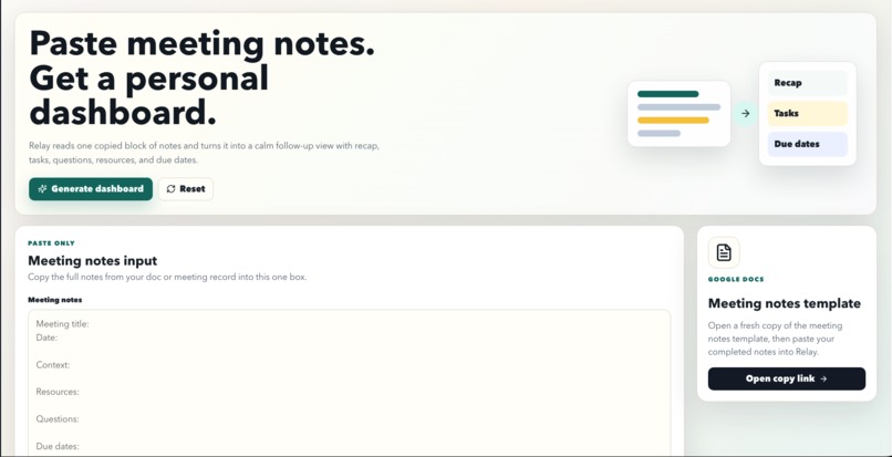
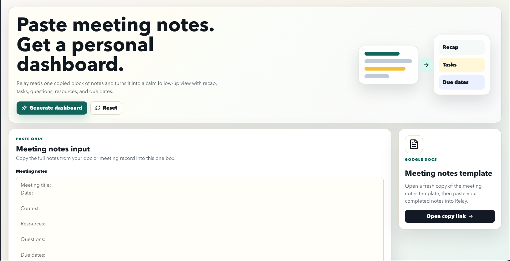
Dashboard before copy/paste
-
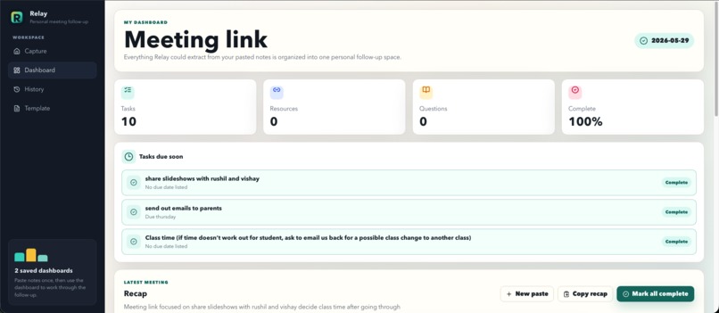
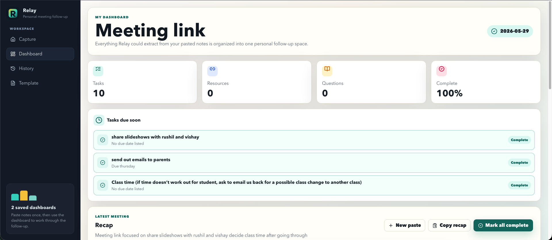
Dashboard after entering in Meeting Minutes
-
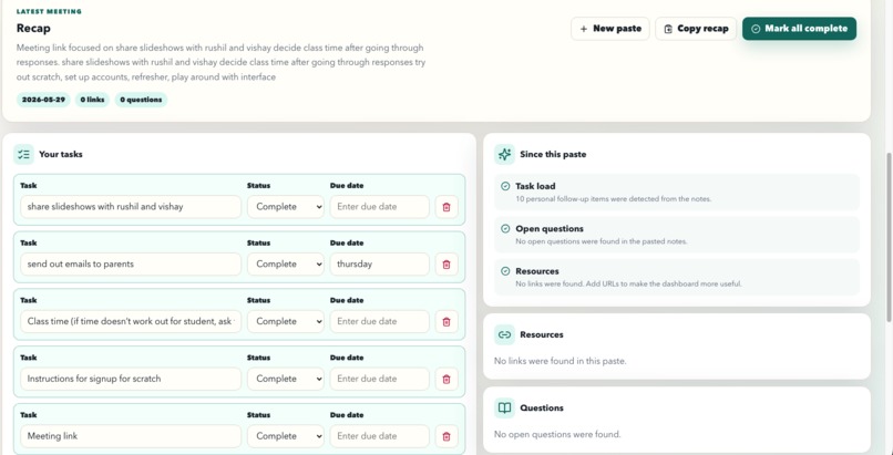
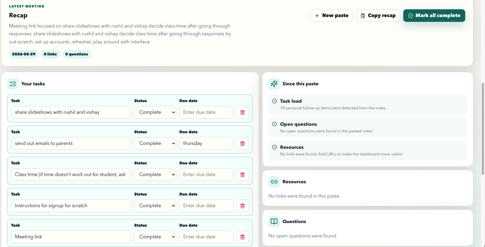
Recap + Task List Generated Automatically
-
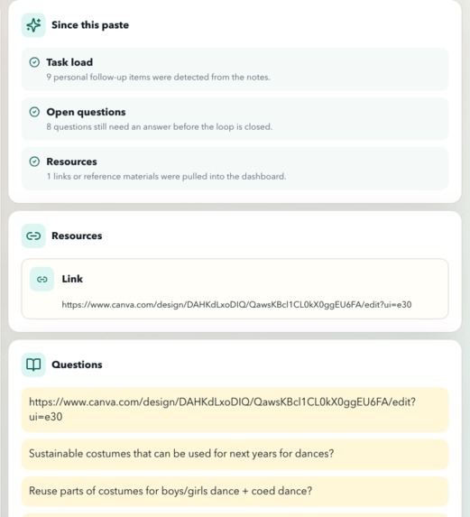
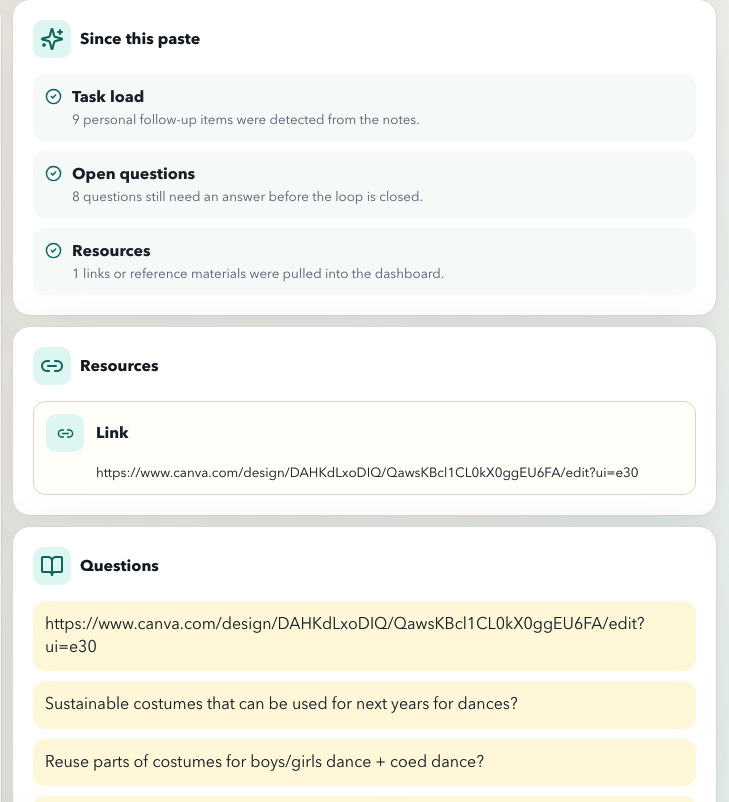
Updates on the bottom + Resources/Links + Questions
-
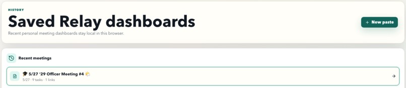
History of dashboards saved
-
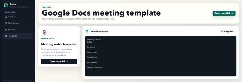
Easy google docs meeting templates for efficient + fast results


Inspiration
Relay was inspired by a problem that happens constantly in school, clubs, hackathons, teams, and everyday life: people have productive conversations, write down messy notes, and then still leave without a clear idea of what needs to happen next. A meeting might include important decisions, useful links, deadlines, questions, and action items, but all of that information usually ends up scattered across a Google Doc, a notes app, a chat thread, or someone’s memory.
We wanted to build a tool that helps people stay organized without forcing them to completely change how they already work. Instead of making users manually create tasks, sort information, rewrite summaries, or build their own dashboard after every meeting, Relay takes the notes they already have and turns them into something useful. The goal was to make follow-through feel automatic, clear, and manageable.
Design4Future is focused on tools that help people stay productive, organized, and in control of their daily lives, and Relay fits that theme directly. Meetings are supposed to help people move forward, but they often create more confusion unless someone takes the time to organize the aftermath. Relay is built to close that gap between “we talked about it” and “we know what to do next.”
What it does
Relay turns meeting notes into a personal follow-up dashboard. A user can take notes in a Google Docs template or any structured note format, paste the full note block into Relay, and generate an organized dashboard from it. The dashboard breaks the meeting down into a clear recap, tasks, due dates, resources, open questions, and progress tracking.
The main purpose of Relay is to help users quickly understand what happened in a meeting and what they need to do next. Instead of rereading a long page of notes, users can see the most important follow-up information in one place. Tasks become editable and trackable, resources are separated out, questions are preserved, and due dates are surfaced so they are harder to miss.
Relay also saves generated dashboards in browser history, so users can return to previous meetings instead of losing context. This makes it useful not just for one meeting, but for ongoing projects where multiple conversations build on each other. It is designed for students, club officers, hackathon teams, project groups, and anyone who needs a simple way to convert conversations into action.
How we built it
We built Relay as a lightweight web app with a simple copy-paste workflow. The core interaction is intentionally straightforward: open the meeting notes template, take notes, paste the completed notes into Relay, and generate a dashboard. We wanted the app to feel practical and beginner-friendly, so we avoided making users connect accounts, configure complicated settings, or learn a new note-taking system.
The app parses structured meeting notes and looks for common sections such as meeting title, date, context, resources, questions, due dates, and meeting minutes. From there, it organizes the content into dashboard sections that are easier to act on. The interface focuses on clarity: users can review a recap, scan tasks, check progress, view resources, revisit questions, and manage saved dashboards.
We also spent time improving the user experience around the template flow. Since many people already use Google Docs for meeting notes, Relay includes a copy-only Google Docs template path. That means users can start with a clean meeting template without editing the original source document. The goal was to make the workflow familiar while still giving users a more organized output than a normal document would provide.
Challenges we ran into
One of the biggest challenges was designing Relay around real meeting notes, not perfect demo data. In real life, notes are messy. People write in fragments, skip sections, add links in random places, mix action items into paragraphs, and forget to clearly label due dates. Relay had to be useful even when the input was not perfectly formatted.
Another challenge was keeping the product simple. Productivity tools can easily become overwhelming if they ask users to fill out too many fields or manage too many systems. We wanted Relay to help users stay organized, but not become another thing they have to organize. That meant focusing the app around one main input box and one clear output dashboard.
We also ran into user experience details that mattered more than expected. Small things like confusing template buttons, sample data, icon sizing, task states, and dashboard feedback could make the app feel less polished. Fixing those details helped Relay feel more like a real tool and less like a prototype.
Accomplishments that we're proud of
We are proud that Relay solves a real, everyday problem with a workflow that feels simple: paste meeting notes, generate a dashboard, and start acting on the results. The app does not require a complicated setup or a new productivity habit. It meets users where they already are and gives them a clearer way to follow through.
We are also proud of the dashboard experience. Relay turns a plain block of text into something organized and useful, with a recap, tasks, resources, questions, due dates, and progress. That transformation is the core value of the project: taking scattered information and turning it into action.
Another accomplishment is making the app feel usable beyond a hackathon demo. We added a meeting template, saved dashboard history, task progress, export/copy options, and small interaction details that make the app feel more complete. Relay is not just an idea about productivity; it is a working tool someone could actually use after a meeting.
What we learned
We learned that the hardest part of productivity is often not knowing what to do, but converting information into action. People already take notes, join meetings, discuss plans, and make decisions. The missing step is often the organization that happens afterward. Relay taught us how valuable that follow-up layer can be.
We also learned that a good productivity tool should reduce friction. If a tool requires too much manual setup, people are less likely to use it consistently. By keeping Relay focused on copy-paste input and dashboard output, we learned how important it is to design around existing habits instead of replacing them.
From a development perspective, we learned how much small design decisions affect usability. Clear empty states, obvious buttons, reliable parsing, readable dashboards, and satisfying task interactions all contribute to whether a user trusts the product. A tool like Relay needs to feel calm and dependable because it is helping users manage responsibilities.
What's next for Relay
Next, we want to make Relay smarter and more flexible. One future improvement is stronger note parsing, so Relay can understand less structured notes and still identify tasks, deadlines, resources, and questions accurately. This would make the app work better for real-world meetings where people do not always follow a perfect template.
We would also like to add AI-powered suggestions. Relay could recommend action items, detect unclear responsibilities, summarize decisions, and flag unanswered questions. This would make the dashboard more helpful while still keeping the user in control.
Other future features could include calendar integration, reminder notifications, search across saved dashboards, collaboration tools, shared meeting workspaces, and better export options. The long-term vision is for Relay to become a personal command center for follow-through: a place where every meeting turns into clear next steps, and users can stay organized without having to rebuild their plans from scratch.

Log in or sign up for Devpost to join the conversation.