Inspiration
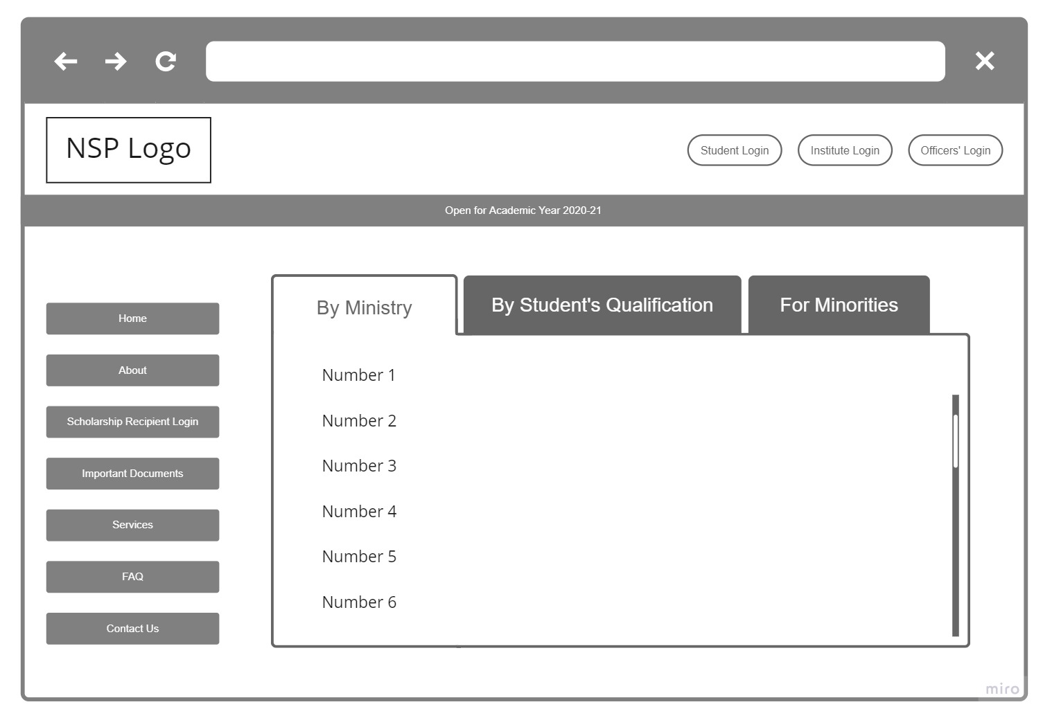
I belong to an underrepresented community (women), and the National Scholarship Portal designed for students like me is a boon. But often I found people struggling to get around the website and understand what things mean, including myself. So I decided to think of a new layout that lays every detail out clearly fro every type of user that would access the platform.
How I built it
Used Miro Whiteboard to create a wireframe of my design that has a Nav on the left side of the screen and clear, distinct login/register buttons for Students, Institutions and Officers. Cleared up the carousel in the original website and put a tab-based system to view the scholarships offered in categories.
Built With
- miro

Log in or sign up for Devpost to join the conversation.