Inspiration
I first opened the website on a mobile, and I was able to do anything at all. So, I had to use a computer that was not readily available, so I had to wait a couple of hours.
What it does
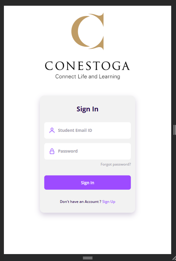
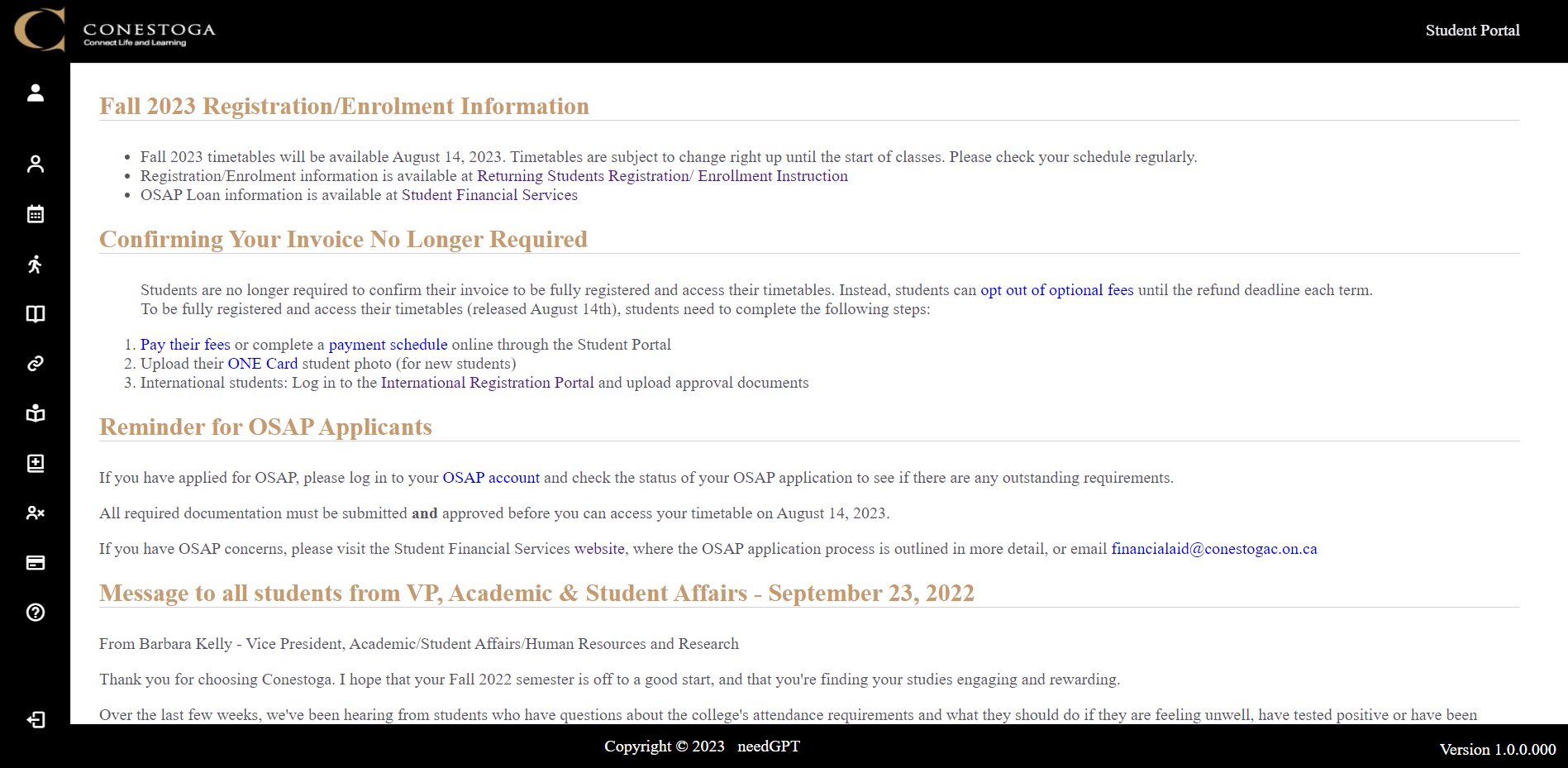
So, the new design is totally responsive to the mobile-first paradigm as well as to Desktop Screens as well.
How we built it
We used HTML5, CSS3, JavaScript, Bootstrap, Figma, MySQL, Git and more to design code and debug and make it functional.
Challenges we ran into
The hardest part was making it interactive, which took most of the time during development.
Accomplishments that we're proud of
We are very proud of how it turned out, and we love its functionality.
What we learned
We learnt different codes, syntaxes and tricks on the path of development.
What's next for Redesign Conestoga Student Portal
We can go ahead and link it to the back-end and give a new fully fledged version.


Log in or sign up for Devpost to join the conversation.