-
-
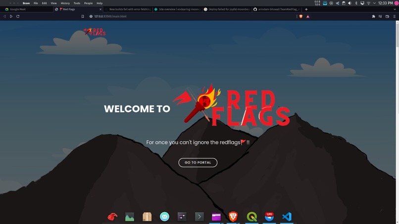
Landing Page
-
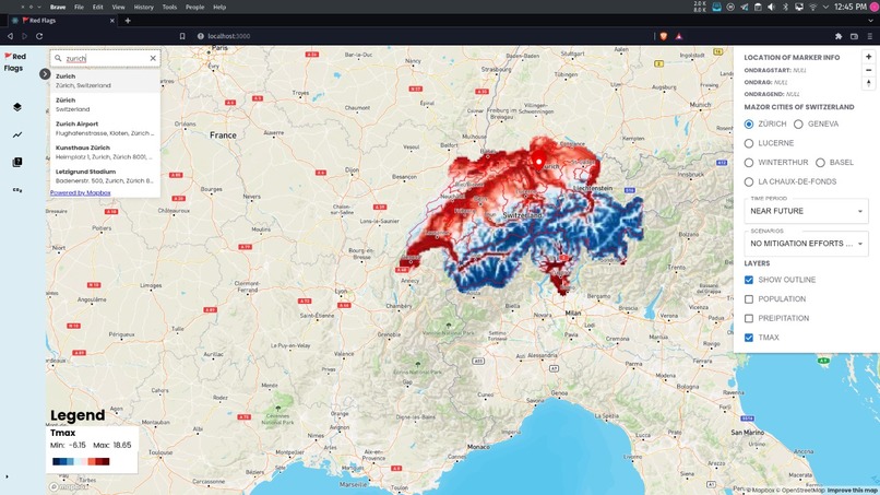
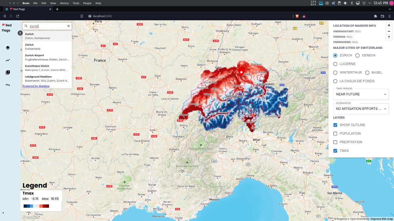
Map Visualization showing Maximum Temperature
-
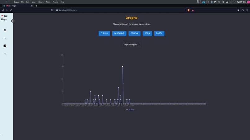
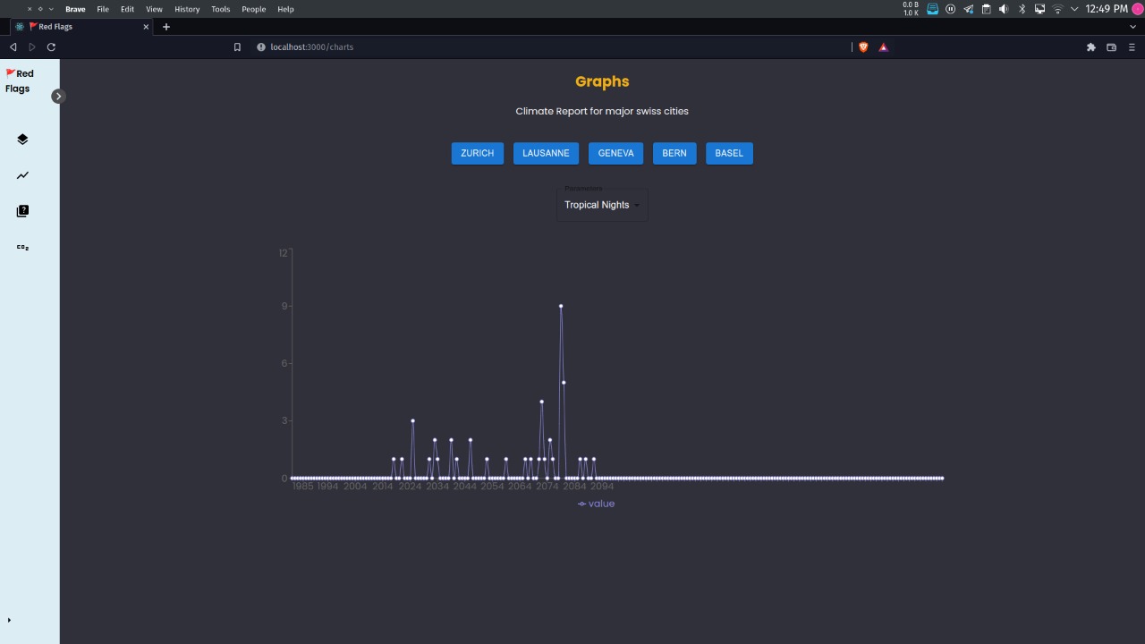
Charts showing the number of Tropical Nights (Min Temperature above 20 deg C) in cities over the years
🚩Red Flags
For once you can’t ignore the red flags🚩🚩
About the project
“Red Flags🚩🚩🚩🚩” is an attempt to communicate the risks of Uncontrolled climate change to the general public. It is only when a person sees the red flags🚩🚩 of uncontrolled climate change that they will truly understand the grim nature of their future. This project thus hopes to energise people to be more vocal in support of Climate Control.
Background
Just some of the drastic changes that have taken place as an effect of climate change
- +2 °C rise in mean temp since 1864
- 200% more heat waves since 1901
- 60% decreased glacier Volume since 1850
- 60% decreased frost days since 1961
- 50%decreased snow days below 200m elevations since 1970
- 12% more intense heavy rainfall since 1901
- 20% increase in winter precipitation since 1864
- 300 m shift in Zero Degree Line since 1961
About Us
We are a group of students interested in climate research with experience in data science and web development. We love to goof around and come up with inane ideas. For once we decided to put our skills to good use and try to communicate the risks of climate change, raising the proverbial red flag for all to see. 🚩🚩🚩🚩🚩
Features
- Map based spatial visualisation of various meteorological phenomenon
- Raising awareness through interactive media like climate awareness quiz
- Simplifying data for all to understand
Inspiration
Staying in Northeast India, and having seen how climate change has affected our communities. The seasonal floods triggered by extreme rainfall have ravaged the state on a yearly basis. Seeing the opportunity to help prevent this fate, we were quickly sold on the necessity of the project. We noticed that the Swiss government had their own portal for displaying climate data. Thus we challenged ourselves to simplify the data they had, and present it for the common man.
What it does
The web portal opens up with a loader showing the change in gradual increase mean global temperature. It shows up on the landing page which contains various tid-bits about our project. The landing page shows the idea behind our project and charts out what we can show in our project. It shows the changes already caused by climate change in Switzerland as a background for the project. On the top of the Landing page you will find the button to get redirected to our portal which has all the good features like visualisation, quizzes etc.
Try it out
Access via our Github Go to :https://github.com/arindam-bhowal Clone it cd into the folder Run “npm i” And to start the server “npm run start” To get the full experience open index.html at the root of the repo.
How we built it
Techstack:
- Web: ReactJS
- Language: JS
- Map vis: MapBox
- Charts: Recharts Data Processing:
- Python, Climate data operator(CDO)
- Py libraries: netCDF, xarray, iris(scipy)
- Bash scripting
Approach:
For the Spatial Visualisation
- We downloaded the data as instructed on the GitHub repository.
- We then Subset it to historical and future ranges and calculated the mean using python and CDO
- We used python to calculate values like Tropical nights and hot days
- Then we converted the data from netcdf to geotiff format for plotting via mapbox
- Next we uploaded the data to mapbox studio.
- We used react js to build the portal.
- We converted the calculated data into geo json to be plotted.
- We created the plotting part using rechart and geo json data.
Note : We only used a single mode l(recommended by host) which may cause inaccuracies. The calculations for precipitation data were made taking 20-year intervals instead of the recommended 30-year period due to an error. It was detected far too late in the project for rectification.
For the Quiz on awareness
- We explored many sources and found a survey on Climate Change awareness by Yale institute and Meta
- We used that data to formulate a quiz to see how far the user is from the average of their country in terms of Awareness.
Note: The quiz employs weights associated with various answers to calculate the climate awareness score. These are designated without any scientific backing to better represent the choices people have. Thus the scoring system can seem arbitrary to some.
For The Quest on Climate impact
- We looked up the most popular car models in Switzerland and their emissions for ease of calculation. We also looked up the number of working days
- We set up the portal to accept the Home and Office locations of the user.
- We used the distance API from MapBox to calculate the distance that is traversed by the user.
- We then use the total distance, carbon emission per km and number of working days to get an estimate on the yearly carbon emissions and thus its impact on Arctic Ice.
Note: The calculations are oversimplified and do not take into account factors like different makes of automobiles. Thus the results should be treated with discretion to avoid misrepresentation of facts.
Challenges we ran into
- Subsetting with python was giving some issues and was kinda intensive and exported values were not coming properly. So we had to dig around quite a lot and finally found a wonderful tool named CDO.
- Also while converting we learnt that only a certain type of geo tiff file, that is 8bit geo tiff can be uploaded.
- We soon came to know that mapbox studio allows only 20 files to be uploaded in a month. If we want to bypass that then we have to use their apis to connect to an Amazon S3 bucket. The documentation was not on par resulting in many failed attempts. However we found that by using multiple accounts and making the data public, we can surpass the upload limit and access the data through another account.
- Most of the documentation of MapBox was oriented towards Vanilla JS users, not React. The React Binding for mabox (React-map-GL) had some predefined examples, but they were done with typescript not javascript. Also we had to spend much time translating to Java Script.
What we learned
- Use of MapBox
- Using CDO
- Managing teamwork on short deadlines
- Processing NetCDF files
What’s next for the project
For further improving the project, we will use the ensemble mean of various climate prediction models. This will minimise the effect of inaccuracies present in individual models. Moreover we can also include other parameters to communicate a holistic picture of the climate scenario like snow melt, etc.
Conclusion
The Red Flags project was an exciting and fast paced challenge for us. Through this project we were able to apply our skills to a real world problem far from the usual confines of our academic papers. We do hope that the web portal can be a real treasure for the larger public to easily access understandable data. With further developments and more accuracy , the tool The project helped us develop our skills under a rigid timeline.
Citations
- CH2018 Project Team (2018): CH2018 - Climate Scenarios for Switzerland. National Centre for Climate Services. doi: 10.18751/Climate/Scenarios/CH2018/1.0
- Leiserowitz, A., Carman, J., Buttermore, N., Neyens, L., Rosenthal, S., Marlon, J., Schneider, J., & Mulcahy, K. (2022). International Public Opinion on Climate Change, 2022. New Haven, CT: Yale Program on Climate Change Communication and Data for Good at Meta.
- Popular Cars in Switzerland https://talesoftravellingsisters.com/what-is-the-most-popular-car-in-switzerland/
- Specifications of Skoda Octavia https://www.autoexpress.co.uk/skoda/octavia/62374/hatchback/mpg
- Number of working days in a calendar year, https://www.arbeitstage.ch/EN/
- This product was made utilising the LandScan High Resolution Global Population Data Set copyrighted by UT-Battelle, LLC, operator of Oak Ridge National Laboratory
- Carbon emission link with sea ice loss https://www.ucl.ac.uk/news/2016/nov/arctic-sea-ice-loss-linked-personal-co2-emissions


Log in or sign up for Devpost to join the conversation.