-
-

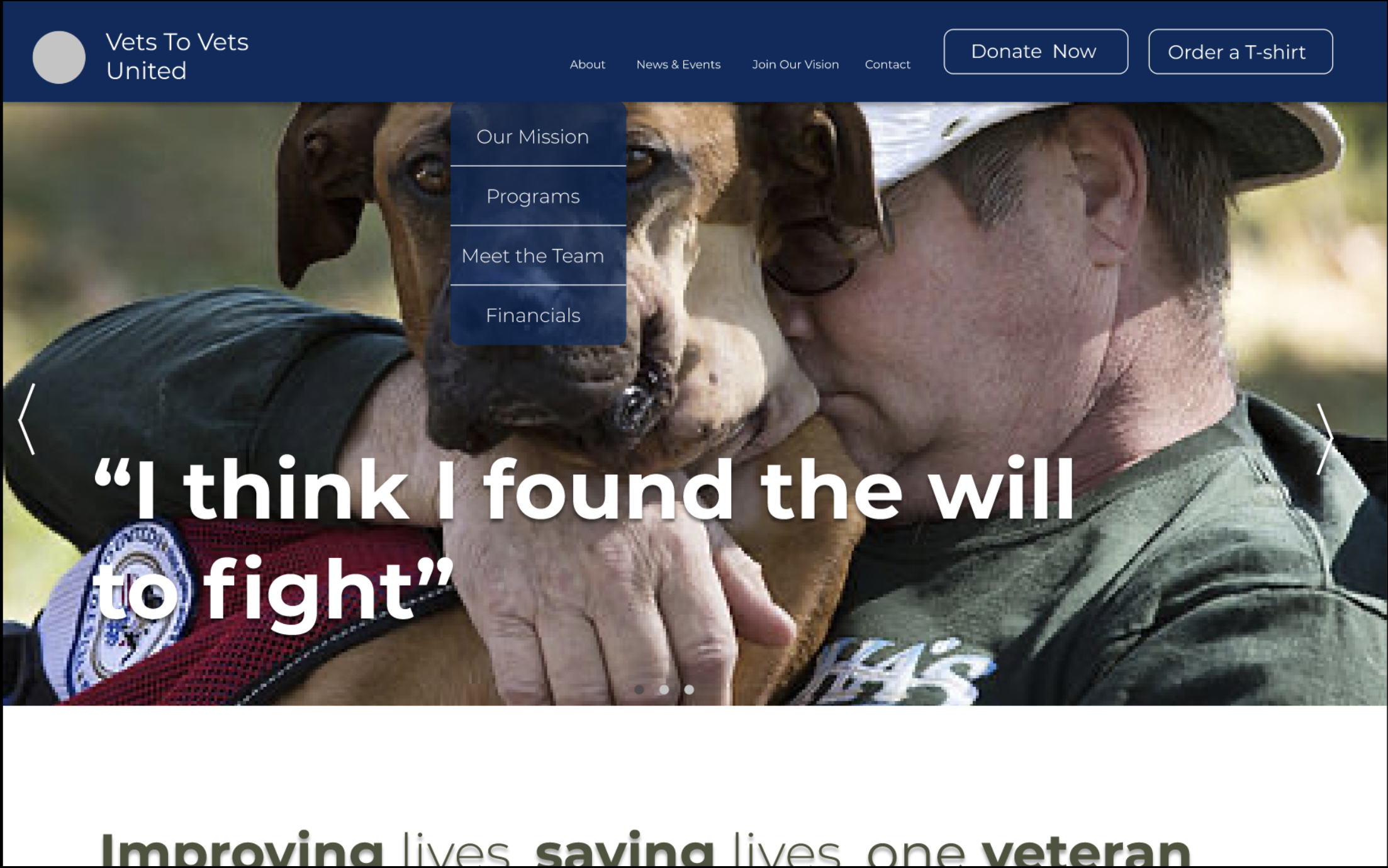
Main Landing Page (I) with Dropdown
-
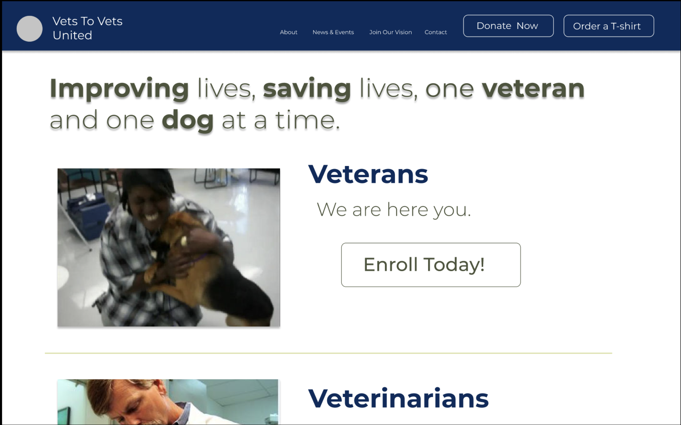
Main Landing Page (II)
-

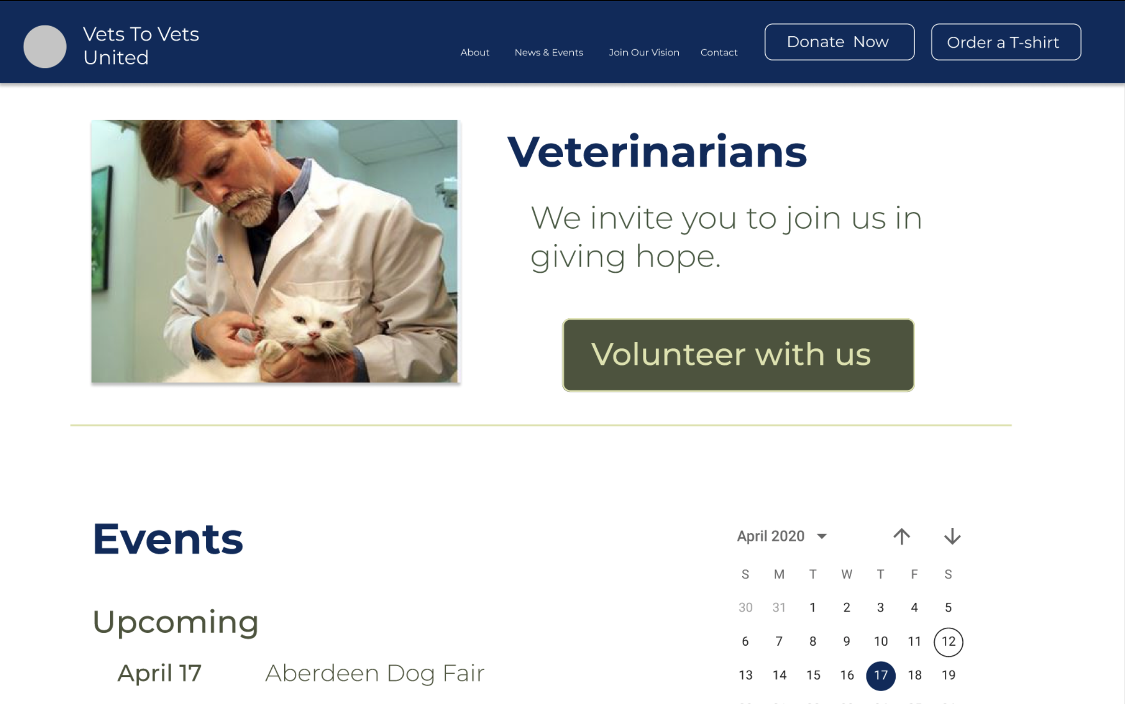
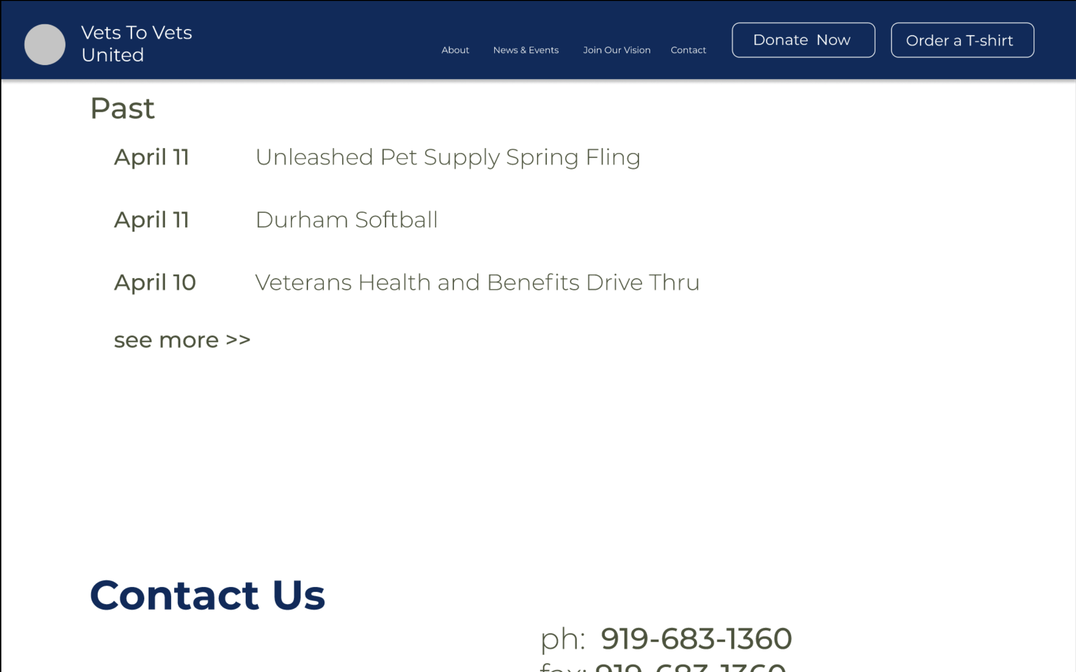
Main Landing Page (III)
-
Main Landing Page (IV)
-
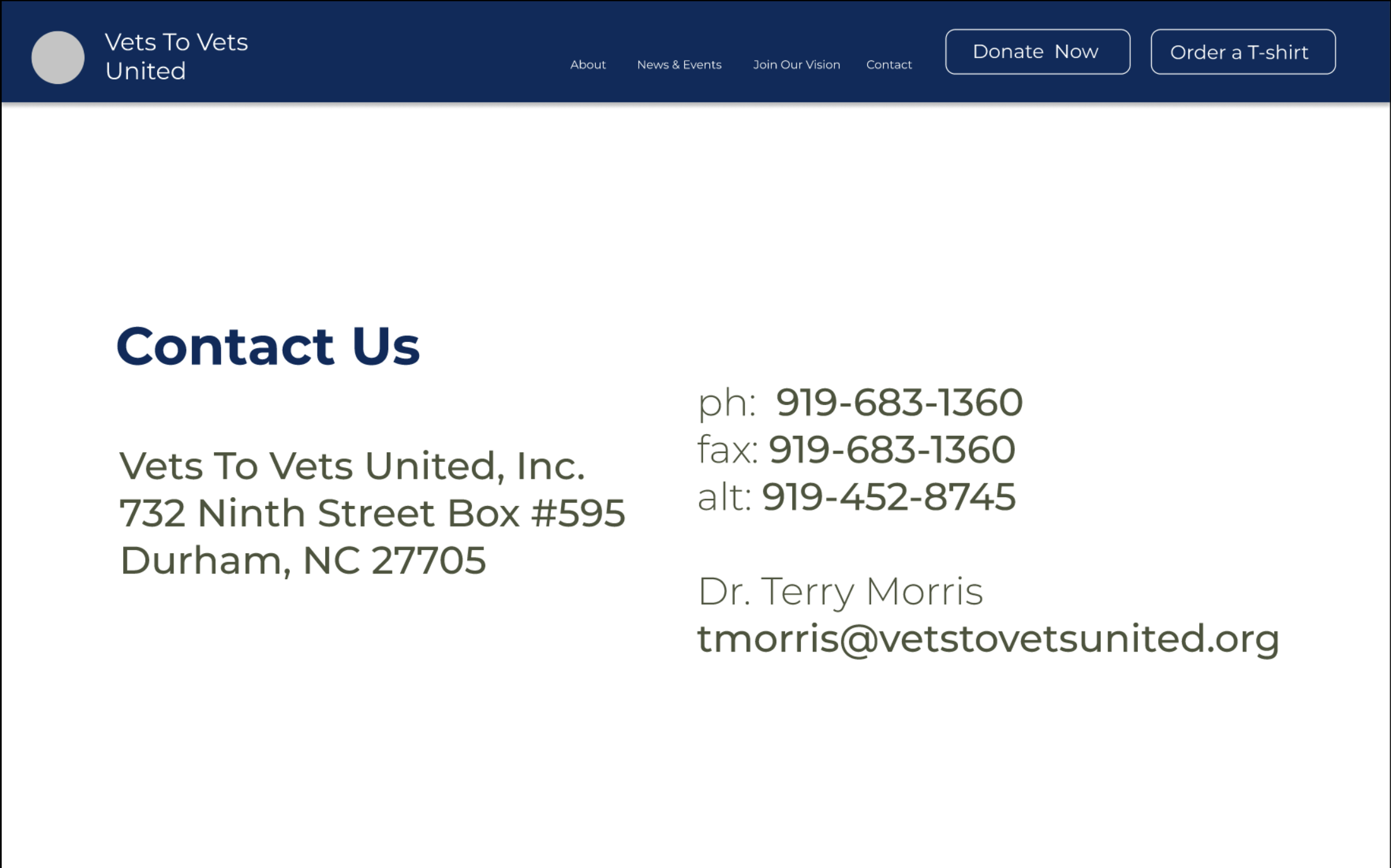
Main Landing Page (V)
-
Design System
-
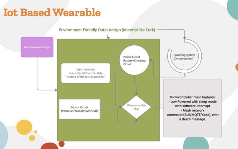
Iot Based Wearable Outline


Inspiration
Over 47.9% of veterans studied by the US National Institutes of Health had accepted claims for a mental health condition. We loved the mission of Vets to Vets pairing veterans with dogs and improving the longevity of veterans, but the website itself is not accessible nor cohesive. The website possesses over three different button designs, font colors, heading designs, and lacked space. Blocks of text deter the user, especially veterans who may be elderly and have a hard seeing or hearing. Additionally, Peeta found that ⅓ pets get lost, but only 10% of the dogs are found. Many pet owners diagnose their pets which may lead to improper diagnosis; a survey by Professor John Volk published in the Journal of the American Veterinary Medical Association noted that 39% of pet owners would simply look online.
What it does
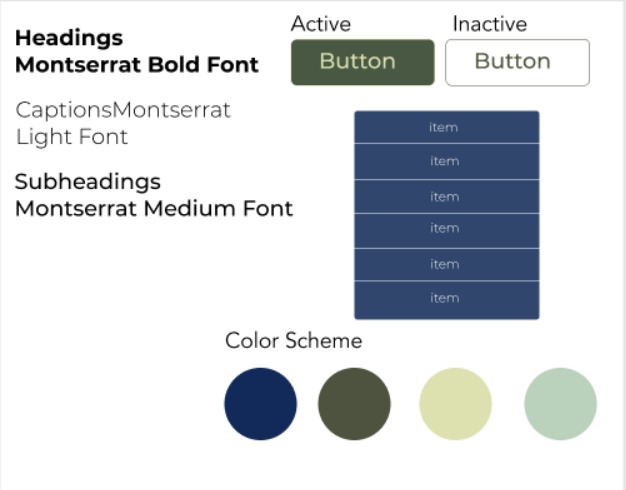
Design System Our design system helps establish cohesive formatting and content design for the website that will appeal to users by being easier to read.
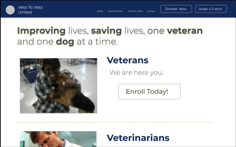
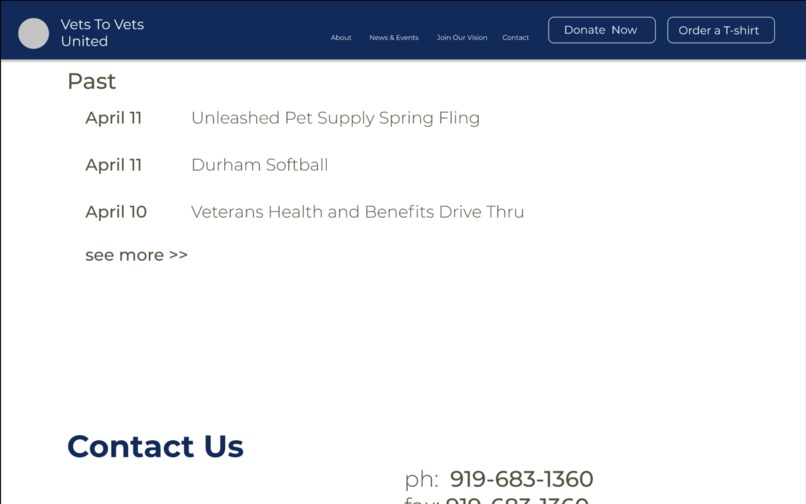
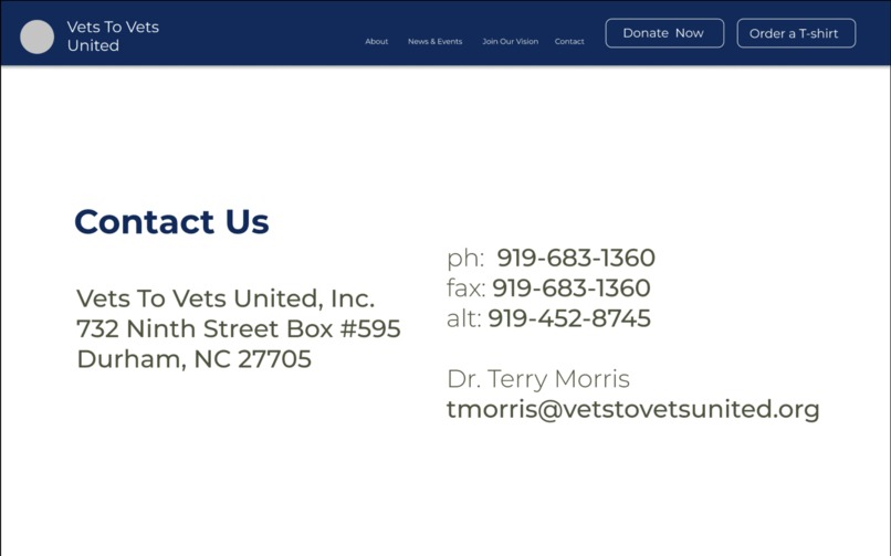
Redesign of the Main Page The main page’s redesign provides an excellent example to work off with fewer options in the dropdowns, consistent and straightforward headings, consistent colors, and button designs with responsive hovering and color changes.
Outlined Idea of an IoT Wearable Essentially, the IoT wearable allows better diagnostics tracking for veterinarians and owners alike. These IoT wearable devices enable the dog’s care for veterinarians and veterans alike to be more accessible; veterinarians have better diagnostics, and veterans can easily track their dogs.
How we built it
We used Figma and Google applications (Doc, Slides, Draw).
Challenges we ran into
There were multiple flaws in the website design; thus, it was difficult for us to focus on one particular flaw to improve upon. Also, the website had too many tabs, and information spread in a disorganized manner. Therefore, we needed to find a way to condense the tabs and web pages without losing any valuable tabs or information.
Not everyone was skilled in Figma, so we focused on each other’s strengths and background to break down tasks and ideate; for instance, one team member had a mechanical engineering background, so we formulated the IoT wearable idea. Besides, all three members lived in different time zones (EST, PST, and IST, respectively), which often made it difficult to collaborate at the same time.
Accomplishments that we're proud of
We are proud that we could improve the front page so that it utilizes valuable space more efficiently. For instance, we were proud that the front page includes an extensive slide show of the dogs, their owners, and their vets, which provides a more emotional aspect to the website and resolves unused spacing. We are also proud that we condensed the website’s tabs so that veterans are not overwhelmed by too many superfluous tabs. Too many tabs deter users, particularly veterans with accessibility issues, from engaging with the website and potentially register with the non-profit. Moreover, we were proud that we redesigned the website with veterinarian professionals and the local community in mind (thinking from the veterinarian perspective when navigating the site). There was no one button to go to a page specifically for veterinarians so we created two large specific tabs directing veterans and veterinarians to relevant resources.
What we learned
Design is an iterative process; there are always ways to improve, and it is important to think outside the box. We were planning and contemplating features to improve the site and ultimately target our users, but we wanted it to also be unique. As a result, instead of simply redesigning the website, we decided to also think about the point-of-view of the organization’s leaders. Thus, a brief design system would allow non-technical and non-design individuals to understand how the website is broken down. Additionally, our general solution involves three components, instead of one, to address this problem from multiple angles.
What's next for Rebranding Vets to Vets United
Due to time constraints, we were not able to redesign all pages but focused on the main landing page because that is what is seen first by users. We would love to help redesign the other pages and work to make this a real development. Also, we would like to attain user analytics on the current site and receive user feedback when the full design is implemented. We want to further increase the accessibility and the audience of Vets to Vets by adding options of audio to our design of the website and wearable, developing marketing strategies for the new website such as advertising on Facebook and collaborating with school organizations.
Built With
- figma

Log in or sign up for Devpost to join the conversation.