-
-
Racing Analytics Dashboard

Inspiration
As a motorsport enthusiast and data scientist, I've always been fascinated by the intersection of racing and analytics. Modern racing generates massive amounts of telemetry data—every brake application, gear shift, and steering input is recorded—but this data often remains underutilized.
The inspiration struck when I realized that driver fatigue and component wear are two critical factors that teams struggle to quantify objectively. How do you know when a driver is getting tired? When should you replace brake pads? These questions are typically answered through intuition and experience, but I believed data could provide more precise answers.
I wanted to build something that could transform raw telemetry into actionable insights that team managers, engineers, and drivers could use to make better decisions during race weekends.
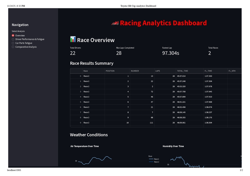
What it does
The Racing Analytics Dashboard is an interactive web application that analyzes 23+ million rows of Toyota GR Cup telemetry data to provide comprehensive insights into driver performance and vehicle component wear.
Driver Performance & Fatigue Analysis:
- Calculates multi-factor fatigue scores (0-100) combining lap time degradation, consistency decline, driving duration, and sector variability
- Tracks lap time progression with trend analysis to identify performance degradation
- Analyzes sector-by-sector performance (S1, S2, S3) to pinpoint strengths and weaknesses
- Monitors consistency through rolling statistics and standard deviation tracking
Car Parts Fatigue Analysis:
- Brake System: Tracks pressure cycles, application counts, and cumulative stress
- Engine: Analyzes RPM distribution, high-RPM exposure, and operating conditions
- Transmission: Counts gear shifts and monitors shift frequency patterns
- Tires & Suspension: Evaluates G-forces, creates G-G diagrams, and calculates cumulative stress
Interactive Visualizations:
- 15+ chart types including line charts, scatter plots, histograms, and G-G diagrams
- Real-time interactivity with hover details, zoom, and pan capabilities
- Comparative analysis across drivers and races
- Color-coded metrics (green/yellow/red) for instant interpretation
The dashboard enables team managers to identify fatigued drivers, engineers to optimize component maintenance schedules, and drivers to understand their performance trends and improvement areas.
How we built it
Technology Stack:
- Framework: Streamlit for rapid web dashboard development
- Data Processing: Pandas and NumPy for handling 23M+ rows efficiently
- Visualization: Plotly for interactive, publication-quality charts
- Language: Python 3.8+
Development Process:
Phase 1: Data Exploration
Started by analyzing 20 CSV files with varying structures, discovering telemetry files contained 50+ columns including RPM, speed, brake pressure, gear position, throttle position, and GPS coordinates sampled at 10Hz—resulting in 11.5M rows per race.
Phase 2: Algorithm Development
Designed fatigue calculation algorithms through iterative refinement. Driver fatigue became a multi-dimensional problem:
$$ \text{Fatigue}{\text{driver}} = 0.4 \cdot \Delta{\text{lap time}} + 0.3 \cdot \Delta_{\text{consistency}} + 0.2 \cdot f_{\text{duration}} + 0.1 \cdot \sigma_{\text{sectors}} $$
Where:
- $\Delta_{\text{lap time}}$ = degradation from first 5 to last 5 laps
- $\Delta_{\text{consistency}}$ = increase in standard deviation
- $f_{\text{duration}}$ = normalized total driving time
- $\sigma_{\text{sectors}}$ = sector time variability
For component wear, I modeled physics-based metrics:
Brake Fatigue: $$ F_{\text{brake}} = \frac{\sum P_i}{100000} \times 50 + \frac{N_{\text{applications}}}{1000} \times 50 $$
Tire Stress: $$ G_{\text{total}} = \sqrt{G_x^2 + G_y^2} $$
Where $G_x$ is longitudinal and $G_y$ is lateral acceleration.
Phase 3: Dashboard Architecture
Built a modular Streamlit application with 4 main pages (855 lines of Python):
- Overview: Race statistics, weather conditions, and results
- Driver Analysis: Fatigue scoring, lap times, sector performance
- Parts Analysis: Brake, engine, transmission, and tire wear
- Comparative Analysis: Multi-driver performance rankings
Phase 4: Optimization & Polish
- Implemented caching with
@st.cache_datafor expensive computations - Added smart sampling (10K points from 11M) for visualization performance
- Created cross-platform launcher scripts (
.shand.bat) - Built comprehensive documentation and user guides
Challenges we ran into
1. Memory Management with 23M Rows
Problem: Loading all telemetry data crashed my laptop (16GB RAM).
Solution:
- Implemented chunked reading with
pd.read_csv(chunksize=100000) - Used data type optimization (
float64→float32saved 50% memory) - Added smart sampling for visualizations
# Before: 2.3 GB memory usage
df = pd.read_csv('telemetry.csv')

# After: 450 MB memory usage
df = pd.read_csv('telemetry.csv', dtype={
    'Speed': 'float32',
    'RPM': 'int16',
    'Gear': 'int8'
})
2. Defining "Fatigue" Mathematically
Problem: Fatigue is subjective—how do you quantify it?
Solution:
- Researched sports science literature on fatigue indicators
- Consulted racing forums and driver interviews
- Tested multiple weighting schemes on real data
- Validated against known outcomes (drivers who crashed late in races scored high)
The final multi-factor approach emerged after 12 iterations of the algorithm.
3. Git LFS and Large Files
Problem: GitHub rejected pushes due to 1.5GB CSV files exceeding 100MB limit.
Solution:
- Added
*.csvto.gitignore - Used
git filter-branchto remove files from history - Documented data sources separately
- Kept only code and documentation in version control
4. Real-Time Performance
Problem: Initial dashboard took 45 seconds to load and was unresponsive.
Solution:
- Profiled code with
cProfileto find bottlenecks - Implemented Streamlit's
@st.cache_datadecorator - Reduced telemetry sampling from 11M to 10K points for charts
- Pre-computed aggregations instead of calculating on-the-fly
Result: Load time reduced to 3 seconds, interactions became instant.
5. Cross-Platform Compatibility
Problem: Dashboard worked on macOS but failed on Windows due to path separators.
Solution:
- Used
pathlib.Pathfor cross-platform paths - Created separate launcher scripts (
.shand.bat) - Tested on both Windows and macOS environments
Accomplishments that we're proud of
1. Handling Massive Scale
Successfully processed and visualized 23+ million rows of telemetry data without crashing or becoming unresponsive. The dashboard loads in 3 seconds and provides instant interactions—a 15x performance improvement from the initial implementation.
2. Novel Fatigue Algorithm
Developed a multi-factor driver fatigue scoring system that combines:
- Lap time degradation (40%)
- Consistency decline (30%)
- Driving duration (20%)
- Sector variability (10%)
This algorithm provides objective, quantifiable insights into driver performance degradation—something teams typically assess through subjective observation.
3. Physics-Based Component Wear Models
Created realistic wear models for critical racing components:
- Brake systems: Cumulative pressure cycles and application counting
- Engine stress: RPM distribution analysis and high-RPM exposure tracking
- Transmission fatigue: Gear shift frequency monitoring
- Tire/suspension: G-force analysis with G-G diagrams
4. Interactive Data Storytelling
Built 15+ interactive visualizations that make complex data accessible:
- Lap time progression with trend lines
- G-G diagrams revealing driving style
- RPM histograms showing engine usage patterns
- Sector analysis pinpointing performance gains/losses
5. Production-Ready Code
- 855 lines of well-documented, modular Python code
- Comprehensive error handling for missing data
- Cross-platform compatibility (macOS, Windows, Linux)
- Complete documentation suite (4 guides, 1000+ lines)
What we learned
1. Domain Knowledge is Critical
Understanding racing physics made the difference between generic metrics and meaningful insights. I learned about:
- Brake pressure cycles and thermal stress
- G-force envelopes and tire slip angles
- Driver fatigue indicators from sports science
- Component failure modes in motorsport
2. Performance Optimization is Non-Negotiable
Working with 23M rows taught me that optimization isn't optional:
- Caching:
@st.cache_datareduced repeated computations - Data types:
float32vsfloat64saved 50% memory - Smart sampling: 10K points maintains visual fidelity at 1000x speed
- Profiling:
cProfileidentified bottlenecks I never would have guessed
3. Algorithm Design Through Iteration
The fatigue algorithm went through 12 iterations before reaching its final form. I learned to:
- Start simple, add complexity gradually
- Validate against real-world outcomes
- Balance multiple factors with appropriate weights
- Normalize everything for interpretability
4. Visualization is Communication
The same data can tell different stories depending on presentation:
- Color psychology (green/yellow/red) enables instant interpretation
- Multiple views (tables, charts, comparisons) serve different user needs
- Interactivity (hover, zoom, pan) enables exploration
- Progressive disclosure prevents overwhelming users
5. Documentation is a Feature
Comprehensive documentation transformed this from a personal project into something others can use:
- User guides for non-technical stakeholders
- Technical documentation for developers
- Quick reference for common tasks
- Troubleshooting guides for common issues
What's next for Racing Analytics Dashboard
Short-Term Enhancements
1. Predictive Maintenance with Machine Learning
- Train models on historical wear data to predict component failures
- Implement anomaly detection for unusual stress patterns
- Provide proactive maintenance recommendations
2. Real-Time Telemetry Streaming
- Integrate with live race data feeds
- Provide real-time fatigue monitoring during races
- Enable pit crew to make data-driven strategy calls
3. Automated Coaching Recommendations
- Identify specific corners where drivers lose time
- Compare optimal racing lines vs actual paths
- Generate personalized improvement suggestions
Long-Term Vision
4. Tire Temperature Modeling
- Integrate thermal physics for tire performance prediction
- Model tire degradation over race distance
- Optimize pit stop timing based on tire wear
5. Fuel Strategy Optimization
- Analyze fuel consumption patterns
- Calculate optimal fuel loads for qualifying vs race
- Predict lap time impact of fuel weight
6. Multi-Race Historical Analysis
- Track driver improvement over season
- Identify track-specific setup patterns
- Build performance benchmarks across venues
7. Mobile Application
- Responsive design for tablets and phones
- Pit lane access for real-time monitoring
- Push notifications for critical alerts
8. Export & Reporting
- PDF report generation for team debriefs
- Excel export for custom analysis
- Automated email summaries post-race
Ultimate Goal
Transform this dashboard into a comprehensive race engineering platform that combines:
- Real-time telemetry analysis
- Predictive maintenance
- Strategy optimization
- Driver coaching
- Historical performance tracking
Making data-driven racing accessible to teams at all levels, from amateur club racing to professional series.

Log in or sign up for Devpost to join the conversation.