Inspiration
During sensory overload, panic, or a meltdown, some autistic and neurodivergent people temporarily lose the ability to speak or type — even when they urgently need to communicate something simple. Existing AAC (assistive and augmentative communication) tools are built for permanent non-verbal users: dense, multi-screen, and designed for calm, deliberate use. That's the opposite of what's usable during a crisis moment. QuietSignal exists to fill that specific gap.
What it does
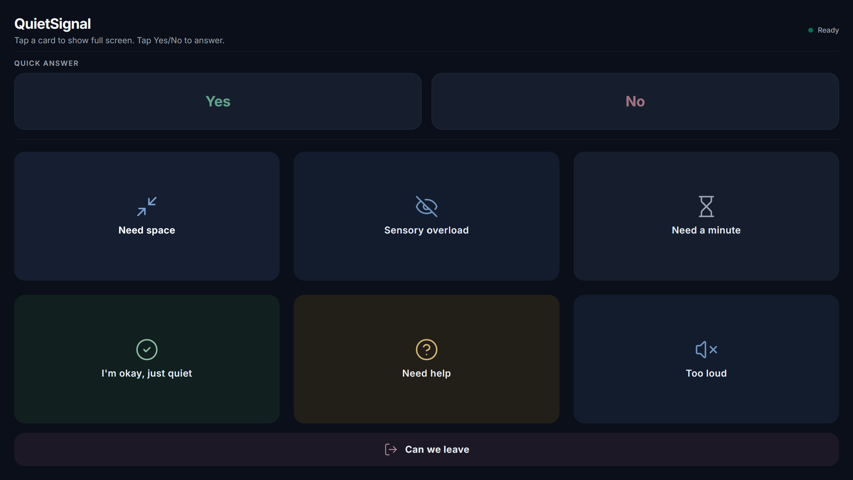
QuietSignal is a single, full-screen web app with large, high-contrast cards for urgent states — "Need space," "Sensory overload," "Need help," and similar — that anyone nearby can understand in one glance, with one tap.
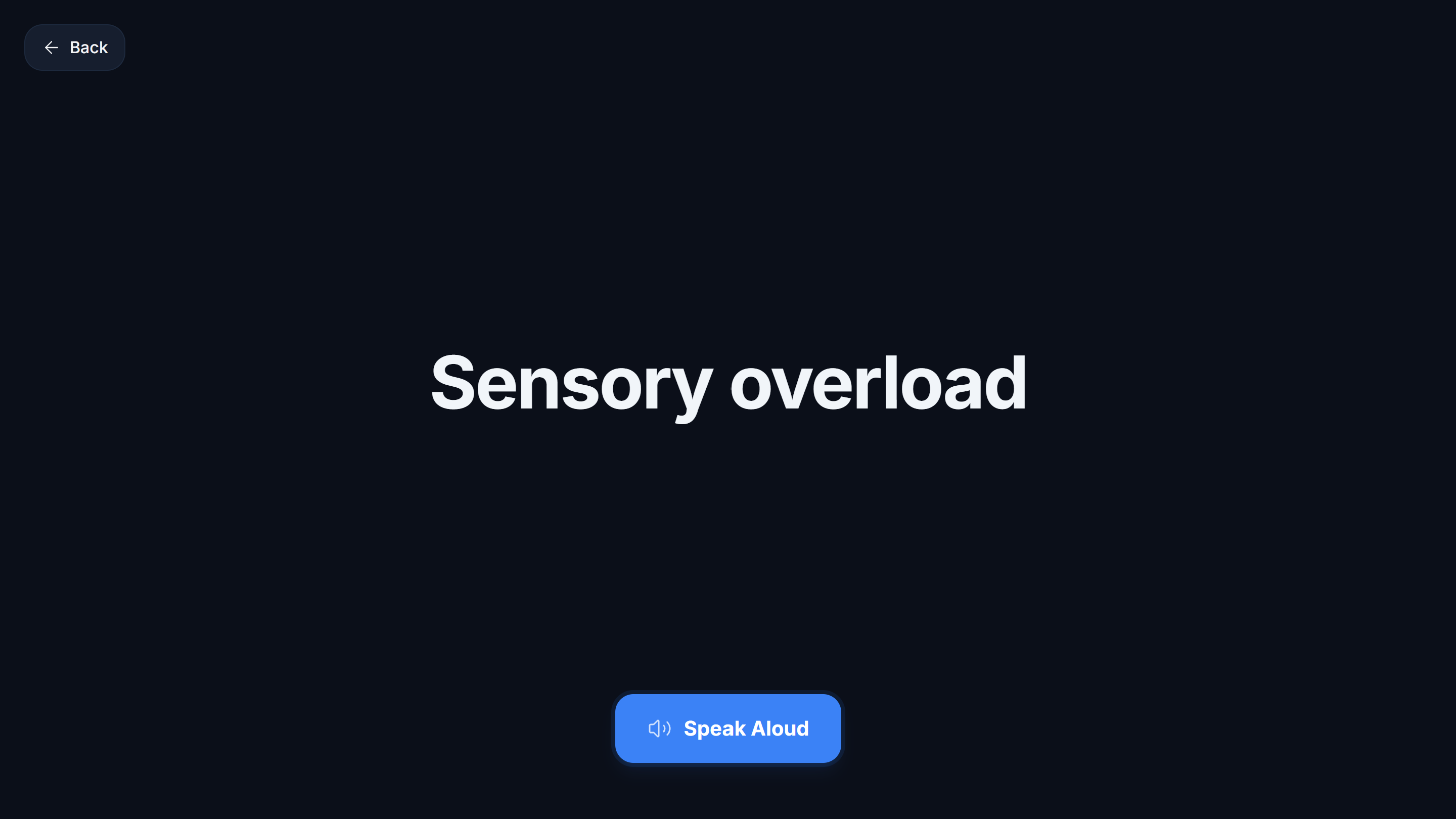
- Tap a card and it fills the screen in large, calm, high-contrast text
- An optional "speak aloud" button reads the phrase out loud using the browser's built-in Web Speech API
- A quick Yes/No pair sits above the grid for fast binary answers
- One tap returns instantly to the grid — no menus, no setup, no login
How I built it
QuietSignal is intentionally small. No backend, no database, no login — every extra moving part is something that could fail while someone is relying on it in a crisis moment. It's built with React and Vite for a fast, simple frontend, styled with Tailwind CSS for a calm, muted, high-contrast dark theme, and uses Lucide icons. All state lives in plain React state, and voice playback uses the browser's native Web Speech API, so there's no API key and nothing server-side to break.
The visual design went through several iterations to get right — early versions used bright accent colors and visible borders that felt more like a typical dashboard than something calming. The final design groups cards by meaning using muted color tints only (cool blue for self-regulation needs, soft green for reassurance, muted amber for urgency, dusty rose for an exit request), with no borders, soft rounded corners, and sentence-case text throughout, so the interface itself doesn't add to sensory load.
Challenges I ran into
The hardest part wasn't the code — it was resisting the urge to add features. It would have been easy to add accounts, customization, or a backend, but every one of those is a new way for the live demo to break in front of judges. The other real challenge was getting the color and visual hierarchy right: an early version made the "Need help" card much bigger than the others, but that actually worked against the goal — someone in distress shouldn't have to judge whether their need is "big enough" to find on screen. All 7 cards ended up the same size for that reason.
What's next for QuietSignal
- Customizable card phrases, so a user or caregiver can adapt the wording
- A caregiver companion view
- Light, dark, and low-stimulation color themes
- Offline-first installable app, since a crisis moment isn't guaranteed to have wifi
Built With
- javascript
- react
- tailwindcss
- vite
- web-speech-api

Log in or sign up for Devpost to join the conversation.