-
-
Hero
-
Ripple Interaction
-
Molten State
-
Fracture State
-
Reformation and Recombining
-
Epilogue Heading
-
Epilogue Sources
-
Mobile Hero
-
Mobile Epilogue
Inspiration
"Everything flows, nothing stands still." — Heraclitus
Most liquid-metal demos on the web stop at the special effect: a pretty blob that follows your cursor, and that's the whole pitch. Quicksilver starts there deliberately, the spectacle has to be genuinely good, because it's the setup for something else.
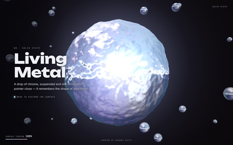
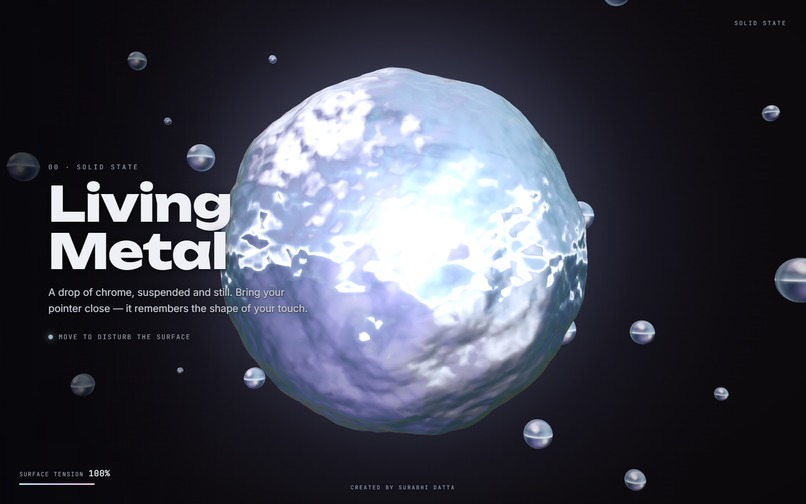
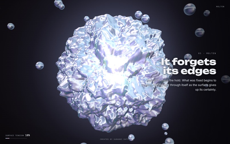
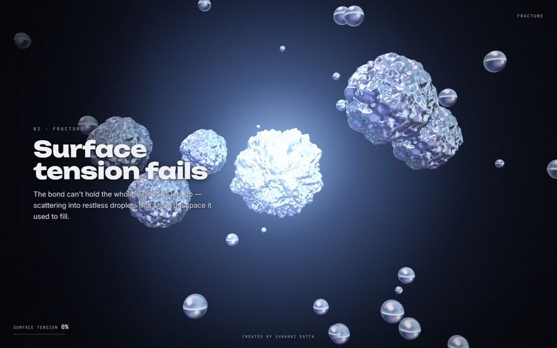
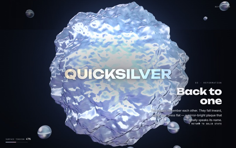
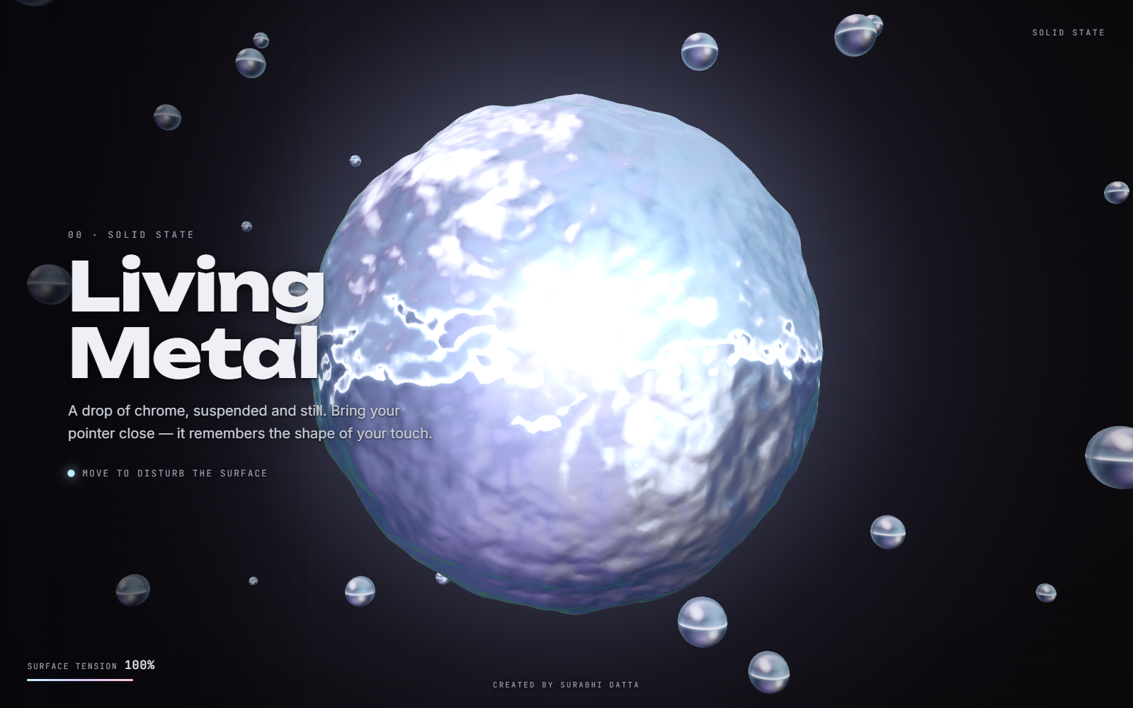
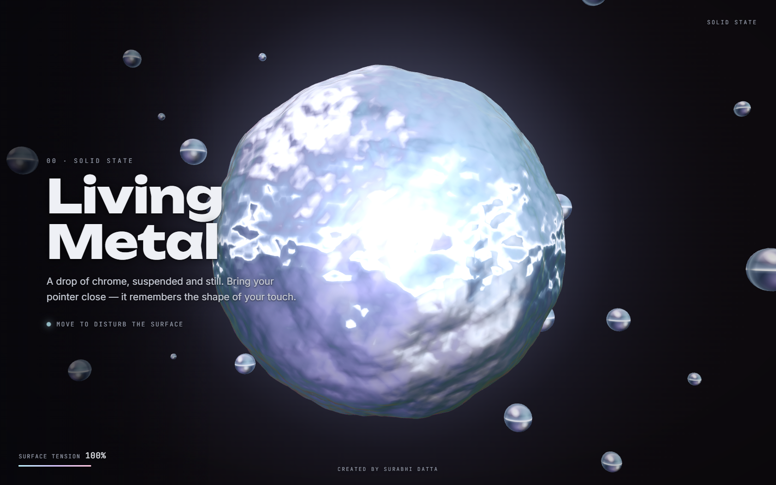
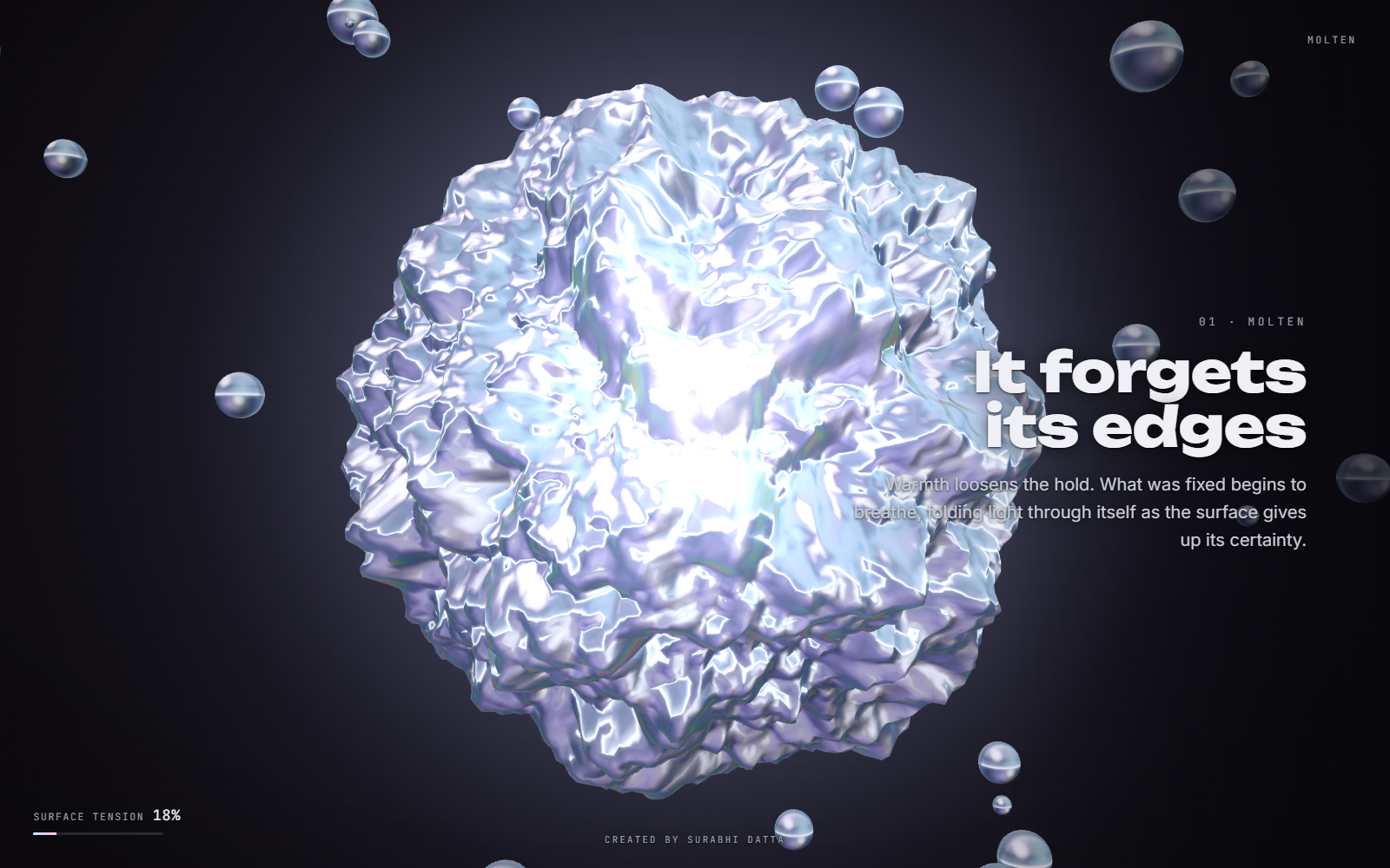
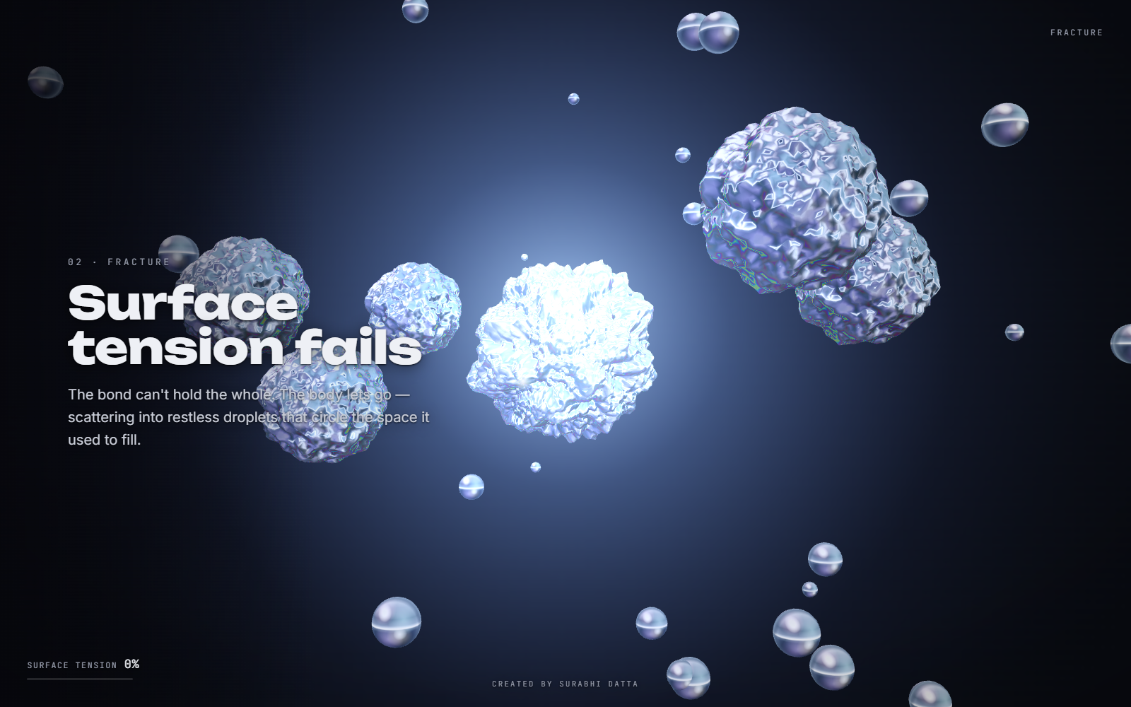
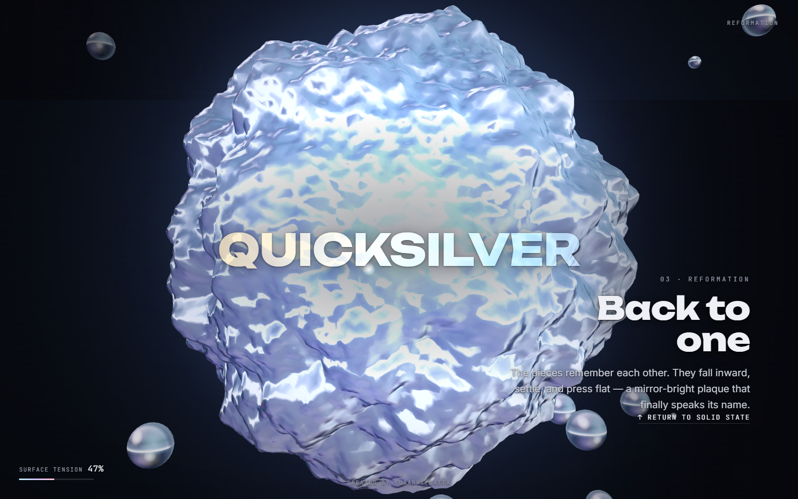
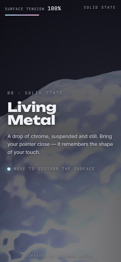
The fiction. A drop of chrome sits suspended and still. Move your pointer across it and it ripples like real mercury, several ripples overlapping and decaying at once. Scroll, and it goes through a narrative arc: it melts, surface tension fails and it shatters into droplets that orbit the space it used to fill, and then the pieces remember each other, fall inward, and press flat into a mirror-bright plaque that finally speaks its name. A HUD tracks SURFACE TENSION as a percentage the whole way down, and it isn't a decorative number, it's a live readout of the exact same value driving the shader's displacement.
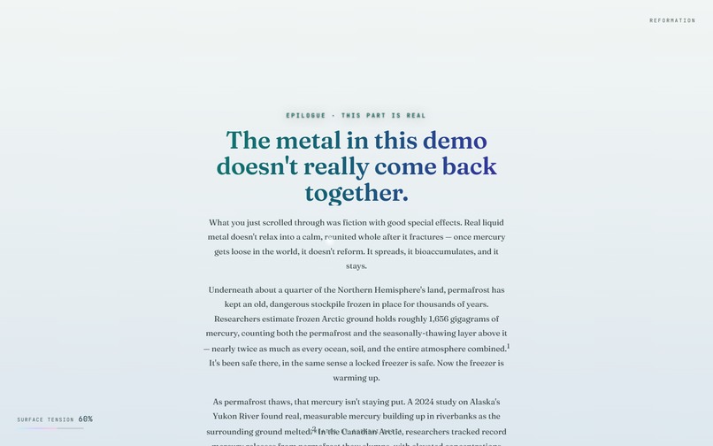
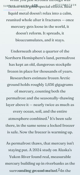
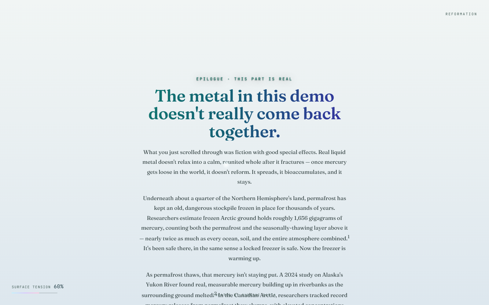
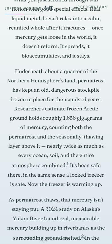
The fact. Then there's a fifth section. The dark chrome lab dissolves into pale daylight, the typeface changes from a chunky geometric sans to an elegant serif, the palette shifts from cool metal to teal and indigo, and the page says plainly: what you just scrolled through was fiction with good special effects. Real liquid metal doesn't relax into a calm, reunited whole after it fractures. Once mercury gets loose in the world, it doesn't reform, it spreads, it bioaccumulates, and it stays.
Underneath about a quarter of the Northern Hemisphere's land, permafrost has kept an old, dangerous mercury stockpile frozen in place for thousands of years, roughly 1,656 gigagrams, nearly twice as much as every ocean, soil, and the entire atmosphere combined. It's been safe there in the same sense a locked freezer is safe. Now the freezer is warming up.
Why build it this way. My first instinct was to make the whole site "about" mercury pollution, thread the message through every scroll zone. That would have made it worse at both jobs: too sparse to teach anything, too preachy to enjoy. Keeping the fiction and the fact structurally separate, spectacle first, substance second, never blurred, is the entire design thesis. The contrast is the argument.
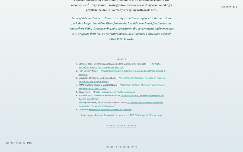
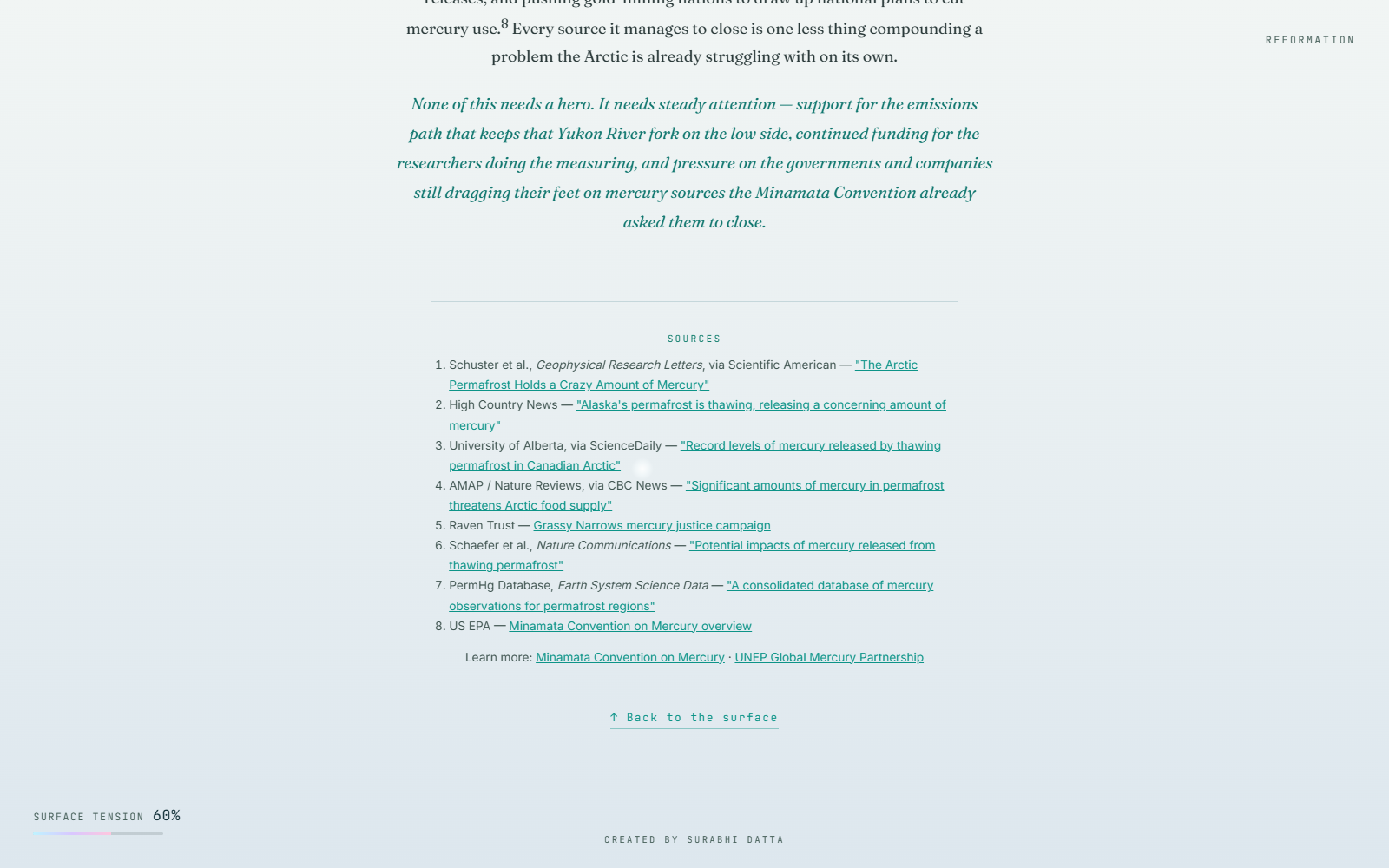
The same restraint governs the writing. Eight cited sources, no alarmism, no donate button, no "act now", just the facts and two neutral "learn more" links. Cutting the persuasion made it more persuasive.
What it does
Everything you see is generated in code. The project ships with zero image assets.
The chrome is a lie, and that's the interesting part. There is no scene lighting. The metal is a matcap, a studio environment (bright ceiling, crisp horizon, dark floor, with iridescent pink/cyan/violet/gold blooms) painted onto an HTML canvas at load time, then sampled in the fragment shader using the view-space normal. Filmic ACES tone-mapping and an iridescent Fresnel rim finish it.
The surface is a hand-written GLSL vertex shader. A subdivided icosahedron is displaced along its normals by 4-octave fbm noise (ambient wobble) layered with up to three independently-timed decaying sine-wave ripples from your touch. Normals are recomputed from two tangential neighbours each frame, so the reflection genuinely bends with the surface instead of sliding over it.
One scroll fraction drives the whole story, eased between zones with smoothstep rather than hard cuts, heat, fracture, plaque-flatten and wordmark reveal are all functions of it.
The narrative is correctly anchored. The scroll fraction ends at the bottom of Reformation, not the bottom of the document, so adding the epilogue below doesn't stretch and break the pacing of the blob's arc. The epilogue's own reveal runs on a completely separate scroll calculation so the two never fight.
A small Postgres backend records, passively and anonymously, how far visitors travel through the narrative (no cookies, no localStorage, no personal data). It's best-effort by contract: if the database is unreachable the visual experience is entirely unaffected.
Interactivity & accessibility
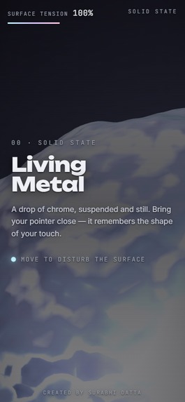
Ripples on desktop and mobile — continuous ripples as the cursor moves, and tap-to-ripple on touch devices. A custom glowing cursor on desktop reinforces "you are touching something," falling back to the system cursor on touch. Verified responsive from 375 px through desktop: no horizontal scroll, and the HUD relocates on narrow phones so the corner labels never collide. Prefers-Reduced-Motion aware — ambient motion is damped while scroll-linked state changes and user-triggered ripples keep working. Keyboard-visible focus states on every link; the canvas never intercepts clicks.
How we built it
3D / graphics: Three.js 0.128.0, custom ShaderMaterial with hand-written GLSL (vertex + fragment), procedurally-baked matcap and glow textures, WebGL
Framework: Next.js 14 (App Router), React 18, the copy is server-rendered, only the scene and the analytics beacon are client components
Typography: next/font self-hosting Unbounded, Inter, JetBrains Mono, and Fraunces (no runtime font requests)
Backend: Vercel serverless functions (Node.js runtime)
Database: PostgreSQL on Neon, via vercel
Hosting / CI: Vercel
Built solo. The chrome is a procedurally-baked matcap sampled by the view-space normal; the surface is a hand-written GLSL vertex shader combining fbm noise with decaying ripple waves. It started as a single self-contained HTML file and was ported faithfully to Next.js with a real backend, with Three.js pinned to 0.128.0 so the visuals match exactly."
Challenges we ran into
A frame-rate bug hiding as a rendering problem. Touch ripples were raycasting the full ~46,000-triangle blob mesh on every pointer move, which hitched frames and read as a jittery cursor. Replacing it with an O(1) analytic ray↔sphere intersection, plus swapping per-frame lerp smoothing for frame-rate-independent exponential smoothing, fixed it completely.
Bolting a fifth act onto a four-act scroll story. Naively appending the epilogue stretched the scroll fraction so the blob's arc never finished. Fixed by anchoring the narrative to the bottom of Reformation and giving the epilogue its own independent scroll calculation.
Legibility against a moving mirror. Text over chrome is a genuinely hard contrast problem, solved with directional scrims that darken the copy side while leaving the metal visible, and a body.is-daylight state that recolours every fixed label the instant the epilogue veil takes over.
Accomplishments that we're proud of
- The tonal pivot lands. Two completely different visual registers, dark interactive fiction and pale cited nonfiction, meeting at one scroll position without a jarring cut.
- Everything is procedural. No image assets, no downloaded 3D models, no shader-library preset; the matcap and the GLSL were built and tuned by hand.
- Restraint. The epilogue is short, sourced, and has no call to action, and it's stronger for it.
What we learned
That the hardest problem in a piece like this is structural, not technical. The instinct to make everything carry the message would have destroyed both halves.
What's next for Quicksilver
- A small builder-only dashboard over the existing
/api/statsfunnel. - A low-power render path (fewer beads, simpler shader) for constrained mobile connections.
- Testing whether the fiction→fact pivot generalizes as a reusable format for a different material.
Built With
- claude
- neon
- postgresql
- react
- three.js
- vercel
- webgl

Log in or sign up for Devpost to join the conversation.